Seven | Branding & Illustration
A Concept
Seven was a single day event that gathered indie music lovers to listen and launch Canadian band Men I Trust's new lead single Seven. Classically Men I Trust, the single has a groovy rhythm that is warm and cozy. The pop melody and lyrics illustrating getting lucky are barely noticeable, lost in the dream-like and warm embrace of the rhythm.
FROM THE EAR TO THE EYE
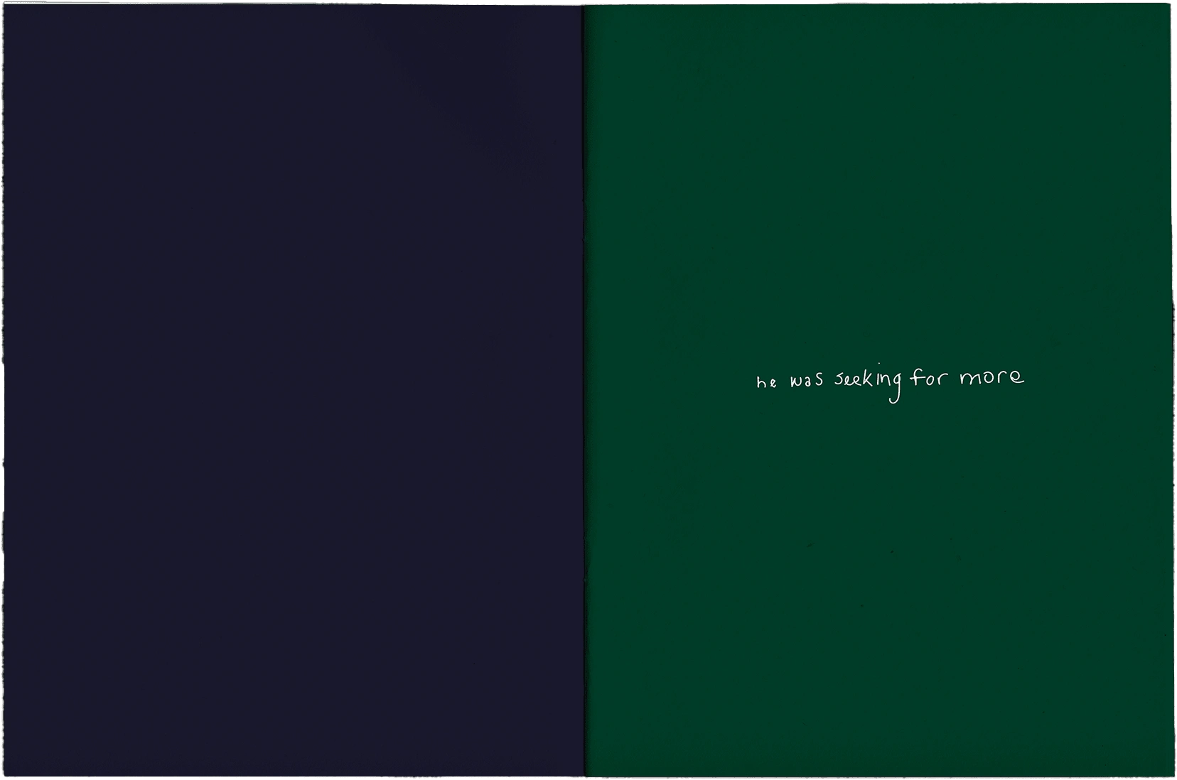
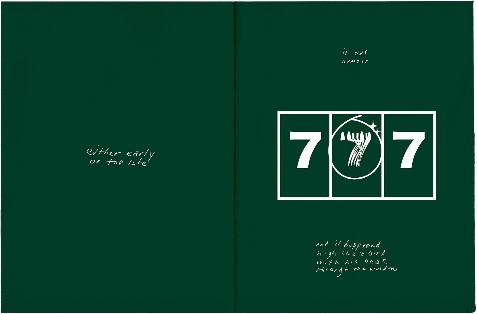
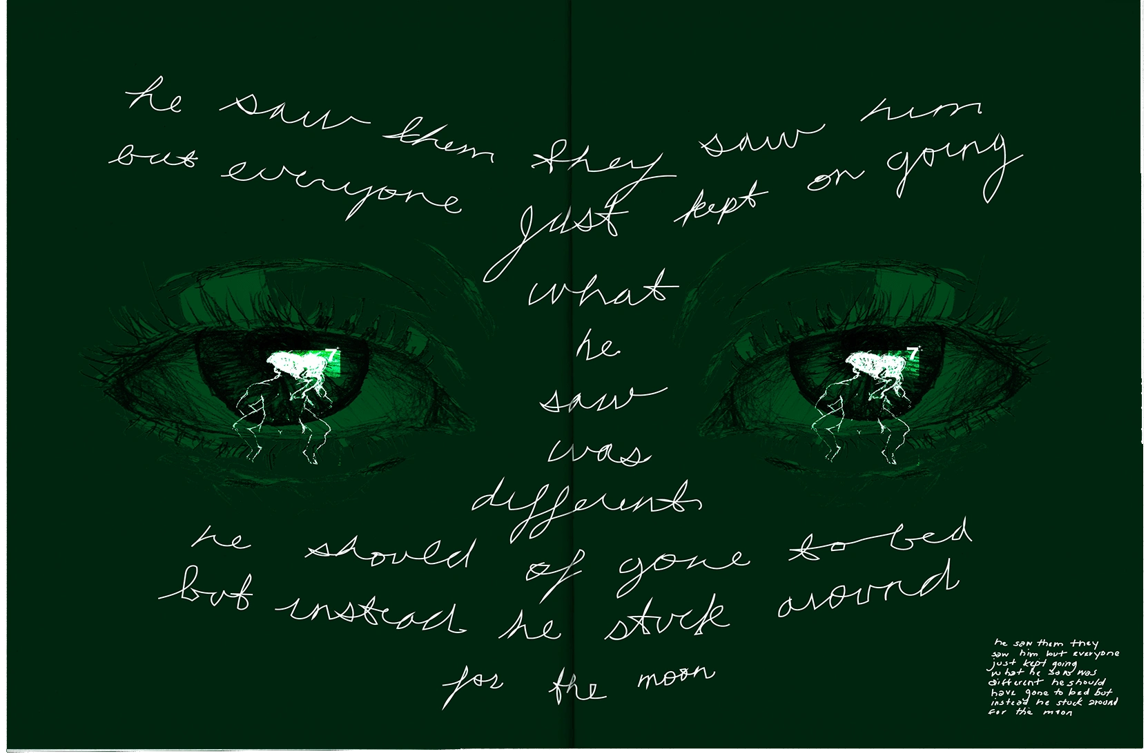
Putting on a event meant creating a tangible experience from two verses, a chorus, and an outro. Furthermore, no one knew the song, yet. At an event of this nature, where there is often media officials and music executive punctuating every corner, it was important there was something in this experience for the fans. In addition, it was important that what was created felt as indie as the band.
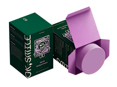
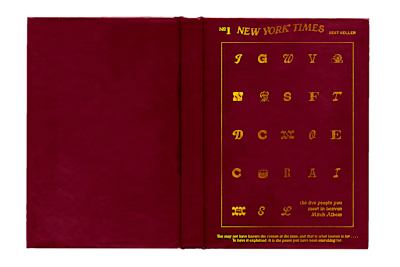
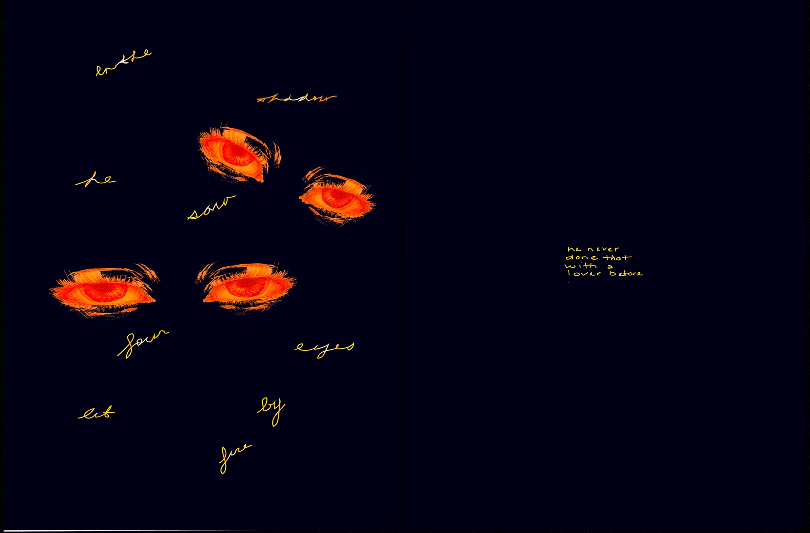
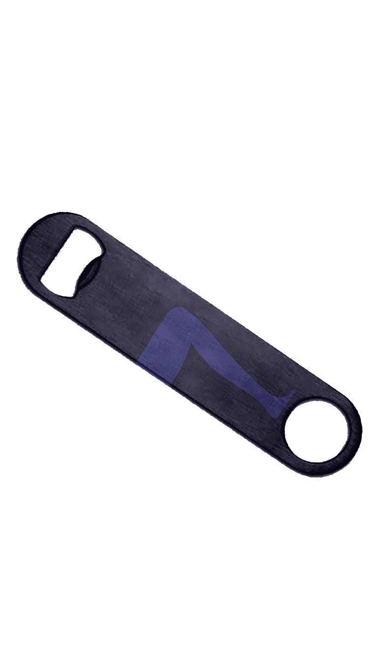
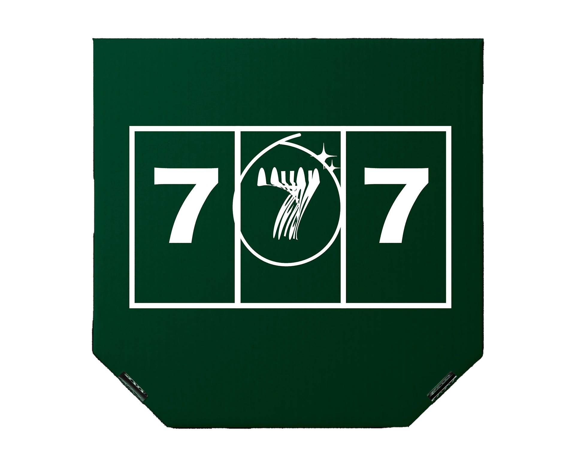
Thus, there was the birth of a zine to introduce the world of Seven—and the lyrics. The design system flows into merchandise and promotions: billboards, posters, bottle openers, pizza boxes, and special edition vinyls.

TYPE, ILLUSTRATION, PALETTE
I was inspired by this idea of someone quickly and secretly writing about the voyeuristic experience illustrated by the lyrics. Therefore, the type is hand lettered and organic, balancing between eligible and emotional.
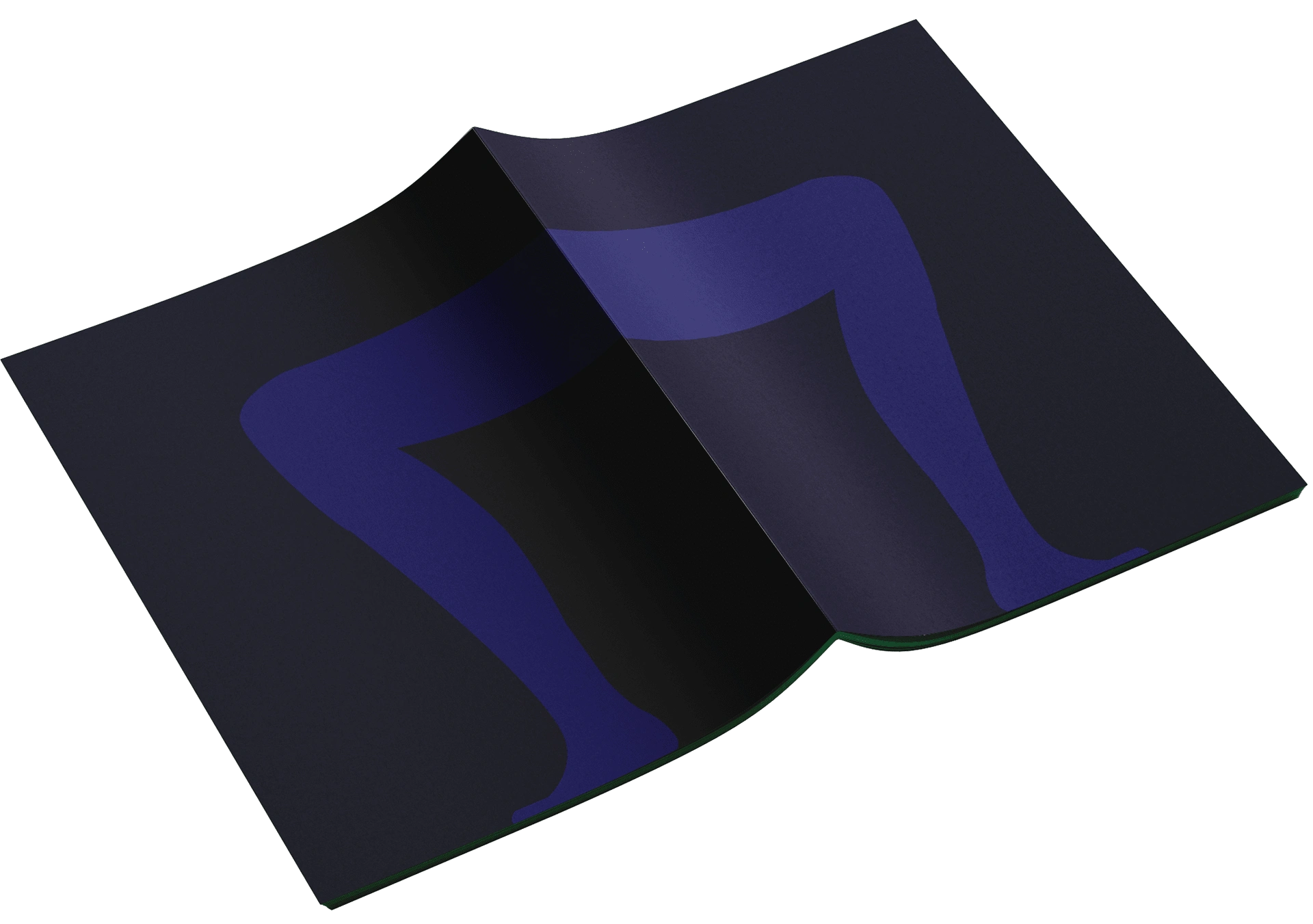
The illustrations used throughout evokes feelings of getting lucky and being watched. Specifically, the primary cover illustration is the number seven in the shape of a leg. The leg is mirrored on the back, so when opened so are the legs.
The color palette was pulled from the single artwork to assimilate into the album rollout. The tonality provides subtly, reflecting the ability to lose oneself in the sonic world of Men I Trust.
Like this project
Posted Mar 4, 2024
Seven was a single day event that gathered indie music lovers to listen and launch Canadian band Men I Trust's new lead single Seven.


