Cookbook is a recipe app for those who like to cook
Oksana Fedko
Cookbook is a recipe app for those who like to cook without too much effort. I designed this mobile app while completing the Google UX Design Professional Certificate course.
My Role
UX/UI designer designing an app named Cookbook from conception to delivery.
Responsibilities
Conducting interviews, paper and digital wireframing, low and high fidelity prototyping, conducting usability studies, accounting for accessibility, and iterating on designs.
Project overview
Problem Statement
1. Home cooks who are busy or lack experience often struggle to find recipes that are both convenient and delicious.
2. Planning and shopping for meals can be time-consuming, especially for those with dietary restrictions or limited pantry staples.
3. Traditional cookbooks lack the flexibility to adjust portion sizes, leading to food waste or extra preparation time.
Goal
1. Create an intuitive platform that helps busy or inexperienced home cooks find quick, easy, and delicious recipes tailored to their skill level and available time.
2. Simplify meal planning and shopping by allowing users to directly order ingredients through the app.
3. Allow users to adjust portion sizes effortlessly, ensuring they cook just the right amount to minimize food waste and save preparation time.
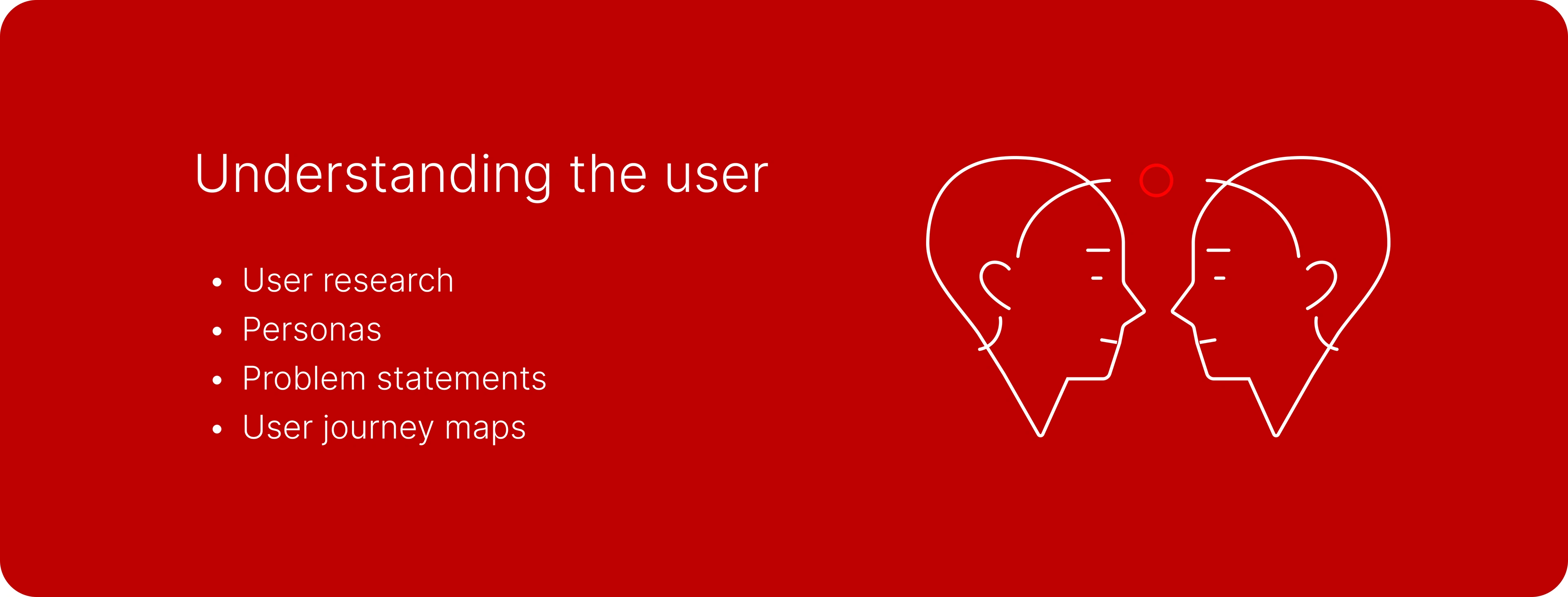
User research: summary
I conducted unmoderated user interviews, which I then turned into empathy maps to better understand the target user and their needs. I discovered that many target users lacked much time for cooking and grocery shopping. They, however, desired to eat homemade food.
Another identified user group included those who wanted to adjust portion sizes easily, disliked wasting food, and preferred to save money.
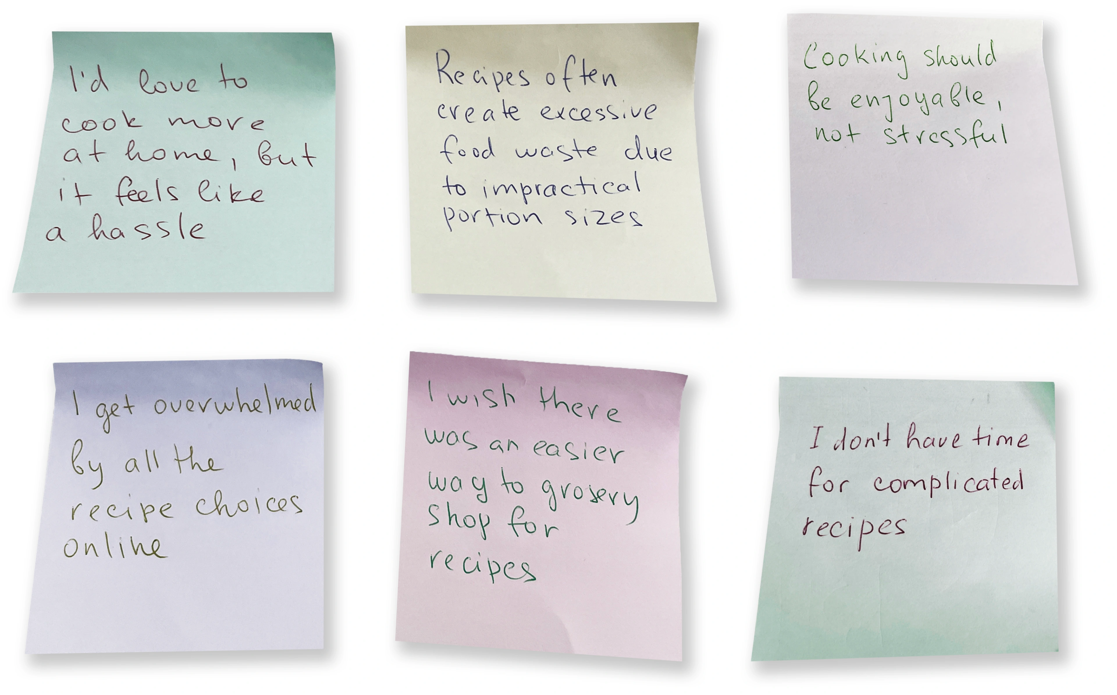
User pain points
Time Constraints
Users find meal planning and cooking time-consuming and frustrating. Complex recipes discourage home cooking.
Shopping Challenges
Users struggle with meal planning, leading to impulsive food choices and waste. Grocery shopping for specific recipes is time-consuming.
Shopping Challenges
Users struggle with meal planning, leading to impulsive food choices and waste. Grocery shopping for specific recipes is time-consuming.
Decision Fatigue
Users struggle to find suitable recipes online due to overwhelming choices and varying skill levels.
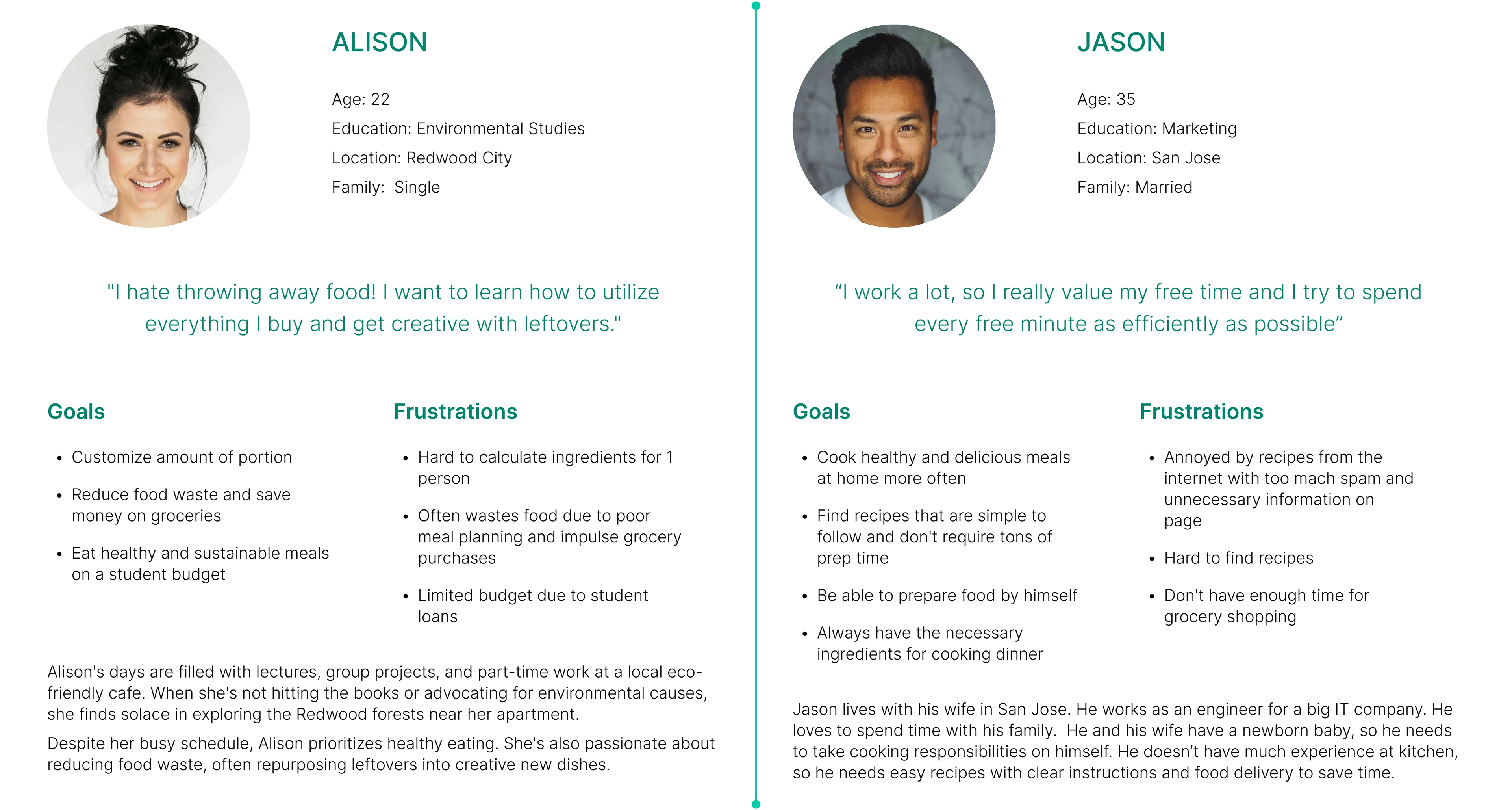
User personas
Alison’s Problem statement
Alison, a busy college student with limited time and a strong commitment to sustainability, struggles to maintain a healthy diet while balancing academics, part-time work, and personal life. She seeks convenient, nutritious meal options that minimize food waste.
Jason’s Problem statement
Jason, a busy working professional, is responsible for cooking for his family while his wife cares for their newborn. With limited cooking experience, a demanding job, and no time for grocery shopping, he seeks quick and convenient meal solutions.
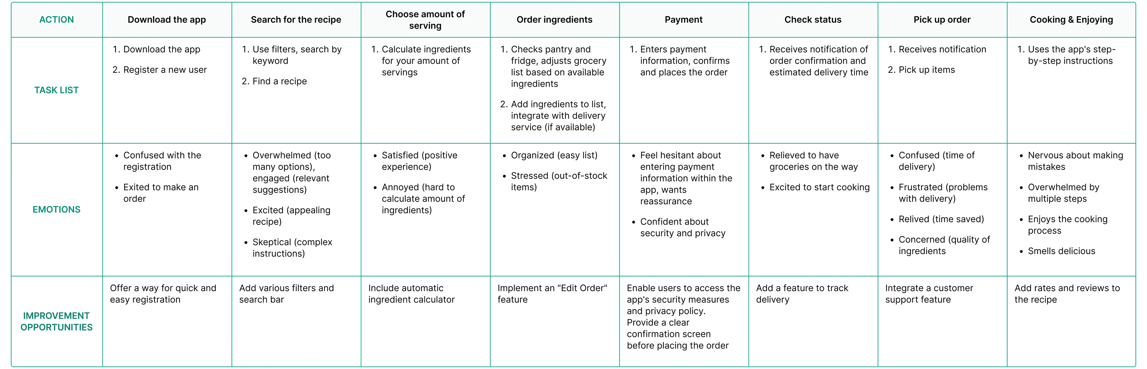
User journey map
I created a user journey map of Jason’s experience using the mobile app to help identify possible pain points and improvement opportunities.
Persona: Jason
Goal: Quickly prepare healthy meals for his family while balancing work and childcare.
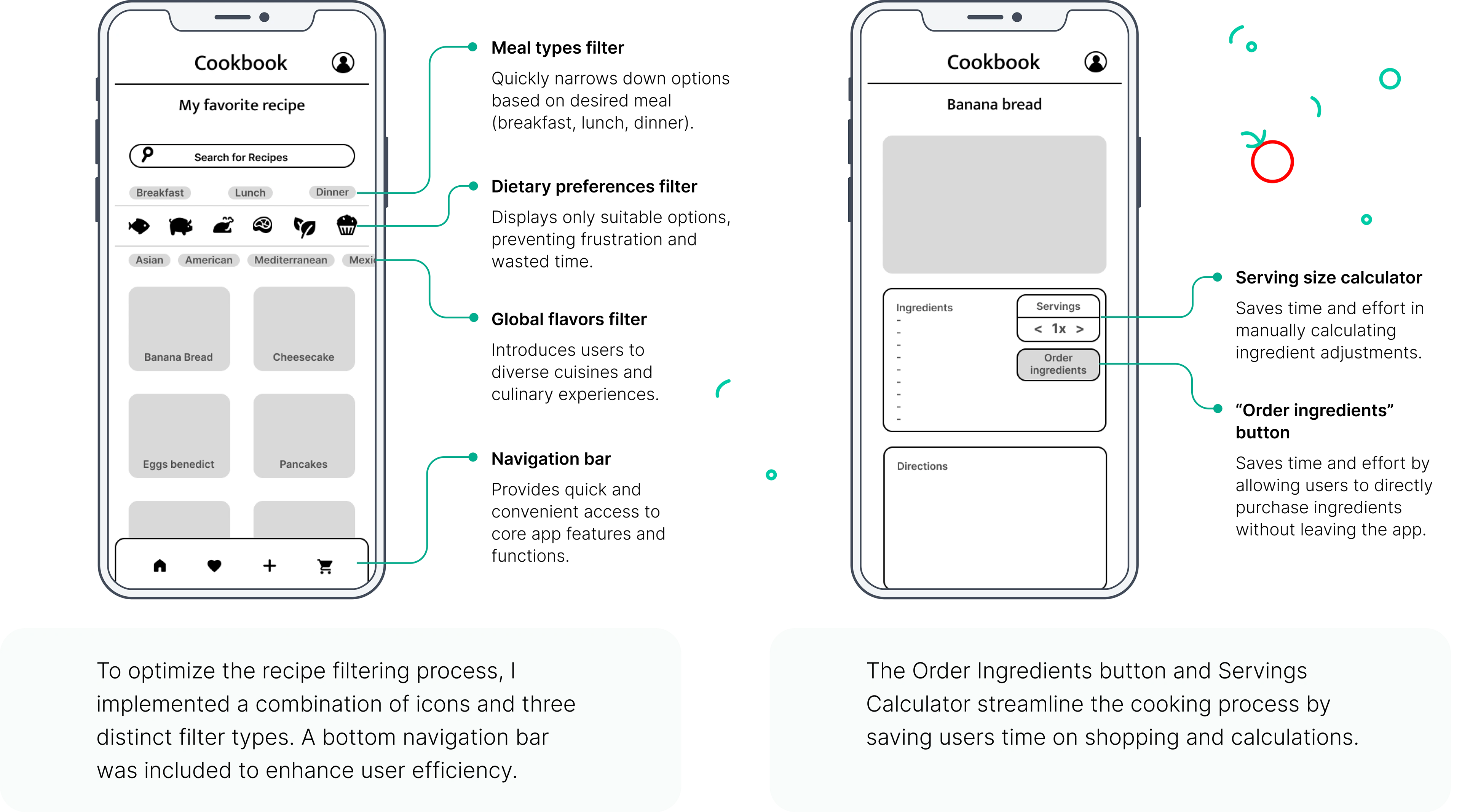
Paper wireframes
By prioritizing core features identified through user research, I created initial low-fidelity wireframes using pen and paper to establish the foundational structure and interaction flow of the product.

Digital wireframes
Building upon the foundational sketches, I iteratively developed digital wireframes, refining the user flow and interface to align with user needs. Through multiple revisions, I optimized the design for optimal user experience.
Low-fidelity prototype
I created a low-fidelity prototype from the user flow diagram and wireframes to test functionality before incorporating it into the final design and ensure accessibility for end-users.
User Flow
1. User creates an account or logs in.
2. User searches for recipes.
3. User selects a recipe.
4. User order ingredients.
5. User confirms order details.
6. User enters payment information.
7. User confirms order.
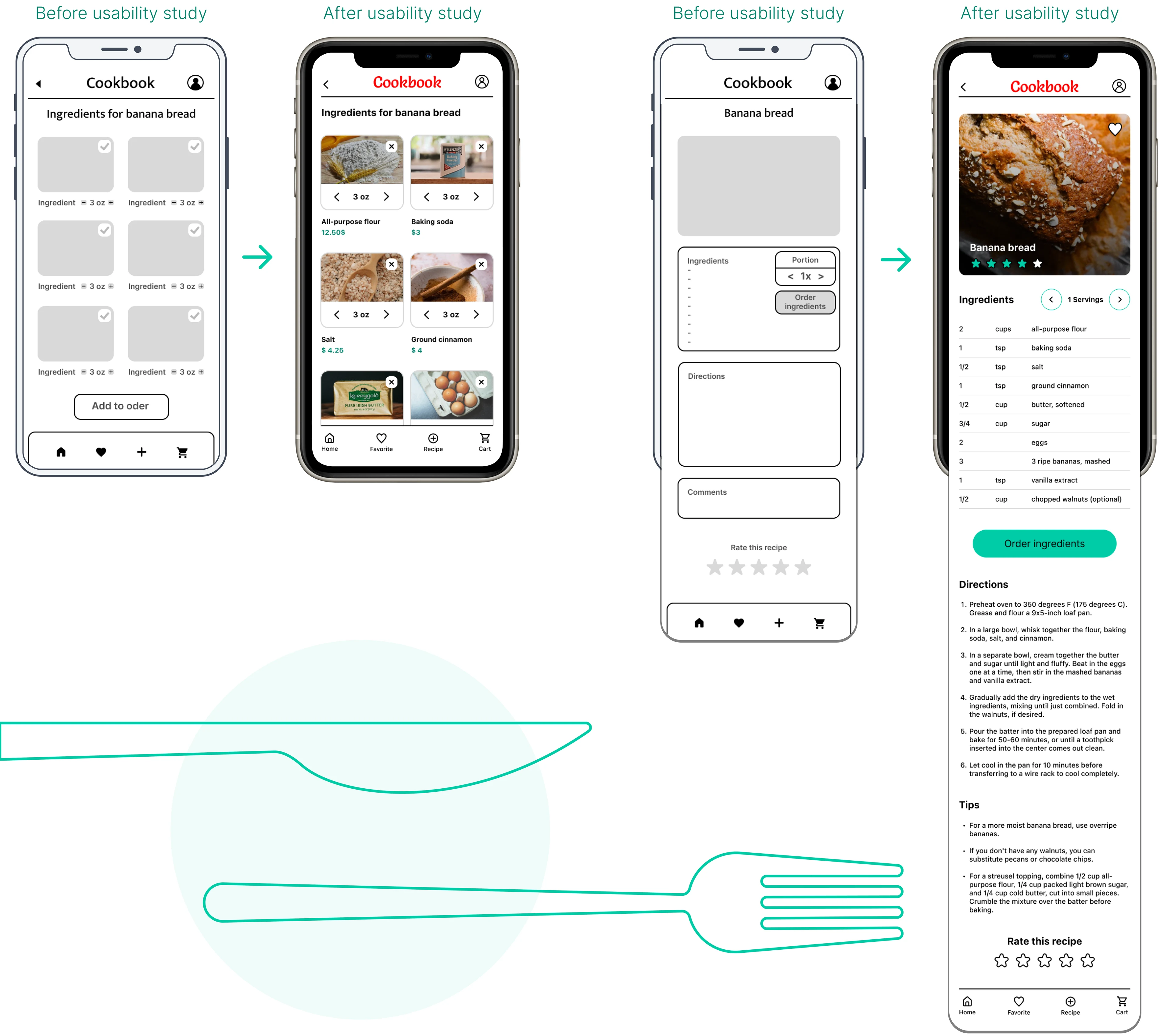
Usability study: findings
Conducting research with participants to get feedback on my wireframe designs is critical. I used an unmoderated usability study to assess how easy it is for participants to complete core tasks within the design.
Round 1 findings
1. Users expressed a preference for social login options. (Facebook, Google, Apple) to streamline the account creation process.
2. A dedicated button to finalize recipe submission is missing.
3. Users struggled to visually identify selected ingredients within the cart. Implementing ingredient selection icons would enhance clarity.
4. A dedicated order confirmation screen displaying all delivery details is necessary to improve the post-checkout experience.
Round 2 findings
1. Button sizes should be evaluated and adjusted throughout the app to comply with accessibility guidelines and improve usability.
2. The payment process involves too many steps. Simplifying this flow by dividing it into separate pages would enhance the user experience.
3. Users expressed frustration with the inability to delete ingredients from their order.
4. To prioritize recipe ratings, prominently display them at the top of the page.
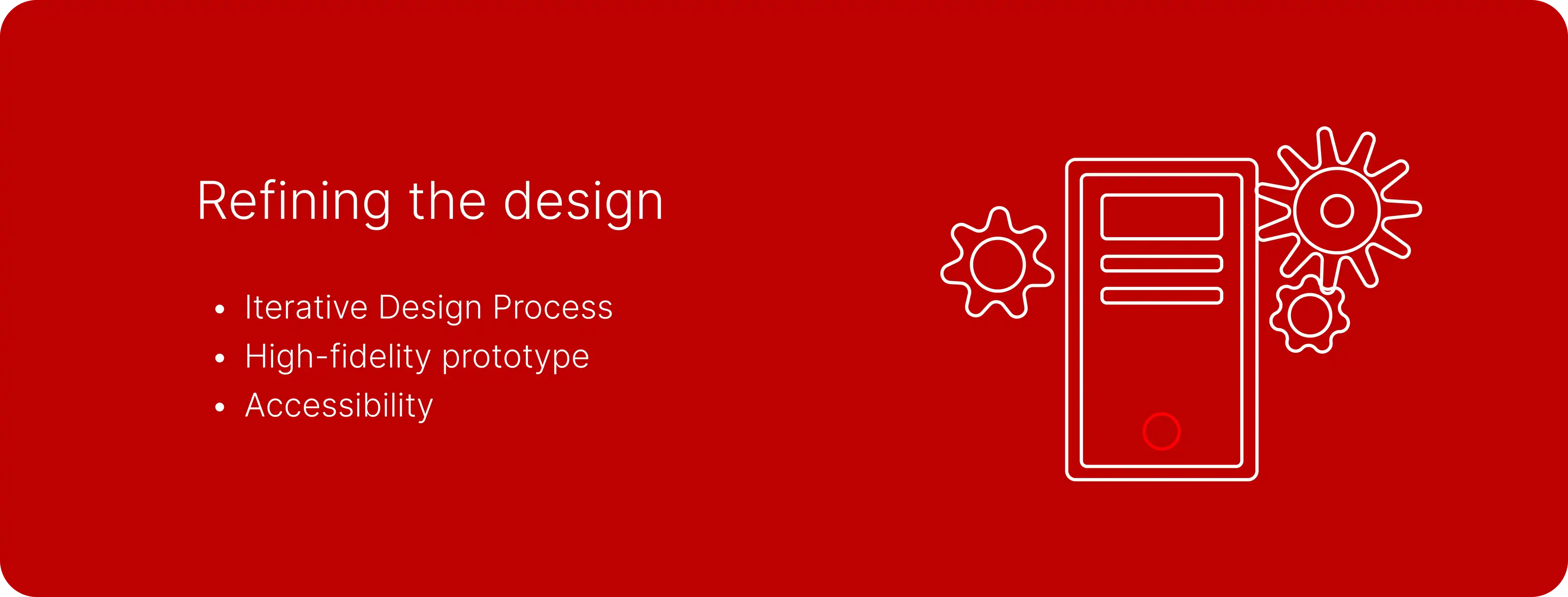
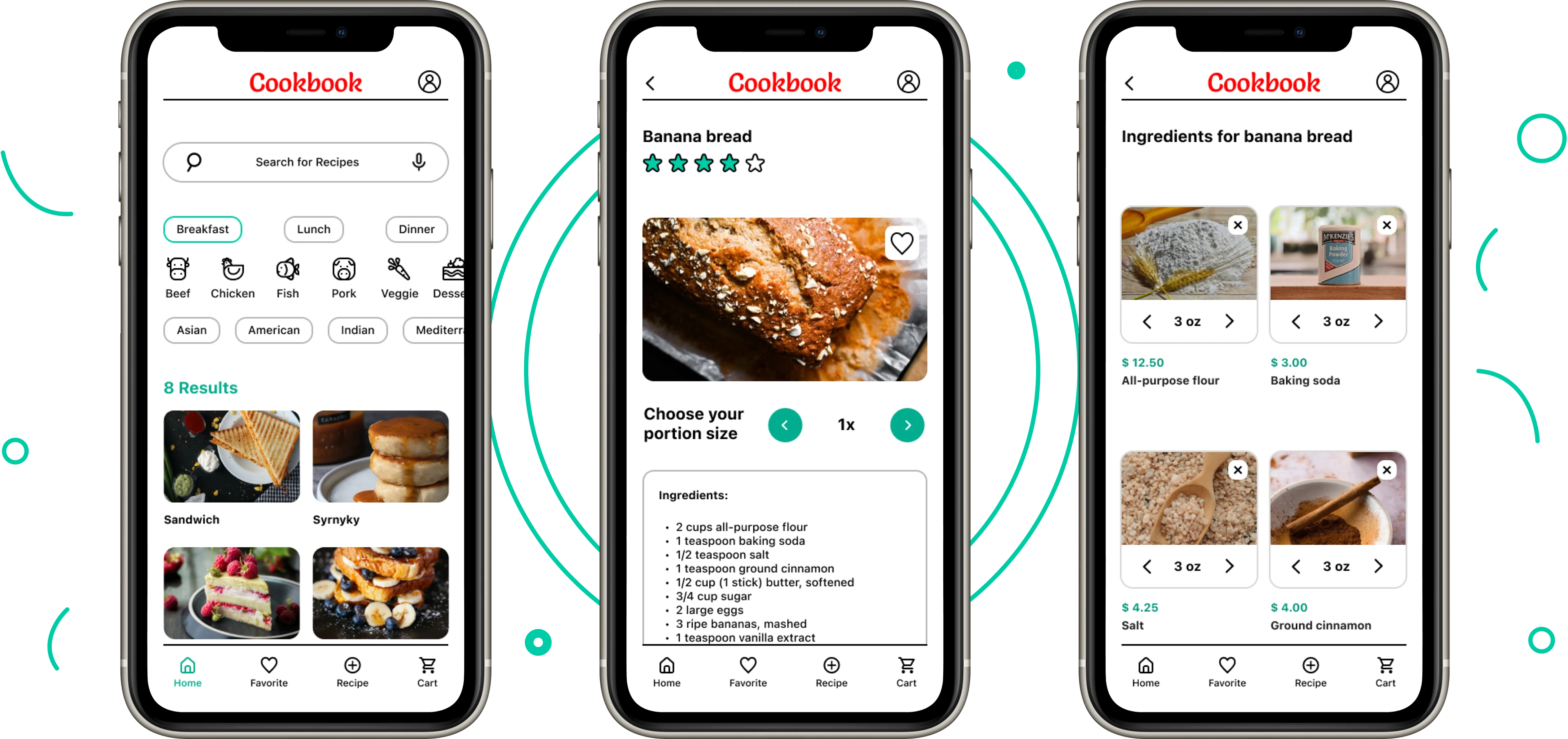
Mockup Iterations
Based on usability study findings, I increased the size of ingredient amount slider for better usability. Additionally, I replaced the check mark icon with a cross icon to improve intuitive perception.
To enhance user experience, I segregated the ingredient slider and order ingredients functions into distinct areas. Additionally, recipe ratings were prioritized by placing them prominently at the top of the page.
Home Screen
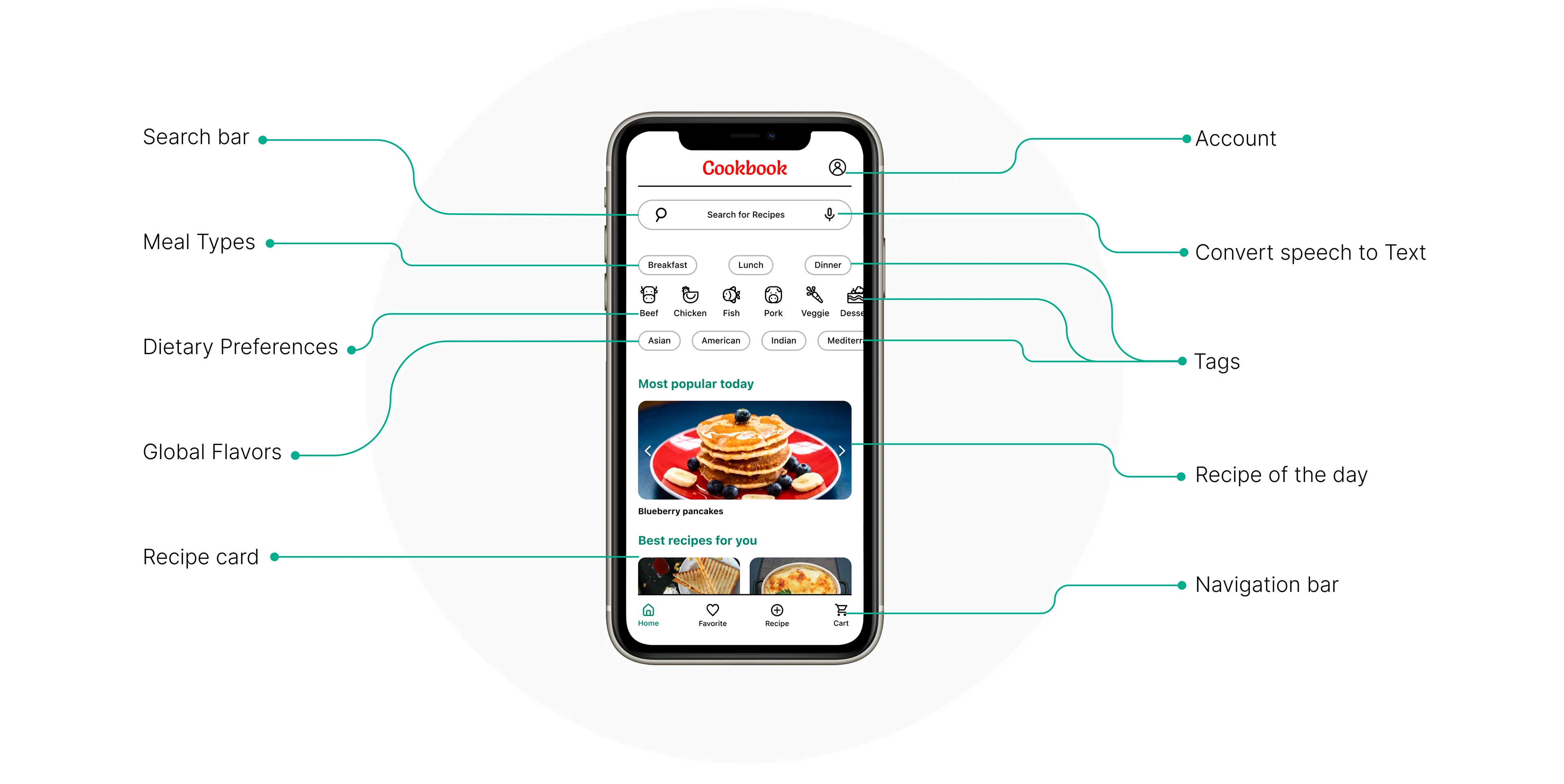
High-fidelity prototype
My hi-fi prototype followed the same user flow as the lo-fi prototype, and included the design changes made after the usability study.
Explore the interactive prototype to
experience the enhanced user flow
⬇
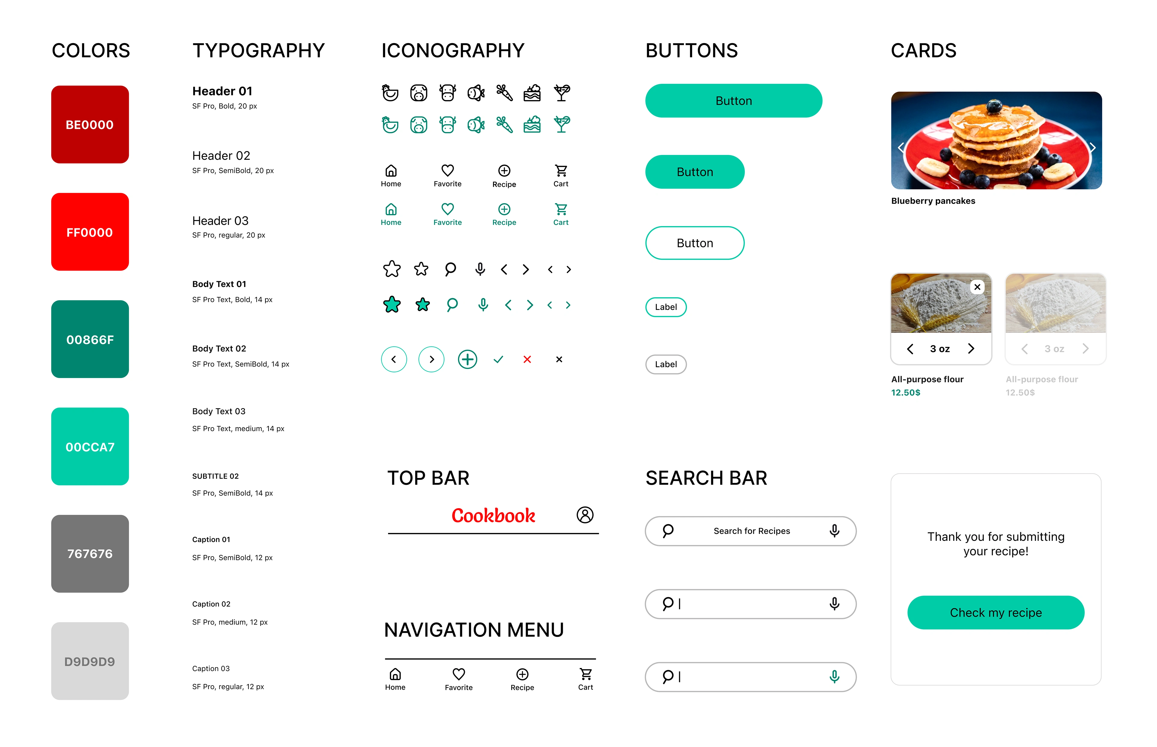
Logo component
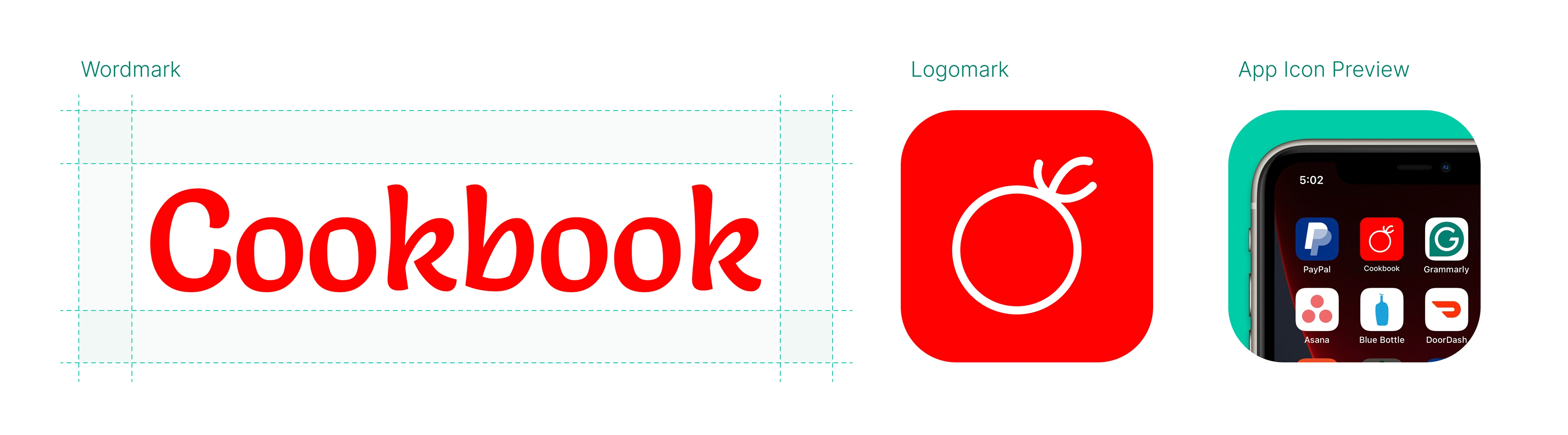
Design components
Accessibility considerations
1. When choosing a color palette, I made sure my primary colors met WCAG AA Compliance before building out the UI for each screen.
2. By implementing a typographic hierarchy, I enhanced readability and improved user understanding of content organization.
3. I am used only one typeface and two font families. By limiting the number of typefaces I can maintain a cohesive visual hierarchy and enhance the overall readability of my app.
Key takeaways
As a UX/UI design novice, this project provided my first opportunity to balance multiple responsibilities. Much like baking a cake, each element – research, design, and content – was essential for creating a cohesive product. It was a valuable learning journey, highlighting the importance next things:
Active Research
Ability to conduct in-depth interviews and gather rich user data was instrumental in informing design decisions.
Iterative Design
Every user insight revealed opportunities to refine the interface and enhance user experience.
The Power of User Testing
Usability testing allows us to identify and address potential pain points before launch.
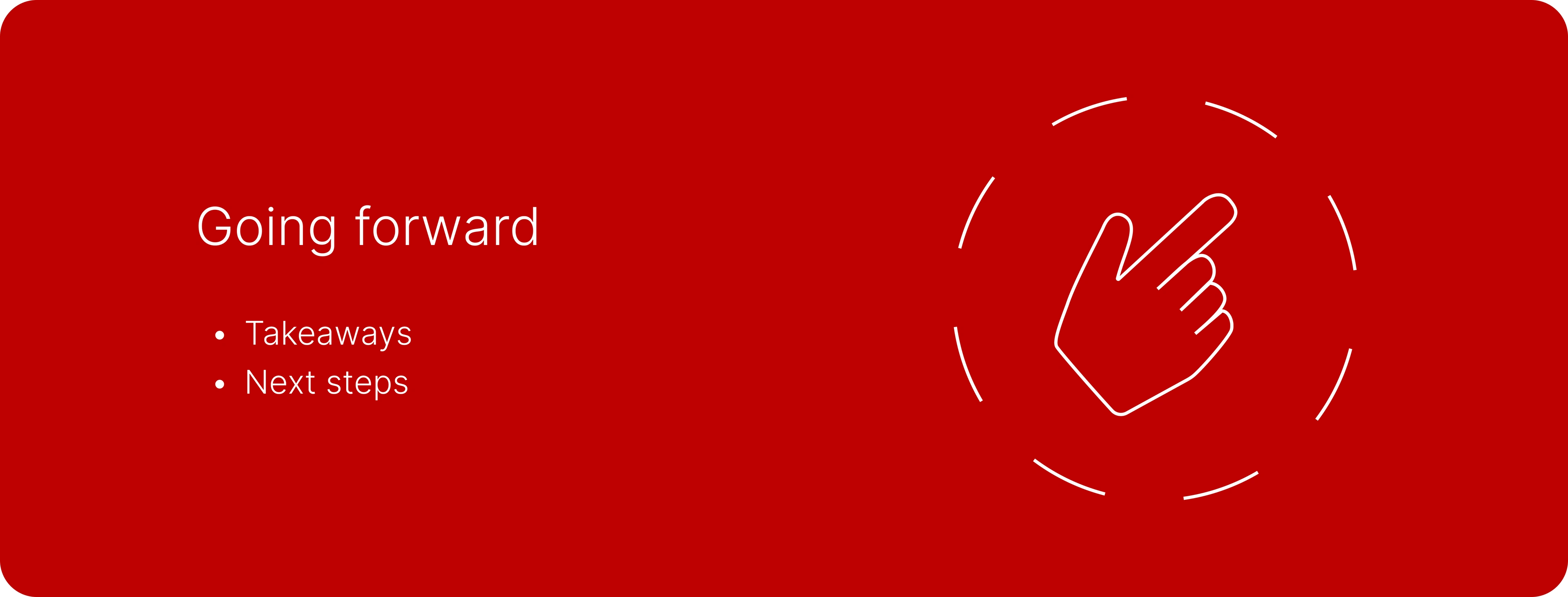
Next steps
1. Obtain UX/UI feedback from designers with more experience in the field to improve the overall design and functionality.
2. Create a cross-platform responsive design. The goal is to build the same experience for all users, no matter what type of device they are using.
Like this project
Posted Jan 28, 2025
UX UI Case study
Likes
0
Views
4