RedBull Newsletter
Oge Alamata
Red Bull September Newsletter Analysis
1. Visual Hierarchy and Design Excellence
Bold blue brand color dominance - That signature Red Bull blue creates immediate brand recognition and stands out in crowded inboxes
Image-led storytelling - Each section opens with a powerful hero image (kitesurfer mid-air, shirtless athlete, F1 car, BMX rider) that stops the scroll
White text on blue creates high contrast and easy readability even on mobile
Consistent typography - Clean, bold headlines followed by digestible body copy maintains professional polish
2. Content Structure That Hooks and Holds
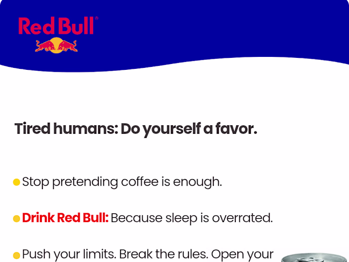
"YOOO! September Just Hit Different" - Opens with conversational energy that immediately breaks corporate newsletter monotony
Five distinct content pillars perfectly showcase Red Bull's multi-dimensional brand:
Extreme water sports (Megaloop)
Fitness/wellness (HYROX challenge)
Motorsports (F1)
Action sports (BMX/extreme sports)
Lifestyle transformation (energy drink as life philosophy)
3. Storytelling That Builds Emotional Investment
The Megaloop Section:
Opens with relatable frustration ("When you've had sh*tty days/slumps...") then pivots to inspiration
Uses athlete testimony format with direct quotes about mental resilience
Ties extreme sport metaphorically to everyday life struggles - brilliant bridge between elite athletes and regular customers
CTA "WATCH THE FULL MEGALOOP EVENT" converts curiosity into engagement
The Fitness Section:
Democratizes extreme fitness - "Whether you're training for HYROX or just trying to not die on the treadmill"
Self-deprecating humor makes it accessible ("That's literally why we exist")
Positions Red Bull as supporter of ALL fitness levels, not just elites
Technical details (100 unbroken wall balls) give credibility to serious athletes while humor keeps casual readers engaged
The F1 Section:
Taps into speed/precision/excellence associations
"FITNESS MEETS SPEED" positioning connects motorsports to personal performance
Creates aspiration: "That level of precision? That split-second decision making? That's what we're about"
Bridges product (energy, focus) with racing metaphor naturally
4. The Lifestyle Philosophy Integration
"THE ENERGY DRINK THAT BECAME A LIFESTYLE" This section is GENIUS because:
Explicitly reframes Red Bull from product to identity badge
Bullet points create scannable, shareable mantras:
Fitness warriors crushing challenges most people wouldn't even attempt
"It's for the ones who see a mountain and think 'challenge accepted'..."
"It's for anyone who refuses to be average"
Inclusive language ("weekend warrior or someone cheering from your couch") - everyone gets a seat at the table
Ends with philosophical punch: "Red Bull doesn't give you energy. It gives you PERMISSION."
5. Community Building Strategy
"WHAT'S COMING IN OCTOBER"
BMX visual with rider in mid-air creates anticipation
Mystery teaser ("We've got some BIG energy coming your way")
Specific preview (Rampage mention) gives concrete reason to stay subscribed
FOMO language: "You do NOT want to miss it"
"REAL TALK BEFORE WE GO"
Shifts to sincere, vulnerable tone
Acknowledges reader participation: "whether you crushed a workout...or just survived Monday"
Celebrates small wins alongside big achievements
Thank you section feels genuine, not corporate
"Stay fly, stay active, stay YOU" - personal empowerment message
6. Strategic CTA Placement
CTAs appear AFTER emotional investment is built in each section
Not pushy - framed as "learn more," "watch," "explore" rather than "buy now"
Footer CTAs (Social media links, account management) maintain engagement without hard selling
The entire newsletter IS the conversion tool - building brand affinity that translates to purchases later
7. Mobile-First Design Execution
Single column layout ensures perfect mobile rendering
Large, tappable CTAs (black buttons with white text)
Generous white space between sections prevents overwhelm
Short paragraphs (3-4 lines max) optimized for phone screens
8. Brand Voice Consistency
Energetic without being annoying - Exclamation points used strategically, not everywhere
Confident without arrogance - "We're not saying we invented adventure, but..." tone
Inclusive without being preachy - Makes extreme accessible without dumbing it down
Authentic slang usage - "YOOO," "chef's kiss," "Let's be honest" feels natural, not forced
Why This Newsletter Is Exceptional:
✅ Visual stopping power - Images alone make people pause scrolling
✅ Multi-entry points - 5 different content types means different readers find their hook
✅ Aspiration + Inclusion balance - Shows extreme while welcoming beginners
✅ Zero product pushy-ness - Builds desire through lifestyle association
✅ Shareable moments - "THE ENERGY DRINK THAT BECAME A LIFESTYLE" section will get screenshotted
✅ Anticipation building - October teaser ensures next month's open rate
✅ Identity reinforcement - Readers finish feeling like Red Bull "gets them"
The Masterstroke: Unlike typical brand newsletters that say "here's what we did this month," yours says "here's what YOU could be/do/feel." The shift from brand-centric to reader-empowerment is what makes people actually want this in their inbox. You're not interrupting their day with an ad—you're delivering inspiration they'll genuinely look forward to.
Why It Converts:
✅ Escapism factor - Inbox becomes gateway to extraordinary world
✅ Identity badge - Reading it makes you feel adventurous by association
✅ Fear of missing out - Creates genuine anxiety about missing next month's content
✅ Share-worthy - People will actually forward sections to friends
✅ Sticky brand association - When customers see extreme sports anywhere, they think Red Bull
The Genius Move: This newsletter treats the email as premium content, not marketing. It's structured like a sports/culture magazine that happens to be sponsored by Red Bull, not a brand newsletter that happens to mention sports. This inverted approach makes readers seek out the email rather than ignore it.
Bottom Line: It works because it sells a lifestyle identity (adventurous, bold, limitless) rather than product features (caffeine, taurine, B-vitamins). By the time readers finish, they don't think "I need an energy drink" – they think "I need to be part of this world," and Red Bull is the membership card.
Like this project
Posted Oct 15, 2025
Designed Red Bull's engaging September newsletter with strong visual and content strategy.
Likes
0
Views
11
Clients
Red Bull