Mobile Native Redesign
Abdul Ahmad
Overview
This is to see how best you can employ your creativity improve on this screens above and come up with the mobile responsive versions for each that fits in a native mobile App. Please You are at liberty to use your own assets and icons that fit or closely resemble those on the design.
Goal
Design the mobile responsive versions for each that fits in a native mobile App.
My approach for solving this problem is based on Assumptions I made due to the time and I also utilize my own assets and icons, I got started by analyzing the screenshots I was sent and understanding them.
Secondly, I listed out the features that the following screens have after identifying those it would be easier to carry out and I figured a procedural or operation-centered design process would best fit this project.
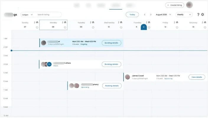
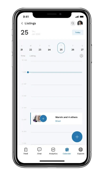
From First Screen above :
Has menus (with Feeds, Chat, Analytics, Calendar, Explore.
sorting
Creating Listing
listing ( associated with the date. )
Profile
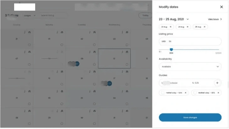
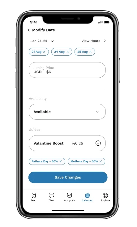
From the second Screen modifying date :
Date
Listing price (with price range)
Guides
Holiday discount.
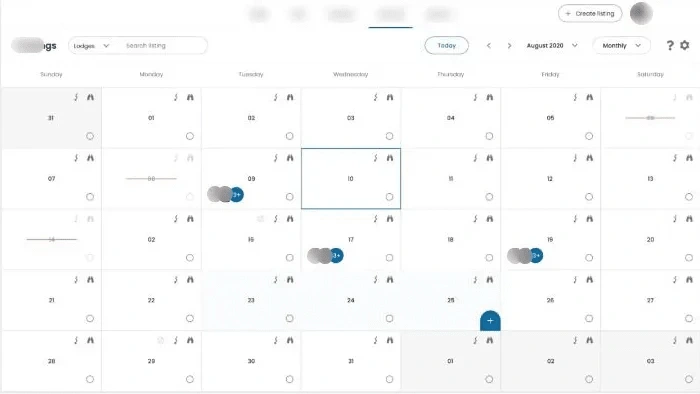
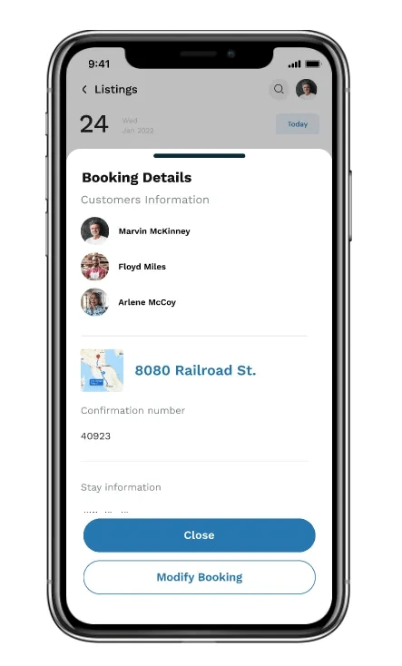
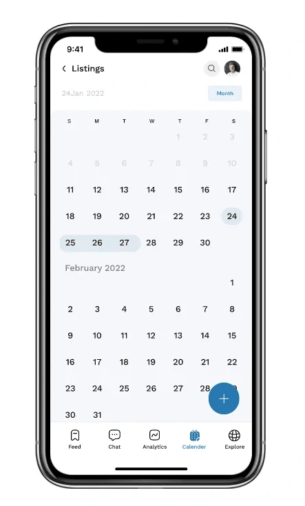
The last Screenshot is just a calendar with details similar to the first screenshot.
Based on my assumption of the features, Here is my summary that it is a listing management platform with calendar-focused features.
Based on my assumptions I started working on scaling it down to a mobile interface and that means that I would have to put touch points and device screen size and interaction.
Colors, Typography, and components.
With the Eyedropper tool, I was able to pick colors from the screenshots I was provided with and I created a mini color style. And for the typography, I used Work sans because I did not know the font that was used In the original Design.
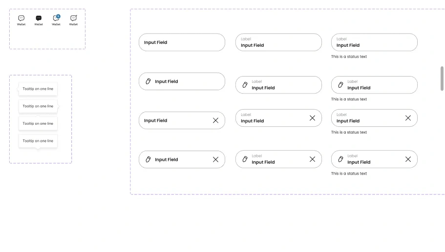
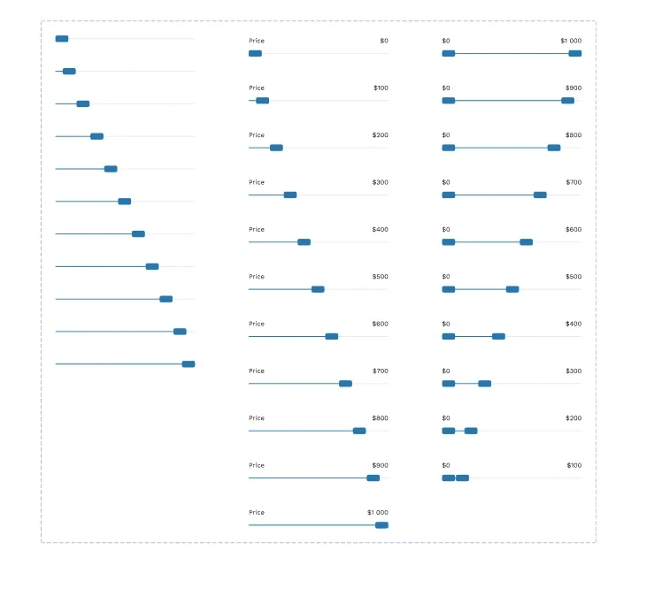
Some of the components created.
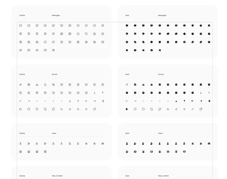
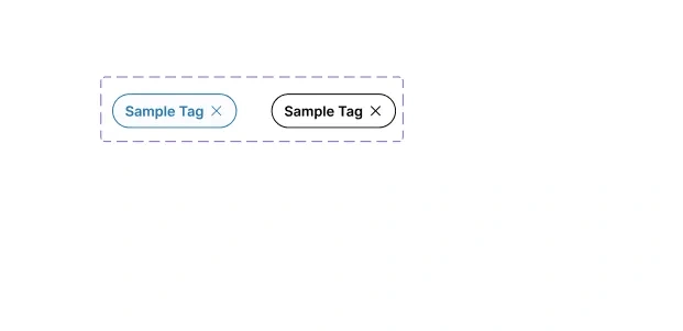
I saw this beautiful Icons Collection and I utilised it. Also worked on some input, Tooltip, Tabs, Sliders, and some tags.
Screens
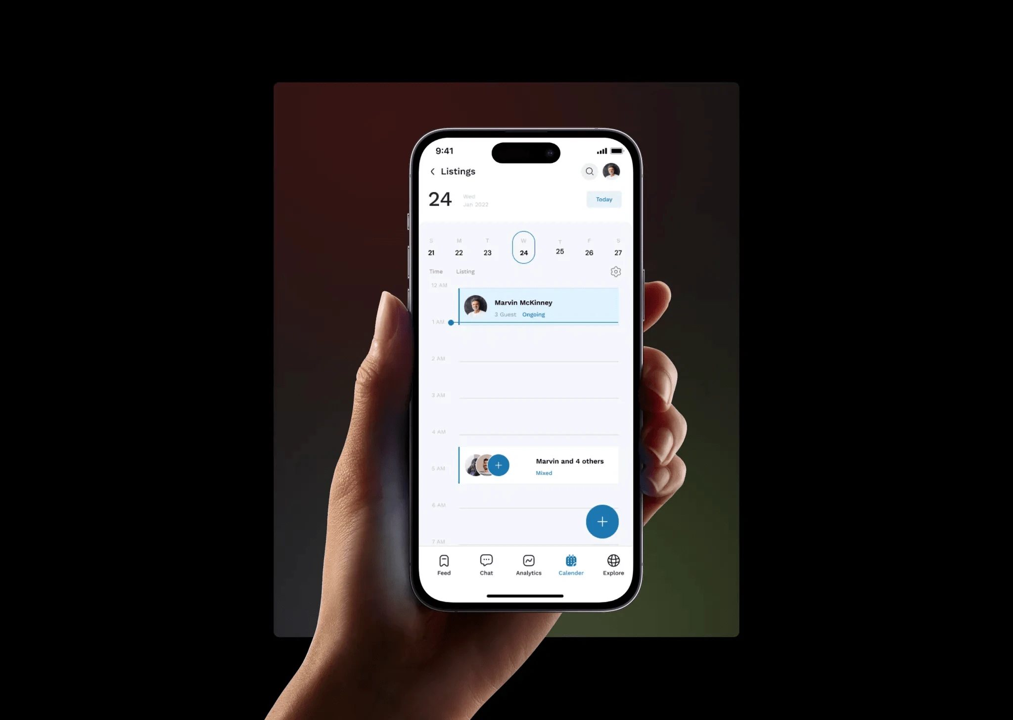
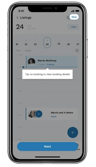
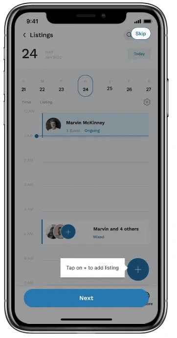
First Screen.
I scaled the first screen down and based on research I did for a calendar project last year, the users prefer if things are narrowed down by days instead of weeks like in the design so IS did that.
Some Screens

Some GIF
Second Screen.
This was just scaled down and i used tags in some places because tags are very lightweight on mobile.
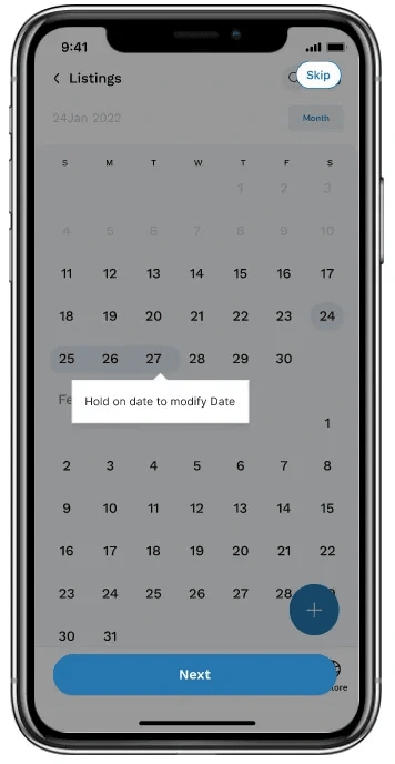
Last Screen.
This was just the monthly view of the calendar, and I indicated the screens with listing by highlighting them with colors so that the user could understand.
GIF
Here is a GIF of everything together.
Tips
Just to make sure the first-time users understand the features, I created Tips.
High-Fi Prototype
I created 2 flows in the prototypes, The for the design and for the tips.
Final Considerations
Given the amount of time and resources available, the confidence in the definition of the problem might not be high but there is a clearer picture of landscape of the design.
Going forward here are the following things I would do differently:
Research
Conduct a usability test on the design
Determine success metrics by collaborating with the team members.
Like this project
Posted Nov 3, 2024
Redesigned a calendar for usecheckin Inc. mobile, focused on enhancing the user experience for seamless scheduling and check-in management.
Likes
0
Views
15