NOVA Atelier – Premium E-commerce Web Design (UX/UI)

Adalat Zulfugarov


Overview
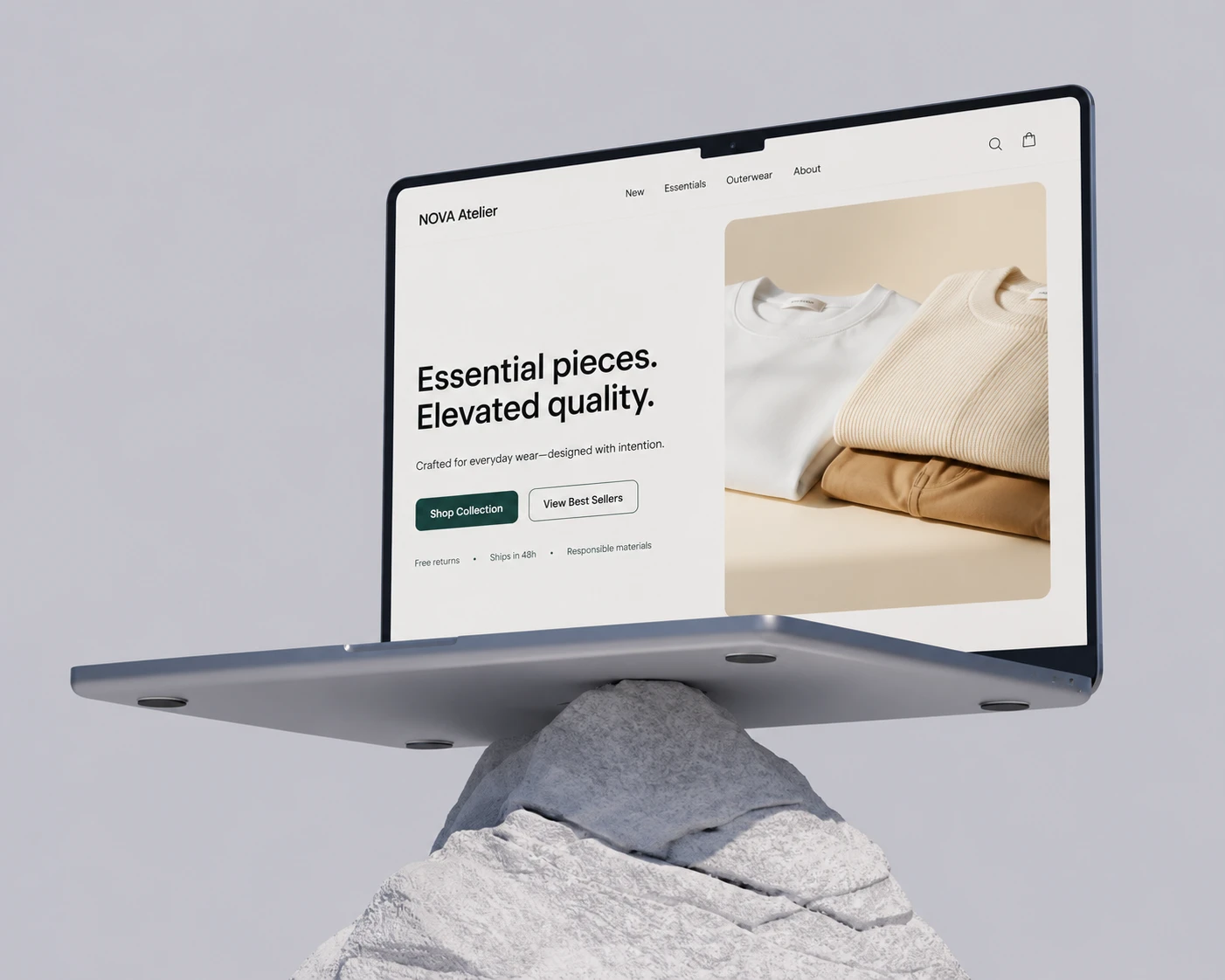
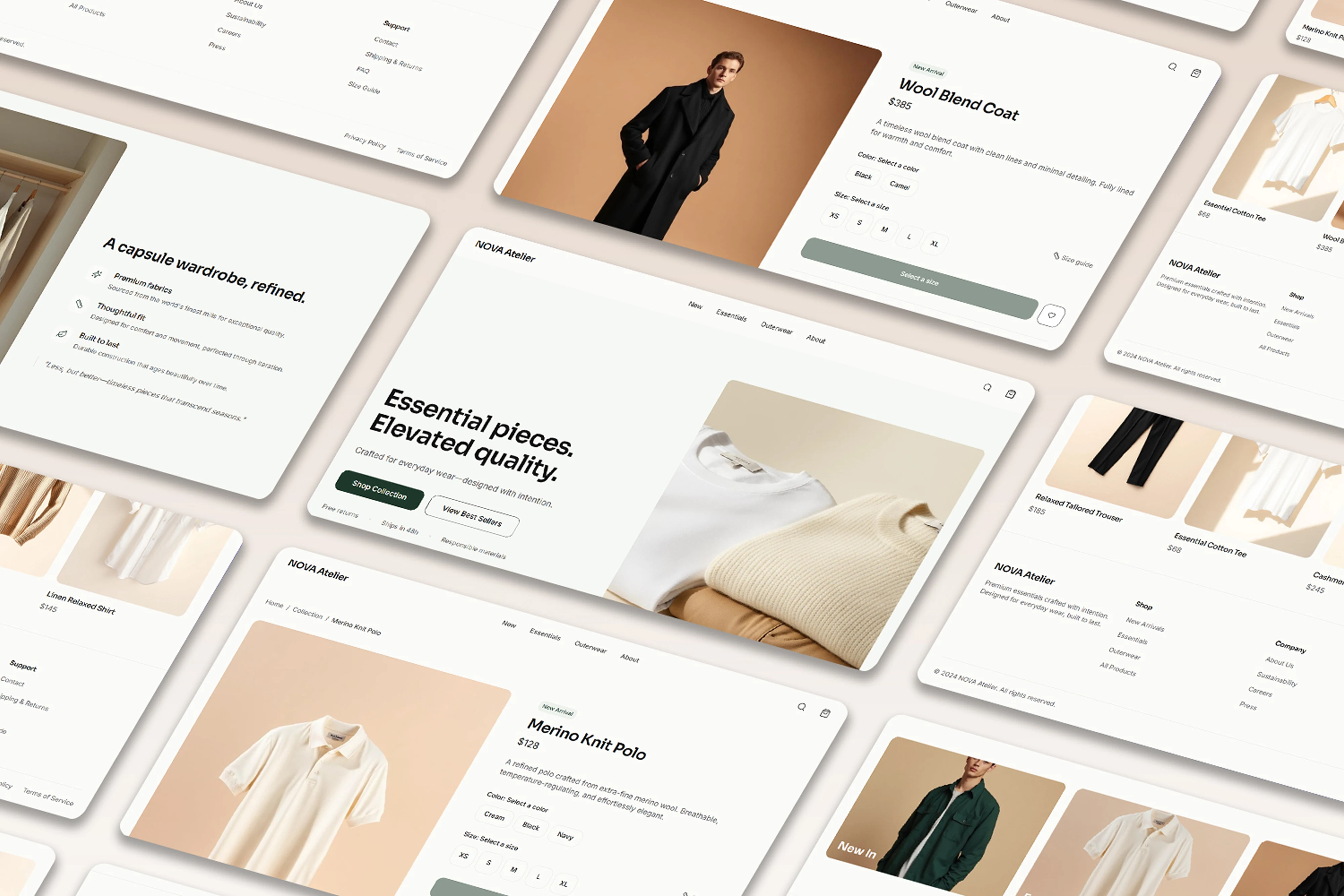
NOVA Atelier is a modern fashion brand built on the philosophy of quiet luxury, offering premium essentials and capsule clothing collections. The brand wanted its digital presence to match the quality of its products. I led the end to end UX/UI design across all key pages, from strategy to final interface.
The Challenge
The existing web experience worked against the brand's positioning instead of supporting it. There was no visual identity strong enough to compete with premium fashion brands, the product pages didn't communicate quality or value, and the Landing, Collection and Product Detail pages felt disconnected from each other. There was also no unified grid system across desktop and mobile, so the experience shifted depending on the screen.
For a brand built on restraint and quality, a generic or inconsistent digital experience was actively undermining trust.
My Role
I owned the full UX/UI process for this project: research and structure, information architecture, visual system, and final interface design across every core page.
UX Strategy
I kept the structure minimal on purpose. Rather than adding pages for the sake of completeness, I focused on three core pages, Landing, Collection and Product Detail, each with a clear job to do. Navigation stays simple and decision paths stay short, so nothing pulls attention away from the product itself. In quiet luxury, restraint is the strategy, not a limitation.
Visual System
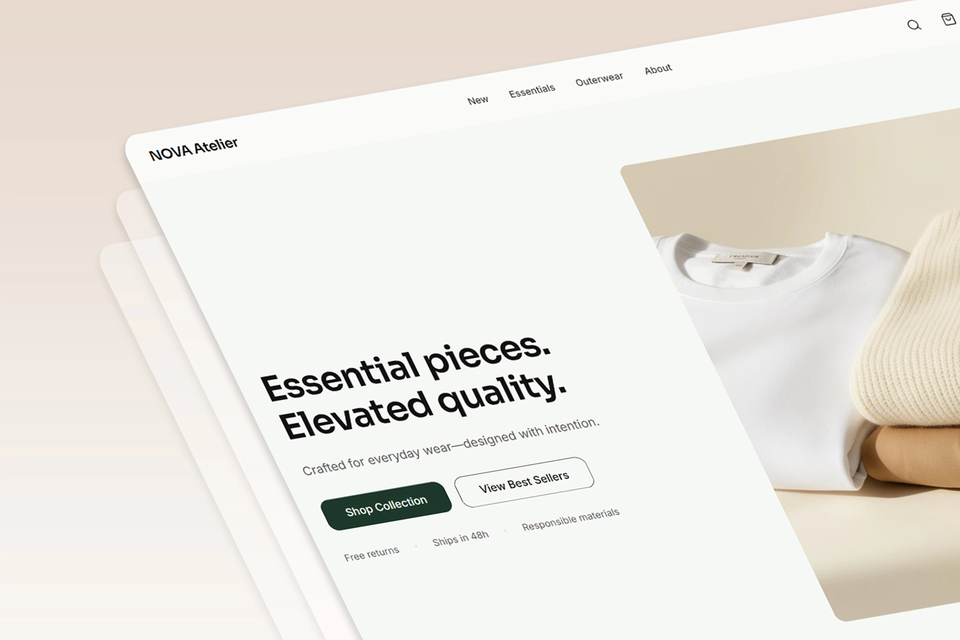
The interface is built on a Swiss inspired editorial grid with generous whitespace, letting each product breathe instead of competing for attention. I used light mode with neutral tones throughout, reserving a deep green accent strictly for calls to action, so the eye is always guided toward the next step. Typography carries most of the premium feel here: a considered hierarchy using Sora and Inter gives the brand an editorial, almost fashion magazine quality. Subtle micro interactions, hover, fade and slide, add a human, refined layer without ever feeling decorative for its own sake.
Landing Page
The homepage opens with a two column editorial hero section designed to make a strong first impression, closer to a fashion feature than a typical store front. Best sellers and category sections support effortless discovery, and a minimal storytelling block communicates the brand's values without over explaining them.
Collection and Product Pages
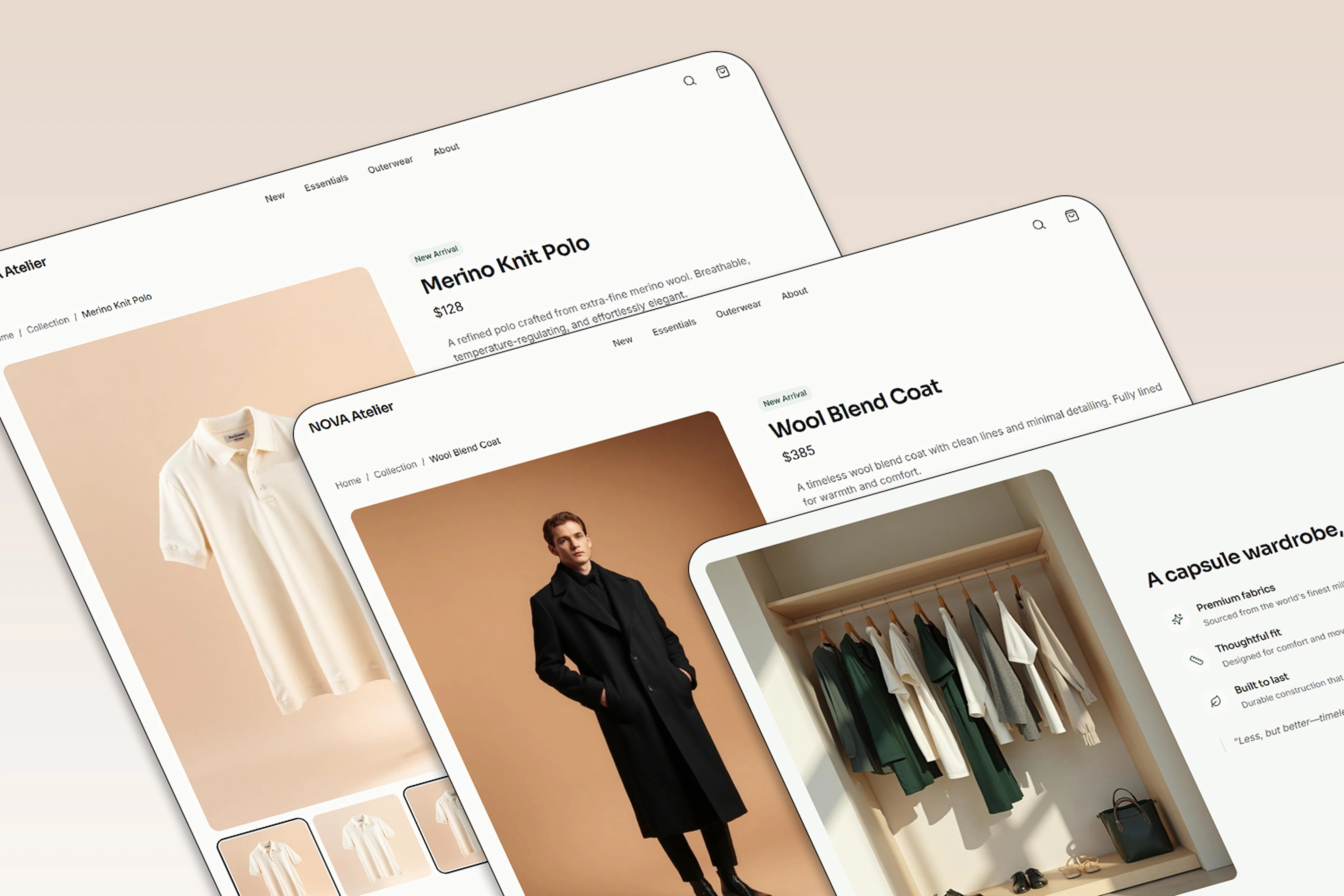
Filter chips keep browsing simple without cluttering the layout. The product gallery is treated editorially, paired with clear, confident CTAs, and product details live in an accordion structure that stays readable instead of overwhelming the page.
Results
The final product is a premium e-commerce experience that authentically reflects NOVA Atelier's identity, a focused UI that elevates how the products are perceived, and a consistent, balanced design system that holds up across every screen size. It is also built to scale, a conversion ready infrastructure that can grow with the brand rather than needing a redesign at the next stage.
Reflection
NOVA Atelier was an exercise in restraint and precision. Every decision, from the grid to the typography to the single accent color, served one goal: letting the product speak for itself within a visual environment worthy of a premium brand.
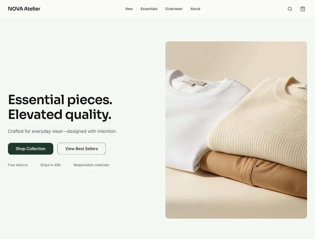
Hero
Like this project
Posted Apr 22, 2026
Editorial e-commerce design for a quiet luxury brand — minimal grid, refined typography, consistent across all pages.
Likes
4
Views
11