Bliss Point: Engineering Craving with AI

Nikol Hayes


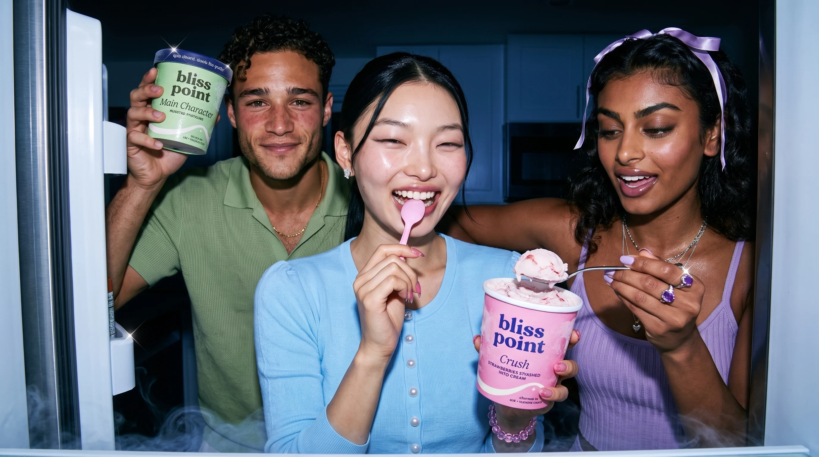
Full breakdown
Generated in Seedance 2.0
Eyes closed. That's the point.
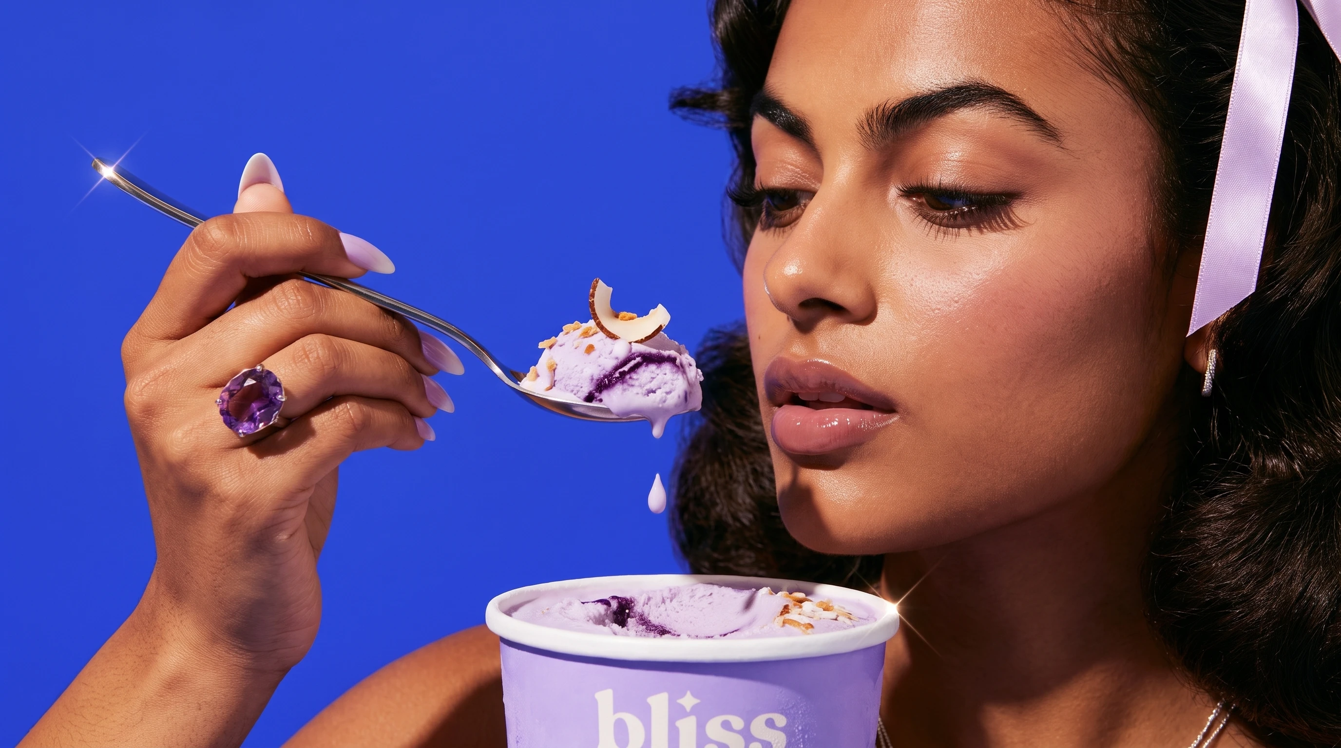
Model Generated in Midjourney. Image generated in Gemini.
Bliss Point: A Dopamine-Driven Vegan Ice Cream Brand
Spec Brand · Food and Beverage · Consumer Packaging
A speculative vegan ice cream brand spanning strategy, naming, packaging design, creative direction and AI campaign production.
Eyes closed. That's the point.
Overview
My latest obsession has been plant-based ice cream — and I noticed almost every brand in the freezer sells the subtraction: dairy-free, sugar-free, guilt-free. Subtraction has never made anyone hungry. I wanted to build a vegan dessert brand that leads with pleasure, personality and craving instead of restriction.
Bliss Point is the result: a self-initiated spec brand for plant-based ice cream. I developed the project from the initial consumer insight through packaging and campaign execution, creating a complete six-flavor brand world designed to make vegan dessert feel irresistible before anyone reads that it is vegan.
The project includes brand strategy, naming, verbal identity, packaging architecture, a six-pint flavor system, three Bliss Bars, model casting, campaign concepts, detailed shot direction and a fully AI-generated photoshoot.
The challenge
Plant-based products often lead with what has been removed. That language may communicate function, but it rarely creates craving.
The central question became:
How do you make vegan ice cream feel irresistible before anyone even reads that it is vegan?
The insight
I kept coming back to the tiny physical reaction that happens when something tastes exceptionally good.
Your eyes close.
It is involuntary, recognizable and nearly impossible to fake. That reaction became the proof behind the campaign and inspired the primary tagline:
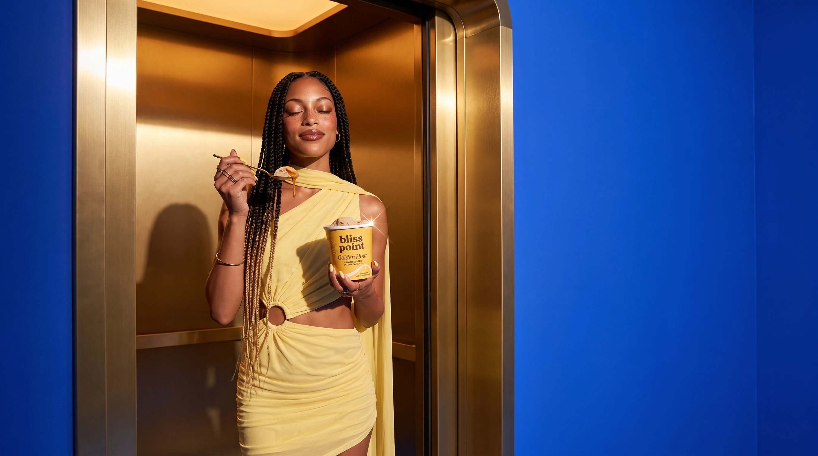
Eyes closed. That's the point.
The line connects the physical experience of tasting the product with the meaning of the brand name. Every portrait of someone caught mid-bliss becomes evidence of the claim.
The name
"Bliss point" is a food science term for the precise level of flavor intensity that creates the greatest sensory pleasure.
That meaning gave the brand both an emotional promise and a strategic foundation. Bliss Point is not positioned as a substitute for traditional ice cream. It is positioned as the peak version of the experience.
The supporting language extends that idea:
Peak everything.
Engineered for euphoria.
The result is a voice that combines indulgence, wit and a subtle food-science edge.
Brand strategy
Bliss Point was built around three principles:
Pleasure first
The brand leads with flavor, texture and emotional reward. Its plant-based formulation is important, but it is not the opening argument.
Every flavor is a feeling
Instead of treating each product as an ingredient variation, every flavor is named after an emotional state or desirable moment.
The product creates the content
Melts, drips, swirls, shell cracks, spoon pulls and under-lid messages are designed as repeatable campaign devices. The packaging and product experience naturally generate visual content.
Visual identity
The identity combines a soft, chunky lowercase serif wordmark with a four-point sparkle replacing the dot in "point."
The sparkle literally marks the bliss point.
A second graphic device, the Peak Curve, rises across the packaging and crests beneath the sparkle. It represents the moment when pleasure reaches its peak.
The system is playful and expressive, but structured enough to remain recognizable across different flavors, formats and campaign environments.
Brand colors
Cobalt Hour · #2B3FE8
The signature world color used across sets, skies, tables and campaign backgrounds.
Fresh Cream · #FFF4DC
The primary canvas for typography, packaging details and soft neutral surfaces.
Midnight · #1B2166
The core ink color used for the wordmark, lids and high-contrast typography.
Cobalt was chosen because it appears so rarely in food. Against it, strawberry pink, pistachio green, caramel yellow and violet ube feel especially vivid and appetizing.
The world stays cobalt. The product brings the color.
The flavor system
Each flavor is treated as its own monochromatic world while remaining part of one recognizable family.
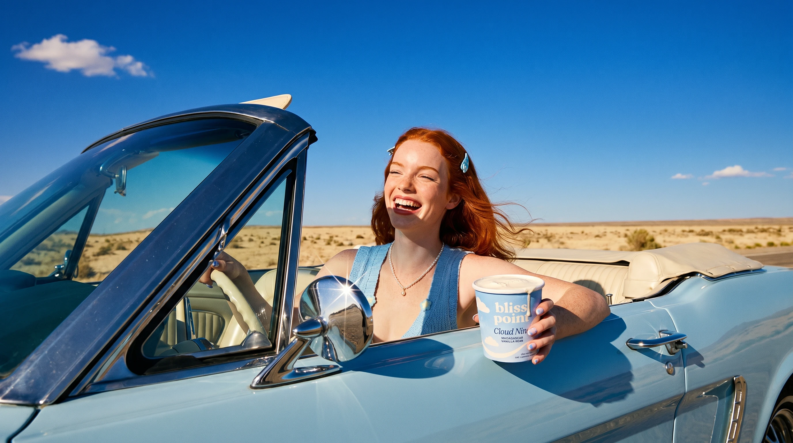
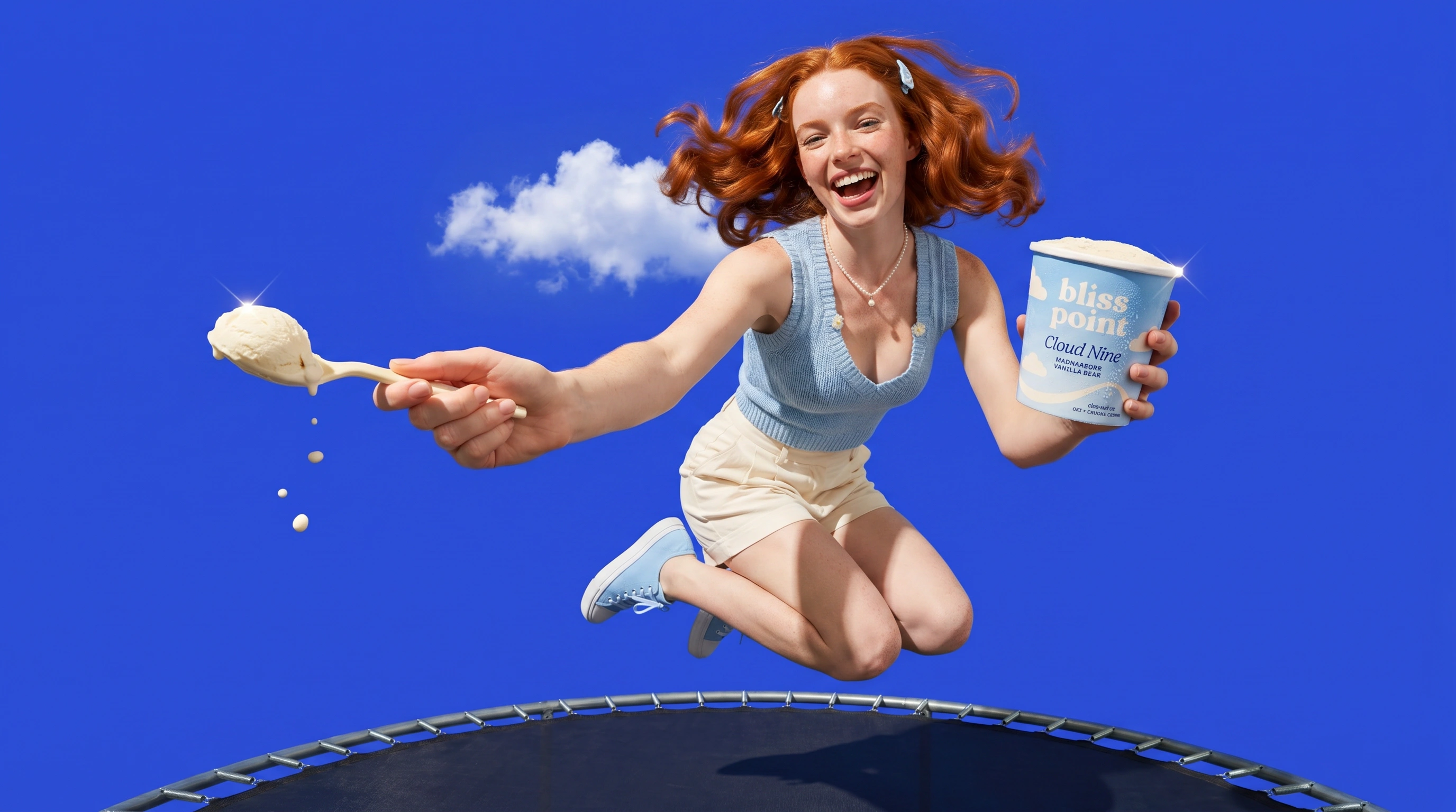
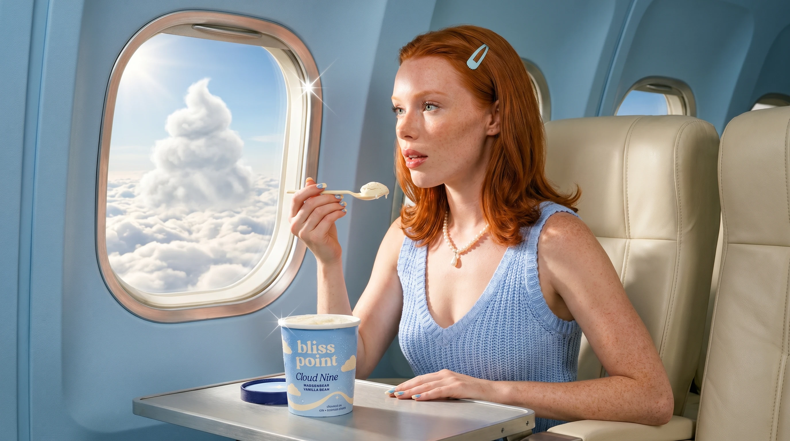
Cloud Nine
Madagascar vanilla bean · Sky blue #9CC8FF
The softest and most nostalgic flavor world, built around clouds, weightlessness and open blue skies.
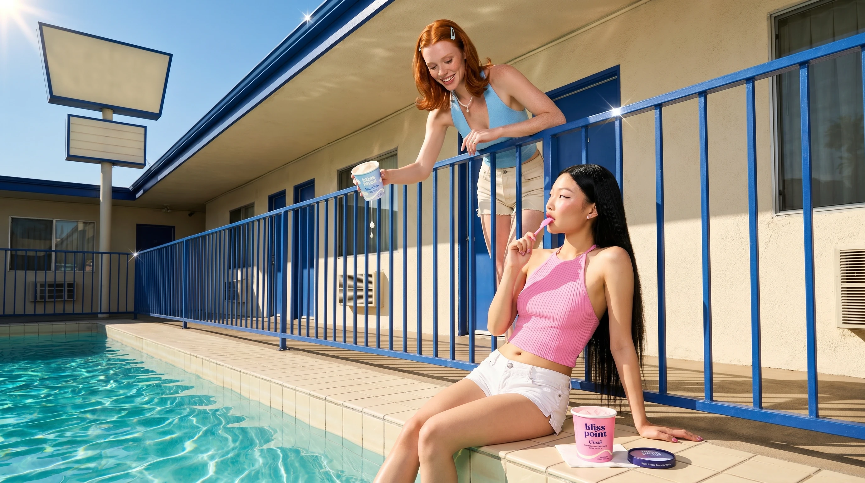
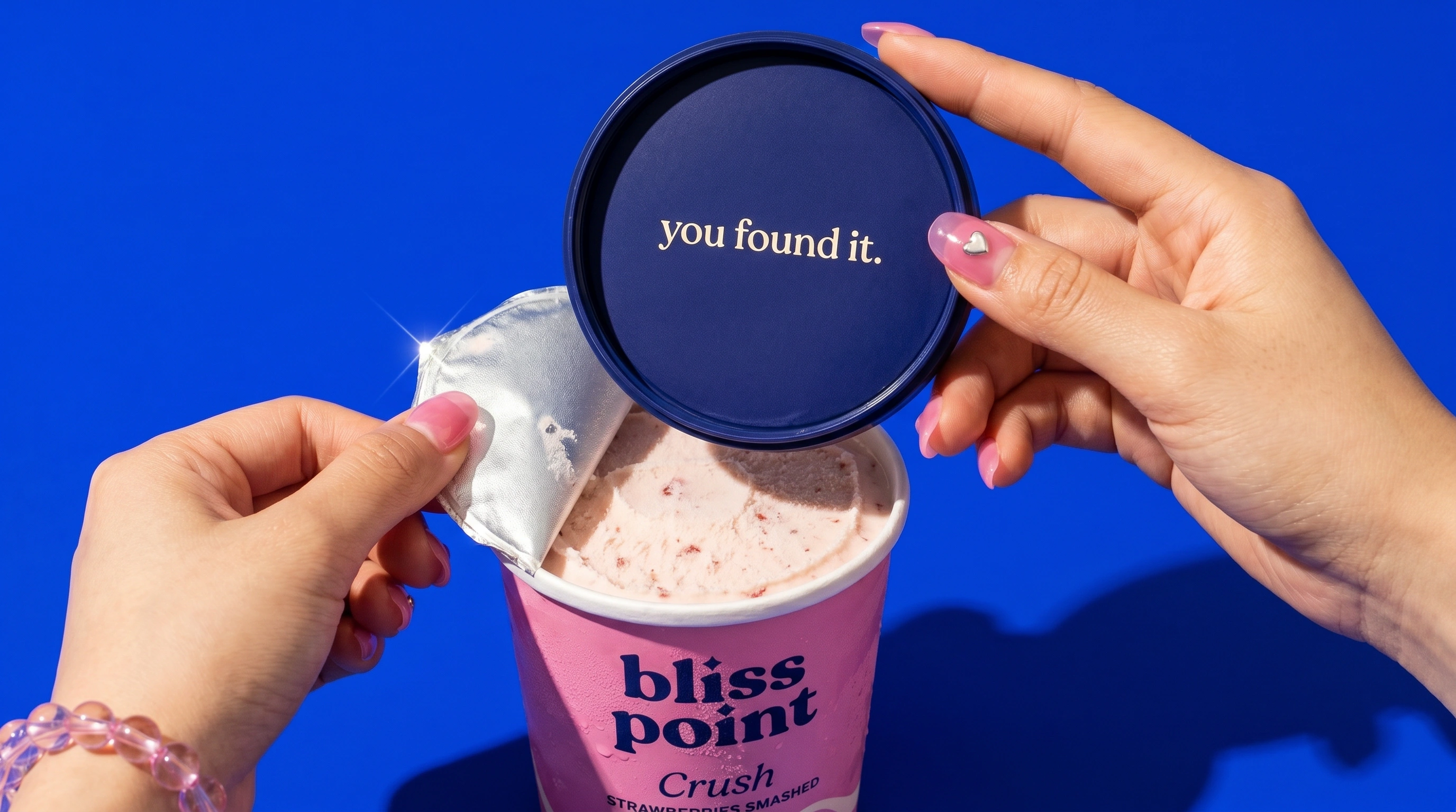
Crush
Strawberries smashed into cream · Bubblegum pink #FFA8C7
Playful, romantic and highly social, with strawberry textures, pink styling and Y2K beauty cues.
Golden Hour
Brown-butter salted caramel · Butter yellow #FFCE45
Warm, cinematic and indulgent, using sunset light, gold details and glossy caramel pulls.
Deep End
Double-fudge chocolate · Cocoa #4E3222
The dark anchor of the collection, with cream typography, fractured chocolate shells and dense fudge textures.
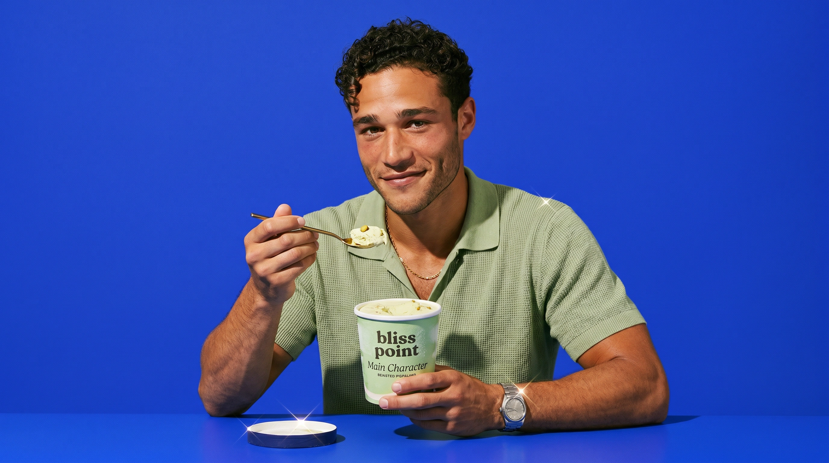
Main Character
Roasted pistachio · Pistachio green #BCE3A6
The fashion-forward flavor, built around pistachio's current association with premium and internet-driven food culture.
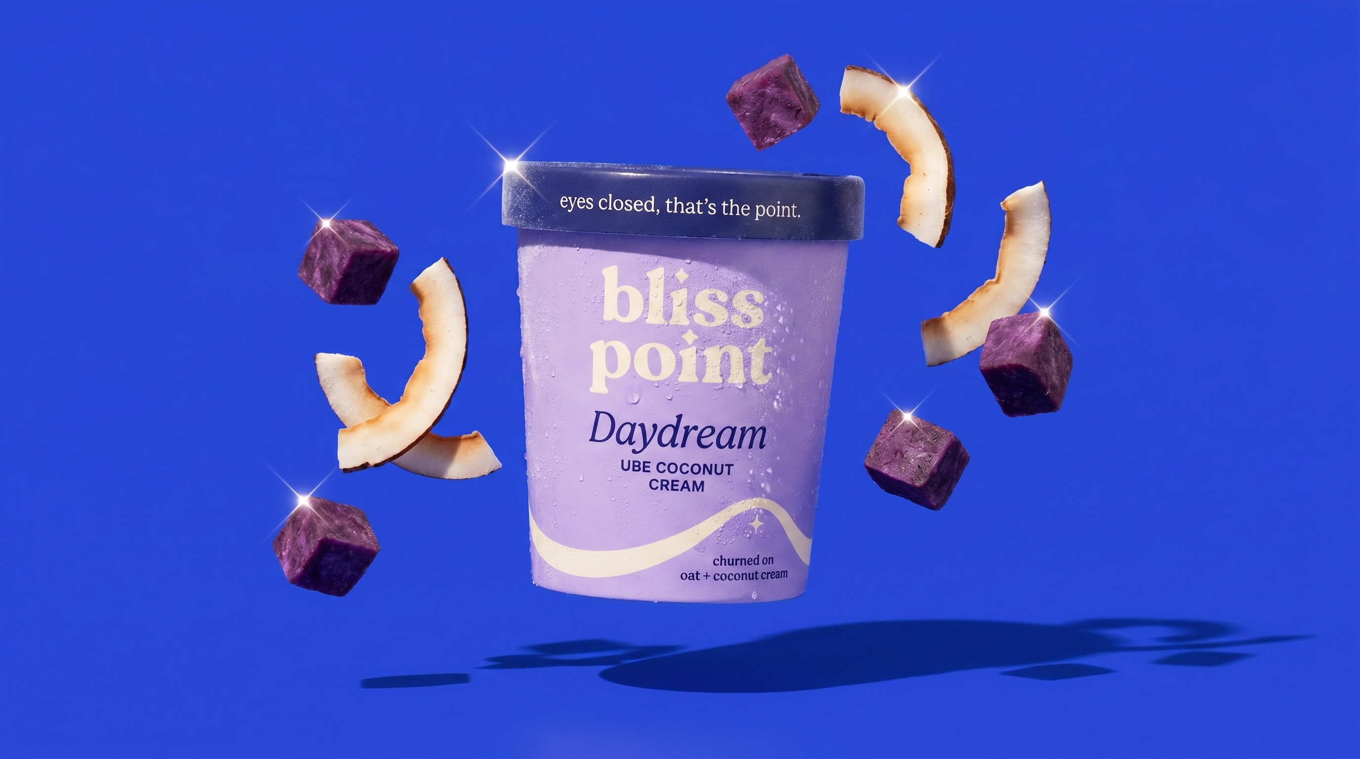
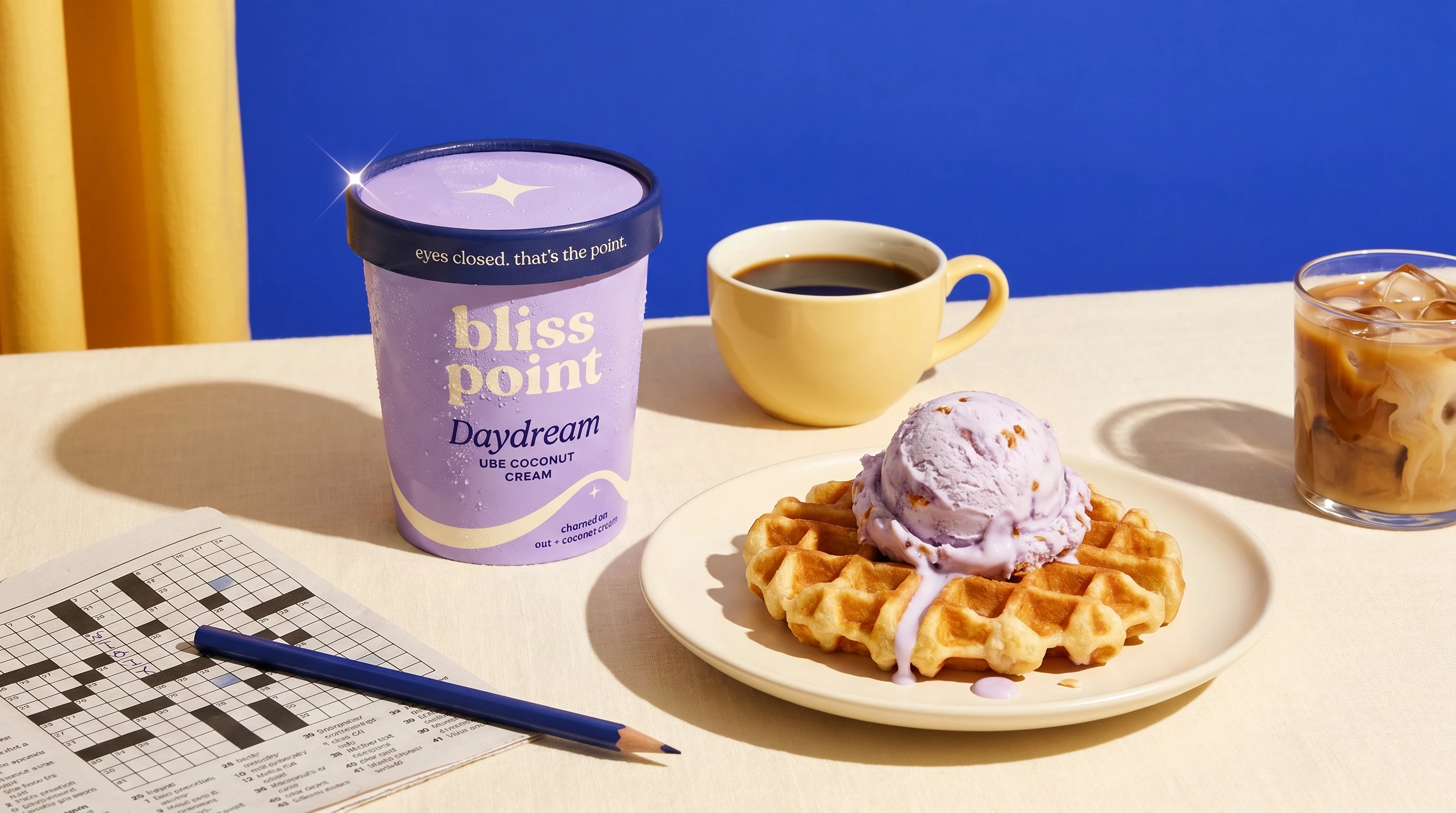
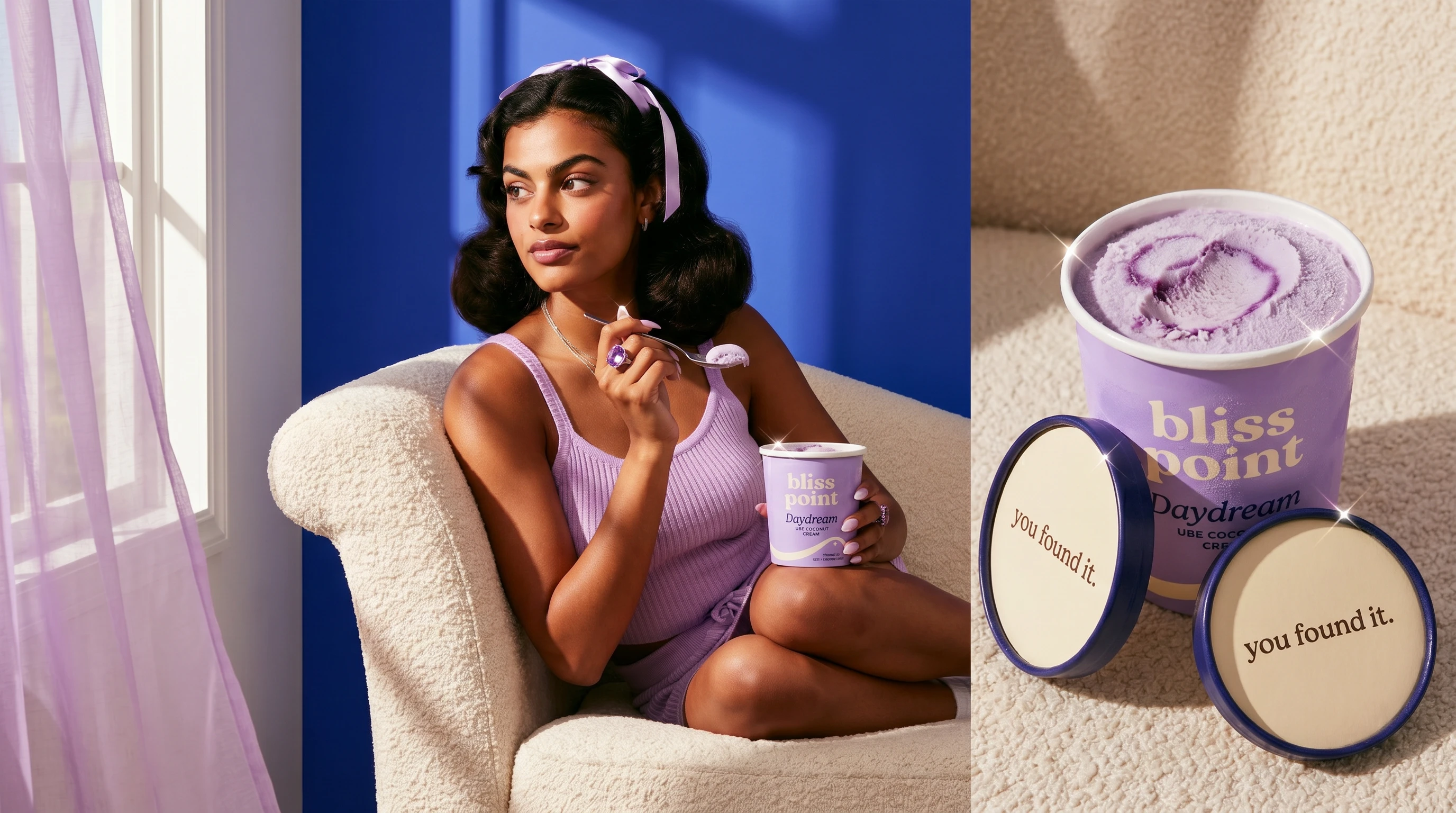
Daydream
Ube coconut cream · Lilac #C4AFF0
A surreal dessert world where the product's naturally violet color supports the campaign palette rather than feeling like an artificial filter.
Together, familiar flavors such as vanilla, chocolate and strawberry create accessibility, while pistachio and ube give the collection discovery value and social relevance.
Packaging architecture
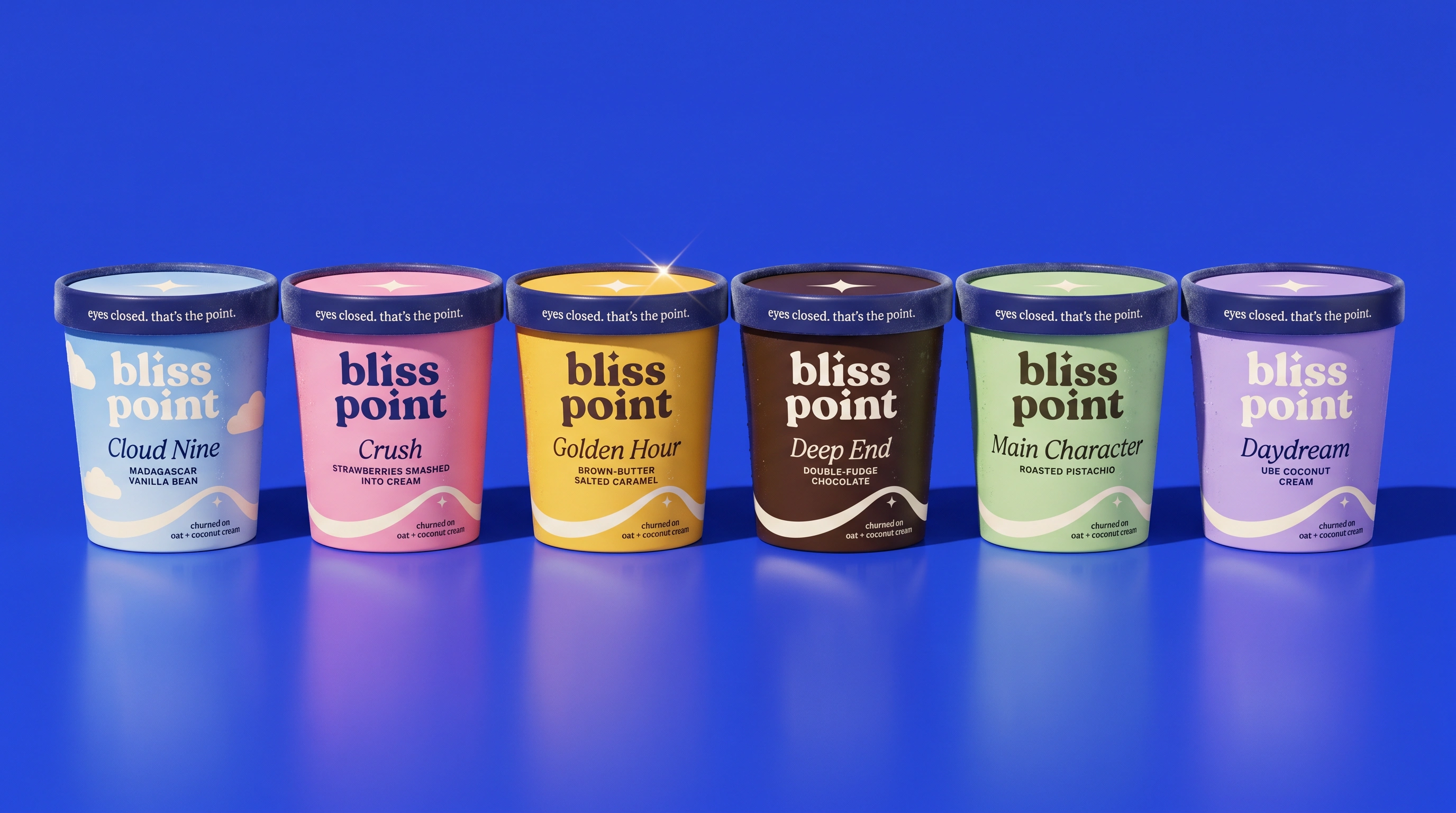
The pints carry the full brand system.
Each pint features:
A Midnight lid with a cream sparkle
The tagline running around the lid rim
A matte body flooded in its assigned flavor color
The Bliss Point wordmark in the upper third
An expressive flavor name with a compact descriptor
The cream Peak Curve sweeping through the lower third
A sparkle positioned at the curve's crest
A small plant-based message at the base: "churned on oat + coconut cream"
The vegan message is intentionally present but visually secondary.
On the back of the pack, the brand reveals its point of view:
Yes, it's vegan. No, we weren't going to lead with that.
The under-lid experience
The underside of each lid contains one rotating micro-message:
you found it.
peak, located.
go on.
Opening the pint becomes a small reward moment. The copy is designed to feel private, surprising and photographable, turning the package into a potential source of organic social content.
Pints are the brand. Bars are the campaign.
The six pints establish the full flavor and color system. Displayed together, they create the shelf rainbow and the clearest expression of the brand world.
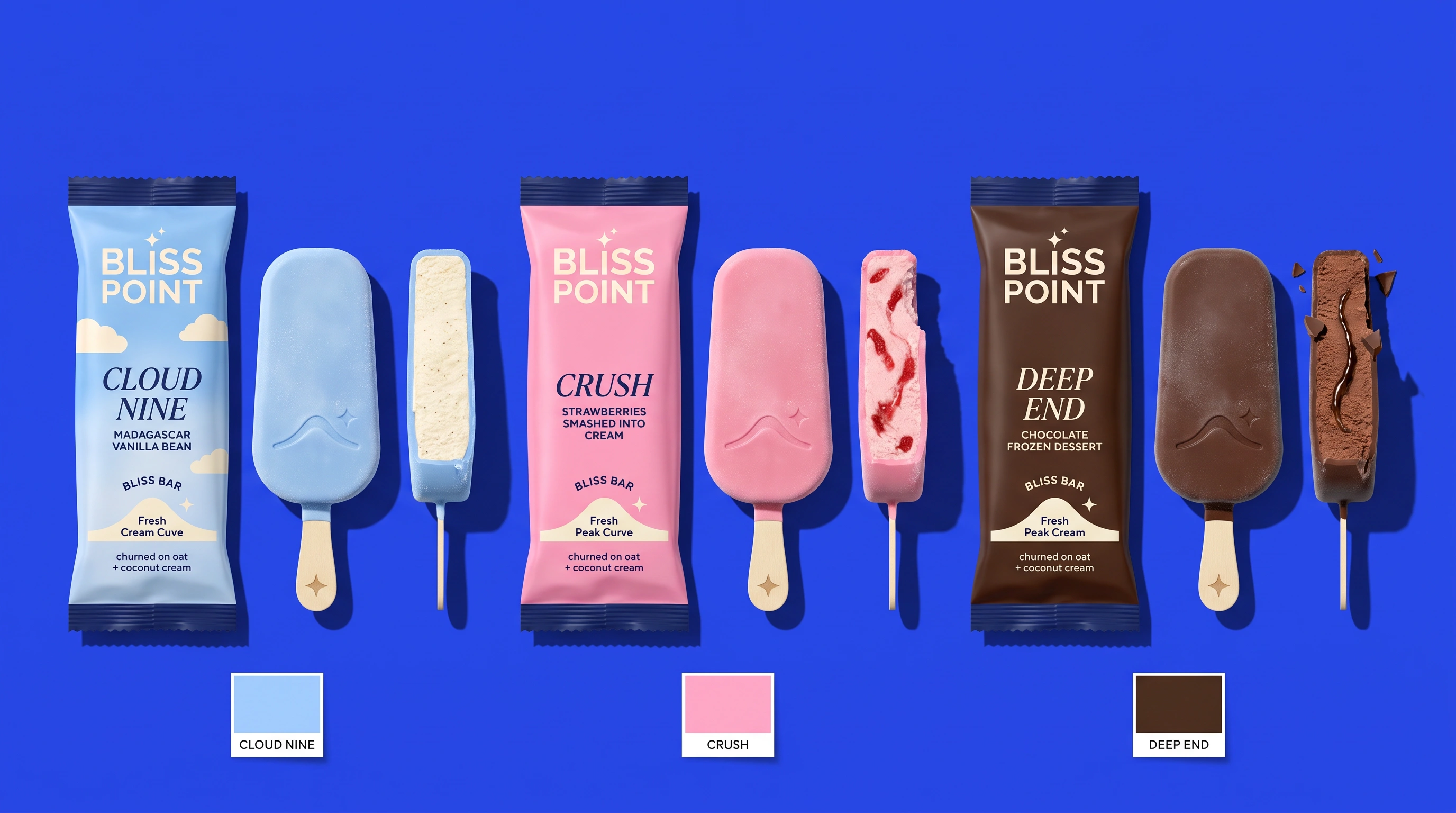
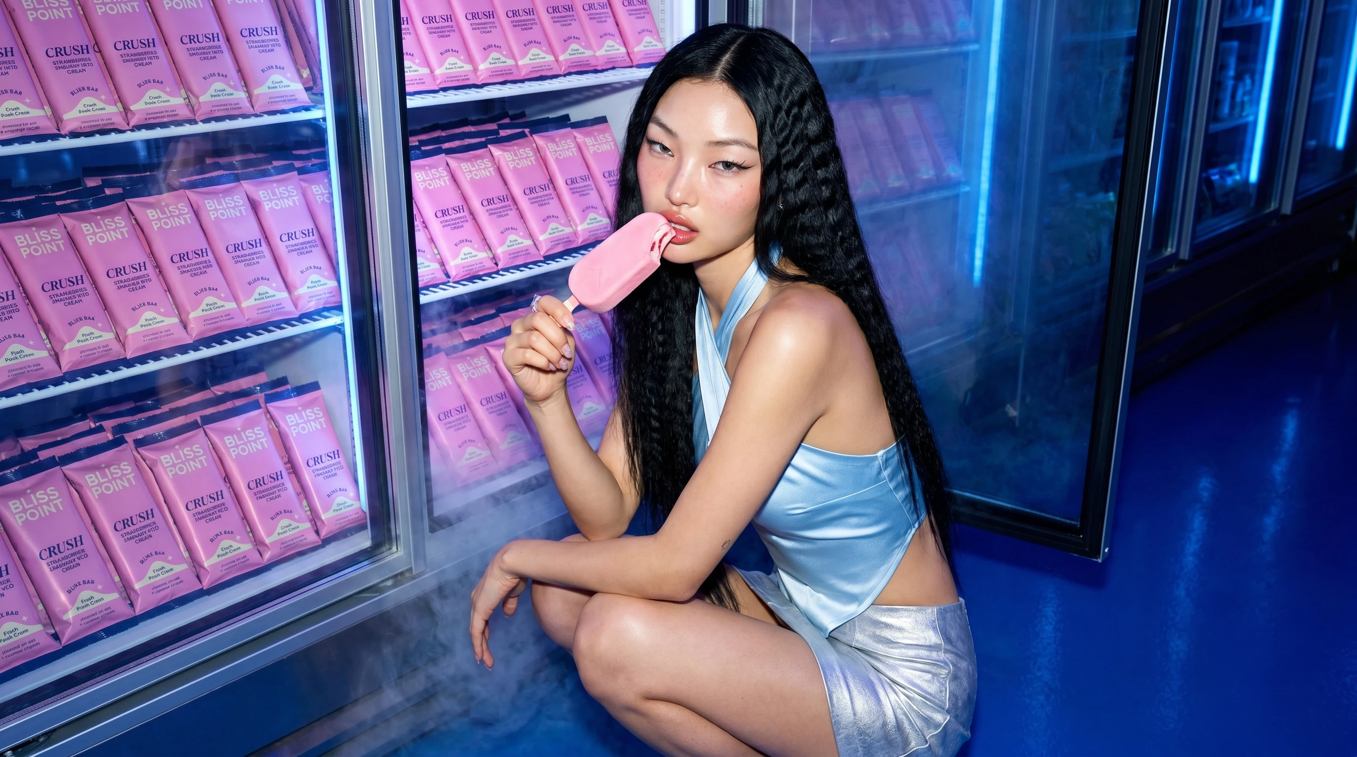
I then extended the three most familiar flavors into individually wrapped Bliss Bars:
Cloud Nine
Crush
Deep End
The bars introduce a more immediate appetite device: the shell crack and first-bite cross-section.
A perfect frozen product can feel static. A product that is cracking, dripping or beginning to melt creates urgency. It is about to change, fall or disappear.
That sense of imminent loss is what makes the image difficult to ignore.
Campaign concept
The campaign translates the sensation of the product into a colorful, cinematic universe.
My visual research included dopamine-bright beverage and beauty campaigns, Y2K styling, hard-flash editorial photography, monochromatic studio worlds and highly art-directed food imagery.
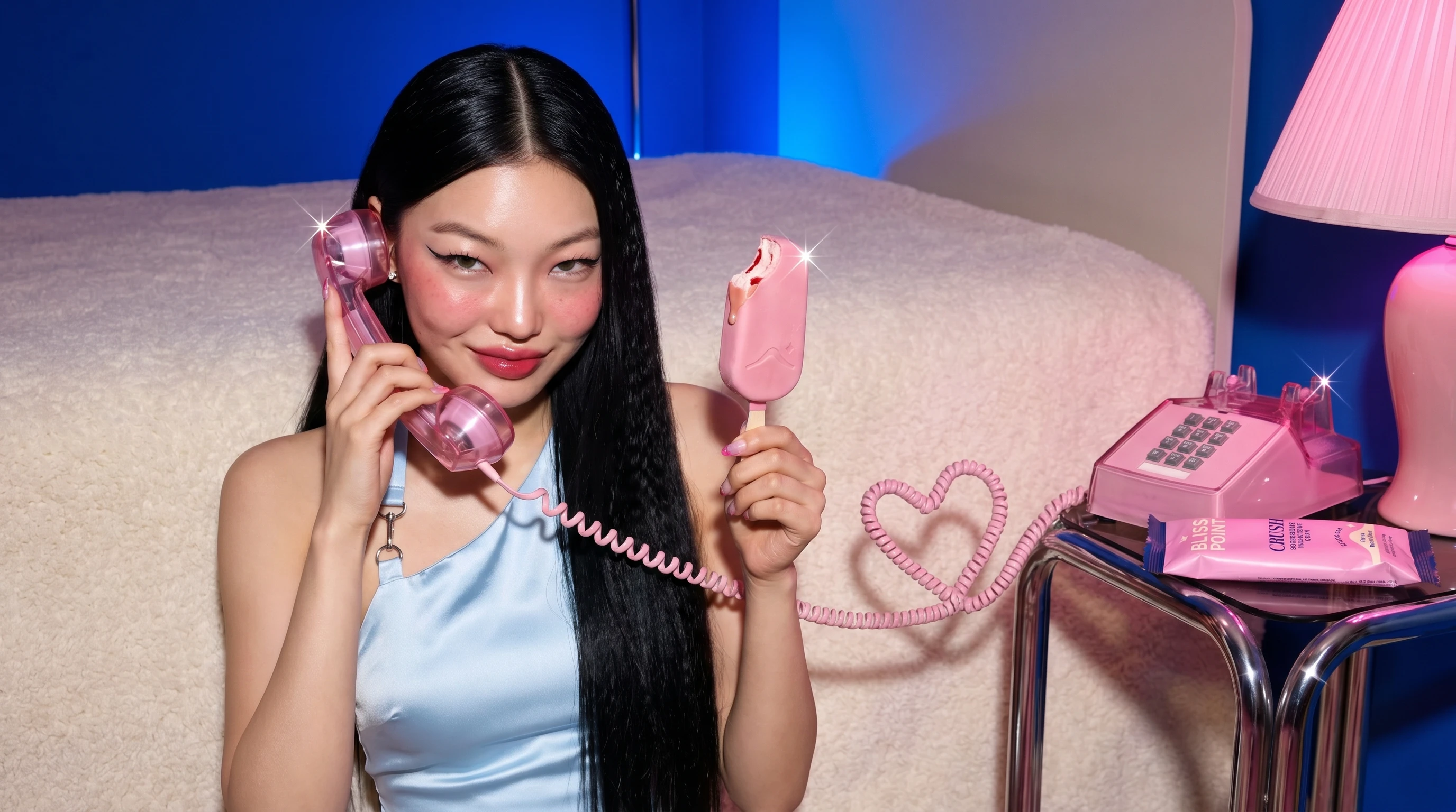
100% AI Generated
I have also been fascinated by Alani Nu's marketing psychology since 2018. I love how the brand transforms functional beverages into emotionally desirable objects through bold color, expressive casting and scroll-stopping creative. For Bliss Point, I studied those broader attention mechanics and translated them into an original plant-based dessert system.
The resulting campaign combines:
Saturated cobalt environments
Flavor-coded wardrobe and beauty styling
Direct flash mixed with hard sunlight
Playful Y2K fashion references
Cinematic retail and lifestyle situations
Surreal elements grounded in real appetite appeal
Precise macro food photography
Controlled moments of melt, drip, crack and pull
Designing for attention and conversion
Every campaign scenario was planned around a specific psychological function.
Anticipation
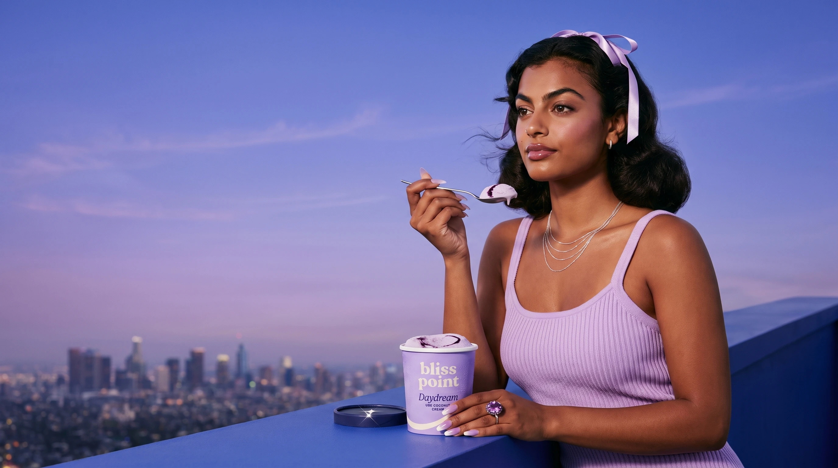
A spoon hovering just before the lips encourages the viewer to imagine the taste. The almost-bite creates more tension than the completed action.
Loss aversion
An empty pint, a falling drip or melting scoop creates urgency because the pleasurable object is about to disappear.
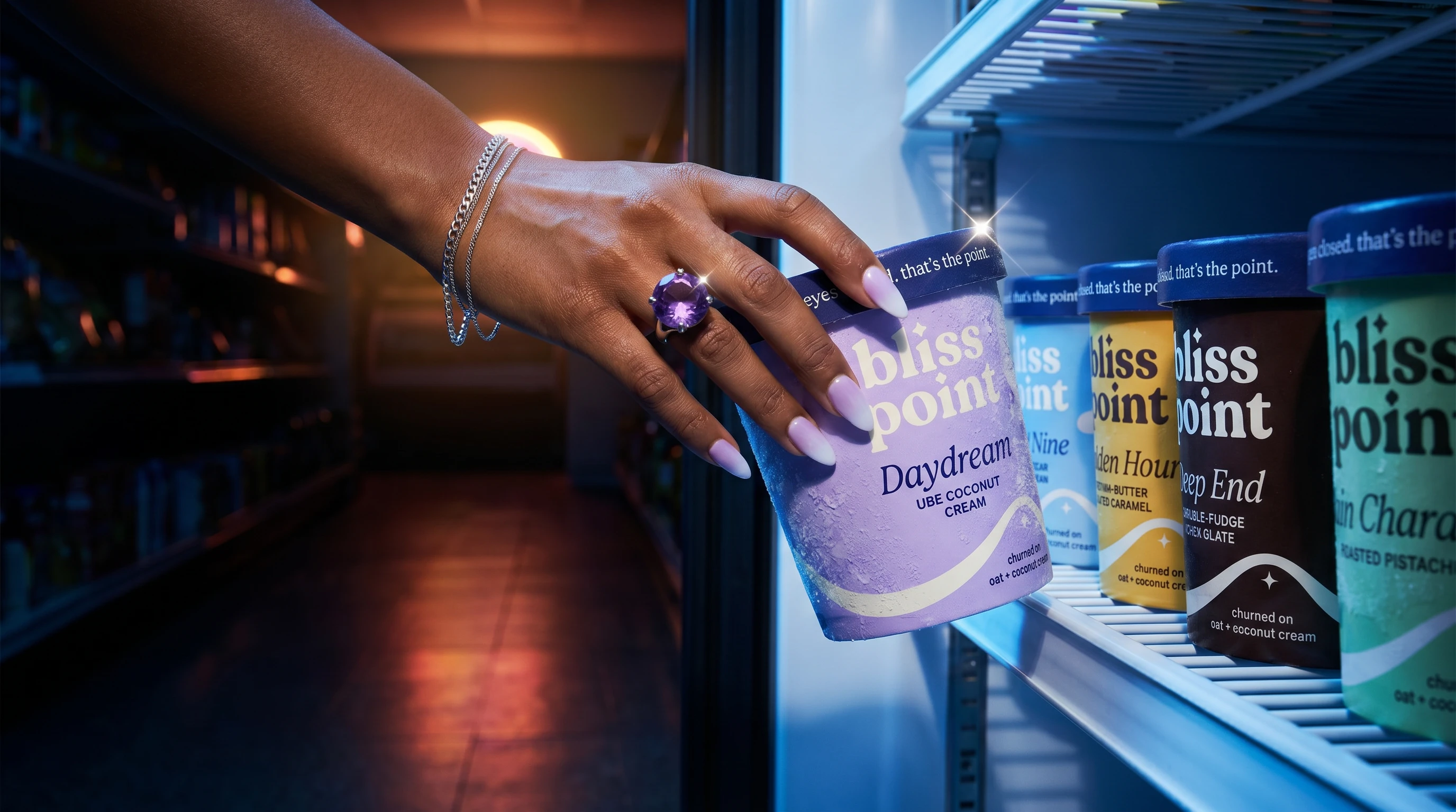
Purchase-context priming
Convenience stores, open freezers and late-night retail scenes place the product inside a recognizable buying moment.
POV participation
A pint or bar extended directly toward the lens collapses the distance between the campaign and the viewer. The product feels offered rather than displayed.
Occasion ownership
Scenes in bed, in traffic, at a motel, at a drive-in or during a freezer raid connect each product with a repeatable consumption ritual.
Social proof
Duo and group scenes position Bliss Point as something people share, steal spoonfuls from and keep stocked in the freezer.
Surprise and discovery
Under-lid copy and unexpected product environments reward attention and create potential screenshot or user-generated-content moments.
Creative direction
I developed individual campaign worlds around a recurring cast of synthetic models. Each character received a flavor assignment, wardrobe system, beauty direction, manicure, jewelry language and set of scenarios.
The art direction extended into details that are often left unresolved in AI imagery:
Hair length, texture and movement
Makeup finish and eyeliner shape
Nail color, shape and embellishments
Product hand placement
Label direction and visibility
Camera angle and lens behavior
Lighting temperature
Shadow direction
Food texture and cross-section
Frost and condensation placement
Melt speed and direction
Sparkle placement
Background color continuity
Negative prompting and artifact prevention
One production rule required every melt to travel down and to the right, as though the light source remained in the upper-left across the campaign.
Another limited each image to one to three sparkle glints, with at least one always touching the product.
These small rules helped the brand world feel intentionally photographed rather than randomly generated.
Campaign formats
The final campaign system spans multiple visual categories:
Product heroes
Clean packaging lineups, flavor systems and isolated pack shots designed for web, retail and portfolio presentation.
Model-led portraits
Expressive campaign imagery built around pleasure, anticipation and the "eyes closed" brand behavior.
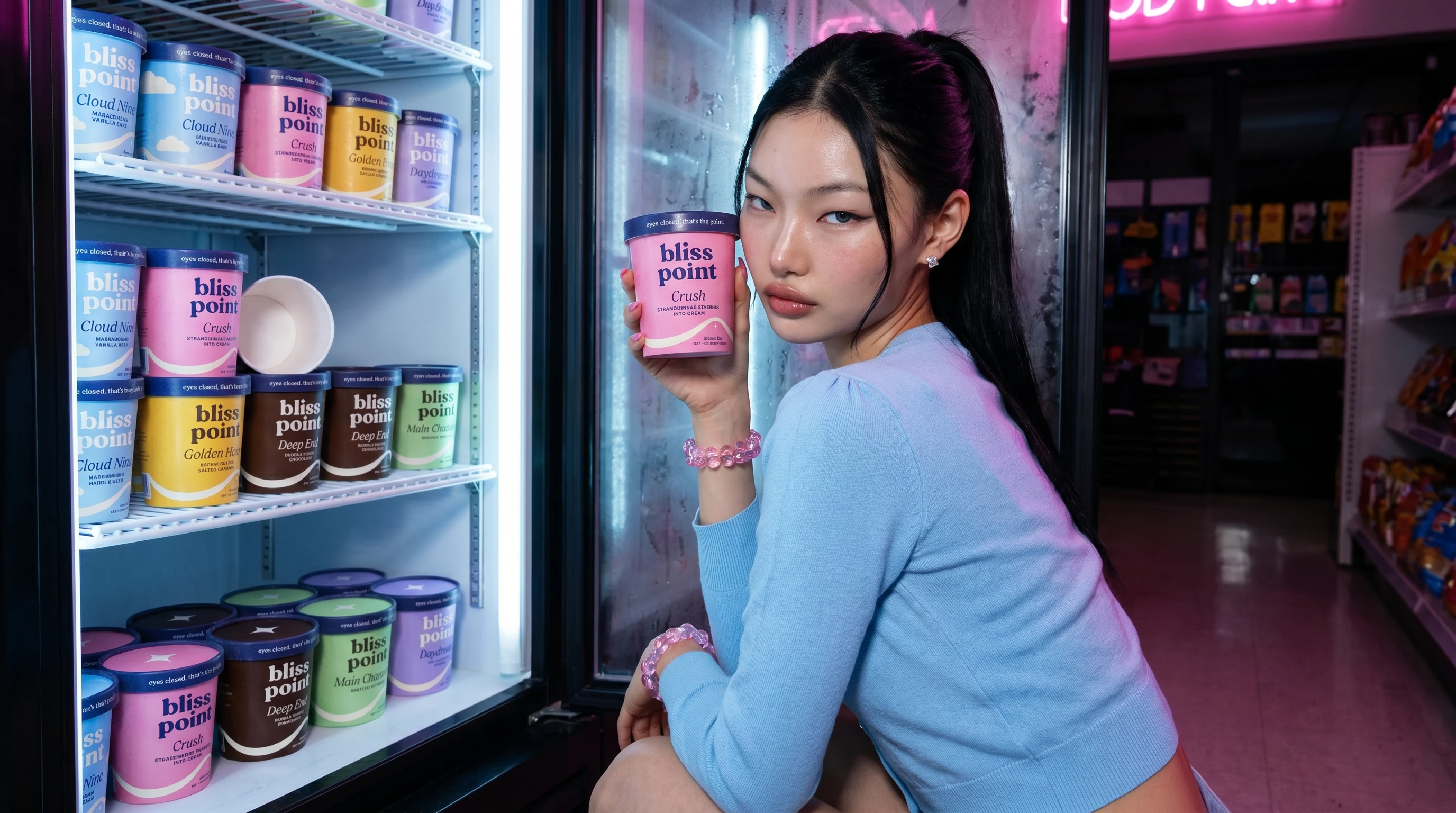
Macro food photography
Chocolate shell cracks, caramel ribbons, melting scoops, frozen cross-sections and suspended drips.
Retail moments
Freezer doors, convenience stores and product-filled displays that place the brand inside a believable buying context.
Lifestyle scenes
Drive-ins, laundromats, motel pools, convertible drives, room service and late-night freezer raids.
Social-first concepts
POV handoffs, photobooth strips, deadpan empty-pint memes and vertical images designed around immediate visual comprehension.
Motion direction
Selected scenes were planned with specific movement, timing and final-frame behavior so the still campaign could extend naturally into short-form video.
AI production process
The project was produced through a multi-stage generative workflow.
1. Strategic development
I established the audience, positioning, central insight, product architecture, naming system and campaign psychology.
2. Identity and packaging
Pints (Generated in Gemini)
Bars (Generated in Gemini)
I developed the color architecture, logo concept, Peak Curve, sparkle device, packaging hierarchy, flavor descriptors and front and back-of-pack copy.
3. Casting
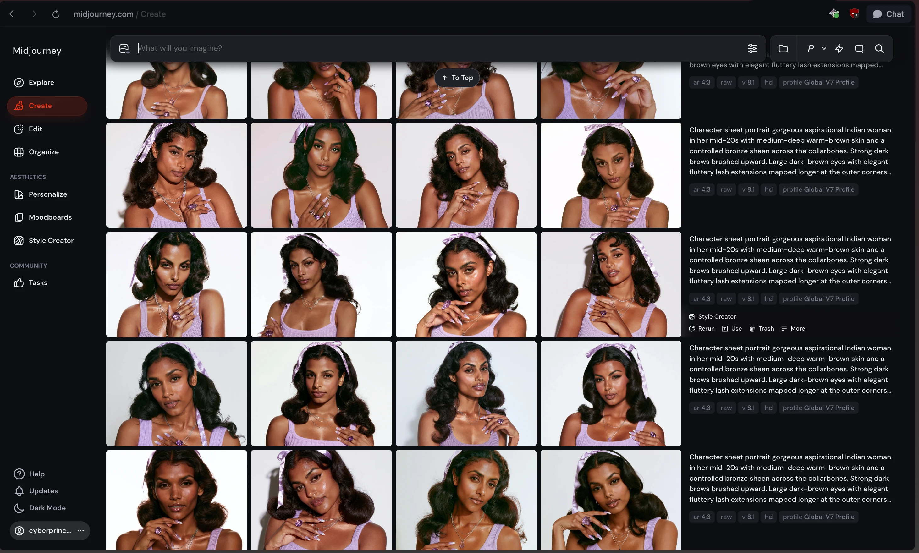
Midjourney UI for creating models.
Midjourney was used to explore and cast the synthetic campaign models. I developed consistent character references with detailed facial features, skin texture, hair and styling direction.
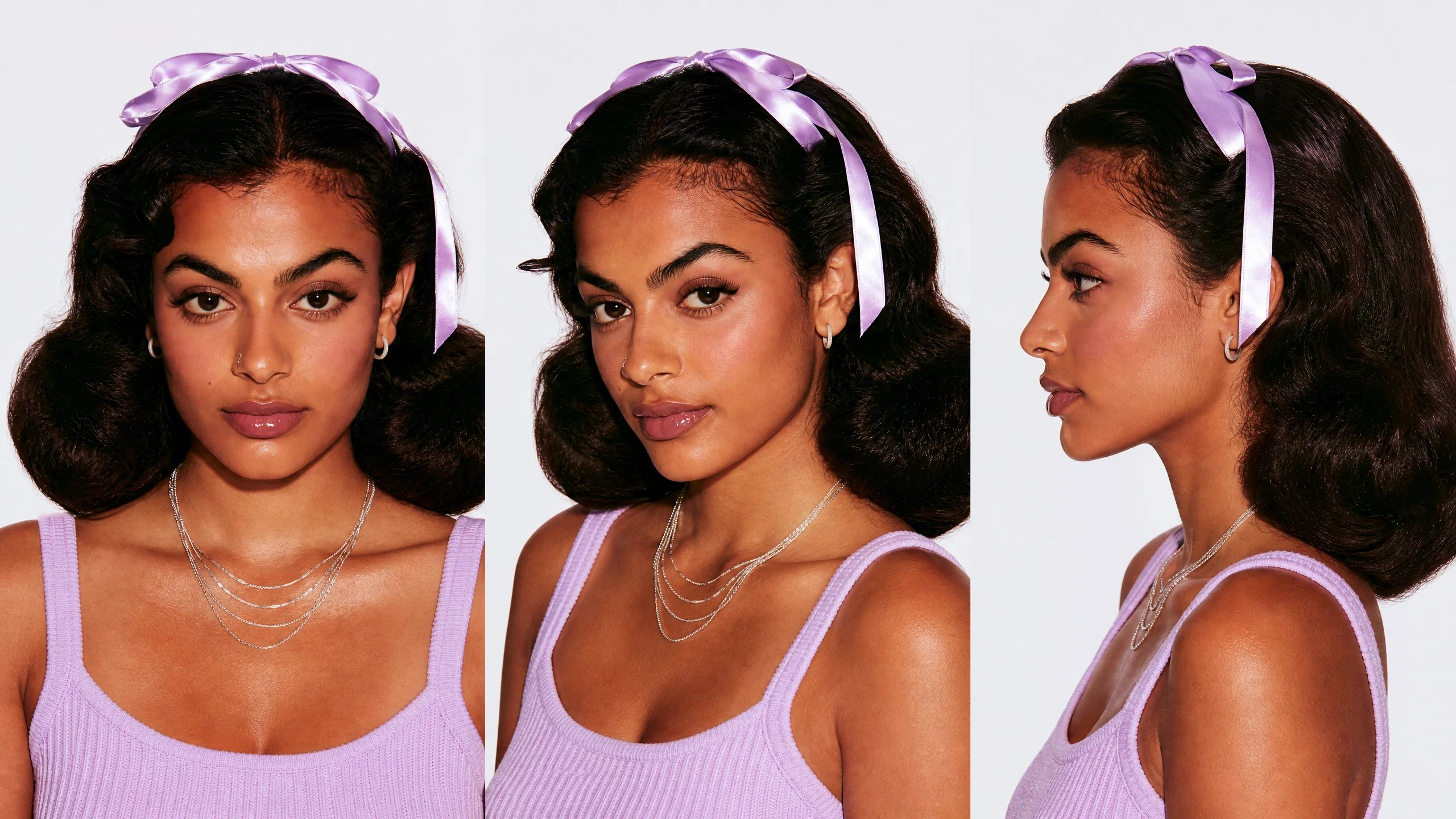
Character Sheet Generated in NBP
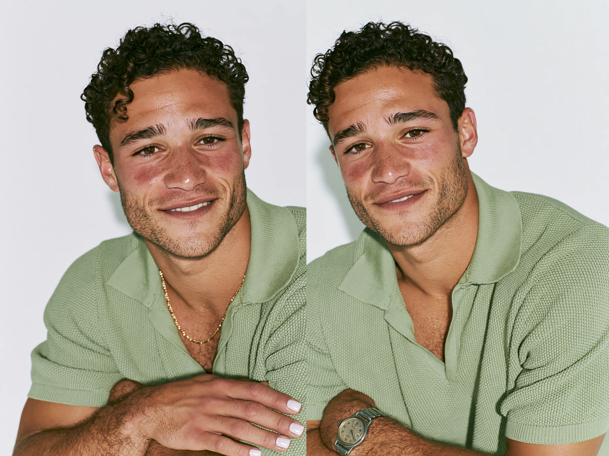
Generated in MIdjourney
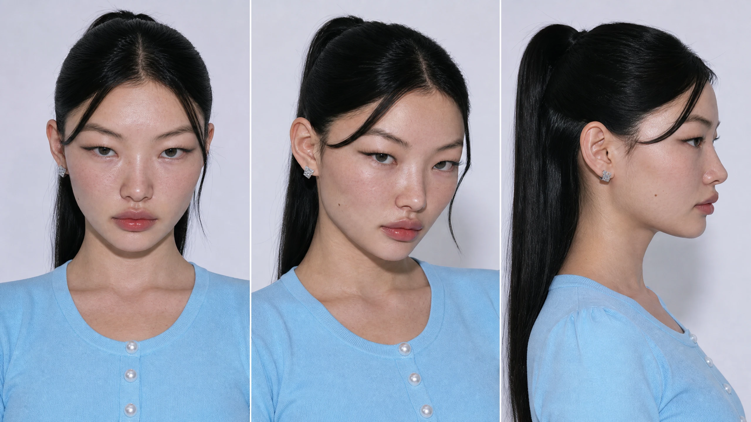
Yuna, Generated in Midjourney
4. Shot planning
Every image began as a structured creative brief containing the purpose of the shot, emotional beat, action, composition, wardrobe, product interaction, lighting, camera behavior and conversion rationale.
5. Image production
GPT image 2 & Nano Banana Pro was used to develop final campaign and product imagery from the art-directed concepts and references.
6. Curation and continuity
Outputs were evaluated for product accuracy, visual realism, flavor recognition, appetite appeal, cast continuity and alignment with the larger campaign system.
Creative strategy and direction were prototyped with Claude Fable 5 and GPT 5.6 Sol.
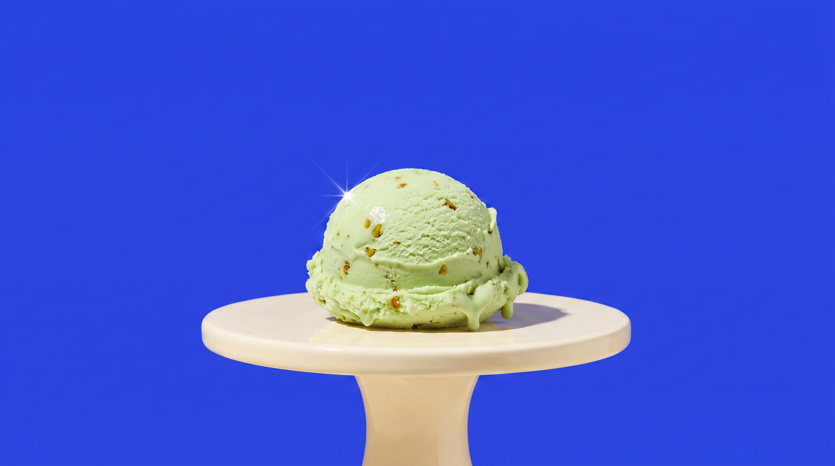
Main Character Flavor: Pistachio
Creative agency level
Generated in Sora 2 by OpenAI.
AI disclosure
Bliss Point is a fictional, self-initiated spec project.
The people, products and campaign environments shown in the project are synthetic. No physical product or traditional photoshoot was used.
AI served as the production medium, but the strategy, concept, naming, copywriting, packaging system, casting direction, styling, campaign architecture, shot planning, prompt systems and final creative decisions were developed and directed by me.
The outcome
The result is a cohesive speculative brand world that extends across six pints, three bars, packaging, product photography, character-led advertising, retail imagery, lifestyle content and motion-ready campaign concepts.
More importantly, the project demonstrates how I approach brand building from beginning to end.
I do not begin with isolated visuals. I begin with a consumer insight, turn it into a repeatable creative idea and build the visual rules that allow the brand to remain recognizable across products, people and platforms.
Bliss Point answers the original question by making pleasure the first message and vegan formulation the satisfying reveal.
Yes, it's vegan. No, we weren't going to lead with that.
My role
Independent Brand Strategist, Designer and Creative Director
Project scope
Brand strategy
Consumer insight
Positioning
Naming
Verbal identity
Tagline development
Copywriting
Flavor architecture
Visual identity concept
Packaging concept
Packaging architecture
Product line development
Model casting
Wardrobe and beauty direction
Campaign concept development
Creative direction
Art direction
Shot-list development
Prompt system design
AI image production
Social content concepts
Motion direction
Final curation
Tools
Midjourney
Claude Fable 5
GPT 5.6 Sol
GPT image 2
Project type
Self-initiated speculative brand
No client or live campaign performance metrics are associated with this project.
Like this project
Posted Aug 6, 2026
0% real. 100% craveable. A fully AI-produced spec brand for vegan ice cream — strategy, packaging, casting, and campaign engineered to the bliss point.