Built with Framer
Premium Travel & Immigration Landing Page - Framer
Florence .
Let’s Go Exp Landing Page Design
Project Overview
I designed and developed a modern landing page for Let’s Go Exp, focusing on creating a visually engaging website that clearly communicates the service offering and encourages visitors to take action.
The project focused on improving how the brand presents its services online through a clear structure, engaging visuals, and smooth interactions.
Live Website:
https://letsgoexp.framer.website/
Role:
UI/UX Designer and Framer Developer
Tools:
Framer
Figma
AI tools for content ideation
What LetsGo EXP needed
LetsGo Explore is a growing travel and immigration consultancy based in Nigeria. They help clients process visas, book curated travel packages, and navigate study abroad applications. The business had a strong, recognisable presence on Instagram bold visa approval posts, warm brand colors, and an aspirational travel aesthetic, but no website that matched that energy.
The goal was clear: build a digital home that feels as premium and trustworthy as the brand looked on social media. A site that would convert visitors into inquiries.
"Turn a strong Instagram brand into a high-converting consultancy website, one that feels luxury, builds trust, and drives visa applications and package bookings."
services section
Visual direction
Design decisions
The brand's Instagram presence was the foundation. LetsGo EXP had already built a consistent visual language — warm earth tones, gold accents, and bold typography on their visa approval posts. The challenge was scaling that up into a full website system without losing the warmth or the premium feel.
I committed to a palette of dark brown, burnt orange, and gold against cream and off-white surfaces. This kept every section feeling cohesive and on-brand, whether it was a destination card or a contact form.
Dark brown #2C1810Burnt orange #C4622DGold #C9973AWarm beige #F5EDE0Off-white #FAF6F0
For typography, I paired Cormorant Garamond — an elegant, editorial serif — with Outfit, a clean modern sans-serif. This combination gave the site a luxury travel feel while remaining highly readable across all screen sizes.
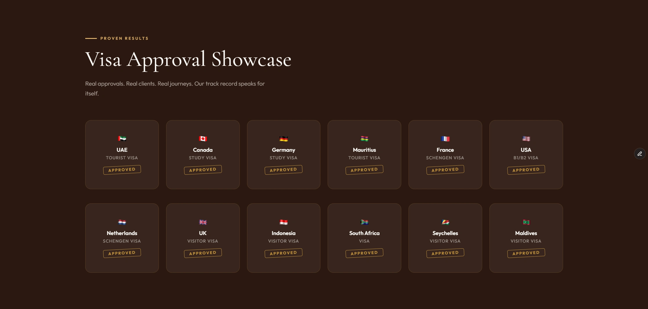
The visa approval showcase section was intentionally styled to mirror the brand's Instagram posts: flag, visa type, and a rotated "APPROVED" stamp. This gave returning social media followers an immediate sense of familiarity and credibility.
Destination
The build
The site was built section by section as modular blocks, making it easy to expand or update individual parts without touching the whole. Every section was built mobile-first and tested across breakpoints.
Key sections built:
Hero with full-bleed video background, animated badge, and dual CTA buttons
Trust bar with animated counters — 500+ visas, 100+ travelers, 98% success rate
Services section with 4 cards covering visa processing, packages, admissions, and consultation
Destinations grid — asymmetric bento layout with Dubai featured large, hover reveals
Travel packages — Dubai, Zanzibar, Bali, Cape Town with pricing in Naira
Visa approval showcase — flag cards with rotating APPROVED stamp, matching Instagram style
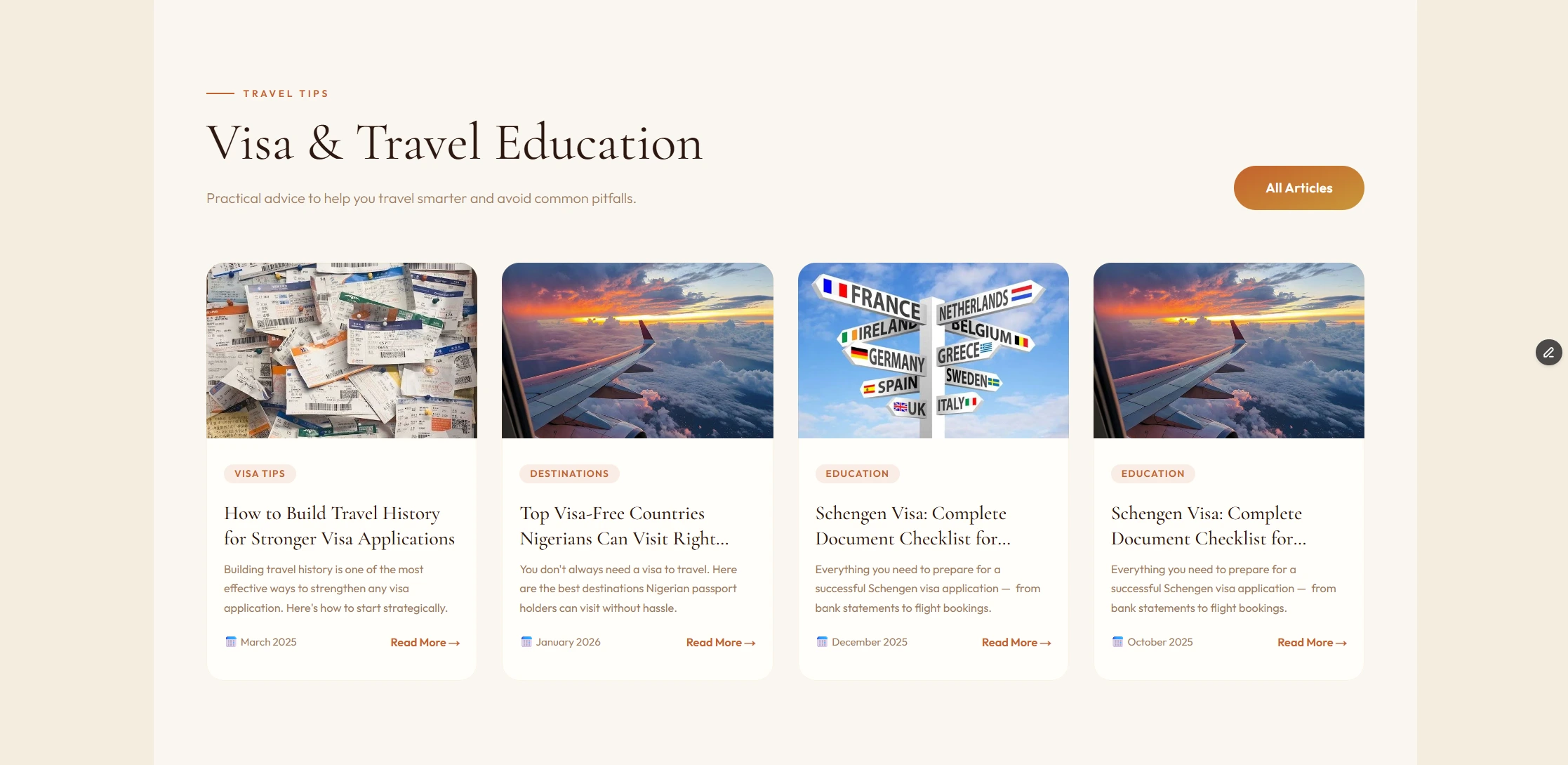
Client testimonials and a travel tips blog section
Full contact and inquiry form with service and destination dropdowns
Floating WhatsApp button — always visible, pulsing animation
Scroll-triggered animations were used throughout — fade-up reveals on cards and sections, counter animations on the trust bar, and hover interactions on destination cards that reveal descriptions and CTAs. All interactions were kept smooth and purposeful, not decorative.
Visa Approval
Conversion focus
Built to drive inquiries
Every design decision was made with conversions in mind. The hero section leads with a clear value statement and two direct actions — apply for a visa or start a WhatsApp conversation. The floating WhatsApp button ensures that route is always one tap away, regardless of where a visitor is on the page.
The inquiry form was scoped to capture the most useful lead information quickly: destination, service type, travel date, and contact details — enough for the LetsGo EXP team to follow up with a personalised response.
Trust signals were placed deliberately. The stats bar appears immediately below the hero. Visa approval cards appear mid-page when a visitor's interest is high. Testimonials from real named clients follow.
The outcome
What the site delivers
7+
Full sections built
10+
Visa approvals showcased
4
Travel packages featured
100%
Mobile responsive
LetsGo EXP now has a complete digital presence that reflects the quality of the service they deliver. The website matches the premium feel of their Instagram brand, communicates trust through social proof, and gives every visitor a clear path to get in touch whether that's filling in the inquiry form or opening WhatsApp.
The modular structure of the Framer build means the client can add new destinations, packages, and blog articles without redesigning anything.
Visa
Like this project
Posted Mar 14, 2026
Designed a premium, engaging landing page for Let’s Go Exp with Framer and Figma.
Likes
1
Views
9