
🚨 Opportunity platforms lose 70% of users in the first 10 seconds — because the site makes finding opportunities feel like work.
If your discovery platform isn't fast, clear, and trust-building instantly, visitors leave — and never come back.
The Transformation — Somopportunity
Before: Cluttered layout. No clear user journey. Hard to navigate on mobile. Zero SEO foundation.
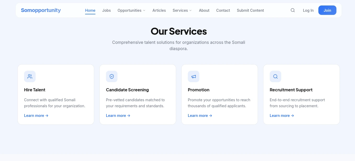
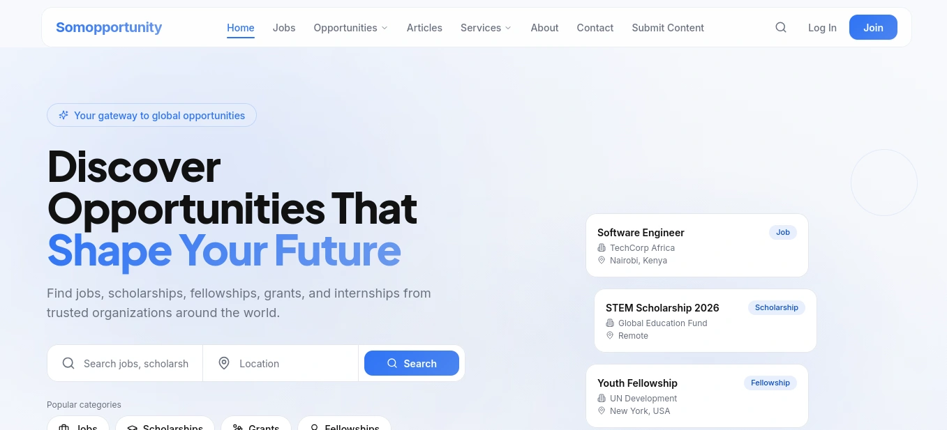
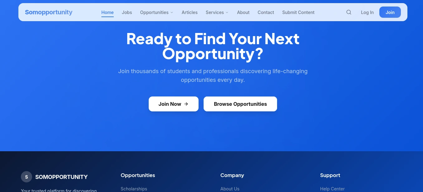
After: A clean, intuitive platform where jobs, scholarships, and grants are discoverable in seconds — on any device.
What we fixed:
✅ Streamlined information architecture — users find what they need fast
✅ Mobile-first build — where 80%+ of job seekers browse
✅ SEO-optimized structure for opportunity-based search queries
✅ Trust signals and clear CTAs that drive sign-ups
✅ Lightweight, fast-loading pages to reduce bounce rate
A platform that opens doors shouldn't have a broken front door.
👉 See it live: somoppurtunity.vercel.app
📩 Ready to redesign your platform? Hire me
0 likes · 0 views · Apr 5, 2026
🚨 Opportunity platforms lose 70% of users in the first 10 seconds — because the site makes finding opportunities feel like work. If your discovery platform ...

