Changing the Way You Travel(Case Study)
Harshit Saharan
Changing the Way You Travel:
A Smart, All-in-One Companion for Every Journey
Designing a seamless travel app that brings flights, hotels, cabs, and activities together in one place. With an intuitive rebooking tool, users can manage changes instantly and at no extra cost, turning disruptions into hassle-free adjustments. The app simplifies every step of the journey, making travel flexible, reliable, and stress-free.
How I found this problem in the first place
Managing my recent trip felt chaotic due to juggling multiple apps for flights, hotels, and cabs — none provided real-time updates, making coordination even more confusing.
How Might We Create a Unified Travel Platform to Seamlessly Integrate Flights, Hotels and Cabs
The problem statement revolves around two main issues: a disjointed user experience and the need for real-time updates.
Solution for disjoint user experience
To tackle the challenge of juggling multiple apps for travel planning, I focused on creating a seamless flow. First, you book your flight. Next, you select your hotel. Finally, you arrange cabs for both your flight and hotel — all within a single, cohesive experience.

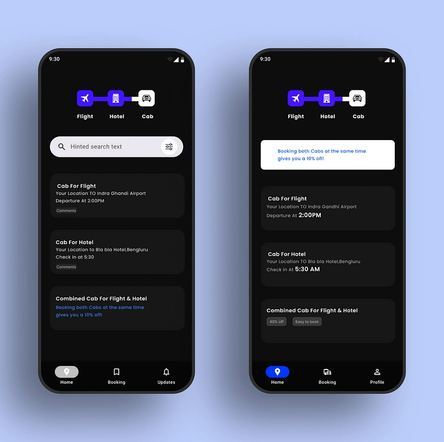
Once users complete their trip booking, they’re directed to the home screen, where a dashboard provides real-time updates for their entire journey. The dashboard acts as a centralized hub, showcasing all the connections between the flight, cabs, hotel, and any additional activities. It’s organized with cards for each element — cabs, flight, and hotel — making it easy to track everything at a glance.

Now, let’s explore how we arrived at this dashboard design.
Booking the trip
When planning a trip, there’s a lot to juggle — booking a flight, arranging a cab to the airport, securing a hotel, and then booking a cab for the hotel. That’s four steps, and as Hick’s Law suggests, the more steps involved, the higher the cognitive load on users.
To simplify this process, the final design streamlined everything into just three steps: booking the flight, hotel, and cabs (both for the airport and the hotel) all in one seamless flow. To keep users informed and reduce any guesswork, a progress bar at the top of the screen clearly indicates the three-step journey to complete their trip booking.

Trip booking
Quick note: I intentionally skipped the usual booking steps — after all, there’s no point in showing usual screens, right? For instance, I didn’t dwell on the typical flight booking process here.
Booking Hotel
Booking a hotel should be simple and stress-free, requiring just a few key details: city, check-in and check-out dates, and the number of rooms. To enhance the experience, I added a feature that automatically calculates and displays the number of nights based on the selected dates, making the process even more intuitive.
The flow uses carefully selected components to ensure simplicity and ease of use. For check-in and check-out dates, I integrated a date picker from the Material Design Component Gallery. To choose the number of rooms and guests, I used a bottom sheet, keeping the interface clean while still providing all the necessary options.

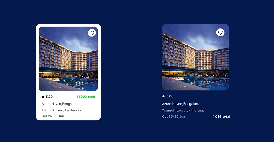
When it came to designing the hotel cards, I was torn between two options. After weighing the pros and cons, I ultimately chose the one right one — balancing functionality and aesthetics for a better user experience.
After booking the hotel (skipping the hotel selection process here), a modal pops up to confirm the booking. Initially, the modal was a simple notification stating, “Hotel booked successfully.” But I saw an opportunity to make it more useful.
I redesigned the modal to display key details about the booked hotel, along with a dropdown menu for applying coupons. At the bottom, I included two clear CTAs: one to confirm the booking and another to make changes, just in case the user wants to tweak something. This added functionality ensures the user feels in control throughout the process.

Flow of hotel booking

Book the cabs(Both for flight and hotel)
For cab bookings, I initially offered separate options for the flight and hotel, which felt disjointed. To improve this, I implemented a tabbed interface that combined both bookings into a single, unified flow, making the process smoother and more intuitive for users.
A notification bar was introduced to inform users that booking both the flight and hotel cabs together unlocks a discount. This feature encourages a smoother booking experience and enhances user engagement..
At first, I placed the discount option within a card, but I soon realized this wasn’t effective. Users had to sift through multiple cards to spot the discount offer, which wasn’t ideal.
To address this, I replaced the card with a notification bar that boldly says, “Book both cabs and get a discount!” This grabs the user’s attention right away, guiding them to the “Book Both Cabs” option and making the discount impossible to miss.
Skipping over the usual cab selection process, let’s dive into the next page — after the user selects both locations. This page displays the locations and prices.
But here’s where it gets interesting…
While gathering UX feedback, a friend shared a relatable story. He recalled a time when he was still packing his luggage, but the cab had already arrived. The driver called, and he found himself wishing for a little extra time.
This inspired a new feature: users can now delay their cab by 10 to 15 minutes with just a tap. To address potential concerns about extra costs, I added a reassuring text element that clearly states, “No extra charges.” This small but thoughtful addition ensures a smoother and more stress-free experience for users.
To ensure users are aware of this feature, I also added a tooltip that pops up, guiding them to the option to delay the cab. This way, users don’t miss out on the convenience of adjusting their ride time, making the app experience even more user-friendly.
I designed a modal to inform users that their cab is already scheduled and displays the exact arrival time. While the user can’t change the original time, they can choose to increment it by either 10 or 15 minutes. Initially, I created a separate modal specifically for this time adjustment feature.
In the original design, there were too many modals, which can sometimes feel overwhelming or like a barrier for users if not used properly. To improve this, I replaced the multiple modals with bottom sheets. After the user confirms their desired time, a simple modal pops up to confirm the adjustment, letting them know the time has been successfully incremented. This approach feels less intrusive and keeps the experience smooth and intuitive.

Cab booking

When users confirm their cab, the same confirmation modal appears, providing consistency and clarity, so they know everything is set.
After booking all the transport, it’s time to enhance the user experience further. I added a feature that suggests nearby parties and popular places, helping users make the most of their trip. By offering curated recommendations, users can easily discover where to go, saving them time and effort that would otherwise be spent searching for things to do. It’s all about making the trip more enjoyable and hassle-free.

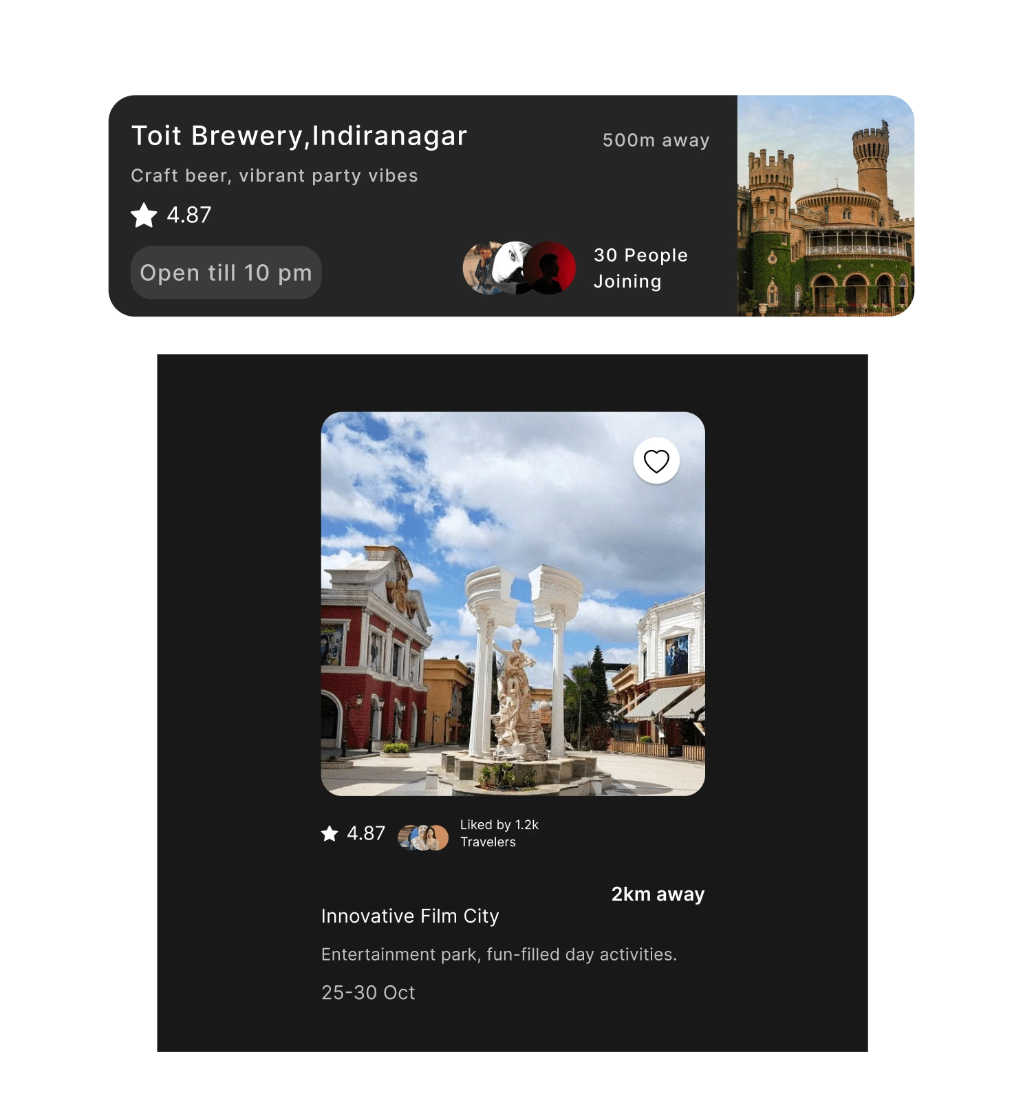
The party card includes a picture, location, description, ratings, and party timings. To build trust, it also shows how many people are attending, similar to how the places card displays the number of people who liked the venue. This helps users make informed decisions and adds a sense of community.
Now, let’s talk about the payment section. To address the disjointed user experience, the page displays a summary of everything the user has booked. Users can easily edit or make changes by clicking on any of the cards. Along with that, the page shows the amount spent on each transport or hotel. At the bottom, the grand total for the trip is clearly displayed. If a coupon code is applied, it’s highlighted, ensuring users are aware of the discount.
Initially, I thought it would be best to apply the coupon code at the very end. However, making the payment process longer wasn’t ideal. Given the compact screen space, it was also challenging to add extra features. So, I decided to incorporate the coupon section with perspective cards, allowing users to apply their discounts without cluttering the screen.


Solution for real time updates
App flow based on different timeline of the journey
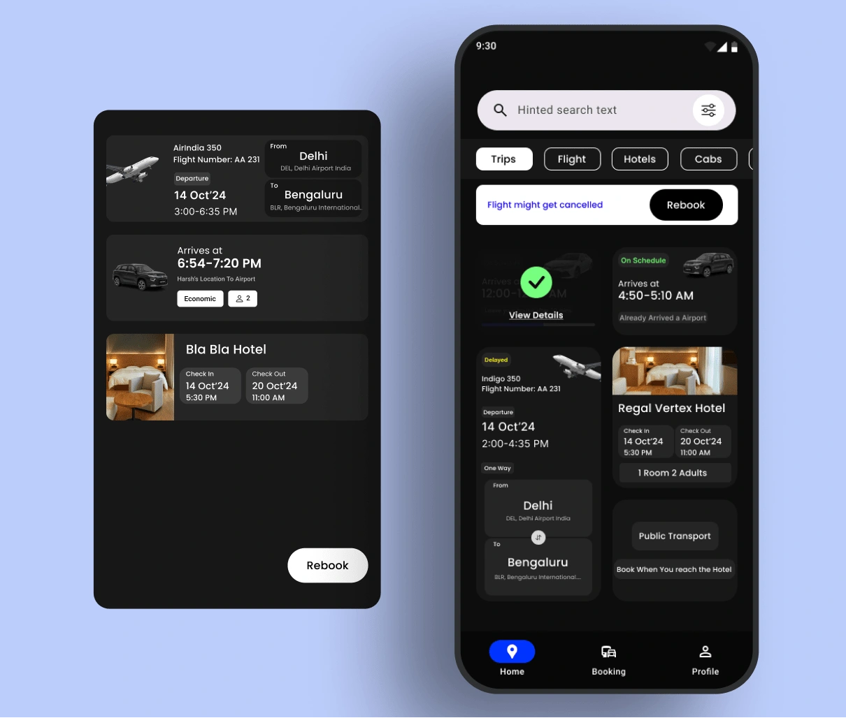
As we discussed earlier, the dashboard was designed to tackle the real-time updates issue. It serves as a central hub, displaying all booked transport and hotel details along with the necessary information, ensuring users stay informed throughout their trip. At the top, you’ll notice an component resembling a notification bar that provides real-time updates. This feature was designed to ensure users can easily see important information and take necessary actions based on that.
Initially, I used a simple notification popup, but I quickly realized that with a travel app, there’s a constant flow of important updates throughout the
trip. When I asked users for feedback, many mentioned that they found multiple pop-up notifications overwhelming and annoying. To address this, I replaced the pop-ups with a dedicated notification bar at the top, making it easier for users to see key updates without feeling bombarded.
The notification bar now delivers all the necessary updates without interrupting the user’s interactions, providing key information in a non-intrusive way. It’s become the most useful feature for real-time updates, enhancing the user’s journey without causing disruption.

Let’s break down the journey through the app, looking at how it progresses through the different stages of the user experience. From booking transport to receiving real-time updates, each stage is designed to make the process smooth and intuitive. First, let’s discuss the journey of the cab to the airport. After booking the cab, users can track its arrival in real time via the notification bar, ensuring they’re informed every step of the way. The process is seamless, allowing users to focus on other tasks while knowing when to expect their ride.
As the cab arrives, the notification bar does its job, displaying all the important details: a direct CTA to contact the driver, the estimated arrival time at the airport, and the specific gate where the flight will be departing. Meanwhile, the cab card shows the basic info, including the arrival time and an “On Schedule” element, which adds a sense of trust and reassurance that everything is on track. A helpful text element guides users, reminding them that the cab is on its way and when they can leave home. Finally, the progress bar tracks the journey from their location to the airport, providing a visual representation of the trip’s progress.\
Cab arrives at the airport, it’s the perfect moment to gather feedback. I added a Rate the Driver CTA, allowing users to quickly rate their ride while the experience is still fresh in their minds .
Once the cab arrives at the airport, the cab card’s elements fade to a lower opacity, and a checkmark appears, indicating that the task has been completed. This subtle change visually reinforces that the journey to the airport is done, offering users a clear sense of progress.


After transitioning from the airport-to-hotel cab journey, the flight card takes center stage as it contains the most critical travel details. It provides essential information, such as the flight name, flight number, departure time, and whether it’s a one-way or return trip.
The card also highlights the flight’s departure location and destination, ensuring clarity for the user. To keep travelers informed, a real-time indicator dynamically updates, showing statuses like On Schedule or On Flight, reinforcing trust and providing peace of mind.
Once users reach their hotel, the major part of the trip is done. The notification bar offers a CTA to contact the driver, and upon arrival, it prompts the hotel to prepare for check-in. A playful thumbs-up CTA is included to make the experience more engaging and fun, encouraging user feedback.


The notification bar also has an option to increment time for users needing extra time at the airport or wishing to visit nearby places. After the flight and airport cab are completed, their sections shrink into a collapsible menu bar, keeping the dashboard clean. Users can expand these sections as needed for easy access without clutter.
When users check in at the hotel, the public transport tab becomes relevant for booking transport at their destination, ensuring the schedule aligns with their new location.
Under the transport card, there’s a dedicated card for nearby parties, which users can book after booking the hotel. This integration ensures real-time updates are seamlessly tackled by presenting all essential information — transport, hotel, and activities — on a single screen.
After designing this app, I identified several potential updates that could further enhance the user experience. I’ll discuss these improvements later on.


We addressed the issue of a disjointed user experience by integrating all transport options into one seamless flow. For real-time updates, we created a dashboard that consolidates all essential information, alongside a persistent notification bar to keep users updated throughout their journey.
What if the flow breaks?
But traveling is not that easy.
However, travel doesn’t always go as planned. Delays and cancellations are common, such as a canceled cab to the airport or a delayed flight. While hotel check-ins and cabs for hotels can be easily rebooked, flight or airport transport disruptions can significantly impact the entire trip.
Minor Cab Delays
In the case of a small delay, the app notifies users that the cab will still reach the airport on time, reassuring them and reducing unnecessary stress.
Major Cab Delays
If the delay is significant and may cause the user to miss their flight, the notification bar alerts them immediately. It provides a CTA to rebook the flight, ensuring users can take quick action to minimize disruption to their journey.
If rebooking is needed, a modal appears, enabling users to easily adjust their itinerary. It updates the times for all related transport, such as the next available cab and flight. The hotel check-in time is also automatically modified to match the new schedule, ensuring the trip continues smoothly despite any delays.
The rebooking cards resemble the payment option cards, displaying real-time information for easy adjustments. For instance, the hotel card shows room availability, confirming that rooms are ready without any waiting. To keep users informed about the status, I added a “Rebooked” section, which updates to either “On Schedule” or “Delayed,” ensuring they are always aware of the situation.

If the flight is delayed
The process mirrors the cab delay scenario. The app automatically rebooks the flight and the cab to the hotel, adjusting the hotel check-in time to align with the new schedule. The rest of the flow remains consistent, ensuring a smooth, seamless experience with real-time updates and rebooking options.
Conclusion
What were the challenges I faced in this design journey
Managing information on a small screen was a tricky challenge. From flight details to bookings and schedules, there was a lot to show without overwhelming users or making the interface feel cluttered.
Another key focus was getting real-time updates right. It was important to provide timely notifications without bombarding users or disrupting their experience — striking that balance was crucial.
Lastly, handling disruptions like delays or cancellations required careful thought. Designing a smooth rebooking flow that adjusted flights, cabs, and hotel check-ins automatically was essential to keep things seamless and stress-free for users.
What I have learned from this project
This project taught me the importance of always prioritizing user needs over technical constraints. While there were limitations, finding creative solutions was essential to ensure the app remained intuitive and user-friendly.
I also learned how critical transparency and trust are in travel experiences. Providing real-time updates and clear communication — especially during disruptions — helped reduce user anxiety and build confidence in the app.
Understanding real-life travel challenges was another big takeaway. Designing flexible, user-centered features that adapt to dynamic situations made the app more practical and reliable for users.
Lastly, the value of user feedback stood out. Insights, like concerns about intrusive notifications or handling delays, were invaluable in refining the design and addressing real user pain points.
What will be the possible outcomes
The app could lead to a truly seamless and stress-free travel experience by bringing transport, accommodations, and updates together in one smooth flow, eliminating the chaos of managing multiple apps.
It also has the potential to boost user trust and confidence. Features like rebooking flows and “on schedule” indicators give users a sense of control, ensuring they always know what’s happening during their journey.
Finally, the app’s adaptable, user-centered design could set a new industry standard. By addressing common pain points in travel apps, it has the potential to redefine how trips are planned and managed.
What could have been better
Designing this app was a journey filled with trial and error, but isn’t that what design is all about? I revised the layout and features multiple times, uncovering and addressing countless loopholes along the way. Even now, the app isn’t perfect — but perfection isn’t the goal from the start. Much like the evolution of a design system, the initial version might not be flawless, but with time, iteration, and refinement, it gets better and better.
Ensuring that critical information is immediately accessible without overwhelming the user is key. While the app attempts to manage a lot of details, a more refined approach to content hierarchy and prioritization could make key actions stand out more clearly, reducing cognitive load.
Although the app does a good job of keeping flows consistent, there are moments where transitions between different sections (e.g., flight, cab, hotel) could feel more fluid and cohesive. Better consistency in interaction patterns would help users navigate the app with fewer mental shifts.
While the app provides feedback on rebooked flights and transport, there could be more immediate, visual cues (such as animations or progress indicators) that help users feel more in control during moments of change, reducing any feelings of uncertainty when adjustments are made.
Traveling to a new city or country is both exciting and exhausting. Designing an app that allows users to book their entire trip — transport, hotels, and even activities — was an exciting challenge. The main difficulty was fitting all this information into a small screen without overwhelming users. The goal was to ensure the app remains user-friendly, minimizing cognitive load and providing a seamless experience
Like this project
Posted Feb 10, 2025
Designing a seamless travel app that brings flights, hotels, cabs, and activities together in one place with a real-time notification center.