E-commerce Single Product Page UI/UX Redesign
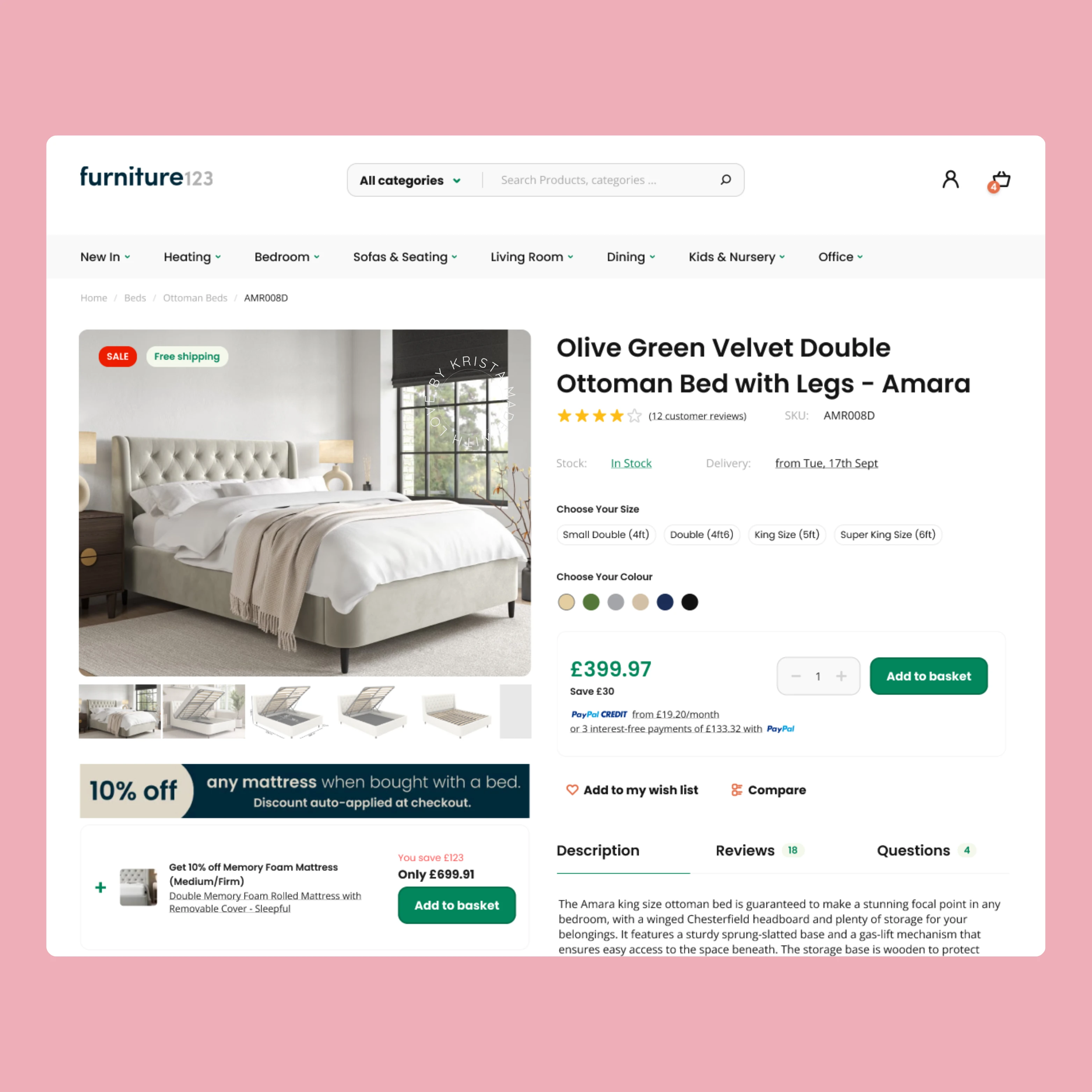
I improved the UI/UX and CRO of a single product page for an e-commerce site selling beds and furniture. The original page had cluttered visuals, confusing navigation, and redundant information, which led to a high bounce rate and low conversions.
Before:
Overwhelming layout with too much text.
Poor product imagery and slow loading times.
Difficult to find product details and customer reviews.

After:
Clean, modern design with a display of different variants.
Simplified navigation and a clear, standout "Add to Basket" button.
Optimized for faster load times and better mobile responsiveness.
Clear product descriptions, benefits, customer reviews and QA, placed where users can easily find them.
This redesign improved user engagement, reduced bounce rate, and increased conversions, providing a more seamless shopping experience.

Like this project
Posted Aug 26, 2024
I revamped the UI/UX and CRO of a cluttered product page, focusing on simplicity and user experience.


