Oread Therapeutics


Information
Client: Oread Therapeutics | Products: Scalp & Face Therapy
Challenge & Solution
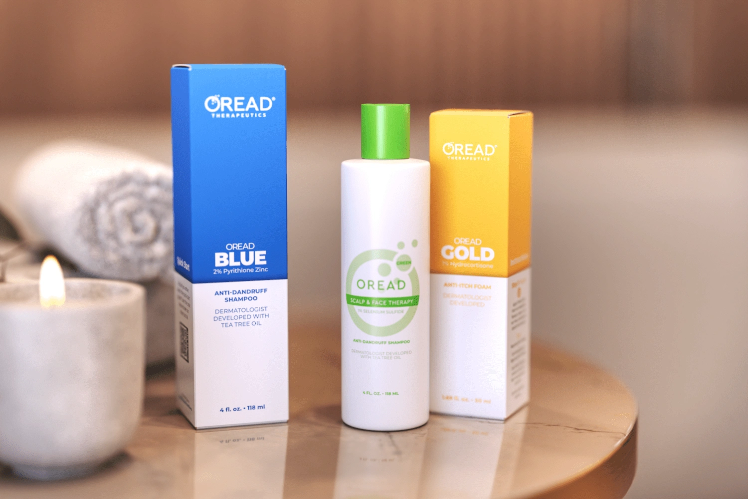
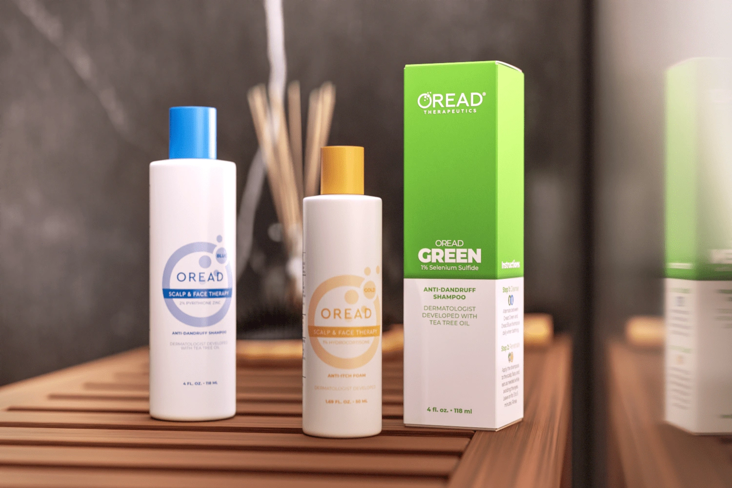
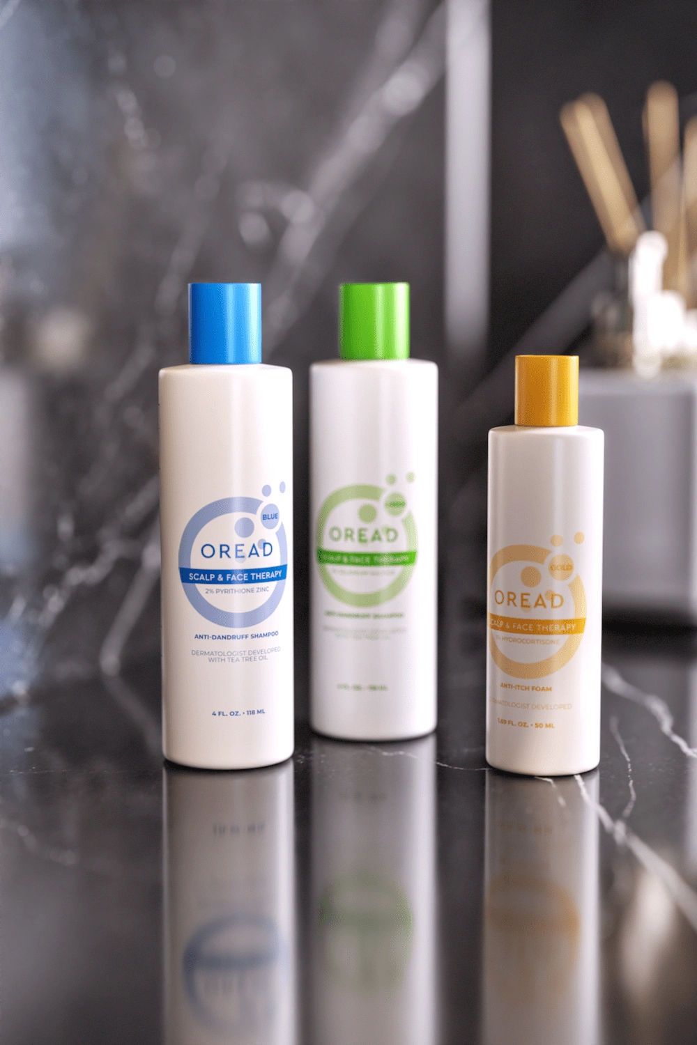
Scalp and Face Therapy, a skin treatment by Oread Therapeutics, needed cohesive packaging for the entire line. Each product name was a color, which became the focal point of the design, dominating the front and flowing to the sides. This color-blocking approach ensured shelf impact and helped consumers quickly identify the desired product.
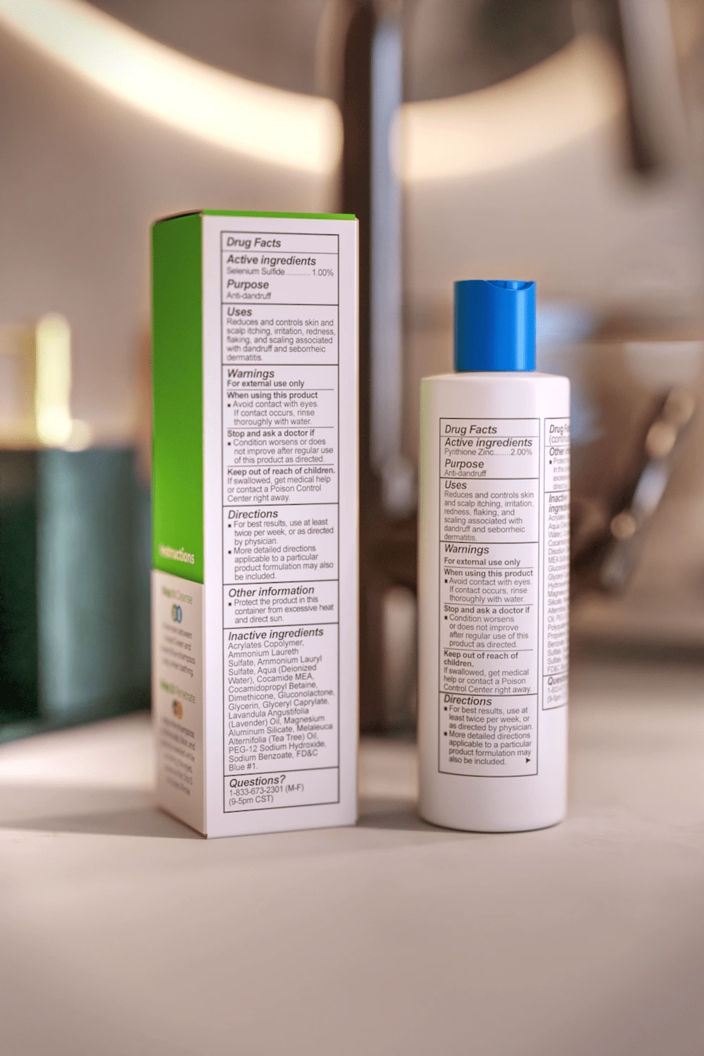
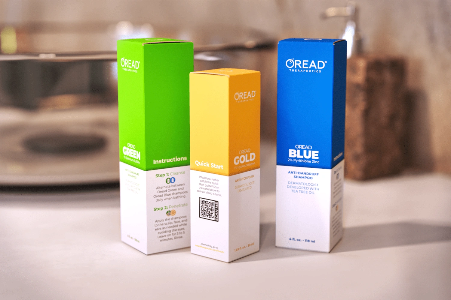
Instructions were placed on the sides: a step-by-step guide and a QR code linking to video instructions. Displaying the full Drug Facts table within limited space, while meeting font size regulations, required meticulous typographic control.
Like this project
0
Posted Apr 22, 2025
Created color-centric packaging system for skincare line that enhanced shelf visibility while elegantly integrating regulatory content.


S-Bit Strawberry

Stuffed Animal Organizer

Treleaf Monstrella

Thyme and Olive