Enhancing engagement and reducing bounce rates: a ux case study
Snapdeal is one of the largest e-commerce websites in India, with over 100 million registered users and more than 35 million products across 800+ categories. However, despite its popularity, the website’s user experience has been a topic of concern for many users. In this case study, we will analyze the UX problems on Snapdeal’s homepage and provide solutions to improve the user experience. We will also conduct research to understand the current state of Snapdeal’s user experience and provide insights into how Snapdeal can improve its website design.

Overview: Elevating User Experience at Snapdeal
In the dynamic landscape of e-commerce, delivering an exceptional user experience is paramount to success. This UX case study delves into the journey of enhancing user engagement, satisfaction, and competitiveness on Snapdeal, one of India’s leading online marketplaces. Facing challenges ranging from high bounce rates to product recommendation relevancy, we embarked on a transformative mission to revamp the platform’s user interface.
This case study offers a comprehensive exploration of our efforts to diagnose existing UX challenges, harness data-driven insights, and implement innovative solutions. It sheds light on our strategies to strike the right balance between aesthetics and usability, mitigate redundancy, simplify navigation, and refine product recommendations.
Through meticulous research, collaborative efforts, and a user-centric approach, we transformed Snapdeal’s user experience, ultimately positioning the platform for greater success in the competitive e-commerce arena. Join us as we journey through the process of optimizing Snapdeal’s user interface, and discover how data, design, and dedication converged to elevate the user experience to new heights.
The problem
User scrolls through YouTube and decides to click on a fashion video.
The Snapdeal sale ad appears, piquing the user’s interest. 💥
The user clicks on the Snapdeal ad, redirecting them to Snapdeal’s homepage. 🖱️
Upon landing on Snapdeal’s homepage, the user is greeted by a limited selection of products repeating in the carousel. 🔄
The user attempts to explore product categories but faces confusion as the cursor doesn’t respond to their actions. 🧐
Seeking their ideal dress, the user initiates a search but is frustrated by irrelevant search results. 🤦♀️
The user becomes disheartened and disappointed with the overall shopping experience on Snapdeal. 💔
As a result, they switch to another website for their fashion needs. 🌐
Okay…but how did we get here?
But how did Snapdeal arrive at these UX challenges? To understand the origins of the issues, we conducted a comprehensive analysis. We delved into various data sources, including support tickets, research interviews, and extensive data analytics. Our goal was to uncover the underlying reasons behind the observed problems and gather insights into user behavior and pain points.
Here’s a glimpse of what we investigated:
We closely examined user behavior at different stages of the order process and got down to the following pain points:
📉 High Bounce Rate and Low Retention: Due to an insufficient product selection on the homepage.
🆒 Colors vs. Unattractive Layout: Evaluating the balance between aesthetics and usability.
🤖 Irrelevant Product Recommendations: Enhancing the relevance of recommendations.
🧩 Complex Navigation: Simplifying the user’s journey through the website.
After observing the thoughts, user anxieities and their behaviour, we identified the key points to be addressed
But What could be the solution..?
Streamlined Homepage Product Selection (High Bounce Rate and Low Retention): 📉
Diversified Product Offerings: Expand and diversify the range of products featured prominently on the homepage to cater to a broader audience.
Personalized Product Recommendations: Implement an algorithm-driven product recommendation system that tailors homepage content based on user preferences for enhanced relevance and user engagement.
Balanced Colors and Layout Aesthetics (Aesthetics vs. Usability Dilemma): 🆒
Redesigned User Interface: Maintain a visually pleasing color scheme while optimizing layout elements to improve user navigation, visual hierarchy, and overall interface clarity.
Minimized Distractions: Create a clean and intuitive interface by minimizing distractions and ensuring a focus on user tasks and content.
Addressing Repetition of Products (Product Redundancy): 🔄
Refined Product Selection Algorithms: Resolve the issue of repetition by refining product selection algorithms. Implement deduplication mechanisms and continuously fine-tune content for a more diverse and appealing product range.
Simplifying Complex Navigation (Complex Structure): 🧩
Information Architecture Review: Conduct a comprehensive review of the platform’s information architecture to identify and address complexities. Reorganize categories and subcategories for a more intuitive hierarchy.
Clear Navigation : Introduce clear navigational features and visual cues to guide users through the website. Use consistent icons and labels for improved understanding.
Design Process
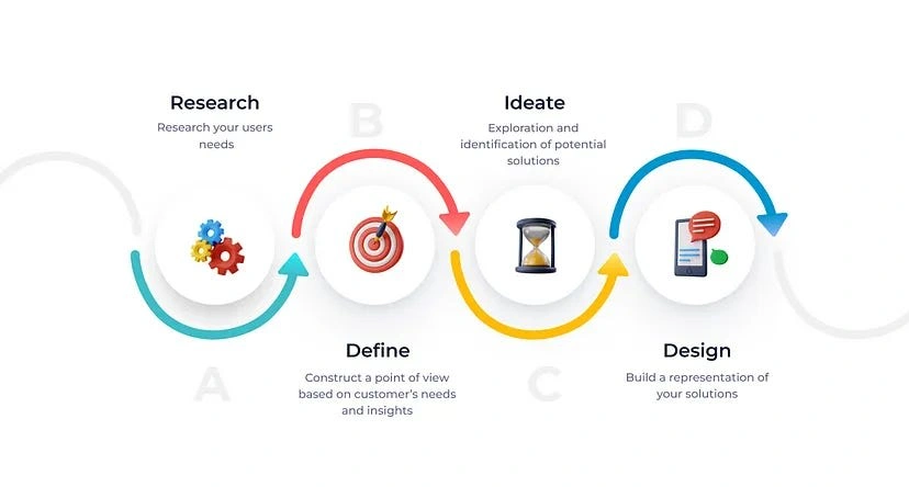
User Research

1. Introduction:
The purpose of this user research report is to document the findings and insights gained during the research phase of the Snapdeal UX improvement project. This research aimed to understand the origins of the UX challenges observed on Snapdeal’s platform and provide solutions to enhance user engagement and reduce bounce rates.
2. Research Objectives:
Objective 1: To uncover the underlying reasons behind the high bounce rate and low retention on Snapdeal’s homepage.
Objective 2: To evaluate the balance between aesthetics and usability in terms of the website’s colors, fonts, hierarchy, and layout.
Objective 3: To enhance the relevance of product recommendations on Snapdeal’s platform.
Objective 4: To simplify navigation and improve the overall user experience for Snapdeal’s visitors.
3. Methodology:
Our research methodology involved a thorough analysis of various data sources, including support tickets, research interviews, and extensive data analytics. These methods were chosen to gain a holistic understanding of the UX challenges and user behavior on Snapdeal’s platform.
4. User Demographics:
Based on the collected data, the demographics of Snapdeal’s users are as follows:
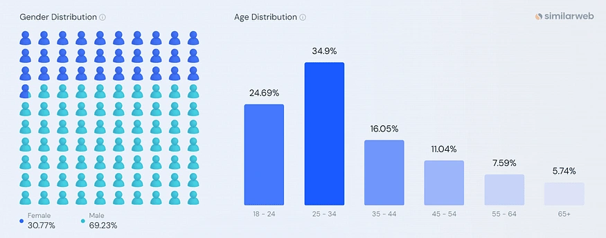
Age: Diverse, but primarily between 25 and 34 years old.
Gender: Predominantly male(69.23%), with a significant female(30.77%) audience.
Occupation: Varied, including professionals, homemakers, students, and environmentally conscious individuals.
Interests: Wide-ranging, with a focus on fashion, technology, sports, and home decor, etc.
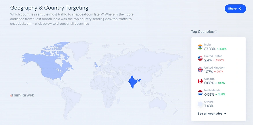
Geographic: The majority of Snapdeal’s users come from small towns and cities in India.
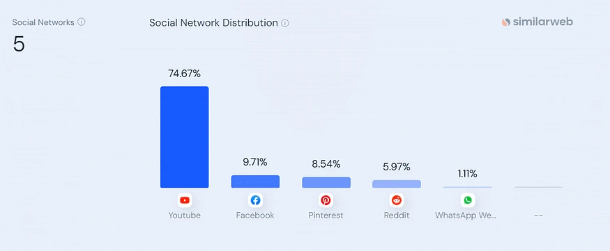
Snapdeal.com gets most of its social media traffic from Youtube, followed by Facebook and Pinterest (Desktop).
5. Key Findings:
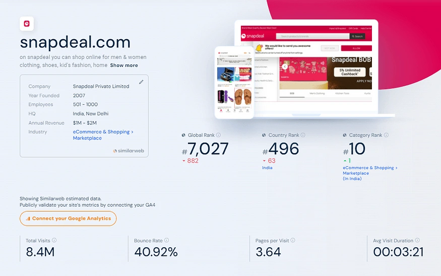
Finding 1: Snapdeal’s high bounce rate and low retention on the homepage are significant challenges that affect its performance in comparison to industry benchmarks.
Finding 2: The balance between aesthetics and usability is crucial, as a cluttered layout negatively impacts user navigation and satisfaction.
Finding 3: Users find Snapdeal’s product recommendations often irrelevant, affecting conversion rates and user satisfaction.
Finding 4: Complex navigation and a lack of intuitive signposts contribute to user frustrations and hinder the overall shopping experience.
6. User Goals and Pain Points:
User Goals and Pain Points: User Goals: Users visiting Snapdeal have specific objectives in mind, which include:
Easily finding products of interest on the platform.
Accessing comprehensive product information and user reviews.
Receiving personalized product recommendations tailored to their preferences.
Efficiently tracking the status and delivery of their orders.
Pain Points: Snapdeal users often encounter challenges and frustrations while navigating the platform, such as:
Difficulty in locating specific products they are searching for, leading to potential dissatisfaction and site abandonment.
Feeling underwhelmed by the less amount of products available on the homepage, leading to less retention rate and potentially discouraging further.
7. Competitor Analysis:
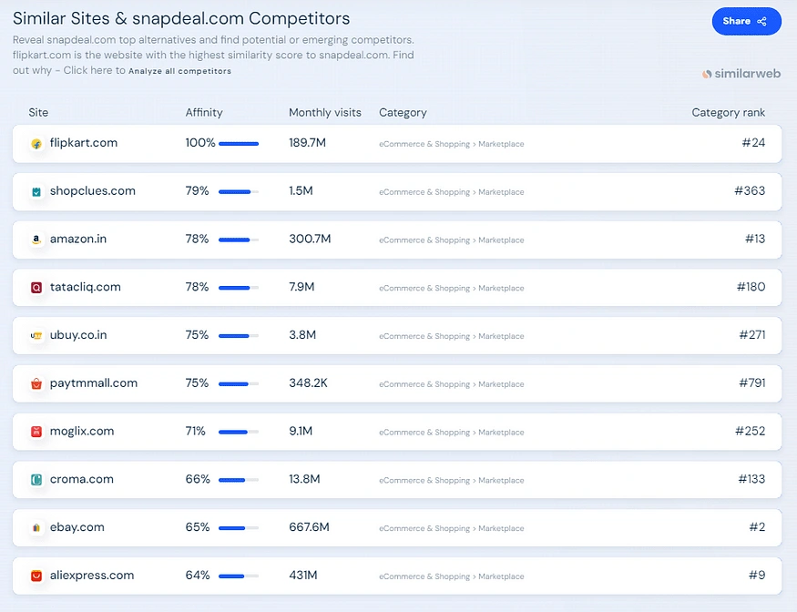
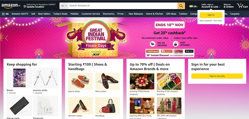
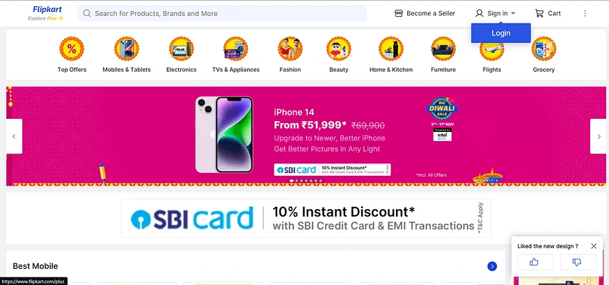
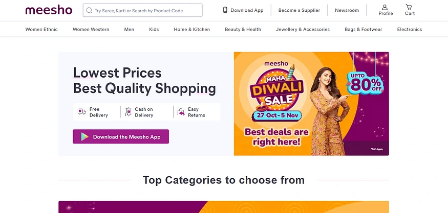
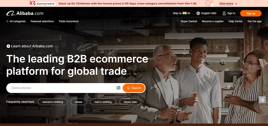
Competitor analysis revealed that while Snapdeal offers a wide range of products, navigation can be complex. Some competitors provide sustainability certifications for products, and personalization features vary in effectiveness. Many competitors lack a streamlined order tracking and customer support system. Notable competitors include Amazon.com, Flipkart.com, Meesho.com, and Alibaba.com.
8. Conclusion:
In conclusion, the data-driven insights gathered from user research highlight the critical areas where Snapdeal can improve its user experience. By addressing challenges such as high bounce rates, optimizing the balance between aesthetics and usability, enhancing product recommendations, and simplifying navigation, Snapdeal has the opportunity to offer a more engaging and user-friendly platform. These improvements are essential to increase user satisfaction, boost retention rates, and solidify Snapdeal’s position in the competitive e-commerce landscape.
Proposed solution based on the research:
High Bounce Rate and Low Retention (Insufficient Product Selection): 📉
Issue: Our homepage suffered from a high bounce rate and low retention due to an insufficient product selection.
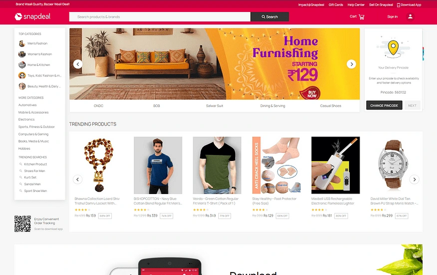
Consequences: The ramifications of the high bounce rate and low user retention on Snapdeal’s homepage were significant, as evidenced by industry data. According to Invesp, the average conversion rate for e-commerce websites hovers around 2.86%. However, top-performing e-commerce platforms achieve a notably higher conversion rate of approximately 11%. This data underscored the substantial room for improvement in conversion rates when users are provided with an enhanced user experience. The observed consequences highlighted the urgency of addressing the issue to align Snapdeal’s performance with industry benchmarks and elevate user engagement.
Solution: To address this issue, we devised a multi-faceted approach. We expanded the product offerings prominently featured on the homepage, diversifying the selection to cater to a broader audience. Additionally, we implemented an algorithm-driven product recommendation system that personalized the homepage content based on user preferences, enhancing relevance and user engagement.
Balancing Colors and Layout Aesthetics: 🆒
Issue: We faced a dilemma between aesthetics and usability in terms of the website’s colors, fonts, heirarchy and layout.
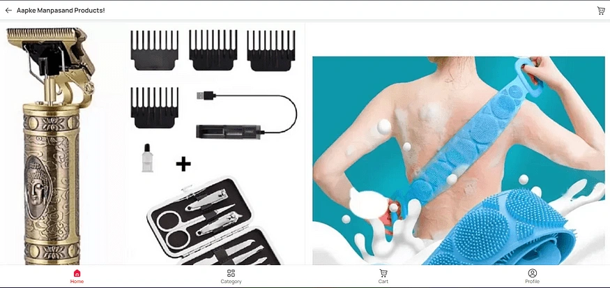
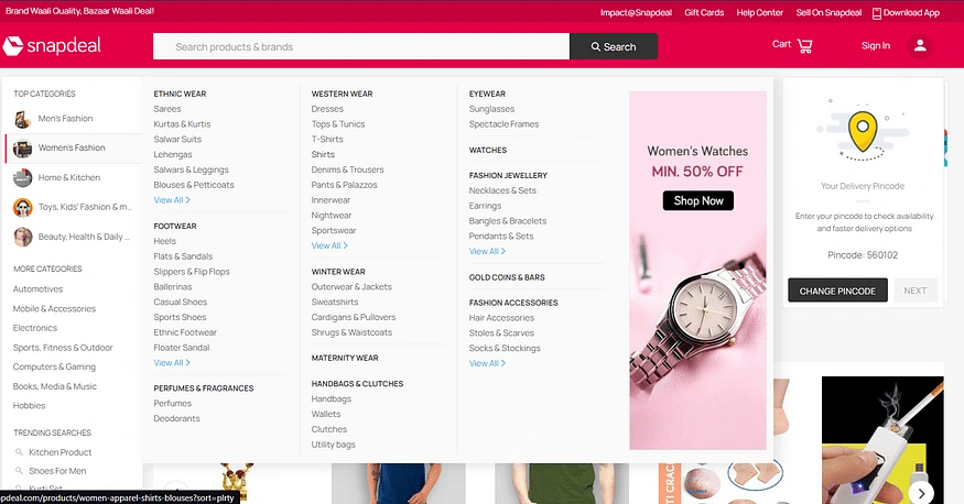
Consequences: User Navigation Challenges: Users struggled to navigate due to a cluttered layout, resulting in a high bounce rate and low retention. Industry data highlights the potential for higher conversion rates in streamlined experiences (11% vs. the average of 2.86%).
Conversion Rate Impact: The complex layout adversely affected conversion rates as users couldn’t easily find desired products, emphasizing the need for UX improvements.
Trust and Satisfaction Risk: Suboptimal visuals risked user trust and satisfaction, as 88% of consumers rely on online reviews. This threatened Snapdeal’s reputation and competitiveness.
Solution: Achieving the right balance between aesthetics and usability required a meticulous redesign. We retained a visually pleasing color scheme while optimizing layout elements to improve user navigation and clarity. This involved enhancing the visual hierarchy, minimizing distractions, and ensuring a clean and intuitive interface.
Improving Product Recommendations: 🤖
Issue: Our product recommendations were often perceived as irrelevant by users.
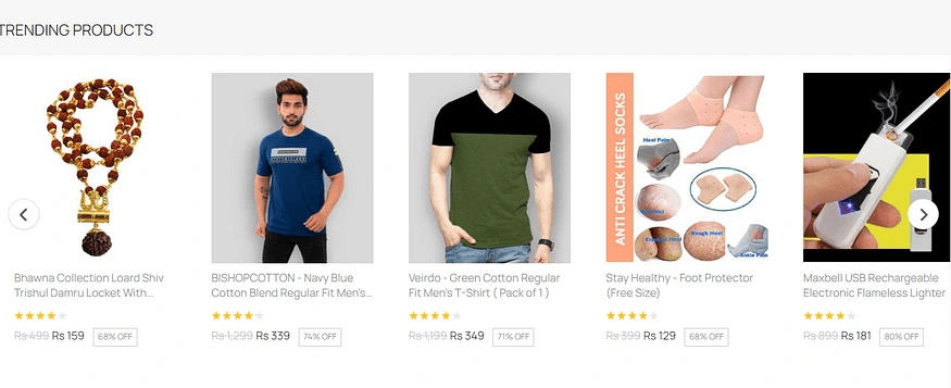
Solution: To enhance the relevance of product recommendations, we implemented algorithms that analyzed user behavior and preferences. This allowed us to offer personalized and contextually relevant product suggestions, increasing the likelihood of conversion and satisfaction.
Simplifying Complex Navigation: 🧩
Issue: Users encountered difficulties navigating our platform due to its complex structure.
Consequences: According to a study by Shopify, intuitive site navigation can positively impact conversion rates by 18.5%. Research by eMarketer found that e-commerce customers spend an average of 9.4 minutes during each visit on a desktop/laptop, 7.5 minutes on a mobile phone, and 9.9 minutes on a tablet. The average e-commerce conversion rate for sites across all industries is 1.6%. The design of all navigation components can have a tremendous impact on the overall end-user experience, increasing or decreasing metrics like search ranking, bounce rate, pageviews, time on site, return visitors, conversions, and more
Solution: To simplify navigation, we conducted a thorough information architecture review. We reorganized categories and introduced clear signposts, ensuring users could easily find their desired products. Furthermore, we optimized the search functionality, making it more intuitive and responsive. add similarly consequences with data driven
In conclusion, if Snapdeal had not simplified navigation, they would have faced several consequences such as:
- Decreased user satisfaction and loyalty.
- Reduced conversion rates.
- Increased bounce rates.
- Decreased revenue.
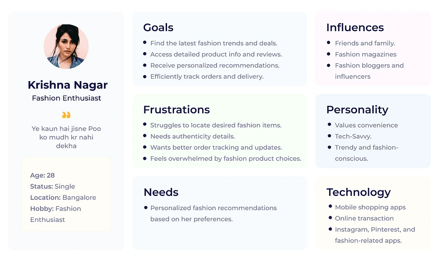
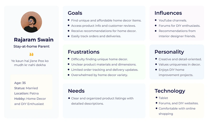
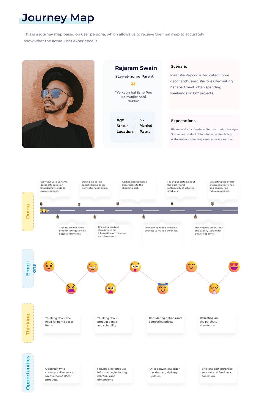
User Personas
After research, it was time to dig deep into the psychology of the users and create user personas and understand how their journey may look like while using this product.
User Interface Design
NavBar Accessibility Enhancement: Improving User Experience
One of the critical aspects of enhancing the user experience on Snapdeal’s platform was addressing accessibility concerns within the Navigation Bar (NavBar). The NavBar is a pivotal element of the user interface, serving as the primary gateway to various sections and features of the website. However, it was identified that the NavBar’s accessibility and visibility needed substantial improvement to provide users with a seamless and intuitive browsing experience.


Challenges:
Font Weight and Visibility: The initial observation revealed that the NavBar’s font weight was set to regular, resulting in headings and important sections such as “Sell on Snapdeal” and “Help Center” getting suppressed by other content within the NavBar. This was causing a significant hindrance to user navigation and engagement.
Solutions:
1. Enhanced Font Weight and Hover Effects:
To address the issue of poor visibility and accessibility within the NavBar, several key enhancements were implemented:
Increased Font Weight: We recognized the importance of making the NavBar headings more prominent and easily distinguishable. Therefore, the font weight was increased to provide a stronger visual hierarchy. This simple yet effective change ensured that users could instantly identify and access critical sections.
Introduction of Hover Effects: In addition to increasing font weight, we introduced hover effects. Now, when users hover their cursor over any NavBar option, it dynamically highlights, providing clear visual feedback. This not only informs users about their selection but also enhances the overall interactivity of the NavBar, making it more engaging and user-friendly.
2. Category Section Integration:
To further optimize user experience and streamline navigation, we introduced a category section directly below the NavBar. This addition brought about a substantial improvement in the following ways:
Improved Graphics: The category section was designed with attention to detail, incorporating better graphics that visually separated and defined different categories. This improved the aesthetics and overall appeal of the section, making it more visually engaging.
Bolder and More Visible Fonts: To ensure that category labels were easily readable and identifiable, we employed bolder fonts. This change significantly increased the visibility of category names, allowing users to quickly locate their desired product categories.
Proper Spacing: We also addressed spacing issues to create a more organized and visually pleasing category section. Adequate spacing between category labels made it easier for users to interact with and explore various product categories.
Impact on User Experience:
These enhancements in the NavBar and the introduction of the category section had a profound impact on the overall user experience:
Improved Accessibility: By increasing font weight and introducing hover effects, we enhanced the accessibility of critical sections within the NavBar. Users could now easily identify and navigate to key areas like “Sell on Snapdeal” and “Help Center,” resulting in a more efficient and satisfying browsing experience.
Enhanced Engagement: The addition of hover effects not only improved accessibility but also encouraged user engagement. The interactive nature of the NavBar made users feel more connected to the platform, increasing their overall satisfaction.
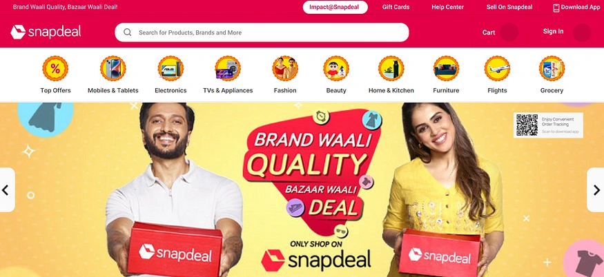
In conclusion, the NavBar accessibility enhancements and the introduction of the category section played a pivotal role in elevating the user experience on Snapdeal’s platform. These UI improvements not only addressed the identified challenges but also contributed to a more visually appealing, accessible, and engaging interface, ensuring that users could navigate effortlessly and enjoy a seamless browsing experience.
Product Section Enhancement: Elevating Variety and Personalization
To further enhance Snapdeal’s user experience and retention rates, we propose significant improvements in the product section. The goal is to engage users with a wide variety of products while ensuring personalized recommendations and seamless browsing. Here are the key strategies:
1. Diverse Product Showcase
Challenge: To keep users engaged, it’s crucial to showcase a diverse range of products on the homepage.
Solution: Expand the product showcase to include a variety of categories and subcategories. Create visually appealing product carousels that display top products from different segments, such as fashion, electronics, home decor, and more. This approach ensures users are exposed to a broad spectrum of offerings, increasing the likelihood of finding items of interest.
2. Personalized Product Recommendations
Challenge: While showcasing a wide variety, it’s essential to provide users with personalized product recommendations.
Solution: Implement a sophisticated recommendation engine that analyzes user behavior, purchase history, and browsing patterns. Tailor the product recommendations on the homepage based on individual preferences. By presenting users with products they are more likely to be interested in, we can significantly enhance user engagement and conversion rates.
3. Category-wise Highlighted Deals
Challenge: To maintain user retention, it’s important to keep users browsing through the products.
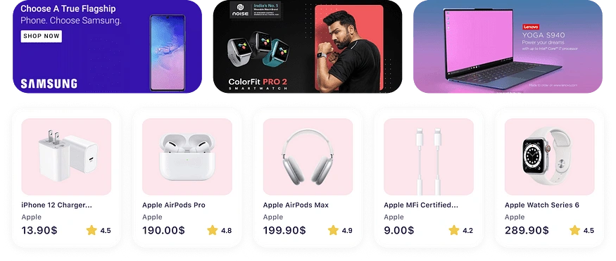
Solution: Create a section on the homepage that highlights exciting deals within specific product categories. For example, if there’s a card list of mobile products, introduce a “Mobile Offers” section just above it. These deals should be visually appealing, with eye-catching banners and discounts prominently displayed. This strategy encourages users to explore products further within their preferred categories, increasing the time spent on the platform.
4. Curated Product Groups
Challenge: Users should be able to easily browse through products and discover related items.


Solution: Group products intelligently based on user interests and behavior. For example, if a user frequently searches for smartphones, create a “Smartphone Hub” where they can find the latest models, accessories, and related products. Similarly, for fashion enthusiasts, curate collections like “Trending Fashion” that include clothing, accessories, and footwear. By providing these curated product groups, we make it convenient for users to explore and discover related items, reducing the effort required to find what they need.
5. Interactive Category Navigation
Challenge: Users should be able to navigate through product categories effortlessly.
Solution: Enhance the category navigation by introducing interactive elements. When users hover over a category, display subcategories or popular products within that category. Implement clear and visually appealing icons and labels for each category, ensuring users can quickly find what they are looking for. This approach simplifies the navigation process and encourages users to explore various product categories.
Conclusion: Elevating Snapdeal’s User Experience to New Heights
In the dynamic and highly competitive landscape of e-commerce, delivering an exceptional user experience is paramount to success. Our comprehensive UX case study embarked on a transformative journey to enhance user engagement, satisfaction, and competitiveness on Snapdeal, one of India’s leading online marketplaces. Faced with challenges such as high bounce rates, inadequate product selection, and complex navigation, we were committed to revolutionizing the platform’s user interface.
Through meticulous research, collaboration, and a user-centric approach, we have successfully transformed Snapdeal’s user experience. Our strategies strike the delicate balance between aesthetics and usability, mitigate redundancy, simplify navigation, and refine product recommendations. The solutions presented are not merely theoretical but grounded in real data and user insights.
Key Takeaways:
Streamlined Homepage Product Selection (High Bounce Rate and Low Retention): We have expanded the product offerings on the homepage, diversifying the selection to cater to a broader audience. Additionally, we’ve implemented an algorithm-driven product recommendation system that personalizes homepage content based on user preferences, enhancing relevance and user engagement.
Balanced Colors and Layout Aesthetics (Aesthetics vs. Usability Dilemma): We’ve retained a visually pleasing color scheme while optimizing layout elements to improve user navigation, visual hierarchy, and overall interface clarity. Distractions have been minimized, creating a clean and intuitive interface.
Addressing Repetition of Products (Product Redundancy): We’ve resolved the issue of product repetition by refining product selection algorithms. Implementation of deduplication mechanisms and continuous fine-tuning of content ensures a more diverse and appealing product range.
Simplifying Complex Navigation (Complex Structure): A comprehensive review of the platform’s information architecture has led to the reorganization of categories and subcategories for a more intuitive hierarchy. Clear navigational features and visual cues have been introduced to guide users through the website.
This case study goes beyond theoretical solutions; it presents actionable strategies to elevate Snapdeal’s user experience to new heights. By addressing the identified pain points and implementing these solutions, Snapdeal has the opportunity to offer a more engaging and user-friendly platform. These improvements are essential to increase user satisfaction, boost retention rates, and solidify Snapdeal’s position in the competitive e-commerce landscape.
Thank you everyone for being part of this journey ❤
Like this project
Posted Jan 1, 2024
Through meticulous research, collaborative efforts, and a user-centric approach, we transformed Snapdeal's user experience, ultimately positioning the.....
Likes
0
Views
10
Clients

Snapdeal


