Brand System Development for EverTrust
Labina Nan

EverTrust
Evertrust specializes in manufacturing and sale of high-quality steel and rubber products. The company prides itself on reliability, dependability, and exceptional quality and durability of its products. There products are backed by robust research and development.
The founder Sachin, wanted EverTrust to reflect the Reliability and Durability of their products through logo, packaging and the Visual Identity as a whole.
Timeline : 21 Days
Role: Logo Design, Visual Identity Systems, Packaging Design
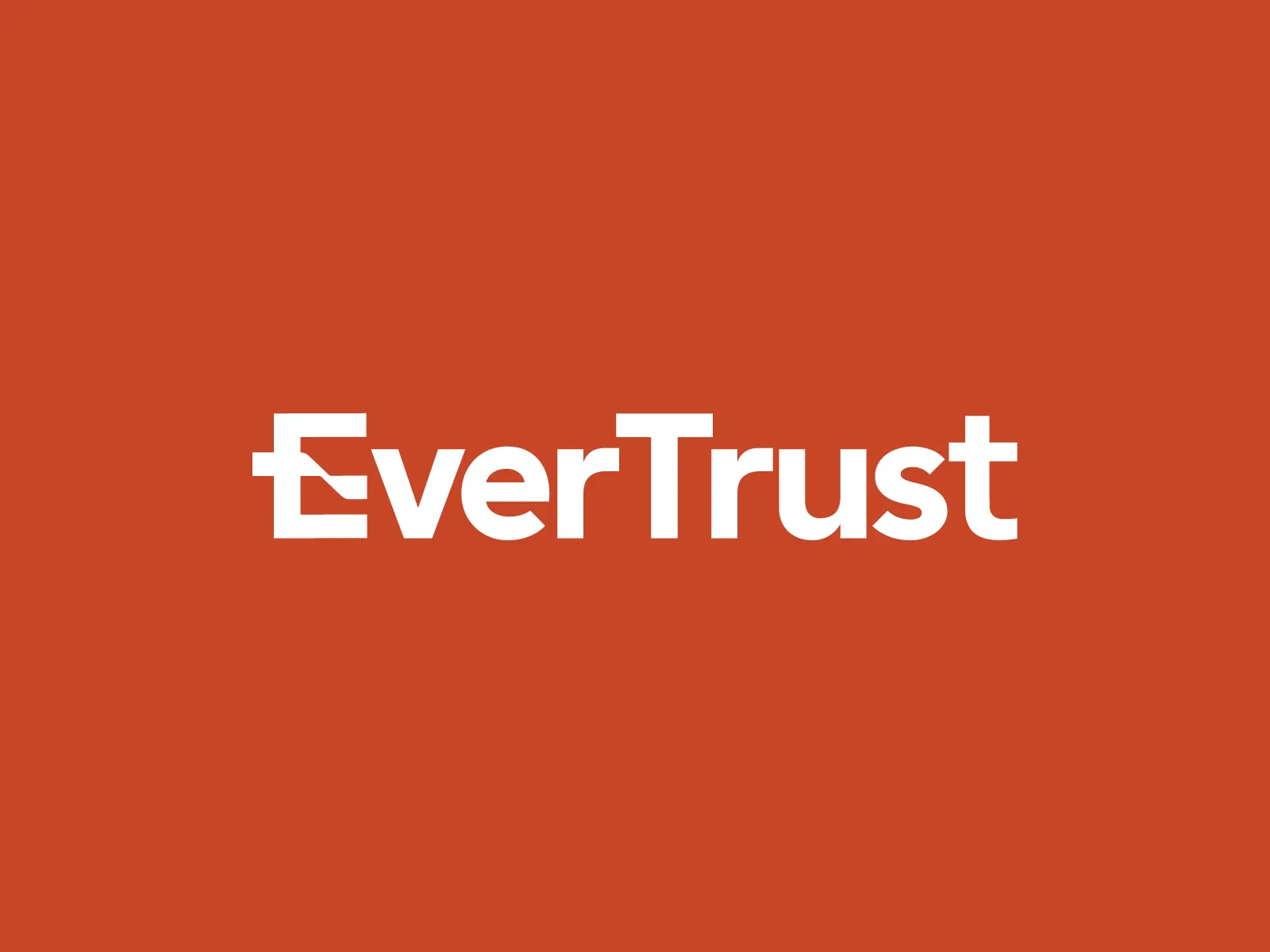
Wordmark Logo
The Challenge
EverTrust was a brand new business that did not exist visually.
The challenge was building credibility from zero in a highly competitive Amazon environment.
Objective
Create a brand system that signals reliability and durability at first glance while feeling clear and confident. Something that works seamlessly across multiple product categories.
Audience Insight
The target customer is a
Men aged 35–60 in the U.S.
Suburban, hands-on, DIY-oriented
Values function over aesthetics
Wants products that just work, without overpromising
This is someone who doesn’t want to be sold to, they are looking for reliable products that work

Market Observation
Competitor analysis revealed overloaded packaging with excessive text, loud, attention-grabbing visuals with little to no hierarchy or clarity
Instead of competing louder, the opportunity was to compete smarter.
Core Strategy
Strip everything down to what matters.
EverTrust is positioned as a straightforward, dependable companion, a brand that doesn’t exaggerate, decorate, or distract.
Something that mirrors their ideal customer
Logo Design
The exploration phase moved through multiple symbolic routes: homes (familiarity), trees (longevity), and durability metaphors.

The final direction landed on a direct approach:
A minimal “E” mark, with a subtle modification
The central bar forms a handshake. This creates a subtle signal of
trust, agreement, reliability.
Visual Identity
The identity system is built on restraint.
Primary Color - Red:
Signals strength, robustness, and confidence
Neutral Base - Black, White, Grey:
Keep it grounded and functional
Typography - Clean Sans Serif:
Reflects precision and manufacturing clarity
Packaging Design
The packaging needed to perform in a high-noise environment like Amazon listings.
Primary Focus: Information clarity.
The design system prioritizes:
Clear hierarchy
Minimal but essential information
Strong visual structure
Like this project
Posted Apr 16, 2026
Developed a brand system for EverTrust emphasizing reliability, durability, and clarity across various product categories.