ChatGPT Paywall – Concept Redesign for Mobile

Furkan Deveci
Reimagining the ChatGPT Paywall – $20/mo Deserves Better UI
A concept redesign of the ChatGPT paywall screen, exploring a cleaner, more friendly and future iOS-inspired visual language.
The goal: if we’re paying $20/month, the paywall should feel as polished as the product itself.
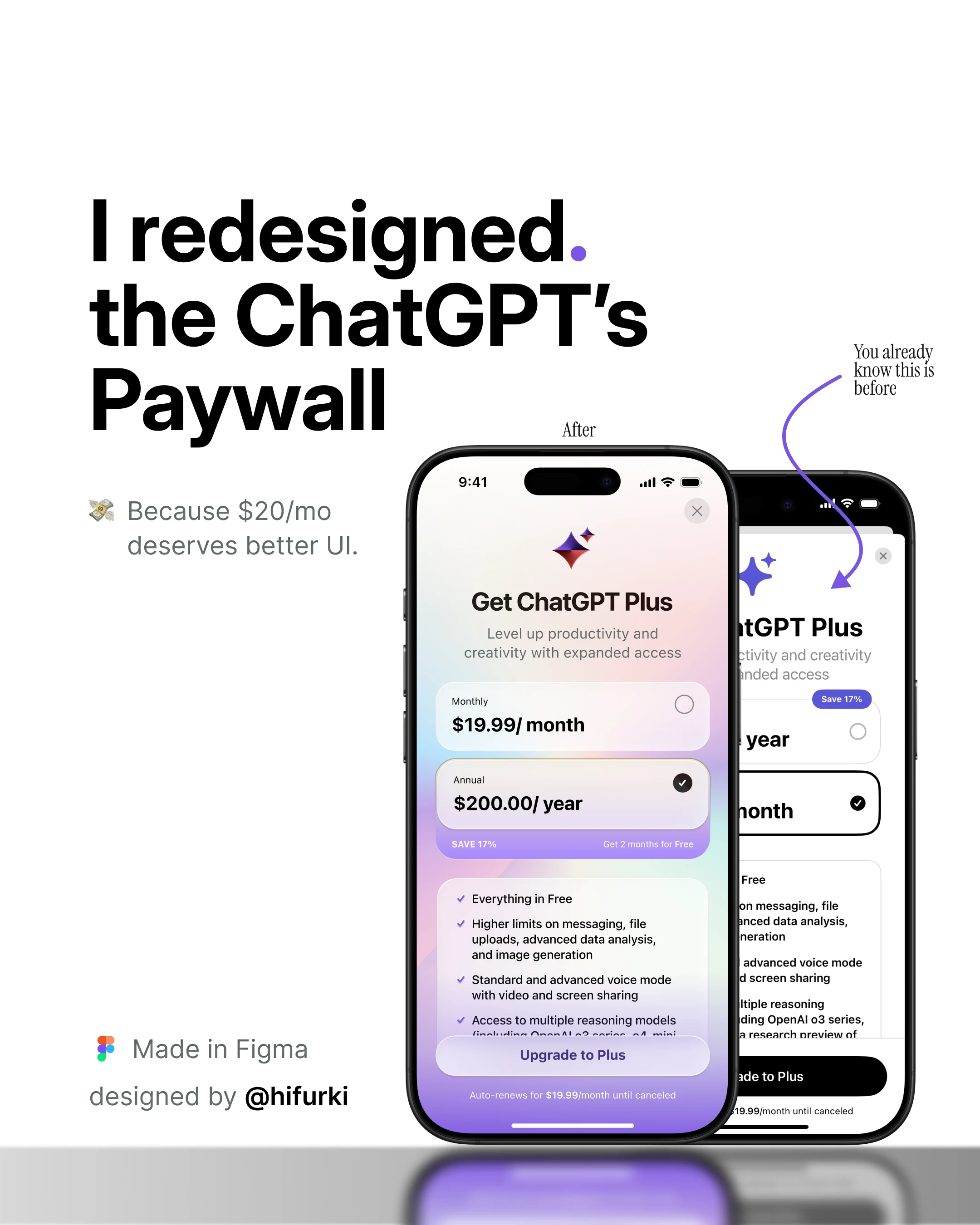
This is a self–initiated concept redesign of the ChatGPT paywall.
I wanted to keep the original structure and content, but improve the visual hierarchy, readability and overall “feel” of the screen on mobile devices.
Rather than doing a complete overhaul, I focused on small, thoughtful UI decisions that make the paywall more approachable and premium.
Before vs After
The “Before” that everyone knows, is very functional but visually compressed
The “After” version uses spacing, contrast and color to guide the eye
Key elements like the primary CTA and preferred plan stand out more
Small changes in spacing, contrast and copy can significantly change how a paywall “feels”, even when the core layout stays the same.
I used Figma to build this UI
Like this project
Posted Nov 1, 2026
Likes
0
Views
0
Tags