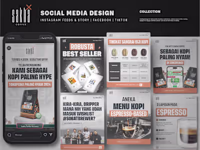
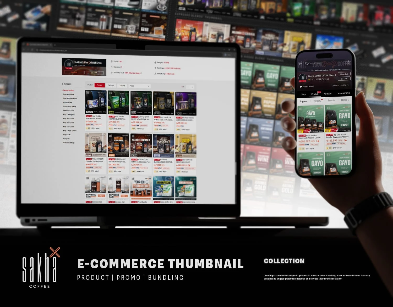
Sakha Coffee: E-Commerce Thumbnail Collection

Zidane fth


Sakha Coffee Roastery
E-Commerce Thumbnail Collection
Client:
Sakha Coffee Roastery
Services:
E-Commerce Thumbnail
Industry:
F&B Retail / E-Commerce
Duration:
1 Day (6 - 10 Thumbnail)
Year:
2024-2025
Project Overview:
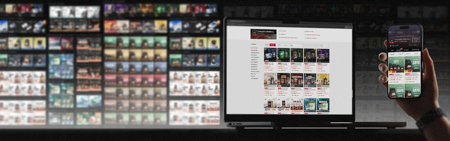
I had the massive opportunity to overhaul the entire ecommerce visual system for Sakha Coffee Roastery. They have an incredible lineup of beans with unique characters, but their online presentation needed a huge upgrade to match. Racing against the clock for a major marketplace promo event, I needed to condense complex coffee details into tiny mobile screens. The mission was to translate the rich taste notes and premium feel of their coffee into a format that works flawlessly and follows the strict safe zone rules across platforms like Shopee, Tokopedia, and Lazada.
My Approach:
I noticed the coffee ecommerce space was visually lazy, with competitors just uploading stiff photos of their bags. I decided to change the game and make the browsing experience feel like exploring a premium coffee shop. I built a highly engaging system focused on visual exploration. I mapped background colors to the origin vibes and illustrated the physical scale of the packaging so buyers could truly understand the product. For the specialty coffees, I gave them exclusive stage lighting and distinct personalities. I even placed the espresso blends right among their actual dessert ingredients to trigger a direct sensory response. By combining these creative concepts with the amazing physical packaging and photography from the internal team, I delivered a digital experience that did more than just boost sales. It actually made people visit the physical store just to compliment the artwork.
Key Features:
Universal marketplace safe zone compliance for seamless viewing
Psychology driven color mapping and character driven visual stages
Mini infographics with clear taste notes and physical grammage scaling
Sensory rich ingredient layouts for espresso blend products
Gamified arcade style interface for custom bundling packages
Bright and hygienic visual contrast for ready to drink espresso lines
1. Coffee Beans Product Thumbnail:
Arabika, Robusta & House BlendI had this massive opportunity to redesign the entire thumbnail system for Sakha Coffee. The goal was to make something universal and completely safe-zone compliant across major marketplaces like Shopee, Tokopedia, and Lazada. The owner gave me the ultimate and honestly scariest brief. He just told me to make it look good.
But here was the real challenge. I was absolutely racing against the clock for a massive e-commerce promo event. I had to somehow find a way to get a ton of complex info like origin, taste notes, and physical size onto a tiny mobile screen without making it look completely cluttered. Looking at the coffee e-commerce space, I saw something that felt a bit lazy. Competitors were mostly just uploading raw photos of their packaging. It was stiff with that "here is the coffee, buy it" approach. There was zero visual storytelling or interactive feel to help people imagine the taste.
I decided I needed a system built on visual exploration. I started with big, blocky typography to act as an immediate hook. Then, to make it less boring, I used different background colors matched to the feel of the coffee's origin. For instance, I chose deep wine red for Temanggung Wine to reflect its rich and fermented notes. Kintamani got a breezy light blue because of its bright and fresh feel, and Papua Wamena was bright yellow to show that sunny, uplifting character. Finally, I focused on the physical size of the packaging by scaling the product images visually. So when you saw 100g versus 1000g, you did not just see numbers, you actually saw the difference in physical size from small to large. Right on the side of the thumbnail, I also built a mini-infographic that integrated flavor illustrations and details. This helped people truly understand the product before they even clicked the image.
The Outcome:
I was so happy with the results. The owner and the senior team loved the new direction, and it proved to be a massive hit almost immediately. Within the first month, I saw a dramatic spike in Click-Through Rates, checkout rates, and product shares on Sakha's e-commerce dashboards. The metrics were incredible and they just kept going up.
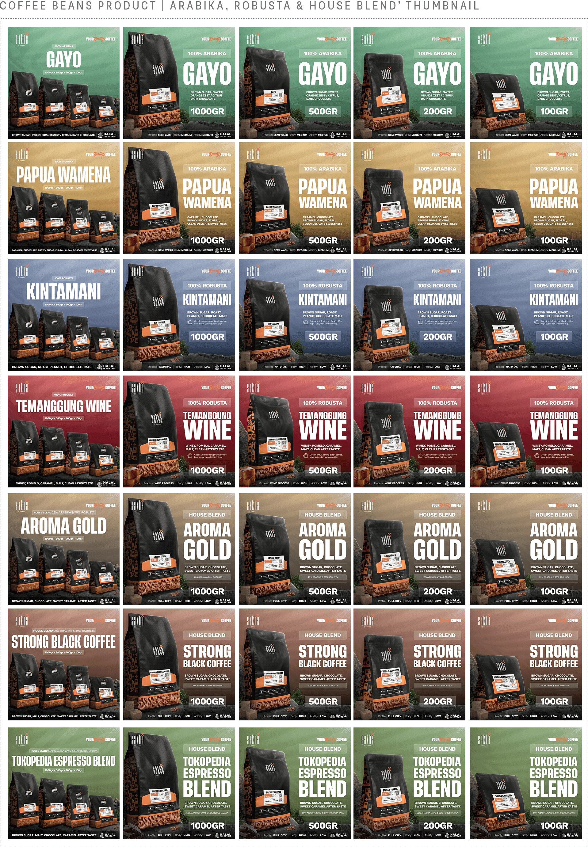
But the real surprise came months later. This visual framework / thumbnail I created accidentally became a kind of industry benchmark. I started seeing competing roasteries, both new ones and established brands, adopting this exact same structure. Seeing my work replicated like that and inspiring other brands to rethink their own presentation was the ultimate compliment. It showed I really made something that resonated with the market.
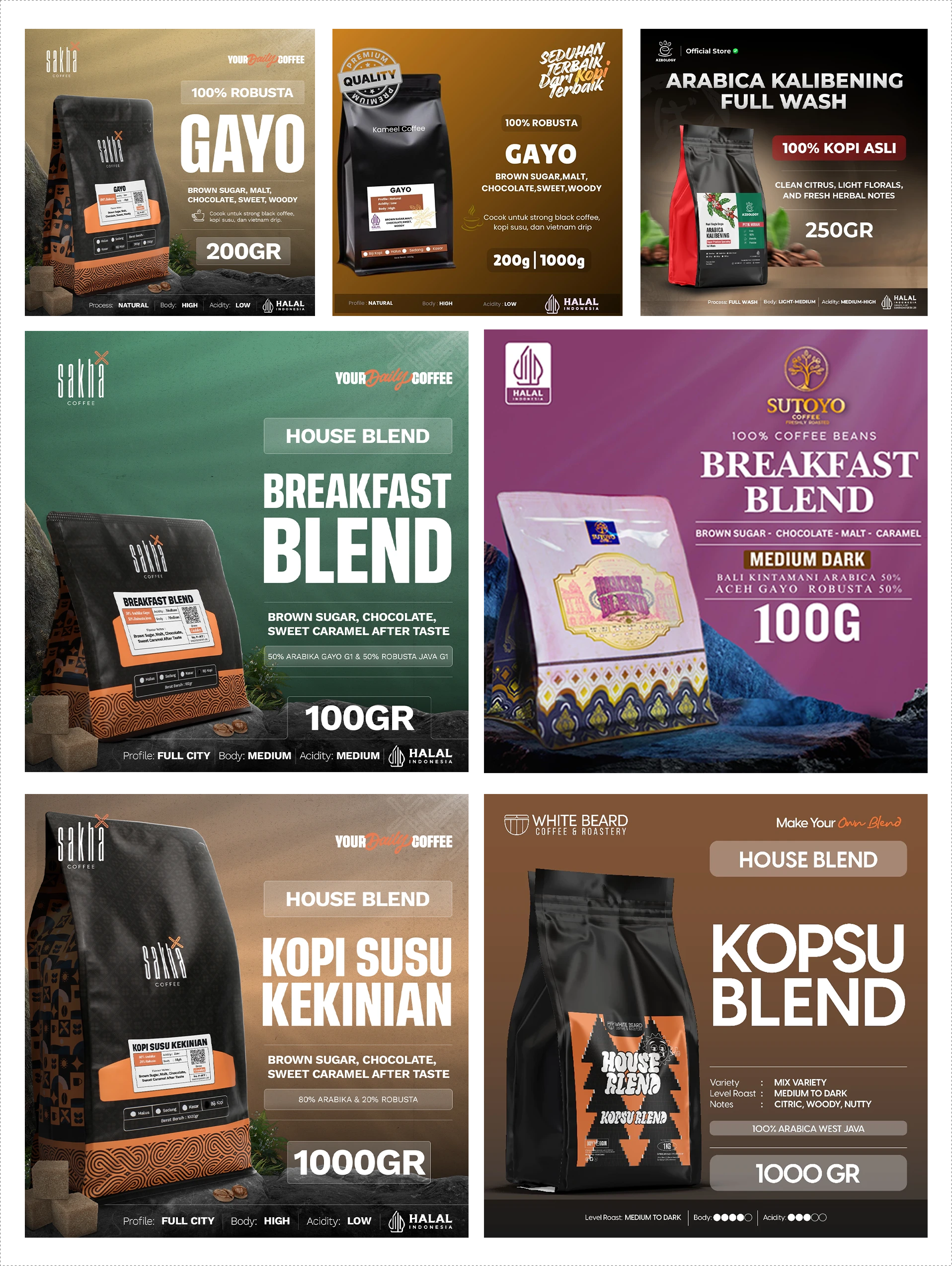
Left: Original Design by Zidanefth (Sakha Coffee Roastery) | Right: The Copycat: Whitebeard Coffee Roastery, Sutoyo Coffee, etc
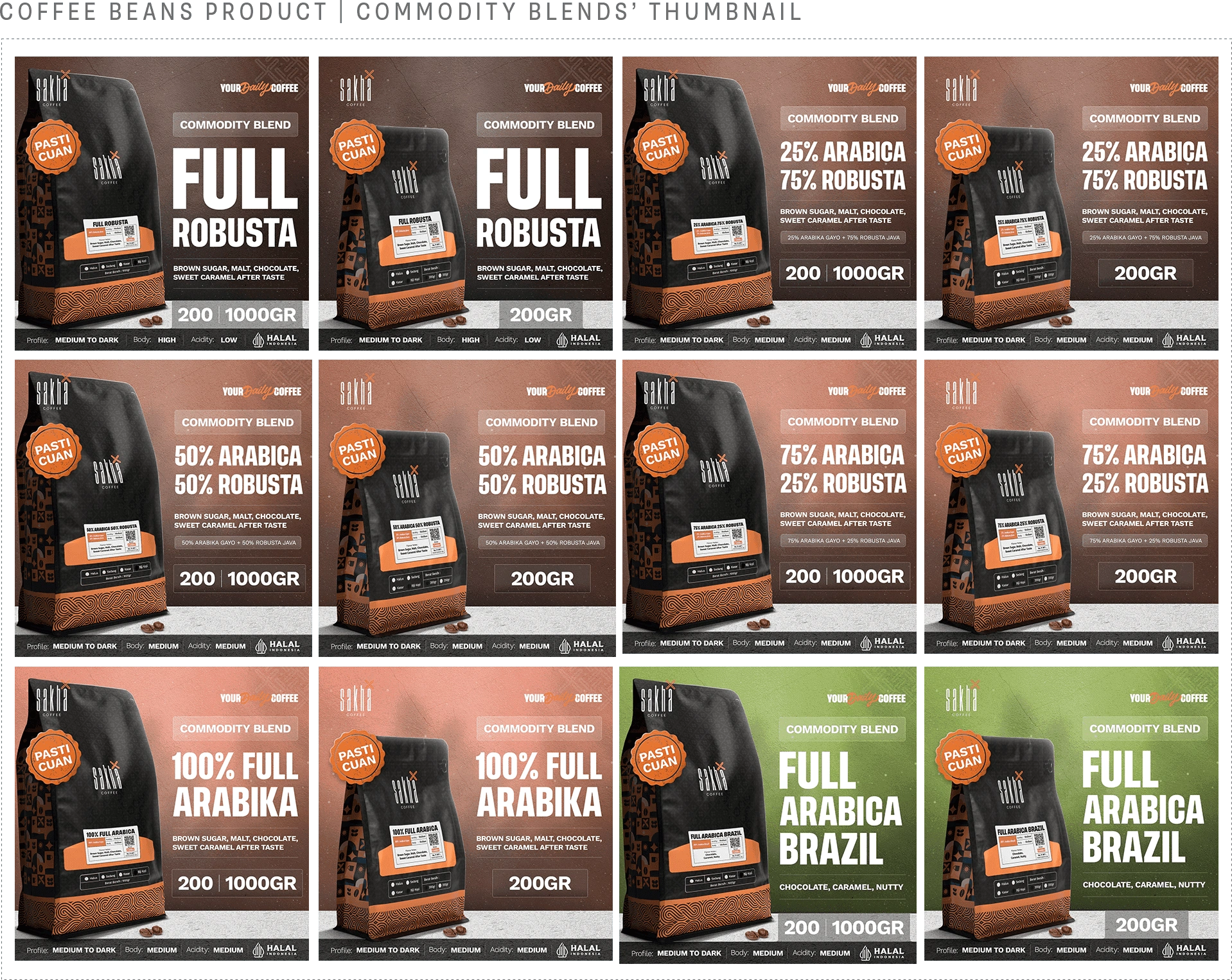
2. Coffee Beans Product Thumbnail:
Commodity BlendAfter setting a new standard with the previous series, I had to tackle a completely different challenge for the Commodity Blend. The target market shifted entirely. I was no longer designing for the casual home brewer. The audience here consisted of cafe owners looking to buy coffee in bulk to stock their shops. These B2B buyers do not have time to casually browse. They know exactly what they want and they need the specifications quickly.
I knew the highly illustrative approach from the previous series would not work for this specific market. I needed to make the design absolutely straight to the point. I stripped away the physical taste note illustrations and replaced them with scattered coffee beans to keep the visual grounded and product-centric. For the backgrounds, I dropped the bright regional colors and developed a gradient system based on the actual coffee intensity. Robusta is typically more bitter and heavy, so I assigned it a deep, dark brown. As the blends moved toward Full Arabica, the background colors became noticeably lighter to reflect a lighter taste profile. The only exception was the special Tokopedia series. For those, I applied their signature bright green to instantly signal a platform-specific product. Everything was built for speed and clarity.
The Outcome:
The response was incredibly positive. I saw a significant jump in Click-Through Rates, and the sales data confirmed I was hitting the exact target market of cafe owners ordering in bulk.
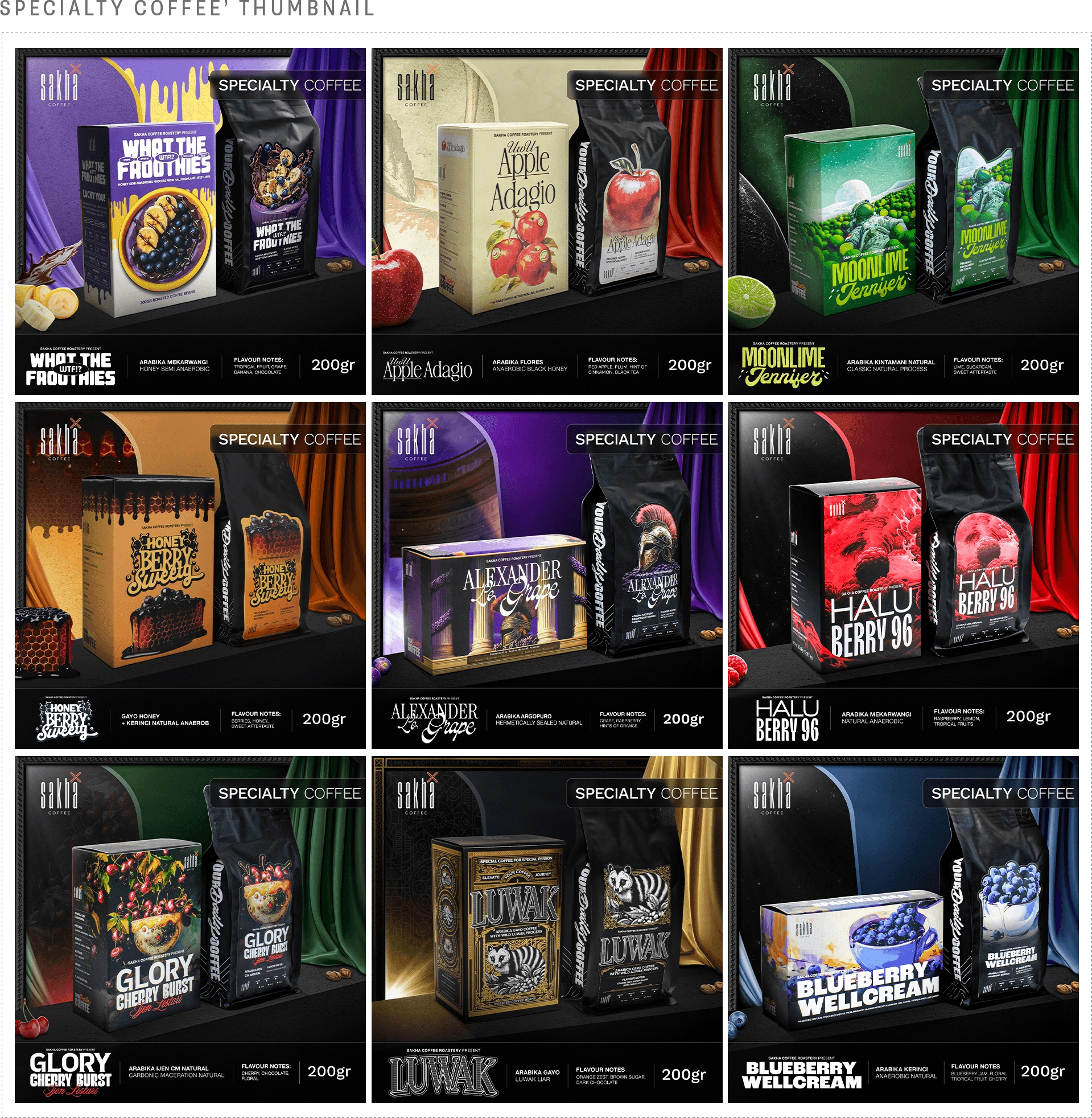
3. Specialty Coffee Thumbnail:
What The Froothies, UwU Apple Adagio, Moonlime Jennifer, Honey Berry Sweety, Alexander Le Grape, Halu Berry 96, Glory Cherry Burst, Arabica Luwak, Blueberry WellcreamFor the Specialty Coffee product, the visual approach needed a massive upgrade. These are premium beans with highly unique flavor profiles and playful names like What The Froothies and Alexander Le Grape. I wanted to step away from the standard layout and create something that felt truly exclusive, vibrant, and full of character. I designed these thumbnails to act like individual stages for each product. Every single blend got its own distinct visual identity, complete with extravagant taste note illustrations and dramatic lighting to match its specific vibe. The goal was simply to make people stop scrolling and say wow.
The Outcome:
The impact went way beyond just e-commerce metrics. This design created real conversations. Customers were actually sending direct messages on the Sakha Coffee Instagram and walking into the physical Sakha Coffee Lab and Store just to compliment the artwork. They specifically mentioned how characterful and beautiful the online store looked. It proved that great e-commerce design does not just sell products, it builds brand love.
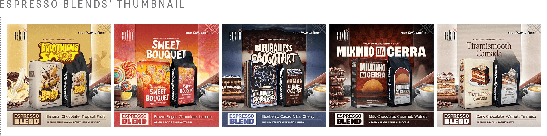
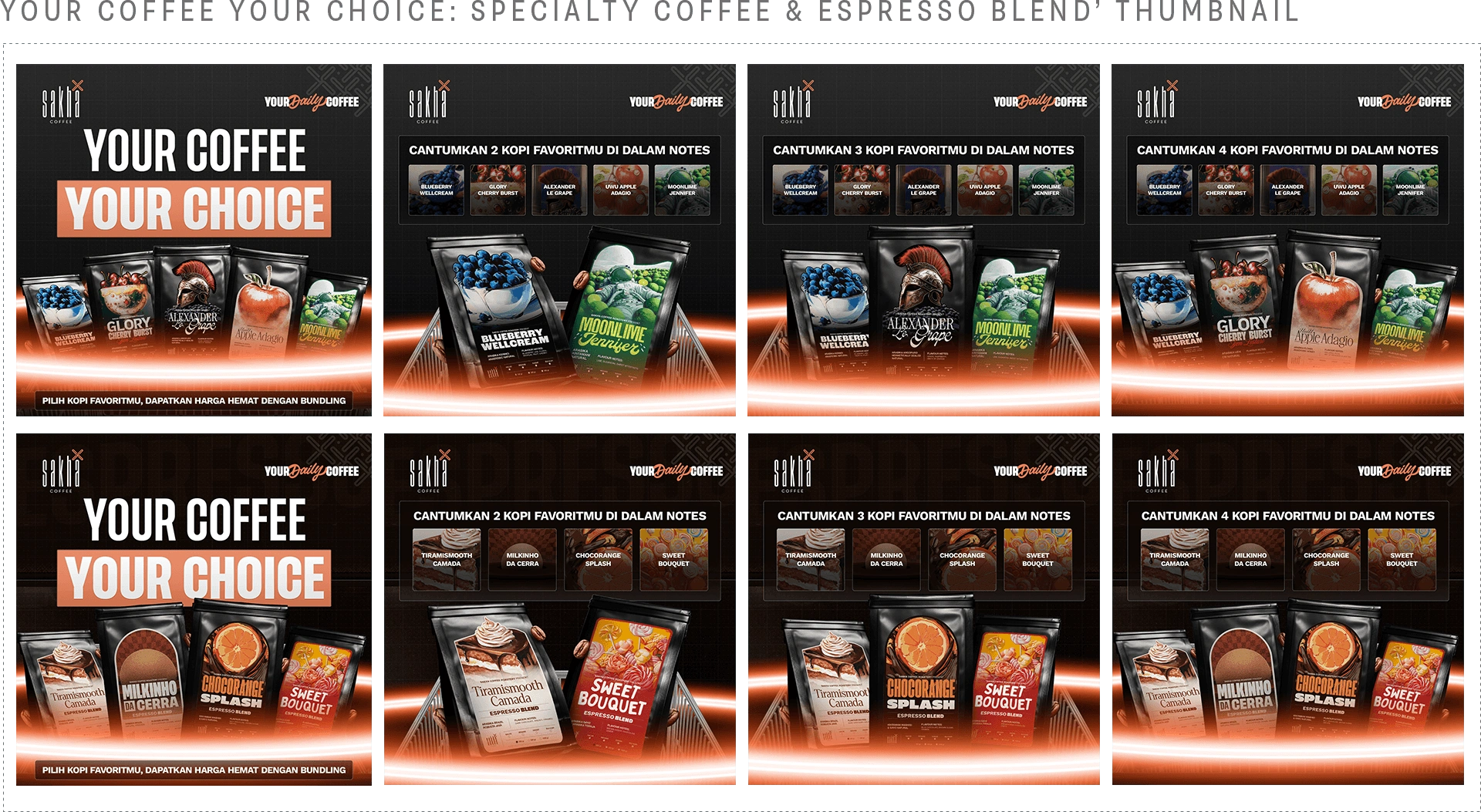
4. Espresso Blend Thumbnail:
The Froothious Shot, Sweet Bouquet, Bluebailess Chocotart, Milkinho Da Cerra, Tiramismooth CamadaFollowing the success of the Specialty series, I applied a similar illustrative approach to the Espresso Blends. With playful names like Tiramismooth Camada and Sweet Bouquet, these coffees are all about rich and dessert inspired flavor notes. I designed each thumbnail to feel like a visual feast. I placed the packaging right in the middle of its core ingredients like cakes, candies, and fruits. Then I anchored the whole layout with a fresh cup of espresso so buyers instantly know the best brewing method for this specific lineup.
The Outcome:
The result was a highly appetizing collection that stood out instantly on any marketplace. It made browsing the online shop feel less like buying standard coffee beans and more like looking at a premium dessert menu.
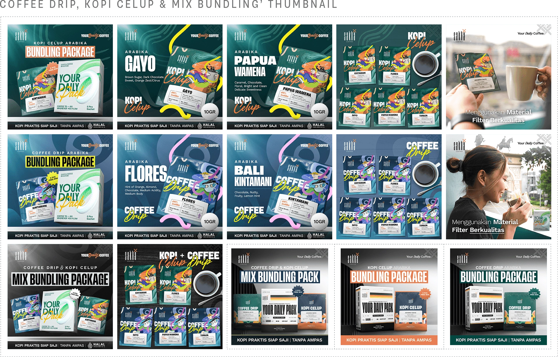
5. Ready-to-Brew Coffee Thumbnail:
Coffee Drip, Kopi Celup & Mix BundlingFor the ready-to-brew lineup, the design process was all about seamless collaboration and visual continuity. The physical packaging for these products was brilliantly designed by Fauzi Herdana, our Senior Graphic Designer. When translating his work into e-commerce thumbnails, I wanted to honor his original vision while maximizing digital impact. I extracted key graphical elements directly from his packaging design and repurposed them as dynamic backgrounds. This created a strong, instant visual identity that clearly separated the Kopi Celup from the Coffee Drip series. To complete the shopping experience, I integrated lifestyle product shots taken by our photographer, Ilham Arifin, giving buyers a real-world feel of the brewing process right inside the image gallery.
The Outcome:
This project proved that a strong brand identity requires perfect alignment across all touchpoints. By actively building upon the existing packaging design and utilizing high-quality photography from the team, I created a cohesive online experience. The final thumbnails felt less like standalone graphics and more like a direct, digital extension of the physical product.
6. Ready-to-Drink Coffee Thumbnail:
Espresso Cair: Espresso Kopi Susu, Full Arabika, Robusta Java, Signature Blend, Special Gold | Your Coffee Your ChoiceFor the ready-to-drink Espresso Cair lineup, I took a completely different visual approach. Liquid espresso is naturally dark and heavy. Most brands just use dark backgrounds to match the coffee, but I decided to do the exact opposite. I used bright, clean, and minimalist backgrounds to create a strong visual contrast. I wanted the dark liquid to truly pop off the screen. More importantly, this bright aesthetic communicates cleanliness and hygiene. Whether the buyer is a casual home consumer or a street vendor using it for their mobile coffee cart, they need to trust that the liquid is pristine and professionally made. The clean design instantly builds that trust and proves it is not just some rushed or rough concoction.
The Outcome:
The bold contrast worked perfectly. The thumbnails stood out massively against the dark and cluttered grids of the e-commerce marketplace. It positioned the Espresso Cair as a premium and highly reliable product. This successfully attracted both individual consumers and small business owners who felt completely confident using our liquid espresso for their own daily sales.
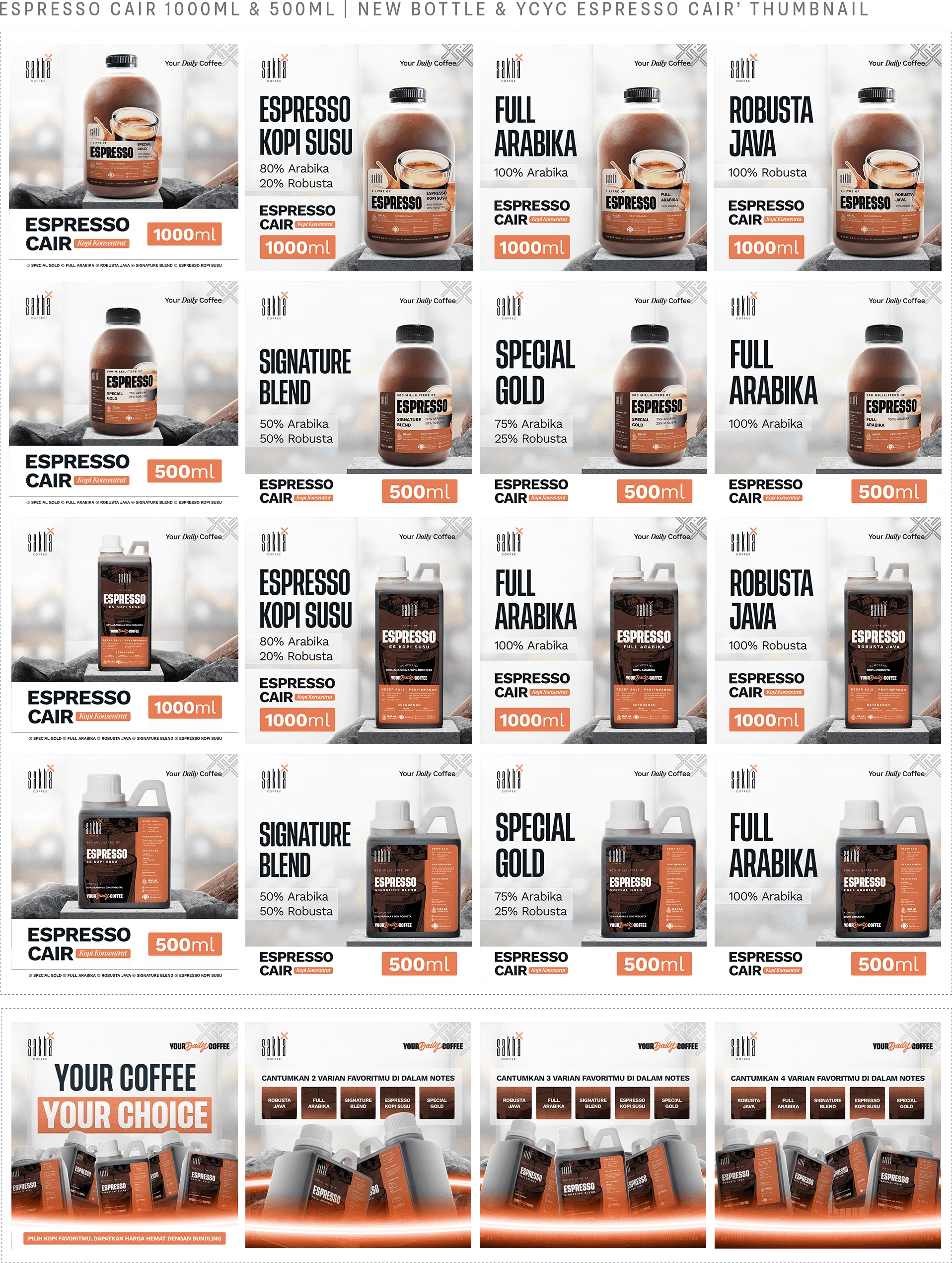
7. Your Coffee Your Choice Bundling Thumbnail:
Specialty Coffee & Espresso Cair 200grFor the custom bundling packages, I wanted to make the shopping experience feel interactive and fun. Instead of just stacking the products normally, I designed the thumbnails to look like an arcade interface or a video game character selection screen. Since buyers can mix and match two to five variants, I built a visual layout that clearly guides their choices. To emphasize the online shopping aspect, I placed a glowing shopping basket at the bottom. The 200g coffee packs look like they are being magically summoned directly from the cart. It turns a standard promotional image into a playful digital experience.
The Outcome:
This gamified approach made the bundling offer highly engaging. The arcade style immediately hooked customers as they scrolled through the marketplace. It successfully encouraged buyers to explore different flavor combinations and boosted the average order value by making the act of buying multiple packs feel fun and rewarding.
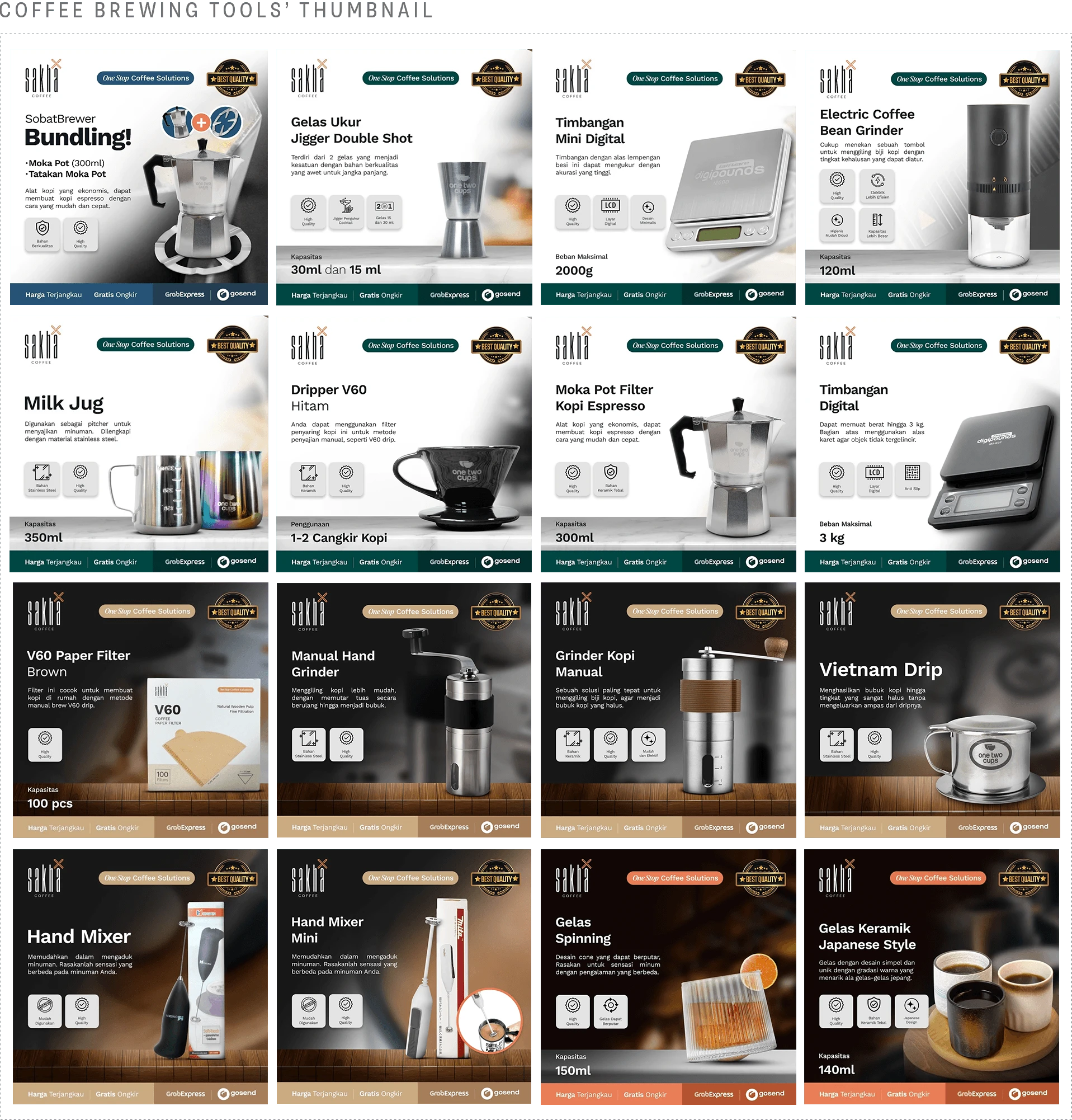
6. Coffee Brewing Tools Thumbnail:
Kettle, Vietnam Drip, Milk Jug, Coffee Grinder, EtcDesigning for hardware and brewing tools requires a very practical mindset. When customers buy equipment like grinders or milk jugs, they want to see exactly what they are getting right away. I made the product the absolute center of attention to highlight the item immediately. Right next to the product, I placed clean icons to clearly show off its specific features and plus points. To push the final buying decision, I added strong interest labels directly into the layout. Badges highlighting high quality, free shipping, and affordable prices act as immediate triggers for the buyer. It is all about giving them zero reasons to hesitate.
The Outcome:
This straightforward and highly informative layout removed any guesswork for the shopper. By answering their technical questions visually before they even had to read the long product description, the thumbnails effectively built buyer trust. This direct communication strategy successfully drove much faster checkout decisions for the entire equipment lineup.
Results:
3x : Average Click Through Rate Growth
+150% : Increase in Overall Product Checkouts
Client Feedback:
We handed him a massive catalog project with an incredibly tight promo deadline. He delivered an agency level visual system that completely transformed our entire digital presence. Working with him is incredibly smooth. He is insanely reliable and his output is always top tier.
Rahadie & Sephia, Sakha Coffee Marketing & Ads Team
Strategy and design by Zidanefth. E-Commerce visual systems for Sakha Coffee Roastery.
Like this project
Posted Mar 28, 2026
Designed a high converting ecommerce thumbnail system for Sakha Coffee. Used color psychology and infographics to massively boost marketplace CTR and sales.
Likes
1
Views
0
Timeline
Jun 5, 2024 - Aug 13, 2025