Internet Insights.
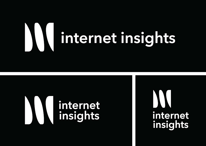
When creating this logo I heavily focused on the word "insights". The logo uses negative space to form two i's. These i's are what gives you insight, through an otherwise all solid coloured square.
The logo is made to fit most media and spaces, but the main logo is made to be suitable for use on a website.
2022


