I wanted this portfolio showcase

Ann Netreba


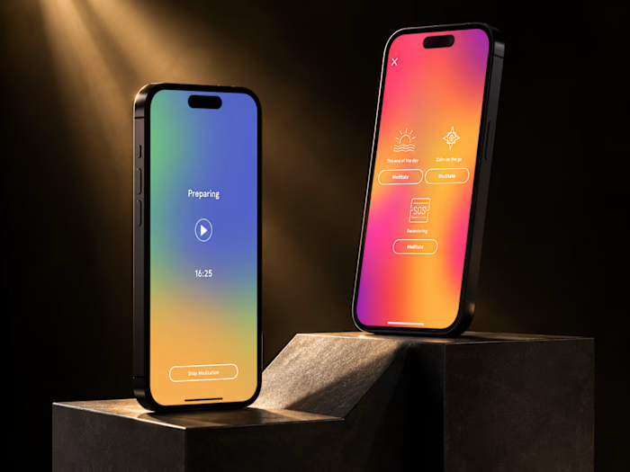
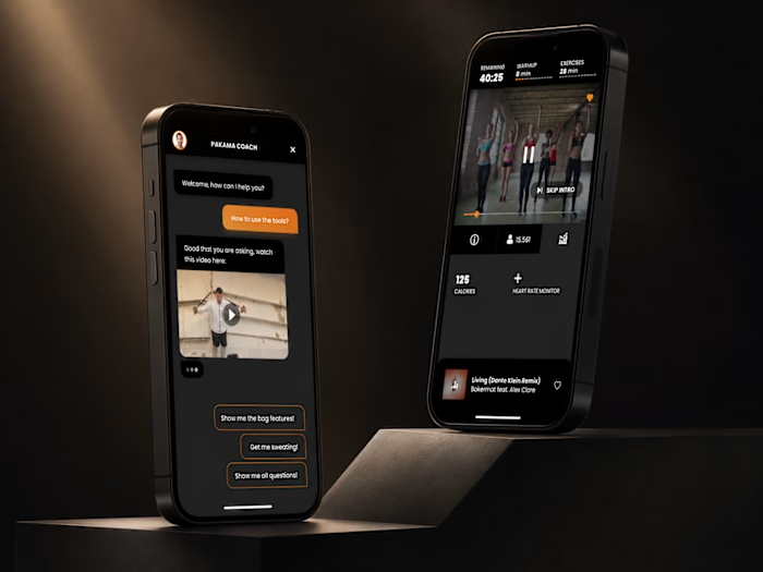
I wanted this portfolio showcase to feel like a real product ecosystem, not just another row of mobile screens.
So instead of showing the app in isolation, I built the visual around the full experience discovering cold plunge and sauna locations on mobile, tracking a session in real time, and continuing that experience on a smartwatch.
The interesting part for me was making three very different screens still feel like one product: same visual language, same hierarchy, same sense of calm and focus.
I’m especially interested in products where mobile and wearable experiences work together rather than feeling like two separate apps.
What’s one feature you think becomes much better when it moves from phone to smartwatch?
Like this project
Posted Aug 24, 2026
I wanted this portfolio showcase to feel like a real product ecosystem, not just another row of mobile screens. So instead of showing the app in isolation, I...
Likes
0
Views
8