
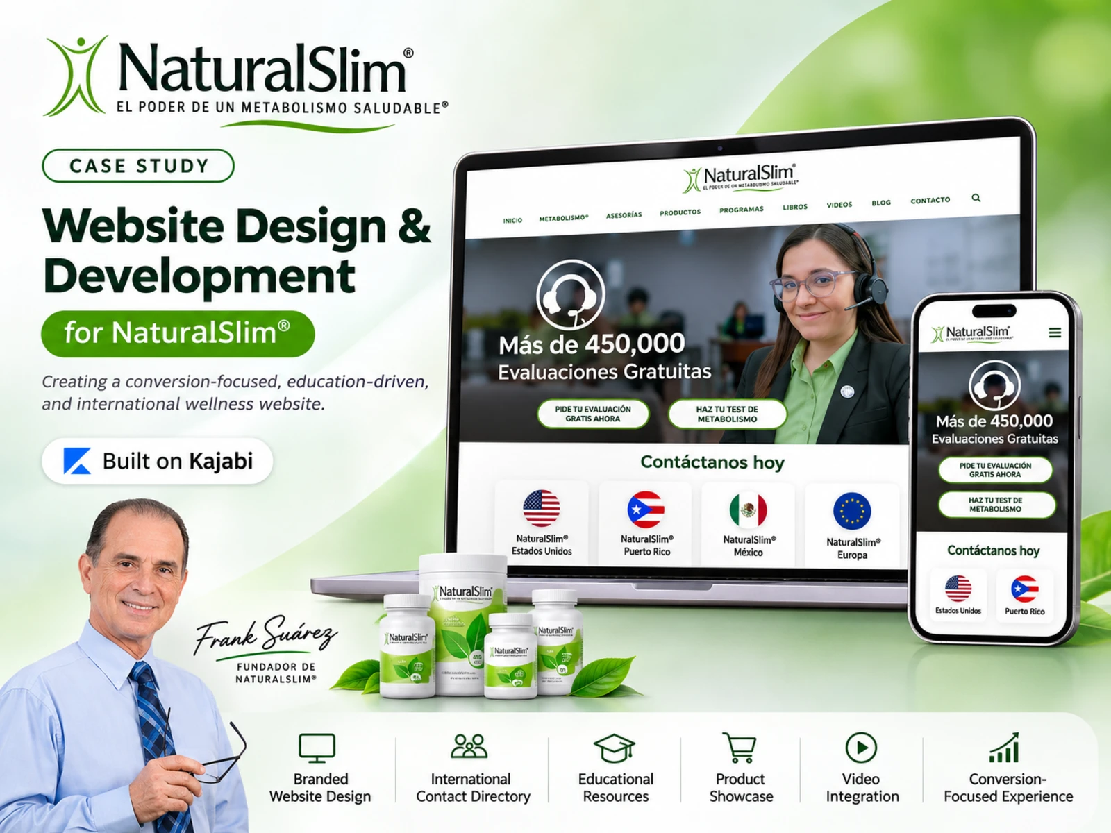
NaturalSlim® - Kajabi Website Design & Development Case Study
Project: NaturalSlim® Website
Client: NaturalSlim®
Industry: Health, Wellness & Nutrition
Platform: Kajabi
Project Category: Website Design, Development & User Experience
Project Website: https://naturalslim.com
Primary Language: Spanish
Target Audience: International, Spanish-speaking health and wellness audiences
01. Executive Summary
NaturalSlim® is an established international health and wellness brand founded by Frank Suárez, known for its educational approach to metabolism, nutrition, weight management, and healthier lifestyle habits.
With a broad audience spanning multiple countries, an extensive collection of educational content, nutritional products, customer success stories, and consultation services, NaturalSlim required a digital experience capable of communicating its brand identity while accommodating different visitor needs.
The NaturalSlim website project focused on developing a professional, informative, and conversion-oriented website using Kajabi.
The objective was to create a unified online experience where visitors could learn about NaturalSlim, understand its approach, explore available resources, discover success stories, request free metabolism evaluations, and connect with the appropriate country-specific representatives.
The project brought together brand presentation, structured information architecture, visual storytelling, and strategic calls to action.
Rather than treating the website as a collection of individual pages, the design approach considered the entire visitor experience—from a user's first interaction with the homepage to their decision to explore the brand's services.
The resulting website provides a coherent framework for presenting NaturalSlim's services, educational resources, products, and international operations through a recognizable visual identity.
02. Understanding the Client and Business
About NaturalSlim®
NaturalSlim® is a health and wellness organization centered on education about metabolism and lifestyle habits.
Founded by Frank Suárez, the brand has developed an extensive educational ecosystem consisting of books, video content, nutrition-related resources, supplements, and personal guidance.
The company's communication emphasizes helping individuals understand how lifestyle habits relate to their metabolism and weight-management goals.
An important aspect of NaturalSlim's identity is its emphasis on education.
The brand presents knowledge as a foundation for making informed lifestyle decisions rather than concentrating exclusively on selling nutritional products.
This educational philosophy is reflected throughout its website content, especially through founder messaging, educational media, customer testimonials, and resource collections.
Business Context
NaturalSlim operates across several international markets and serves visitors with different expectations.
Some visitors arrive already familiar with Frank Suárez and his educational work. Others discover the brand through a particular wellness topic, a video, or a product recommendation.
The website therefore needed to accommodate visitors at different stages of familiarity and purchase intent.
For example:
A first-time visitor might want to understand what NaturalSlim is and how its system works.
A potential customer might be interested in requesting a free metabolism evaluation.
An existing follower might want access to videos, books, or educational resources.
An international visitor might need to find the relevant NaturalSlim office or contact representative.
A returning customer might want to revisit information about available products or services.
These distinct user needs informed the project's content structure and interaction design.
03. The Project Challenge
Designing for a Content-Rich International Brand
The central challenge was to translate NaturalSlim's broad range of information, services, and brand messaging into a cohesive digital experience.
The brand's website needed to present multiple types of content without overwhelming visitors or disrupting their ability to locate important information.
This required balancing educational content with conversion opportunities, promotional messaging with brand credibility, and international accessibility with a consistent user interface.
Challenge 1: Organizing a Large Amount of Information
NaturalSlim's content spans company information, metabolism education, books, products, evaluations, videos, testimonials, and contact details.
Without an intentional content hierarchy, visitors could struggle to determine where to begin.
The website needed a structure that prioritized the most important information while allowing users to explore deeper content at their own pace.
Challenge 2: Supporting an International Audience
Visitors from different countries require different contact options.
Displaying contact details without clear geographical organization could create confusion, especially when individual offices use different telephone numbers, websites, and service channels.
The solution needed to make the geographical distinctions immediately recognizable.
Challenge 3: Balancing Education and Conversion
NaturalSlim's business model places considerable emphasis on educating potential customers.
However, the website also needs to encourage users to request evaluations and contact the brand.
An overly promotional design might weaken the educational experience, while an overly informational design could make the next step unclear.
The challenge was to bring these two objectives together.
Challenge 4: Maintaining Brand Credibility
Health and wellness is a sensitive, information-driven industry in which visitors often look for reassurance and credibility.
The website needed to communicate professionalism, brand history, and educational authority without relying exclusively on promotional claims.
Founder photography, branded product imagery, testimonials, and educational content were important elements of this presentation.
Challenge 5: Creating a Consistent Experience in Kajabi
The project required a design approach that could bring together multiple homepage sections, visual components, and content types while maintaining a consistent appearance.
That meant establishing reusable design patterns, coherent spacing, recognizable action buttons, and a clear visual hierarchy within the Kajabi website environment.
04. Project Objectives
The project was guided by six major objectives.
1. Build a Professional and Recognizable Brand Experience
Create a website that reflects NaturalSlim's established brand identity through its signature color palette, logo, imagery, typography, and messaging.
2. Improve Information Discovery
Make it easier for users to move between company information, educational resources, products, testimonials, and contact pathways.
3. Encourage Meaningful Visitor Actions
Give visitors clear opportunities to request free evaluations, explore metabolism-related resources, and contact NaturalSlim representatives.
4. Establish a Scalable Content Structure
Organize different content formats into clearly defined sections that can support updates and future additions without compromising the overall design.
5. Serve Multiple International Markets
Provide recognizable country-specific contact information so visitors can identify relevant representatives and communication channels.
6. Deliver a Cohesive Kajabi Website Experience
Use Kajabi as the foundation for a unified website that combines branded content, service-related information, educational media, and visitor engagement opportunities.
05. Discovery, Planning & Information Architecture
Understanding the Audience
An effective website begins with understanding what users need from the experience.
For NaturalSlim, the key audience groups were defined through their likely website goals and the content available to them.
New Visitors
These users need a clear introduction to NaturalSlim, its mission, and the services it offers.
Their primary questions include:
What is NaturalSlim?
How does the system work?
What makes the company different?
Where should I begin?
Prospective Customers
These visitors have an existing interest in improving their wellness habits or exploring NaturalSlim's services.
Their priorities include understanding the evaluation process, finding relevant support, and identifying how to contact the company.
Educational Content Consumers
These users are interested in Frank Suárez's books, metabolism-related videos, and other learning resources.
They benefit from accessible, clearly categorized educational materials.
International Visitors
These users need to determine which country-specific service channel is relevant to them.
For this audience, accurate labeling and simple contact navigation are particularly important.
Information Architecture Strategy
The homepage was organized as a structured journey through the brand.
The sequence introduces NaturalSlim, presents opportunities for direct contact, communicates its history and educational approach, demonstrates its available offerings, and highlights supporting resources.
This arrangement allows the website to serve as both an introduction to the company and a navigation point for exploring its wider digital ecosystem.
Homepage Content Architecture
The visible homepage follows this general structure:
Header and primary navigation
Hero section and free-evaluation messaging
International contact directory
Introduction to NaturalSlim
Founder and brand philosophy
Metabolism and weight-management program information
Product-related visual presentation
Customer testimonials
Metabolism education section
Educational books and learning materials
Customer success content
NaturalSlim system explanation
Educational video gallery
MetabolismoTV® resources
Additional founder and educational content
Footer navigation and support information
This structure creates a comprehensive overview without requiring every topic to compete for attention at the top of the page.
06. Visual Design Strategy
Establishing the Brand Direction
The design uses NaturalSlim's established visual identity to create a clean, familiar, and recognizable experience.
The website incorporates green accents, white backgrounds, natural imagery, branded product photography, and educational illustrations.
Each element contributes to the overall visual language.
Color Palette
Primary Green
Green is the dominant accent used in headings, buttons, and supporting elements.
It reinforces the brand's identity and creates a visual association with NaturalSlim's natural wellness positioning.
White and Light Neutrals
White backgrounds create separation between sections, improve readability, and allow imagery and calls to action to remain prominent.
Light-gray backgrounds are used to distinguish certain content groups, including testimonial areas.
Dark Text
Dark text provides contrast against lighter backgrounds, supporting readability and helping important information stand out.
Soft Green Background Imagery
Some sections incorporate green gradients or nature-inspired imagery to add warmth and create variation between informational blocks.
Typography
The website uses a clear typographic hierarchy to distinguish major section titles, supporting headings, body content, and calls to action.
Strong section headings help visitors quickly understand the purpose of each content block.
Smaller supporting text provides explanations without competing visually with the primary message.
Buttons and Interactive Elements
Green buttons act as the dominant visual treatment for important actions.
Rounded corners, consistent colors, and clear placement help distinguish clickable actions from surrounding body content.
This creates a more predictable interaction experience as visitors move through the page.
Imagery and Visual Storytelling
NaturalSlim's visual content includes:
Brand representatives and customer support imagery
Founder photographs
Product collections
Books and educational materials
Customer success imagery
Metabolism illustrations
Video thumbnails
Using varied imagery helps support the different goals of each section while maintaining the central brand narrative.
07. Kajabi Website Design & Development
Platform Overview
Kajabi was the platform used for the website project.
The development approach focused on building a cohesive branded experience that supports the presentation of NaturalSlim's content and visitor engagement opportunities.
For a content-rich project like NaturalSlim, the principal implementation considerations include page structure, visual consistency, navigation, media presentation, responsive behavior, and the arrangement of conversion elements.
Page Structure and Content Organization
The website contains a series of distinct content sections.
Each section has its own communication objective, but shares common styling and layout conventions.
This section-based approach improves content clarity and supports a more manageable design structure.
Header and Navigation
The header presents the NaturalSlim logo and a primary navigation system.
The navigation is designed to give visitors access to relevant areas of the website while maintaining a consistent brand presence.
A clearly positioned header is particularly important for websites with a substantial amount of educational and supporting content.
Content Section Development
The homepage incorporates several presentation patterns:
Full-width hero imagery
Text-and-image content sections
Repeating multi-column cards
Product-focused imagery
Testimonial blocks
Educational illustration groups
Video galleries
Footer navigation columns
Using different layouts helps communicate the purpose of each section while maintaining a consistent overall experience.
Media Integration
The website uses photographic and video-based content to support brand storytelling and education.
Product imagery highlights recognizable brand offerings, while founder photography and video thumbnails help connect visitors to NaturalSlim's educational ecosystem.
Conversion Element Placement
Calls to action appear at relevant points across the visitor journey.
The website introduces evaluation-related actions near the top of the page and provides additional opportunities for contact and resource exploration throughout the homepage.
This reduces dependence on any single conversion location.
Kajabi Implementation Boundaries
The confirmed project platform is Kajabi. The visible website demonstrates the layout and content decisions described in this case study.
Specific behind-the-scenes configurations—such as custom HTML/CSS, Kajabi forms, pipelines, automations, checkout flows, CRM rules, and third-party integrations—are not documented here as completed deliverables because their implementation details have not yet been established.
This distinction keeps the case study technically accurate while preserving its focus on the completed website design and experience.
08. Detailed Homepage Design Breakdown
Section 1: Homepage Hero
Purpose: Introduce the primary offering and encourage immediate engagement.
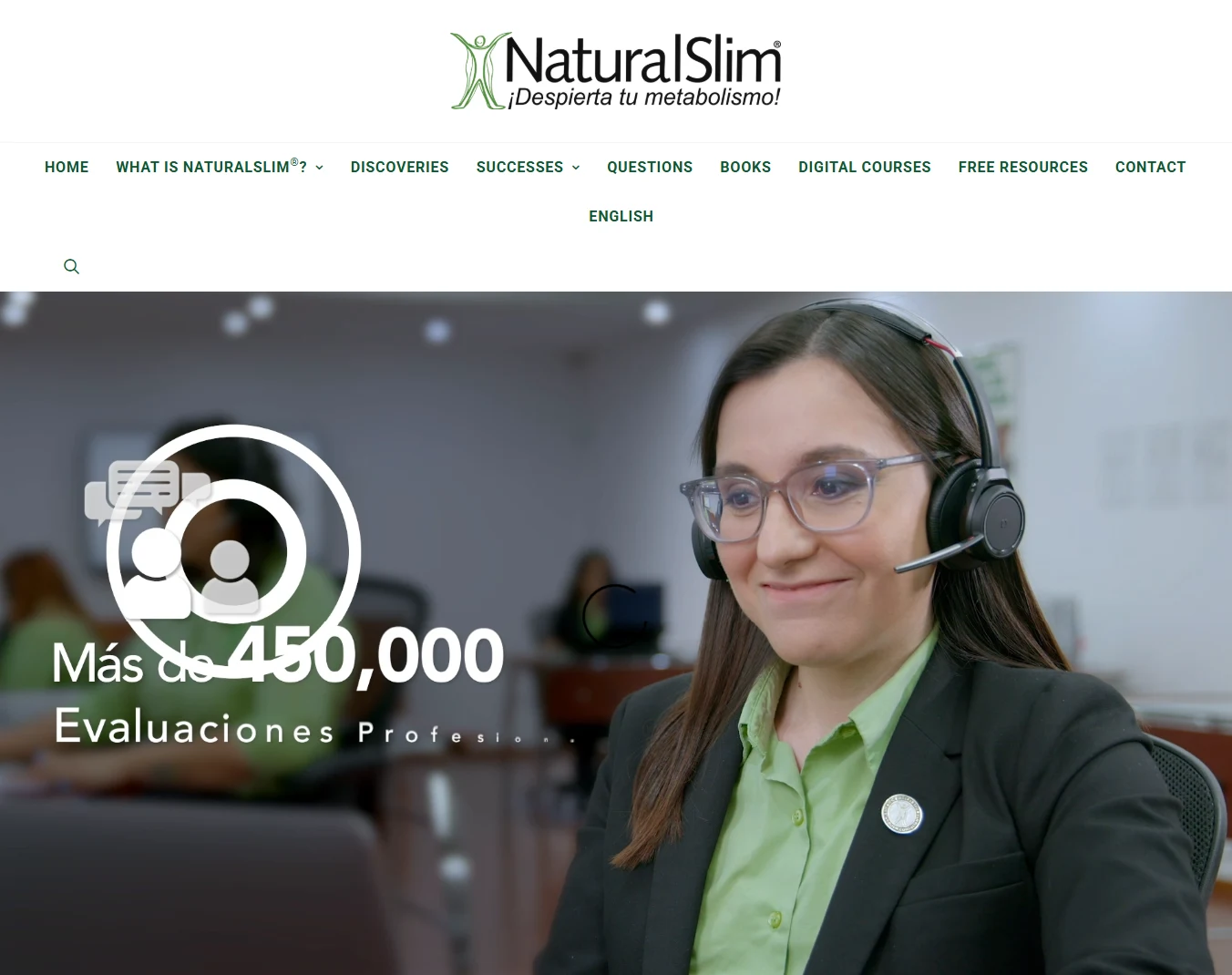
The homepage opens with a prominent hero section featuring a representative wearing a headset.
The image communicates direct customer support and creates a human connection with the brand.
The hero messaging emphasizes free evaluations, establishing a clear introductory action for visitors interested in NaturalSlim's services.
Design Decisions
Use large imagery to immediately capture attention.
Communicate the primary offering near the top of the page.
Introduce clear actions without requiring visitors to scroll through extensive information.
Use brand colors to maintain visual consistency.
UX Value
The hero helps visitors identify a potential next step soon after arriving on the website.
Section 2: International Contact Directory
Purpose: Connect visitors with country-specific NaturalSlim representatives.
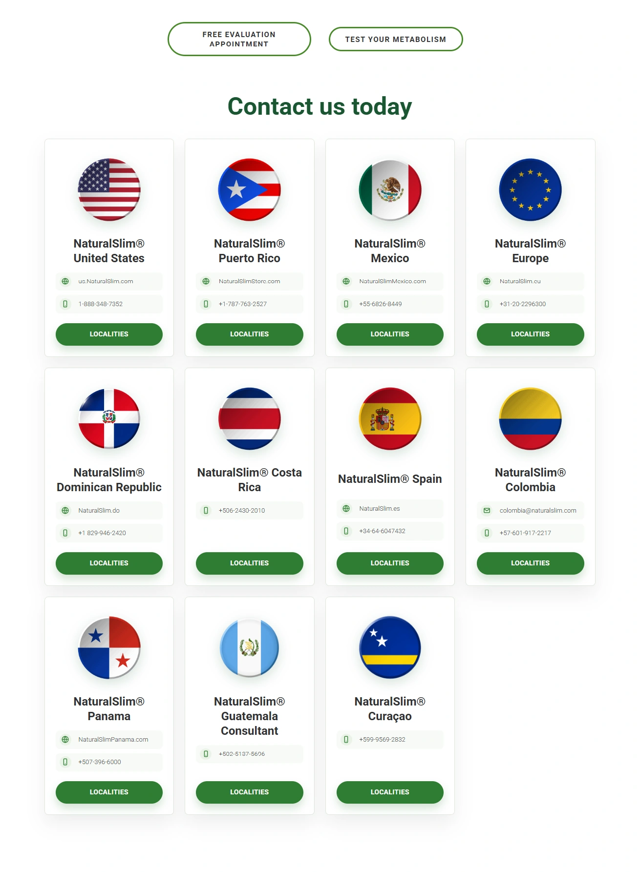
The contact section uses a grid of individual country cards.
Each card presents a recognizable national flag, location information, and a corresponding action.
The cards are arranged consistently, making the section easy to scan.
Design Decisions
Use flags as immediate geographical identifiers.
Maintain a consistent card structure.
Group related information within each country card.
Use recognizable green action buttons.
Present several countries together while preserving visual separation.
UX Value
This directory makes it easier for international visitors to locate relevant contact pathways.
It also reduces the visual complexity of presenting multiple countries, telephone numbers, and service options in one location.
Section 3: What Is NaturalSlim?
Purpose: Introduce the company and its central philosophy.
This section provides a concise explanation of NaturalSlim and its approach to metabolism education.
The section uses a clear heading and supporting text to establish the brand's positioning.
Design Decisions
Introduce the brand through a direct question.
Use a recognizable heading.
Place explanatory text in a dedicated section.
Separate company information from promotional content.
UX Value
New visitors can develop an initial understanding of NaturalSlim before exploring more detailed content.
Section 4: Founder Story and Brand Philosophy
Purpose: Establish a connection between the brand and its founder.
This section features Frank Suárez alongside brand messaging.
The presentation emphasizes the founder's role in shaping NaturalSlim's educational approach.
Design Decisions
Use founder photography as the central visual element.
Present the brand philosophy in a distinct section.
Use background imagery to create visual separation.
Integrate the founder's name into the composition.
UX Value
The section helps visitors understand the history and personality behind the brand.
Section 5: NaturalSlim Program Introduction
Purpose: Explain the brand's approach to weight management.

A major homepage section introduces NaturalSlim's system through a prominent headline and supporting content.
This area communicates the company's educational and wellness positioning while establishing a bridge between introductory information and related products or services.
Design Decisions
Use a strong headline to define the section's purpose.
Present explanatory content below the heading.
Maintain a clear reading hierarchy.
Use supporting visual content to strengthen the message.
UX Value
Visitors are given an opportunity to understand the company's program before being directed toward additional resources.
Section 6: Product Presentation
Purpose: Introduce the range of NaturalSlim-branded products.
The website features product photography arranged as a cohesive group.
This imagery reinforces brand recognition and visually connects the company's educational message with its product ecosystem.
Design Decisions
Use recognizable branded product imagery.
Present multiple products as a coordinated collection.
Maintain spacing between supporting information and visual assets.
Integrate the imagery into the broader brand narrative.
UX Value
The section helps visitors recognize the types of products associated with NaturalSlim without turning the homepage into an extensive product catalog.
Section 7: Customer Testimonials
Purpose: Introduce social proof.
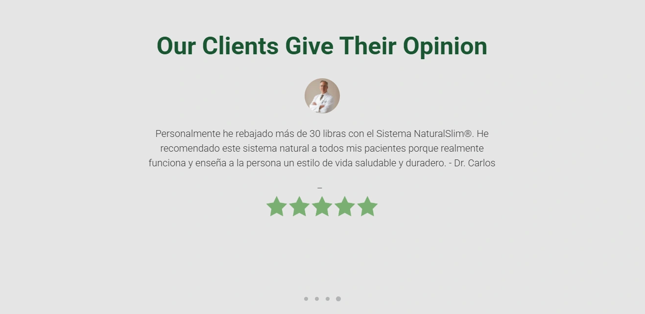
The testimonial section uses a contrasting background to separate customer experiences from informational content.
It includes customer feedback, rating imagery, and carousel-style presentation indicators.
Design Decisions
Separate testimonials with a distinct background.
Use a clear customer-focused heading.
Include visual rating elements.
Keep the feedback layout focused and readable.
UX Value
Visitors can explore customer experiences as part of their evaluation of the brand.
Testimonials are presented as individual experiences, rather than independently verified evidence of typical health outcomes.
Section 8: Metabolism Education
Purpose: Introduce metabolism-related educational content.
The website includes a dedicated section addressing metabolism.
Illustrations and supporting text communicate the educational focus of the brand in a more visual format.
Design Decisions
Use descriptive headings to introduce educational topics.
Combine illustrations with explanatory content.
Present complex topics in smaller visual groups.
Maintain a consistent aesthetic across diagrams and supporting text.
UX Value
Visual presentation makes the material more approachable and encourages visitors to continue exploring educational resources.
Section 9: Books and Learning Materials
Purpose: Highlight the educational resources associated with NaturalSlim.
The website includes book imagery and supporting content related to Frank Suárez's published work.
This section reinforces NaturalSlim's education-driven identity.
Design Decisions
Feature recognizable book-cover imagery.
Pair educational products with descriptive text.
Include a relevant action for further exploration.
Keep the layout distinct from the wider product presentation.
UX Value
Visitors interested in learning can discover additional resources without needing to navigate away from the main brand story immediately.
Section 10: NaturalSlim Successes
Purpose: Present customer success-oriented content.
The website uses a branded visual section focused on NaturalSlim success stories.
Photography and green background treatments make the section visually distinct.
Design Decisions
Use people-centered imagery.
Create a visually recognizable section.
Reinforce brand colors and visual identity.
Position the content as part of the broader customer experience narrative.
UX Value
This provides another opportunity for visitors to encounter experiences associated with the brand.
Section 11: NaturalSlim System Overview
Purpose: Explain the components of the NaturalSlim approach.
This section uses multiple circular images arranged in a structured layout.
Each image corresponds to an aspect of the program or educational framework.
Design Decisions
Break broader concepts into smaller content groups.
Use circular imagery for visual consistency.
Align descriptions with their corresponding visuals.
Maintain a repeated structure across the section.
UX Value
The presentation makes it easier to scan different elements of the system and understand how they fit into the wider brand narrative.
Section 12: Educational Video Gallery
Purpose: Encourage engagement with video-based education.
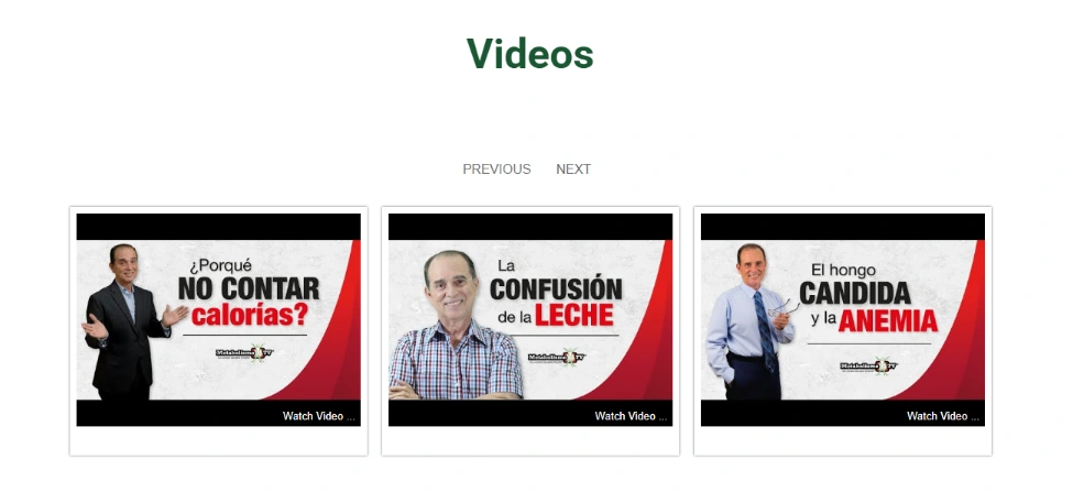
The homepage includes a video section featuring multiple educational thumbnails.
The gallery introduces different topics through recognizable imagery and video titles.
Design Decisions
Display videos as a coordinated gallery.
Use thumbnails to communicate content topics.
Maintain consistent presentation dimensions.
Make video resources easy to identify.
UX Value
Visitors who prefer video-based learning can discover relevant material without searching through long paragraphs of text.
Section 13: MetabolismoTV® Resources
Purpose: Connect users to the brand's wider educational media ecosystem.
The website introduces MetabolismoTV®, a major educational initiative associated with Frank Suárez.
Supporting links provide pathways to additional resources.
Design Decisions
Use prominent branded imagery.
Present supporting links in a structured arrangement.
Separate educational media content from product-focused areas.
Maintain continuity with the wider NaturalSlim visual identity.
UX Value
The section supports continued brand engagement beyond the initial website visit.
Section 14: Additional Educational and Founder Content
Purpose: Reinforce the educational positioning of NaturalSlim.
The lower homepage includes additional founder-related imagery, educational messaging, and book-focused content.
This helps bring the website back to the brand's knowledge-centered identity before the visitor reaches the footer.
Section 15: Footer
Purpose: Provide secondary navigation and supporting information.
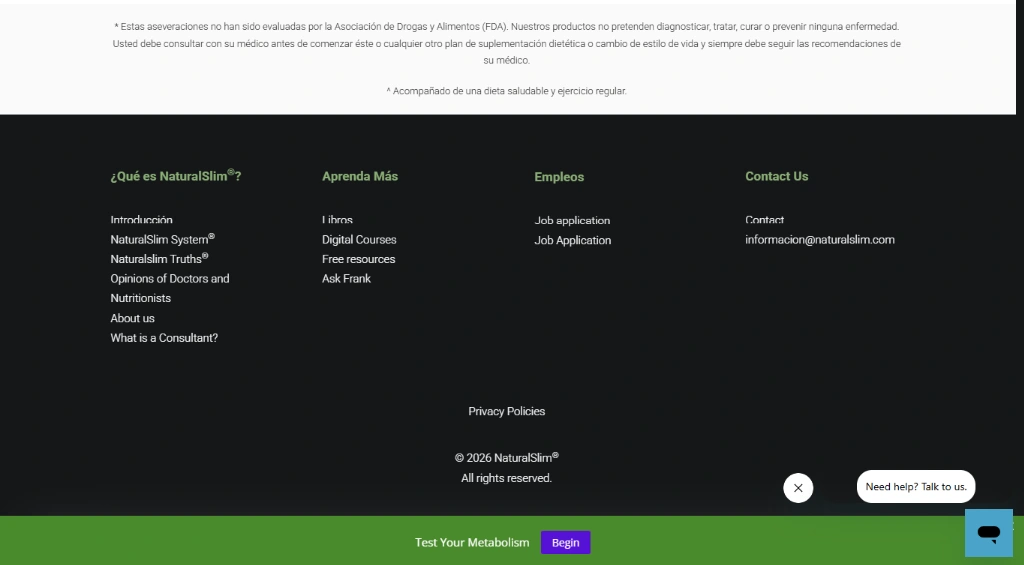
The footer uses a darker background and organizes links into multiple content groups.
Its visual treatment distinguishes it from the main content while maintaining the site's established color system.
UX Value
Visitors reaching the bottom of the homepage retain access to navigation, contact-related links, and other useful destinations.
09. User Experience Strategy
The website experience can be understood through three major principles: clarity, discoverability, and engagement.
Clarity
Every major section communicates a recognizable purpose.
The homepage uses descriptive headings, imagery, and consistent layouts to separate different topics.
This helps visitors distinguish brand information from educational material, products, testimonials, and contact options.
Discoverability
The long-form homepage acts as a guided overview of NaturalSlim's wider digital ecosystem.
Visitors can encounter different content areas naturally while scrolling, rather than needing to understand the full site structure immediately.
Engagement
The website provides several types of engagement opportunities.
Visitors can explore educational information, watch videos, learn about products, or contact a representative.
This accommodates users with varying levels of interest and familiarity.
Content Scannability
The design uses section headings, visual groupings, cards, photographs, and spacing to make the homepage easier to scan.
Although the homepage contains substantial information, these layout patterns help create recognizable boundaries between topics.
Mobile Experience Considerations
For a content-rich website, responsive behavior is especially important.
The supplied screenshot shows the design in a narrow viewport, including compact navigation and multiple content sections.
The design approach emphasizes preserving readable information, recognizable calls to action, and understandable content groupings on smaller screens.
A complete technical assessment of mobile responsiveness would require testing on multiple actual devices and viewport sizes.
10. Conversion Strategy & Customer Journey
The website was structured to support multiple forms of visitor engagement rather than relying on a single conversion pathway.
Primary Conversion: Free Metabolism Evaluation
Free evaluation messaging is prominently featured near the beginning of the homepage.
This creates a clear action for visitors interested in receiving personalized guidance.
Illustrative User Journey
The visitor arrives on the NaturalSlim homepage.
They encounter the free-evaluation offer.
They select the relevant call to action.
They reach the evaluation-request experience.
They provide the requested information.
The NaturalSlim team can follow up according to its established process.
The public evaluation page describes a personalized consultation request and includes a request form.
The case study does not assume any specific Kajabi automation or CRM behavior without implementation evidence.
Secondary Conversion: Country-Specific Contact
International visitors may prefer to communicate with the appropriate regional office.
The country directory makes this pathway prominent.
Illustrative User Journey
A visitor identifies their country.
They locate the relevant contact card.
They select the associated action.
They continue through the available regional contact channel.
This provides a clear geographical navigation model for a global audience.
Educational Engagement Journey
Not every visitor is immediately ready to request a consultation.
Some users first need to learn about the brand.
Illustrative User Journey
A visitor encounters the NaturalSlim website.
They explore company information.
They learn about the founder and educational philosophy.
They read metabolism-related content.
They explore a video or book resource.
They return to another page or contact option when ready.
This pathway illustrates the importance of educational content in supporting longer consideration journeys.
Trust-Building Journey
For visitors unfamiliar with NaturalSlim, trust can develop through several touchpoints:
Founder and brand history
Educational content
Recognizable product imagery
Customer testimonials
Customer success stories
Clear contact information
The website brings these elements together to create a more informative brand experience.
11. Challenges & Design Responses
Challenge: Multiple Audiences With Different Intentions
Design Response
The homepage incorporates both introductory information and deeper resource sections.
This allows new visitors to learn about NaturalSlim while providing more direct pathways for users already interested in contacting the organization.
Challenge: Presenting International Contact Information
Design Response
Country cards combine visual geographical identifiers, location names, and consistent actions.
This creates a more recognizable and repeatable layout than presenting all contact details in one unstructured list.
Challenge: Maintaining Visual Consistency Across Different Content Types
Design Response
The website uses a recurring visual system consisting of green accents, neutral backgrounds, section headings, imagery, and styled buttons.
This connects educational, promotional, and testimonial content within one recognizable interface.
Challenge: Balancing Long-Form Content and Readability
Design Response
The homepage separates information into distinct sections supported by visual hierarchy and relevant imagery.
This makes individual topics easier to locate during scrolling.
Challenge: Supporting Education Without Losing Conversion Opportunities
Design Response
Calls to action are included in different contexts, allowing users to engage with the brand after reviewing relevant content.
This helps connect education with appropriate next steps.
12. Responsive Design & Accessibility Considerations
A professional Kajabi website needs to function across different devices, browsers, and interaction contexts.
The NaturalSlim design uses a section-based layout that supports a structured presentation of content.
Important responsive design considerations include:
Navigation Adaptation
A compact navigation experience should preserve access to essential pages on smaller screens.
Card Layout Adaptation
Country-based contact cards need sufficient spacing and readable labels as the number of available columns decreases.
Image Scaling
Photography, product imagery, and educational illustrations should retain appropriate proportions across different screen widths.
Typography Hierarchy
Headings, descriptive text, and button labels should remain legible without requiring users to zoom.
Touch Interaction
Buttons and other interactive elements should have sufficient size and spacing for touch-based devices.
Accessibility
The website should support semantic headings, meaningful alternative text, keyboard-accessible controls, visible focus indicators, and sufficient text contrast.
These are important design and quality criteria. A formal accessibility audit or verified WCAG conformance result has not been supplied.
13. Quality Assurance & Testing Considerations
A complete website handover should include a structured quality-assurance process.
For the NaturalSlim website, the following areas represent the key checks relevant to its visible features.
Visual Consistency Checks
Verify logo presentation across page layouts.
Review typography and spacing consistency.
Check color usage and contrast.
Confirm image alignment and proportions.
Review button presentation across sections.
Navigation Checks
Verify primary navigation links.
Review mobile navigation behavior.
Test footer destinations.
Confirm educational resource links.
Test internal and external navigation.
Contact Directory Checks
Review each country label.
Verify regional destinations.
Confirm telephone number formatting.
Check the responsiveness of country cards.
Ensure contact actions remain recognizable.
Conversion Checks
Confirm evaluation buttons lead to the intended destination.
Review evaluation forms.
Test validation and submission feedback.
Check any confirmation or follow-up pages.
Verify that conversion pathways remain usable on mobile devices.
Content and Media Checks
Review video previews and playback destinations.
Check book and product imagery.
Confirm that links to educational material work.
Review testimonial presentation.
Check the readability of long-form educational sections.
Technical Checks
Assess image loading and page performance.
Check core pages in major browsers.
Review responsive layouts at common screen widths.
Inspect heading order and semantic markup.
Verify basic SEO metadata.
Check accessibility of interactive controls.
These checks document a recommended QA scope; they are not presented as a completed test report or proof of specific performance scores.
14. SEO & Content Discoverability
The website's content-heavy structure creates several opportunities for organic discoverability.
NaturalSlim publishes information related to metabolism, nutrition, wellness education, books, and its services.
A website containing this range of material benefits from a clear information hierarchy and consistent page metadata.
Relevant SEO Considerations
Descriptive Page Titles
Each important page should communicate its subject and relevance to visitors.
Clear Heading Structure
Primary and secondary headings should reflect the actual organization of the content.
Internal Linking
Educational content can link to related resources and relevant service information.
Image Optimization
Images should use appropriate dimensions, compression, and descriptive alternative text.
Mobile Usability
Readable layouts and usable navigation contribute to a better search and visitor experience.
Content Relevance
Educational sections should communicate accurate, clearly attributed information that aligns with the searcher's intent.
For a health-related website, medically sensitive claims also require careful review and appropriate disclosures.
The case study does not claim a measurable improvement in search rankings or organic traffic because no analytics or before-and-after SEO data has been provided.
15. Project Deliverables
The website experience presented in this case study includes the following design and content deliverables.
Website Experience
A branded Kajabi website organized around NaturalSlim's identity, educational message, and audience needs.
Homepage Design
A long-form homepage incorporating the primary content sections of the NaturalSlim ecosystem.
Navigation Experience
A recognizable header and footer structure that helps visitors explore the website.
International Contact Presentation
A structured, country-specific directory featuring flags, location information, and contact-related actions.
Educational Content Presentation
Dedicated sections for metabolism education, books, video content, and other learning resources.
Brand Storytelling
Founder-related content and imagery that communicate NaturalSlim's history and philosophy.
Customer-Focused Content
Testimonial and success-oriented sections that introduce customer perspectives.
Conversion-Focused Elements
Prominent calls to action designed to direct visitors toward evaluations, contact options, and educational resources.
Visual Design System
Consistent application of the brand's colors, typography, imagery, buttons, and section treatments.
16. Project Outcome
The NaturalSlim Kajabi project brings together a wide range of brand content within one structured digital experience.
The website combines educational information, product imagery, brand storytelling, customer testimonials, country-specific contact options, and service-related calls to action.
Its design supports different visitor intentions while maintaining a recognizable brand identity.
Observable Project Outcomes
A Unified Digital Presentation
The website presents multiple aspects of the NaturalSlim brand within one cohesive homepage and supporting content structure.
Clearer Content Grouping
Country contacts, educational topics, testimonials, videos, and other resources are presented in identifiable sections.
Multiple Engagement Opportunities
Visitors are given different ways to continue their journey, including evaluation requests, regional contact actions, and educational resource exploration.
Consistent Brand Communication
Green accents, branded imagery, typography, and recurring layout patterns reinforce the NaturalSlim identity.
An Internationally Oriented Experience
The country-specific directory makes geographical distinctions visible and supports the brand's international presentation.
Business Impact
The website was designed to support awareness, education, engagement, and consultation-related conversions.
Actual changes in lead volume, evaluation bookings, conversion rates, website traffic, search rankings, or sales have not been quantified.
These outcomes would require verified analytics or client-reported performance data.
17. Lessons Learned & Professional Insights
The NaturalSlim project demonstrates several principles relevant to website design and development.
Information Architecture Is Essential for Content-Heavy Brands
When a business has many resources, products, and services, an effective information structure is necessary to prevent content from becoming difficult to navigate.
A strong hierarchy helps visitors understand which information matters at each stage of their journey.
Design Must Support Different User Intentions
Visitors rarely arrive with identical goals.
Providing paths for learning, contacting the business, or requesting a service creates a more flexible website experience.
International Brands Benefit From Localized Navigation
Location-based content is more useful when it is clearly labeled and visually organized.
The country-card approach demonstrates how geographical information can be incorporated into a broader digital experience.
Consistency Creates Cohesion
Repeated color treatments, headings, buttons, and layout patterns help connect sections that serve very different purposes.
This becomes especially valuable for websites containing long-form content, product imagery, videos, and testimonials.
Education Can Be Part of the Conversion Journey
NaturalSlim's website demonstrates how informational content can coexist with service-related calls to action.
Rather than directing every visitor immediately toward a transaction, the experience provides opportunities to learn about the brand and engage when appropriate.
Platform Choice Does Not Replace Design Strategy
Developing a website in Kajabi still requires deliberate decisions about content hierarchy, navigation, visual presentation, and user engagement.
The quality of the visitor experience depends on how those elements are brought together, not simply on the platform used.
18. Final Conclusion
The NaturalSlim® website project demonstrates the role of thoughtful website design and development in presenting a complex, education-driven international brand.
Built using Kajabi, the website brings together NaturalSlim's brand story, educational resources, product presentation, customer experiences, and international contact options in a structured and visually consistent environment.
From the prominent hero section and free-evaluation messaging to the country-specific contact directory, founder content, educational resources, and video gallery, each major section has a defined communication purpose.
The design emphasizes clarity, recognizable branding, accessible information, and meaningful pathways for visitor engagement.
The project highlights the value of combining website development with information architecture, user experience design, visual communication, and conversion strategy.
Ultimately, NaturalSlim illustrates how a content-rich Kajabi website can serve as more than a digital brochure—becoming a central destination for brand discovery, education, international communication, and customer engagement.
Project Website: https://naturalslim.com
Platform: Kajabi
Project Focus: Website Design, Development, User Experience, Brand Presentation & Conversion-Oriented Content Architecture.
1 like · 0 views · Nov 6, 2026
Designed and developed a content-rich Kajabi website for NaturalSlim, emphasizing brand identity and user engagement.
Timeline
Jun 10, 2025 - Jun 26, 2025

