
Owen Wyer
Building brands for ambitious companies that build authority
New to Contra
Owen is ready for their next project!
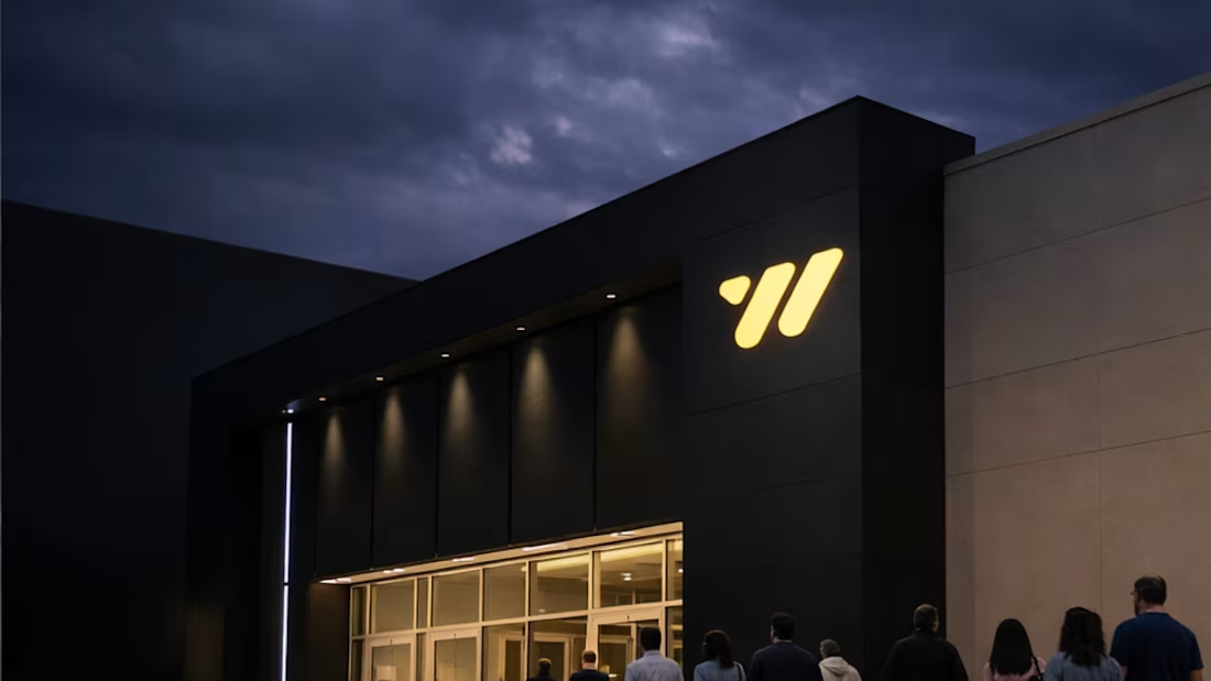
Weston Theatres — Cinema Technology & Brand System
0
2
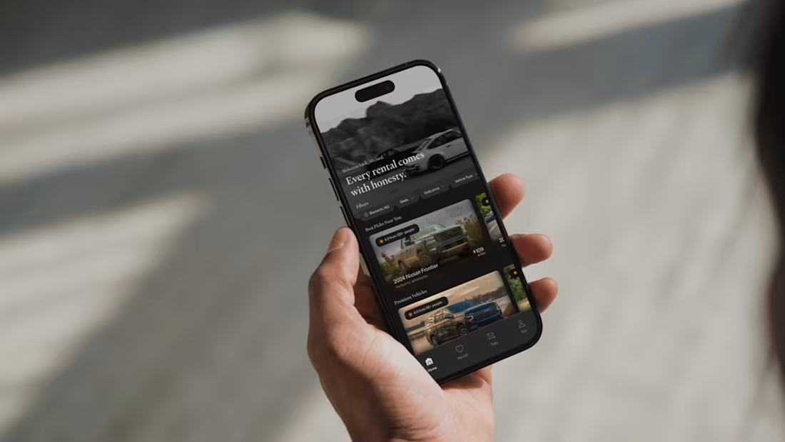
Most rental platforms optimize for speed. This explores what happens when you optimize for feeling instead.
Instead of dense listings and aggressive UI, the experience leans on clarity, pacing, and restraint. Vehicles are framed with care. Information is precise, but never loud. Browsing feels intentional — almost leisurely.
The result is an interface that feels less transactional and more experiential.
An app you return to not because you need to rent — but because it feels good to be there.
0
70
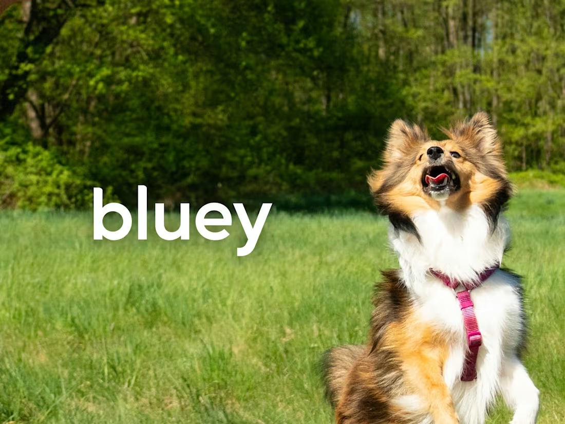
Bluey — Pet Wellness Brand System
0
3
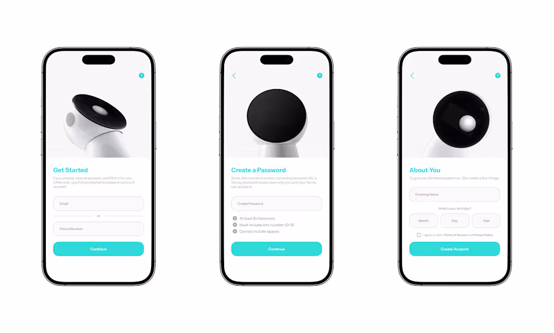
I worked on a short design exploration around what a modern consumer app for Jibo could feel like.
My favorite detail: when setting your password, Jibo closes his eyes.
Because if something has a face, privacy should be visible — not abstract.
The project didn’t continue, but the thinking did.
0
67
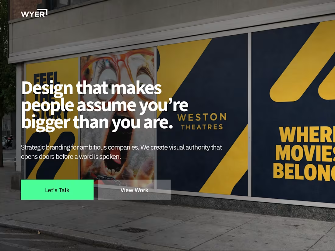
Brand direction, web design, and Framer build by WYER - for WYER.
0
11