
Orbix Studio
UI/UX Design Agency Engineered Around
New to Contra
Orbix is building their profile!
Sociafy, The Social Media Growth Tool
Sociafy is a dashboard made for people who manage social media. It takes messy data - like follower counts, post ratings, and the best times to share, and turns it into a clean, easy-to-read screen. It helps users understand what is working on their social media without getting confused by too many numbers.
Challenge
The biggest problem was that most analytics apps look boring and are hard to understand. We needed to take a lot of complex information and fit it onto one screen without making it look messy.
We had to show important data like "Audience Sentiment" in a way that makes sense instantly.
We needed a design that didn't hurt the eyes after looking at it for a long time.
The goal was to make checking stats feel simple, not like a math test.
Outcome
A dashboard that looks as good as it works.
A clean, dark-themed design that makes colorful charts pop out.
Simple tools like the "Optimal Posting Time" calendar that help users plan ahead.
A layout where users can find exactly what they need in seconds, not minutes.
A final product that makes tracking growth feel easy and actually fun.
4
10
61
Most teams don’t struggle with tasks.
They struggle with visibility.
This task & team management mobile app is designed to fix that.
Instead of jumping between tabs, everything is structured into three 𝗰𝗹𝗲𝗮𝗿 𝘃𝗶𝗲𝘄𝘀:
- A member-based breakdown showing who’s working on what
- A live KPI dashboard tracking 290 tasks across every stage
- A calendar view with progress and ownership visible on each task
𝗧𝗵𝗲 𝗿𝗲𝘀𝘂𝗹𝘁?
Less back-and-forth.
Faster decisions.
Clear accountability across the team.
Built for startups, agencies, and SaaS teams that need clarity to move faster.
If your current product tracks tasks but doesn’t show the full picture,
that’s where we come in.
Let’s build something better. 👋
0
9
Agrova is a smart agriculture responsive mobile experience designed to help farmers improve productivity using data-driven insights and sustainable practices. From crop monitoring to performance metrics, the interface focuses on clarity, trust, and accessibility.
Modern farmers often deal with fragmented tools, complex dashboards, and limited access to real-time insights. Critical decisions are delayed due to poor visibility and disconnected systems.
Agrova brings agricultural data, productivity tracking, and community trust into a single mobile-first experience. The responsive app simplifies complex farming insights into clear visuals, accessible FAQs, and structured data cards that guide action.
0
38
This e-commerce dashboard is designed to give store owners a clear view of what’s happening inside their business from sales performance to customer activity.
Instead of overwhelming users with complex data, the interface focuses on clarity and structure. Key metrics like views, visits, orders, and conversion rate are presented in a clean hierarchy so sellers can quickly understand how their store is performing.
The layout also highlights revenue insights, product status, and recent activities, allowing merchants to monitor growth and react faster.
0
44
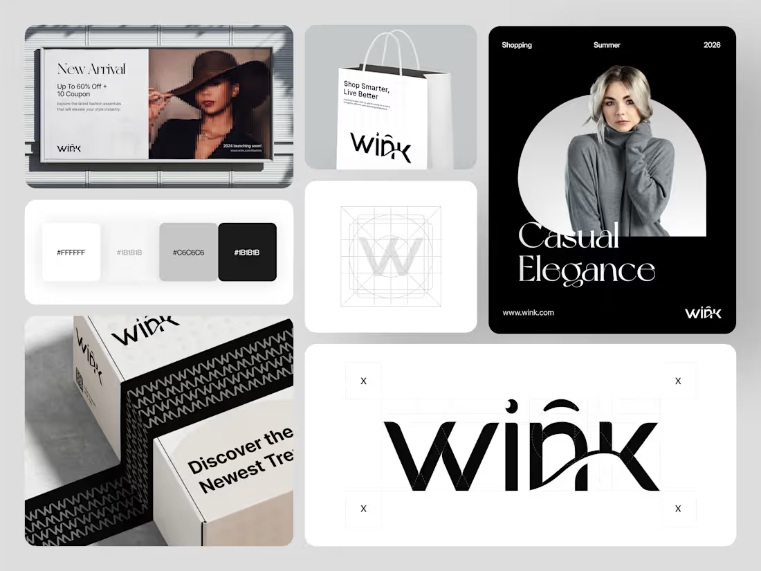
Wink, the goal was to create a clean and modern identity that feels confident across every touchpoint from packaging and marketing visuals to the digital storefront.
The brand system focuses on minimal elegance and strong typography, giving the identity a premium yet approachable feel that works across both physical and digital experiences.
The design includes packaging concepts, promotional layouts, and a structured visual identity that helps the brand stay consistent wherever customers encounter it.
0
45
We just wrapped up this mindful wellness website, and it's all about that clear, trustworthy flow from poking around services to booking a session, every bit is simplified to feel natural and easygoing. No overload, just gentle guidance.
0
57