
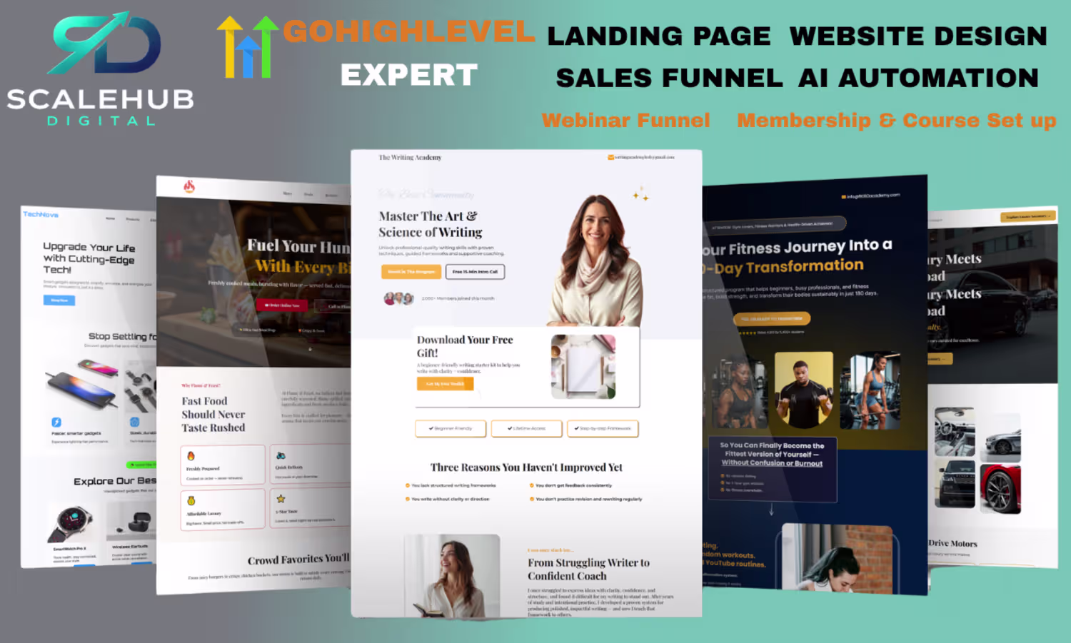
Stella Obanla
Conversion-Focused Landing Page & Sales Funnel Designer
New to Contra
Stella is building their profile!
This is the cleanest AI video we have ever created.
We are not just making videos, we are building something extraordinary.
And we are doing it with FREE AI tools.
Our next video drops soon.
Ready for your own? DM me or drop a comment below 👇
#WebDesign #WebsiteDesigner #FreelanceDesigner
#WebDeveloper #UIDesign #DigitalMarketing
#SmallBusinessOwner #BusinessGrowth #NaijaDesigner
#LagosDesigner #AfricanCreatives #DesignInspiration
#WebsiteDesign #ModernWebsite #OnlineBusiness
#BrandIdentity #CreativeAgency #NaijaTech
#StartupNigeria #FreelanceLife
1
1
14
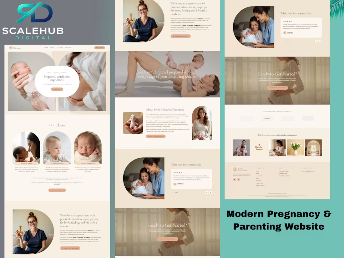
Designed this beautiful birth education website using AI
Created to make expecting parents feel supported, informed, and confident throughout their parenting journey.
Great design isn't just about looks - it's about creating trust and connection.
📩 Need a website for your business? DM me.
#WebDesign #AIDesign #UIDesign #WebsiteDesign #Freelancer #BuildInPublic
0
12
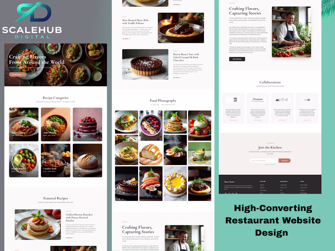
Just designed this modern restaurant website using AI, and the result is incredible 🤯
From mouth-watering food photography to a conversion-focused layout, every section was crafted to attract customers, increase reservations, and showcase the brand beautifully.
AI is changing the way websites are designed.
Need a website for your business?
📩 DM me and let's build something amazing.
#WebDesign #UIDesign #RestaurantWebsite #AIDesign #WebDesigner #WebsiteDesign #LandingPage #SmallBusiness #FoodBusiness #Freelancer
0
15
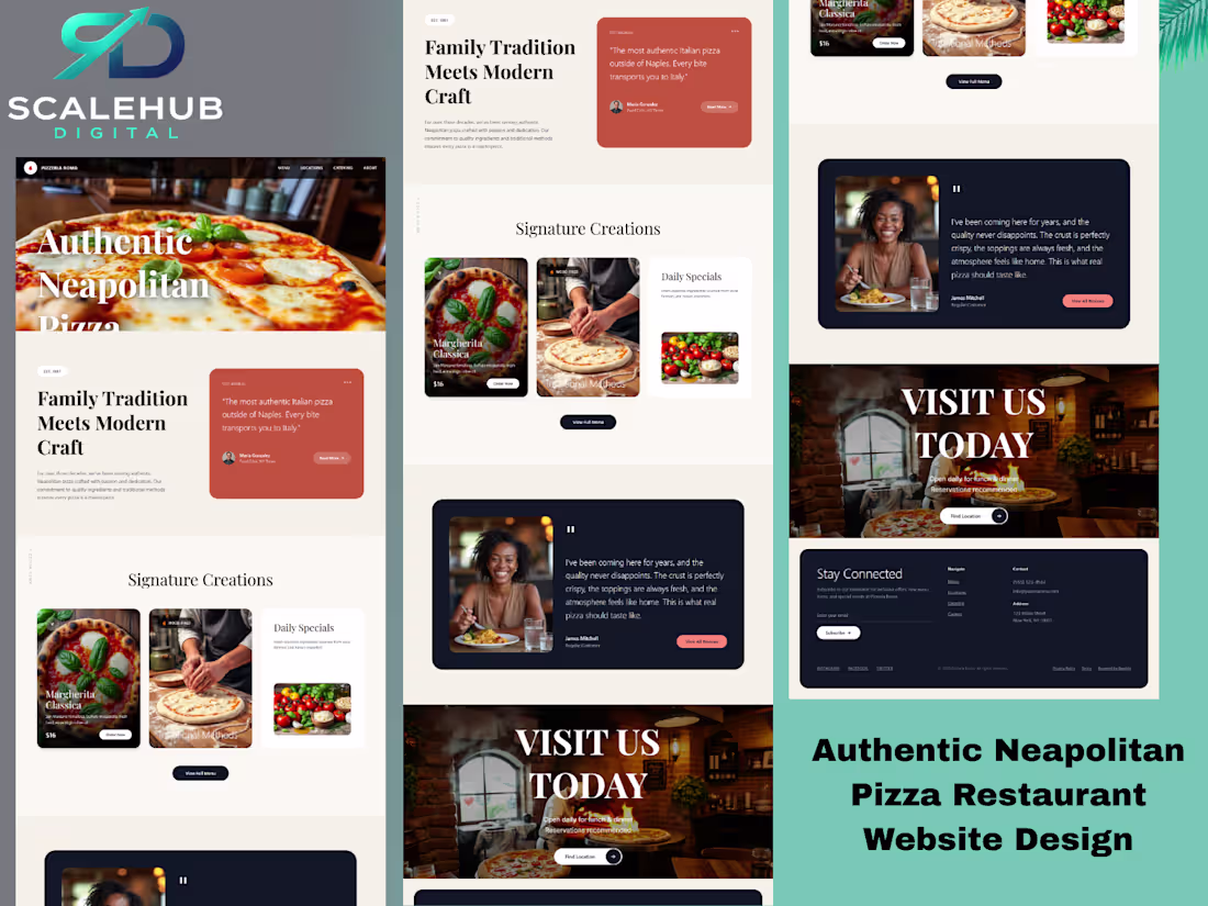
Let me show you guys what I've been up to
This is a restaurant website created to make you hungry just by looking at it
If your business deserves a website that actually works for you while you sleep you know where to find me
DM ME
#WebDesign (https://x.com/hashtag/WebDesign?src=hashtag_click) #FunnelDesign (https://x.com/hashtag/FunnelDesign?src=hashtag_click) #RestaurantWeb (https://x.com/hashtag/RestaurantWeb?src=hashtag_click)
2
1
35
Posted Day 1 of my AI video challenge.
By Day 3 someone asked me to create a video ad for their brand.
I said yes. I delivered.
Still a beginner. Still learning. But the results are already speaking.
30 days. 5 free AI tools.
#AIVideo (https://x.com/hashtag/AIVideo?src=hashtag_click) #FirstClient (https://x.com/hashtag/FirstClient?src=hashtag_click) #AIVideoAds (https://x.com/hashtag/AIVideoAds?src=hashtag_click) #30DayChallenge (https://x.com/hashtag/30DayChallenge?src=hashtag_click)
0
32
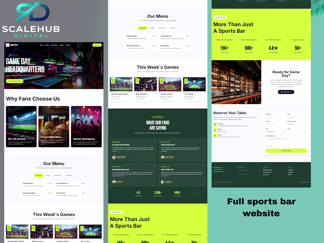
I built this full sports bar website using AI - zero code, just the right prompts 🤯
Homepage · Menu · Game schedule · Reviews · Reservation form · Full mobile layout
All of it. Pure prompts.
If you want to know exactly how I did it - drop a comment or DM me 👇
I'll share the full prompt breakdown that made this possible.
And yes - I build these for businesses too
#AIWebDesign #NoCodeMovement #FreelanceDesigner #AITools2026 #WebDesignTips
0
30
Day 2 of my 30-Day AI Video Challenge is live.
Today I produced a cinematic video ad for Potio Beauty's Restore Tone Correction Serum - a Nigerian skincare brand - entirely using free AI tools.
This project is a live demonstration of what I offer as a freelancer:
* AI-generated cinematic video ads
* Product & brand storytelling
* Short-form content for social media
Every day of this challenge is a new piece of portfolio work.
📺 Watch the full series → @cinematicaistory on YouTube & X
📩 Available for projects - let's build something.
#AIVideoAds #FreelanceCreator #CinematicAIStory #VideoMarketing #AIMarketing #NigerianCreative
0
32
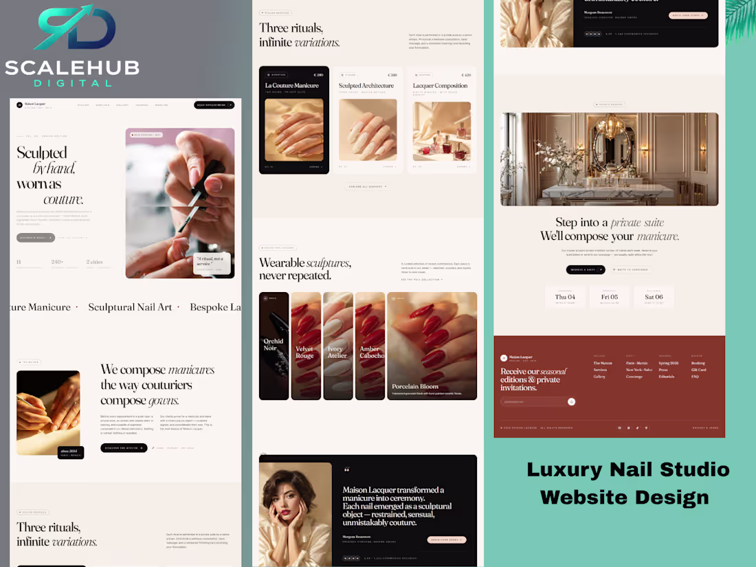
A luxury nail studio website focused on elegance, premium branding, and seamless appointment booking. Every section was crafted to create a high-end digital experience that turns visitors into clients.
#WebDesign (https://x.com/hashtag/WebDesign?src=hashtag_click) #UIDesign (https://x.com/hashtag/UIDesign?src=hashtag_click) #LuxuryBranding (https://x.com/hashtag/LuxuryBranding?src=hashtag_click) #BeautyWebsite (https://x.com/hashtag/BeautyWebsite?src=hashtag_click) #WebsiteDesigner (https://x.com/hashtag/WebsiteDesigner?src=hashtag_click)
0
32
Excited to share something new alongside my freelance work. 🖤
I've launched Cinematic AI Story - a 30-day challenge where I'm mastering cinematic AI video creation and using it to produce real video ads for businesses.
Day 1 is live. First AI video character created with full consistency - face, skin tone, and aesthetic locked in throughout.
This directly expands what I offer as a freelancer:
AI-generated video ads
Cinematic brand content
Marketing videos for businesses
Watch the full journey on YouTube & X → @cinematicaistory
📩 Available for projects - let's talk.
#AIVideo #FreelanceCreator #VideoAds #CinematicAIStory #AIMarketing
0
29
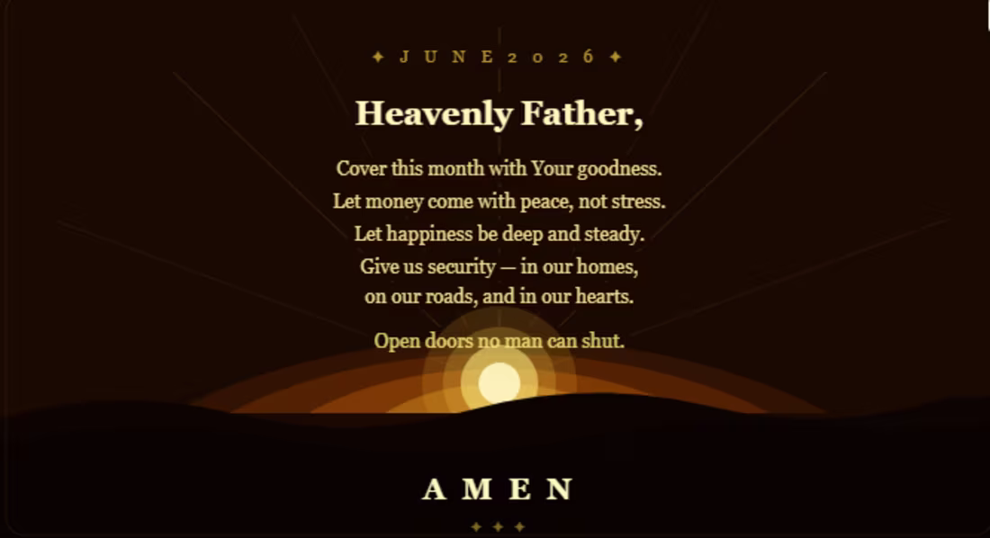
Posting this for someone who needs it today 🙏 #June2026
0
29

Eid Mubarak to everyone celebrating today🌙
May your prayers be answered and your home filled with joy.
Warm wishes from me to you 💛
#EidMubarak #Eid2026 #BlessedDay #Nigeria #NigerianTwitter
0
27
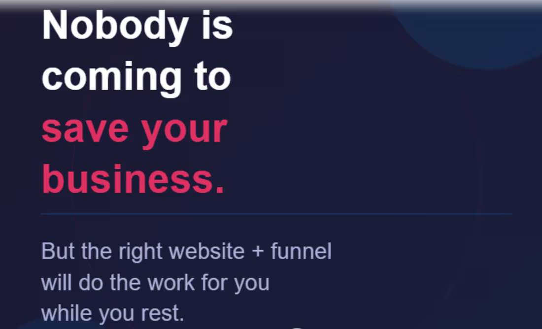
Nobody is coming to save your business.
But the right website + funnel works for you 24/7 even on weekends while you rest.
That is what I build.
DM me "BUILD" and let us talk 🔥
#SaturdayMotivation #FunnelBuilder #WebDesign #SmallBusiness
1
35
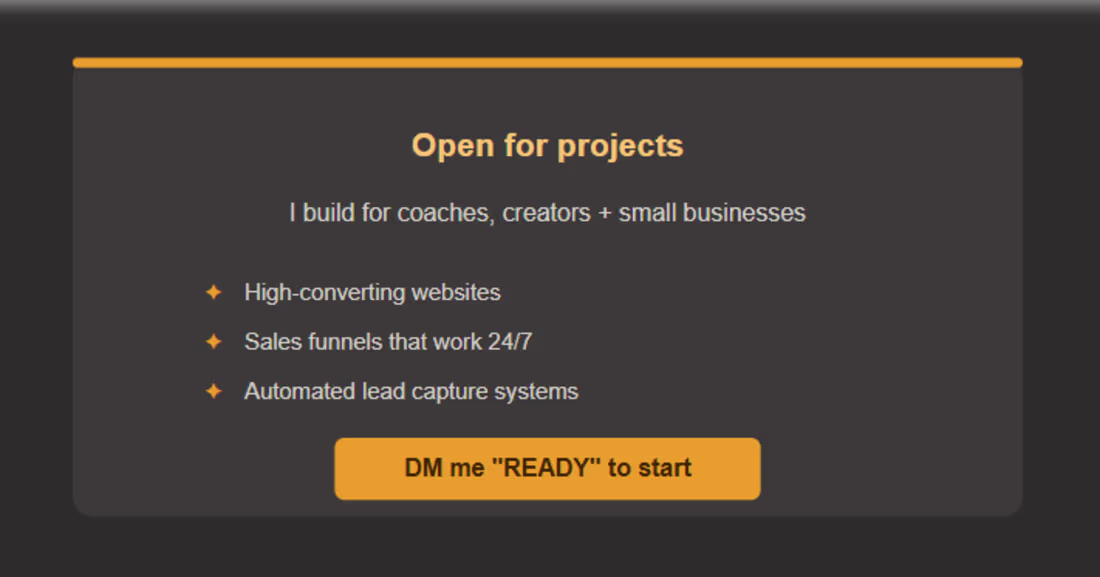
Coaches + small business owners 👇
Getting traffic but no sales?
That is a funnel problem. I fix it.
Website + funnel + automation all done for you.
DM me "READY" and let us talk.
#HireMe #FunnelExpert #WebDesigner #BusinessGrowth
1
42
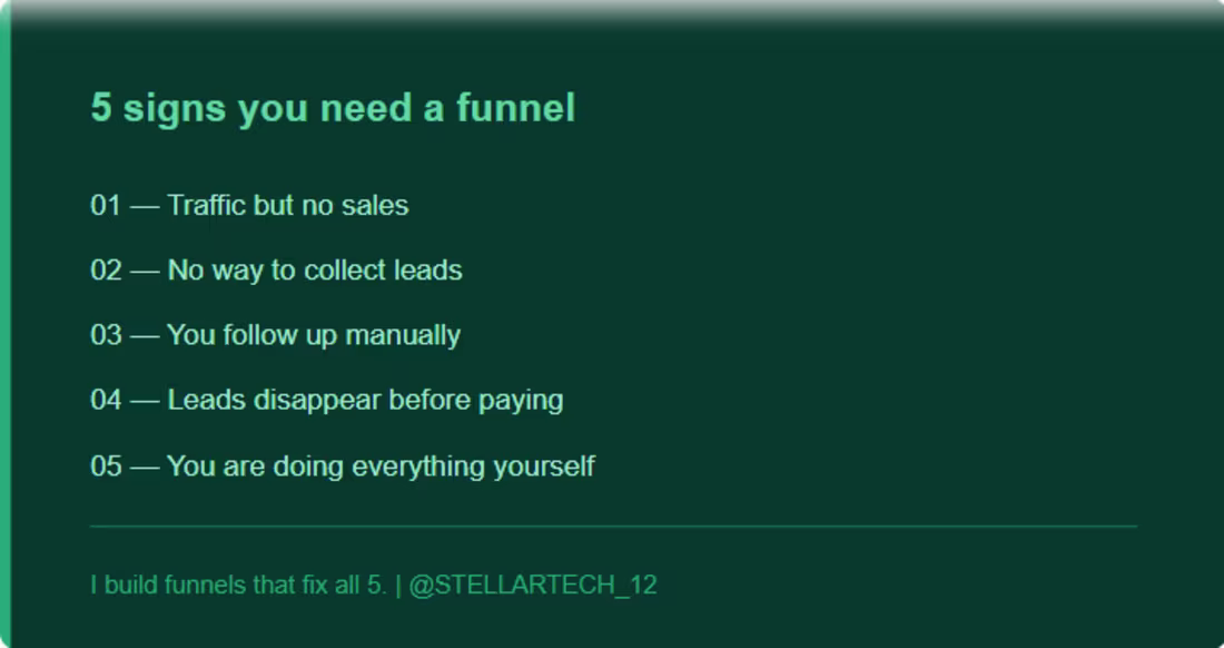
If any of these sounds like you your business needs a funnel.
A funnel works while you sleep.
No manual follow-up. No lost leads.
Drop "YES" below if this hits 👇
#FunnelBuilder #OnlineBusiness #WebDesign
1
35
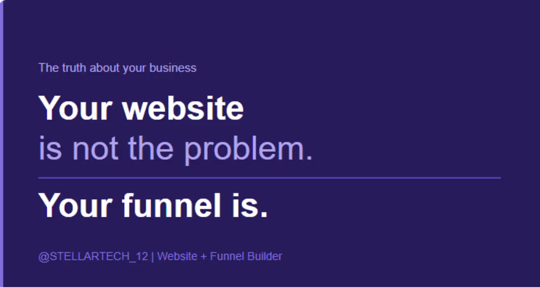
Your website tells people who you are.
Your funnel tells them what to do next.
No funnel = lost leads every day.
I fix that. DM me "FUNNEL" 👇
#SalesFunnel #WebDesign #SmallBusiness
0
23
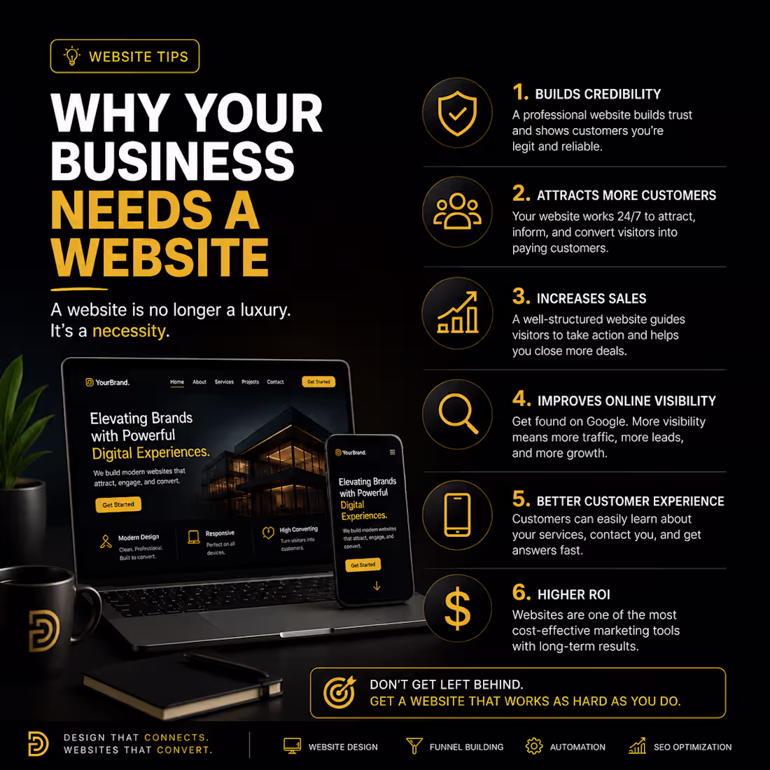
Most businesses don’t actually have a traffic problem…
They have a TRUST problem 👀
A professional website helps customers trust your business, understand your services, and take action faster.
In 2026, a website is no longer optional it’s part of your business identity
0
22
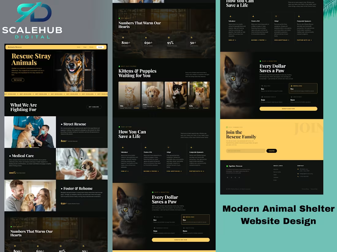
Designed this modern animal rescue website focused on storytelling, donations, and pet adoption 🐾❤️
The goal was to create a website that doesn’t just look beautiful but also helps rescue organizations build trust, increase donations, and encourage more pet adoptions.
Clean UI, emotional visuals, strong calls-to-action, and a modern user experience 🔥
1
39
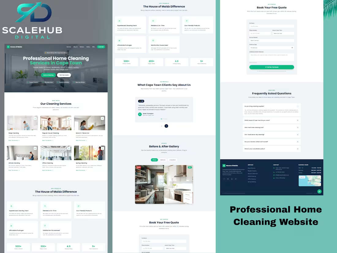
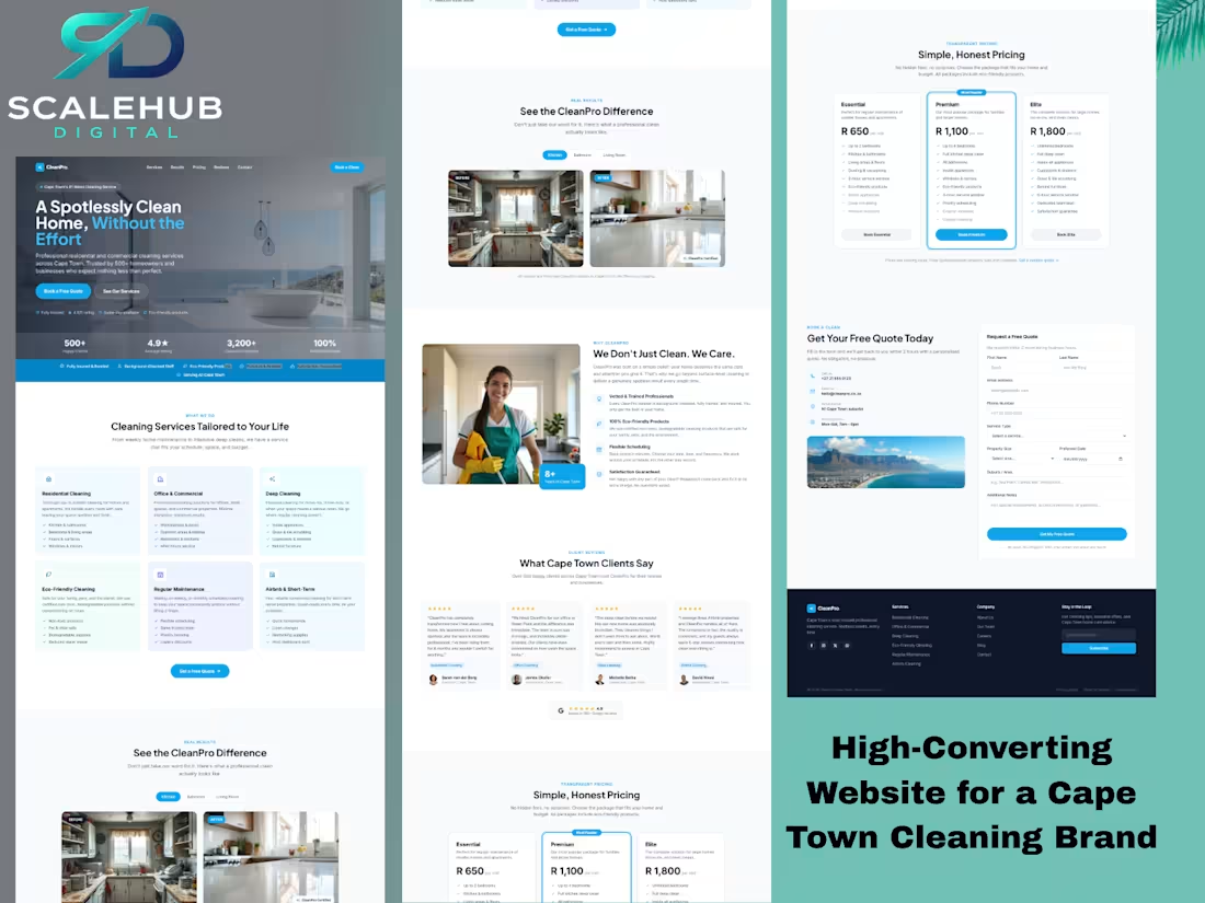
From just having an online presence to looking like a premium brand
Built this modern high-converting cleaning service website designed to:
* Build trust
* Generate more bookings
* Improve customer experience
* Make the business stand out online
Every section was created with conversion in mind
#WebDesign (https://www.linkedin.com/search/results/all/?keywords=%23webdesign&origin=HASH_TAG_FROM_FEED) #CleaningBusiness (https://www.linkedin.com/search/results/all/?keywords=%23cleaningbusiness&origin=HASH_TAG_FROM_FEED) #LandingPageDesign (https://www.linkedin.com/search/results/all/?keywords=%23landingpagedesign&origin=HASH_TAG_FROM_FEED) #UIDesign (https://www.linkedin.com/search/results/all/?keywords=%23uidesign&origin=HASH_TAG_FROM_FEED) #Freelancer (https://www.linkedin.com/search/results/all/?keywords=%23freelancer&origin=HASH_TAG_FROM_FEED)
1
38

Happy Mother’s Day to all the amazing mothers out there
Your love, strength, and sacrifices never go unnoticed
#MothersDay (https://x.com/hashtag/MothersDay?src=hashtag_click) #HappyMothersDay (https://x.com/hashtag/HappyMothersDay?src=hashtag_click) #MothersLove (https://x.com/hashtag/MothersLove?src=hashtag_click) #Sunday (https://x.com/hashtag/Sunday?src=hashtag_click)
1
52

Happy Saturday beautiful people 🤍
Soft face. Big goals. Locked in for business 💻
New week soon, new goals, more business, more growth and bigger wins
Compliments are fully accepted by the way 😂🤍
#HappyWeekend #SaturdayVibes #SoftGirlEra #ContentCreator #BlackGirlMagic #WeekendMood #GlowUp #DigitalCreator #EntrepreneurLife #BusinessMindset #AestheticVibes #PhotoDump #MelaninBeauty #CreativeGirl #InstagramAesthetic #WeekendEnergy #FaceCard #WorkAndGrace #SelfGrowth #SocialMediaCreator
0
43

Protect your peace, sharpen your mind, trust God, keep building
#latenightthoughts (https://web.facebook.com/hashtag/latenightthoughts?__cft__[0]=AZaKcNZL_bq7aI-pyMJ4jmEVdege4tnq0WCmCG1_PZpWBtLvsY-SaMrP22waLPbD-fjOQsNCcWzNIDwCF9QrDnZpBwKLBKSuzq_KwbU7P-bAiE0NIV30eE6SA5cC2Hf02gh2VdtXk6HNAFOkhYqfCigR&__tn__=*NK-R) #christiancreatives (https://web.facebook.com/hashtag/christiancreatives?__cft__[0]=AZaKcNZL_bq7aI-pyMJ4jmEVdege4tnq0WCmCG1_PZpWBtLvsY-SaMrP22waLPbD-fjOQsNCcWzNIDwCF9QrDnZpBwKLBKSuzq_KwbU7P-bAiE0NIV30eE6SA5cC2Hf02gh2VdtXk6HNAFOkhYqfCigR&__tn__=*NK-R) #FaithAndWork (https://web.facebook.com/hashtag/faithandwork?__cft__[0]=AZaKcNZL_bq7aI-pyMJ4jmEVdege4tnq0WCmCG1_PZpWBtLvsY-SaMrP22waLPbD-fjOQsNCcWzNIDwCF9QrDnZpBwKLBKSuzq_KwbU7P-bAiE0NIV30eE6SA5cC2Hf02gh2VdtXk6HNAFOkhYqfCigR&__tn__=*NK-R) #biblestudyonline (https://web.facebook.com/hashtag/biblestudyonline?__cft__[0]=AZaKcNZL_bq7aI-pyMJ4jmEVdege4tnq0WCmCG1_PZpWBtLvsY-SaMrP22waLPbD-fjOQsNCcWzNIDwCF9QrDnZpBwKLBKSuzq_KwbU7P-bAiE0NIV30eE6SA5cC2Hf02gh2VdtXk6HNAFOkhYqfCigR&__tn__=*NK-R) #digitalcreator (https://web.facebook.com/hashtag/digitalcreator?__cft__[0]=AZaKcNZL_bq7aI-pyMJ4jmEVdege4tnq0WCmCG1_PZpWBtLvsY-SaMrP22waLPbD-fjOQsNCcWzNIDwCF9QrDnZpBwKLBKSuzq_KwbU7P-bAiE0NIV30eE6SA5cC2Hf02gh2VdtXk6HNAFOkhYqfCigR&__tn__=*NK-R) #entrepreneurlife (https://web.facebook.com/hashtag/entrepreneurlife?__cft__[0]=AZaKcNZL_bq7aI-pyMJ4jmEVdege4tnq0WCmCG1_PZpWBtLvsY-SaMrP22waLPbD-fjOQsNCcWzNIDwCF9QrDnZpBwKLBKSuzq_KwbU7P-bAiE0NIV30eE6SA5cC2Hf02gh2VdtXk6HNAFOkhYqfCigR&__tn__=*NK-R) #WorkInSilence (https://web.facebook.com/hashtag/workinsilence?__cft__[0]=AZaKcNZL_bq7aI-pyMJ4jmEVdege4tnq0WCmCG1_PZpWBtLvsY-SaMrP22waLPbD-fjOQsNCcWzNIDwCF9QrDnZpBwKLBKSuzq_KwbU7P-bAiE0NIV30eE6SA5cC2Hf02gh2VdtXk6HNAFOkhYqfCigR&__tn__=*NK-R) #mindset (https://web.facebook.com/hashtag/mindset?__cft__[0]=AZaKcNZL_bq7aI-pyMJ4jmEVdege4tnq0WCmCG1_PZpWBtLvsY-SaMrP22waLPbD-fjOQsNCcWzNIDwCF9QrDnZpBwKLBKSuzq_KwbU7P-bAiE0NIV30eE6SA5cC2Hf02gh2VdtXk6HNAFOkhYqfCigR&__tn__=*NK-R) #laptoplifestyle (https://web.facebook.com/hashtag/laptoplifestyle?__cft__[0]=AZaKcNZL_bq7aI-pyMJ4jmEVdege4tnq0WCmCG1_PZpWBtLvsY-SaMrP22waLPbD-fjOQsNCcWzNIDwCF9QrDnZpBwKLBKSuzq_KwbU7P-bAiE0NIV30eE6SA5cC2Hf02gh2VdtXk6HNAFOkhYqfCigR&__tn__=*NK-R) #christianentrepreneur (https://web.facebook.com/hashtag/christianentrepreneur?__cft__[0]=AZaKcNZL_bq7aI-pyMJ4jmEVdege4tnq0WCmCG1_PZpWBtLvsY-SaMrP22waLPbD-fjOQsNCcWzNIDwCF9QrDnZpBwKLBKSuzq_KwbU7P-bAiE0NIV30eE6SA5cC2Hf02gh2VdtXk6HNAFOkhYqfCigR&__tn__=*NK-R) #FocusMode (https://web.facebook.com/hashtag/focusmode?__cft__[0]=AZaKcNZL_bq7aI-pyMJ4jmEVdege4tnq0WCmCG1_PZpWBtLvsY-SaMrP22waLPbD-fjOQsNCcWzNIDwCF9QrDnZpBwKLBKSuzq_KwbU7P-bAiE0NIV30eE6SA5cC2Hf02gh2VdtXk6HNAFOkhYqfCigR&__tn__=*NK-R) #softlife (https://web.facebook.com/hashtag/softlife?__cft__[0]=AZaKcNZL_bq7aI-pyMJ4jmEVdege4tnq0WCmCG1_PZpWBtLvsY-SaMrP22waLPbD-fjOQsNCcWzNIDwCF9QrDnZpBwKLBKSuzq_KwbU7P-bAiE0NIV30eE6SA5cC2Hf02gh2VdtXk6HNAFOkhYqfCigR&__tn__=*NK-R) #growthmindset (https://web.facebook.com/hashtag/growthmindset?__cft__[0]=AZaKcNZL_bq7aI-pyMJ4jmEVdege4tnq0WCmCG1_PZpWBtLvsY-SaMrP22waLPbD-fjOQsNCcWzNIDwCF9QrDnZpBwKLBKSuzq_KwbU7P-bAiE0NIV30eE6SA5cC2Hf02gh2VdtXk6HNAFOkhYqfCigR&__tn__=*NK-R) #dailymotivation (https://web.facebook.com/hashtag/dailymotivation?__cft__[0]=AZaKcNZL_bq7aI-pyMJ4jmEVdege4tnq0WCmCG1_PZpWBtLvsY-SaMrP22waLPbD-fjOQsNCcWzNIDwCF9QrDnZpBwKLBKSuzq_KwbU7P-bAiE0NIV30eE6SA5cC2Hf02gh2VdtXk6HNAFOkhYqfCigR&__tn__=*NK-R) #FaithOverFear (https://web.facebook.com/hashtag/faithoverfear?__cft__[0]=AZaKcNZL_bq7aI-pyMJ4jmEVdege4tnq0WCmCG1_PZpWBtLvsY-SaMrP22waLPbD-fjOQsNCcWzNIDwCF9QrDnZpBwKLBKSuzq_KwbU7P-bAiE0NIV30eE6SA5cC2Hf02gh2VdtXk6HNAFOkhYqfCigR&__tn__=*NK-R)
0
48
Good Morning Everyone
Most businesses are still taking orders in DMs…
Answering the same questions every day…
Losing customers they never even knew existed.
Meanwhile, others are building simple systems that:
* Attract clients automatically
* Save time
* Increase sales without stress
The difference?
They made their business easy to find and easy to buy from.
If you’re serious about growing, it’s time to level up.
Send me a message or comment
#DigitalMarketing (https://x.com/hashtag/DigitalMarketing?src=hashtag_click) #SmallBusinessGrowth (https://x.com/hashtag/SmallBusinessGrowth?src=hashtag_click) #OnlineBusiness (https://x.com/hashtag/OnlineBusiness?src=hashtag_click) #WebsiteDesign (https://x.com/hashtag/WebsiteDesign?src=hashtag_click) #EntrepreneurLife
(https://x.com/hashtag/EntrepreneurLife?src=hashtag_click)#BusinessTips (https://x.com/hashtag/BusinessTips?src=hashtag_click) #MakeMoneyOnline (https://x.com/hashtag/MakeMoneyOnline?src=hashtag_click) #SocialMediaMarketing (https://x.com/hashtag/SocialMediaMarketing?src=hashtag_click) #BrandBuilding
(https://x.com/hashtag/BrandBuilding?src=hashtag_click)#ClientAttraction (https://x.com/hashtag/ClientAttraction?src=hashtag_click) #PassiveIncome (https://x.com/hashtag/PassiveIncome?src=hashtag_click) #ScaleYourBusiness (https://x.com/hashtag/ScaleYourBusiness?src=hashtag_click)
1
61
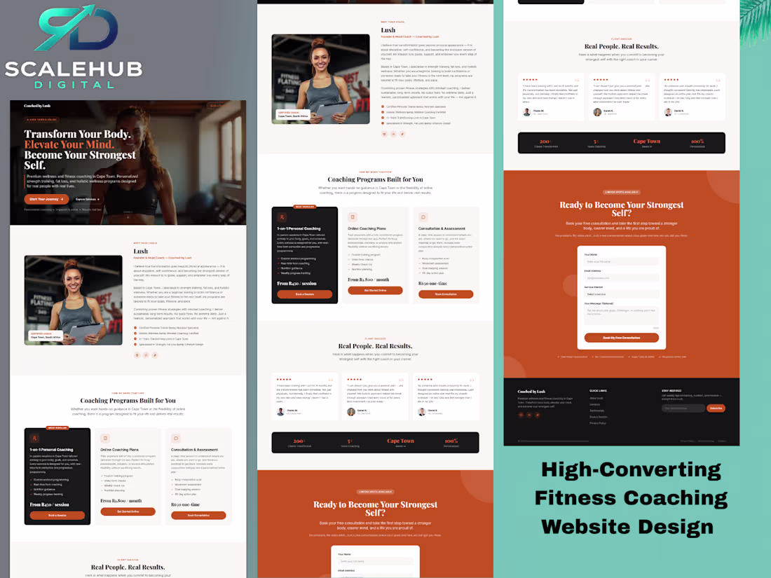
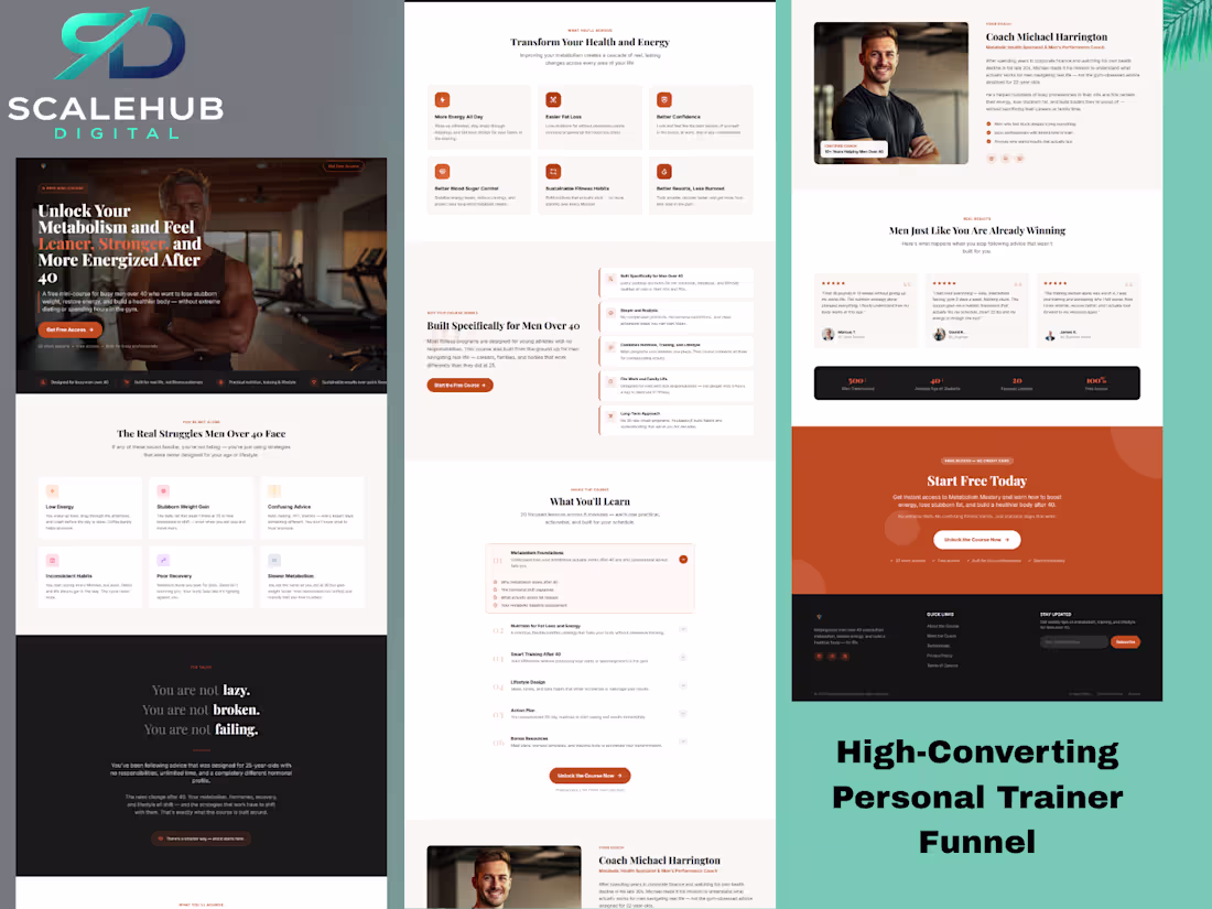
Designed a high-converting website for a fitness coach to replace manual DM-based sales.
Focus:
– Clear offer positioning
– Trust-building layout
– Simple lead capture system
Result: A streamlined client acquisition system instead of manual back-and-forth.
1
51
Designed a high-converting website for a Cleaning services to replace manual DM-based sales.
Focus:
– Clear offer positioning
– Trust-building layout
– Simple lead capture system
Result: A streamlined client acquisition system instead of manual back-and-forth.
1
47
Different industries. Same goal: RESULTS.
From plumbing to beauty, ski resorts to consultants…
The right funnel/design changes everything.
If your business isn’t converting the way it should,
You’re not the problem-the system is.
Send me a message, let’s fix it.
#salesfunnels (https://web.facebook.com/watch/hashtag/salesfunnels/?__cft__[0]=AZZxAhgohAPDdaoTMvU-QWCr2931cRmGabvJ5qA_Vm1iCevaTVvlB4euaWfq7AOpacFcYtr0el-xseilVTYDtKSmujgdYujA5QV4nUAUr-cl09kFOKYHAefm6QeiqXSH4Ww4zakgeb2u0H_oFybgJq9thPdT2oweGVP25Jtl2tyL-rQ0LmynvNcX04KSy7ZZpfZZ_xEpnUYPLr36Vi_-4f-0&__tn__=*NK-R) #digitalmarketing (https://web.facebook.com/watch/hashtag/digitalmarketing/?__cft__[0]=AZZxAhgohAPDdaoTMvU-QWCr2931cRmGabvJ5qA_Vm1iCevaTVvlB4euaWfq7AOpacFcYtr0el-xseilVTYDtKSmujgdYujA5QV4nUAUr-cl09kFOKYHAefm6QeiqXSH4Ww4zakgeb2u0H_oFybgJq9thPdT2oweGVP25Jtl2tyL-rQ0LmynvNcX04KSy7ZZpfZZ_xEpnUYPLr36Vi_-4f-0&__tn__=*NK-R) #smallbusinessgrowthtips (https://web.facebook.com/watch/hashtag/smallbusinessgrowthtips/?__cft__[0]=AZZxAhgohAPDdaoTMvU-QWCr2931cRmGabvJ5qA_Vm1iCevaTVvlB4euaWfq7AOpacFcYtr0el-xseilVTYDtKSmujgdYujA5QV4nUAUr-cl09kFOKYHAefm6QeiqXSH4Ww4zakgeb2u0H_oFybgJq9thPdT2oweGVP25Jtl2tyL-rQ0LmynvNcX04KSy7ZZpfZZ_xEpnUYPLr36Vi_-4f-0&__tn__=*NK-R) #LeadGeneration (https://web.facebook.com/watch/hashtag/leadgeneration/?__cft__[0]=AZZxAhgohAPDdaoTMvU-QWCr2931cRmGabvJ5qA_Vm1iCevaTVvlB4euaWfq7AOpacFcYtr0el-xseilVTYDtKSmujgdYujA5QV4nUAUr-cl09kFOKYHAefm6QeiqXSH4Ww4zakgeb2u0H_oFybgJq9thPdT2oweGVP25Jtl2tyL-rQ0LmynvNcX04KSy7ZZpfZZ_xEpnUYPLr36Vi_-4f-0&__tn__=*NK-R) #marketingstrategy (https://web.facebook.com/watch/hashtag/marketingstrategy/?__cft__[0]=AZZxAhgohAPDdaoTMvU-QWCr2931cRmGabvJ5qA_Vm1iCevaTVvlB4euaWfq7AOpacFcYtr0el-xseilVTYDtKSmujgdYujA5QV4nUAUr-cl09kFOKYHAefm6QeiqXSH4Ww4zakgeb2u0H_oFybgJq9thPdT2oweGVP25Jtl2tyL-rQ0LmynvNcX04KSy7ZZpfZZ_xEpnUYPLr36Vi_-4f-0&__tn__=*NK-R) #funneldesign (https://web.facebook.com/watch/hashtag/funneldesign/?__cft__[0]=AZZxAhgohAPDdaoTMvU-QWCr2931cRmGabvJ5qA_Vm1iCevaTVvlB4euaWfq7AOpacFcYtr0el-xseilVTYDtKSmujgdYujA5QV4nUAUr-cl09kFOKYHAefm6QeiqXSH4Ww4zakgeb2u0H_oFybgJq9thPdT2oweGVP25Jtl2tyL-rQ0LmynvNcX04KSy7ZZpfZZ_xEpnUYPLr36Vi_-4f-0&__tn__=*NK-R) #onlinebusiness (https://web.facebook.com/watch/hashtag/onlinebusiness/?__cft__[0]=AZZxAhgohAPDdaoTMvU-QWCr2931cRmGabvJ5qA_Vm1iCevaTVvlB4euaWfq7AOpacFcYtr0el-xseilVTYDtKSmujgdYujA5QV4nUAUr-cl09kFOKYHAefm6QeiqXSH4Ww4zakgeb2u0H_oFybgJq9thPdT2oweGVP25Jtl2tyL-rQ0LmynvNcX04KSy7ZZpfZZ_xEpnUYPLr36Vi_-4f-0&__tn__=*NK-R) #entrepreneurlife (https://web.facebook.com/watch/hashtag/entrepreneurlife/?__cft__[0]=AZZxAhgohAPDdaoTMvU-QWCr2931cRmGabvJ5qA_Vm1iCevaTVvlB4euaWfq7AOpacFcYtr0el-xseilVTYDtKSmujgdYujA5QV4nUAUr-cl09kFOKYHAefm6QeiqXSH4Ww4zakgeb2u0H_oFybgJq9thPdT2oweGVP25Jtl2tyL-rQ0LmynvNcX04KSy7ZZpfZZ_xEpnUYPLr36Vi_-4f-0&__tn__=*NK-R) #ContentMarketing (https://web.facebook.com/watch/hashtag/contentmarketing/?__cft__[0]=AZZxAhgohAPDdaoTMvU-QWCr2931cRmGabvJ5qA_Vm1iCevaTVvlB4euaWfq7AOpacFcYtr0el-xseilVTYDtKSmujgdYujA5QV4nUAUr-cl09kFOKYHAefm6QeiqXSH4Ww4zakgeb2u0H_oFybgJq9thPdT2oweGVP25Jtl2tyL-rQ0LmynvNcX04KSy7ZZpfZZ_xEpnUYPLr36Vi_-4f-0&__tn__=*NK-R) #BrandGrowth (https://web.facebook.com/watch/hashtag/brandgrowth/?__cft__[0]=AZZxAhgohAPDdaoTMvU-QWCr2931cRmGabvJ5qA_Vm1iCevaTVvlB4euaWfq7AOpacFcYtr0el-xseilVTYDtKSmujgdYujA5QV4nUAUr-cl09kFOKYHAefm6QeiqXSH4Ww4zakgeb2u0H_oFybgJq9thPdT2oweGVP25Jtl2tyL-rQ0LmynvNcX04KSy7ZZpfZZ_xEpnUYPLr36Vi_-4f-0&__tn__=*NK-R)
0
51
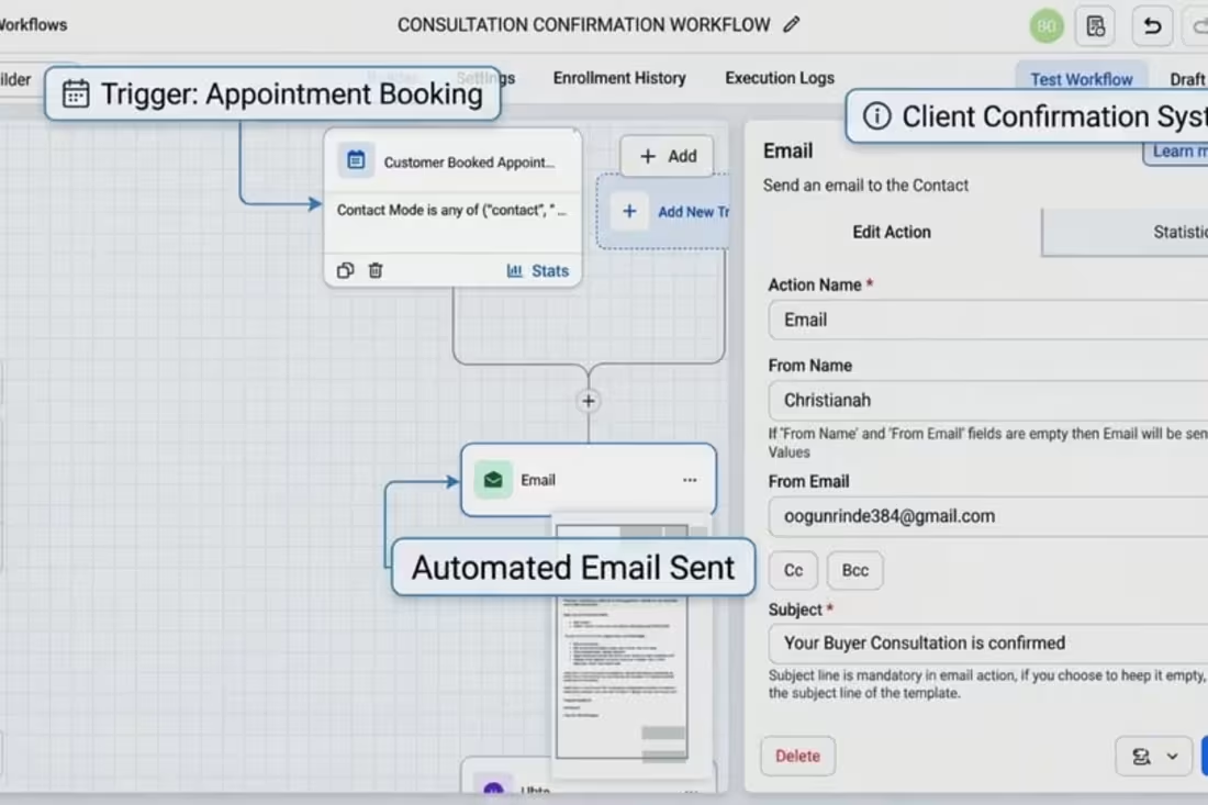
Consultation booking and email workflow built in GoHighLevel for real estate businesses. Automatically triggers when a client books an appointment, sending a professional confirmation email with details. Designed to improve client communication, reduce no-shows, and create a smooth, automated onboarding experience for service-based businesses and consultants.
#realestatebusiness (https://www.linkedin.com/search/results/all/?keywords=%23realestatebusiness&origin=HASH_TAG_FROM_FEED) #realestateagent (https://www.linkedin.com/search/results/all/?keywords=%23realestateagent&origin=HASH_TAG_FROM_FEED) #gohighlevel (https://www.linkedin.com/search/results/all/?keywords=%23gohighlevel&origin=HASH_TAG_FROM_FEED) #crm (https://www.linkedin.com/search/results/all/?keywords=%23crm&origin=HASH_TAG_FROM_FEED)
#marketingautomation (https://www.linkedin.com/search/results/all/?keywords=%23marketingautomation&origin=HASH_TAG_FROM_FEED) #leadconversion (https://www.linkedin.com/search/results/all/?keywords=%23leadconversion&origin=HASH_TAG_FROM_FEED) #clientexperience (https://www.linkedin.com/search/results/all/?keywords=%23clientexperience&origin=HASH_TAG_FROM_FEED)
#appointmentsetting (https://www.linkedin.com/search/results/all/?keywords=%23appointmentsetting&origin=HASH_TAG_FROM_FEED) #businessautomation (https://www.linkedin.com/search/results/all/?keywords=%23businessautomation&origin=HASH_TAG_FROM_FEED) #servicebasedbusiness (https://www.linkedin.com/search/results/all/?keywords=%23servicebasedbusiness&origin=HASH_TAG_FROM_FEED)
0
60
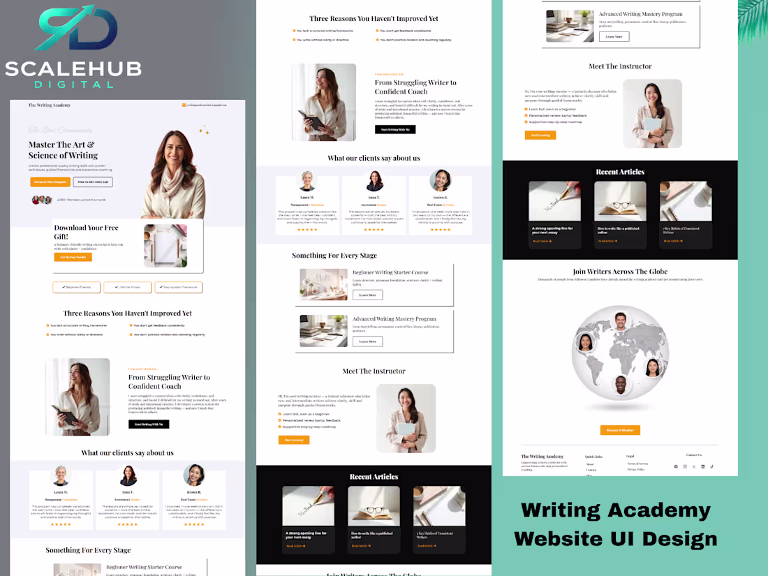
Most websites look good
But they don’t convert.
This Writing Academy page was designed to guide attention, build trust, and turn visitors into action.
Design is not decoration.
It’s direction.
#webdesign (https://web.facebook.com/hashtag/webdesign?__cft__[0]=AZbr3uCqjtCFVX6LxYPlneNr6I_mdv4bq4d3xc-PTWjutFZIwzgwnhqr3rMN2WqGPkBH1IoP75vgTMyG3v9RlP6YjzwaLb_NsS15PH8KGUVDXCsr32E-80GkfoBoPN4m-WzJK3cHJXucGYCWpAwElQ8hbCBt8hH0j6frH59-8bJuhEchNl4nWIHdtS8a8xWJ52w&__tn__=*NK-R) #landingpage (https://web.facebook.com/hashtag/landingpage?__cft__[0]=AZbr3uCqjtCFVX6LxYPlneNr6I_mdv4bq4d3xc-PTWjutFZIwzgwnhqr3rMN2WqGPkBH1IoP75vgTMyG3v9RlP6YjzwaLb_NsS15PH8KGUVDXCsr32E-80GkfoBoPN4m-WzJK3cHJXucGYCWpAwElQ8hbCBt8hH0j6frH59-8bJuhEchNl4nWIHdtS8a8xWJ52w&__tn__=*NK-R) #uiDesign (https://web.facebook.com/hashtag/uidesign?__cft__[0]=AZbr3uCqjtCFVX6LxYPlneNr6I_mdv4bq4d3xc-PTWjutFZIwzgwnhqr3rMN2WqGPkBH1IoP75vgTMyG3v9RlP6YjzwaLb_NsS15PH8KGUVDXCsr32E-80GkfoBoPN4m-WzJK3cHJXucGYCWpAwElQ8hbCBt8hH0j6frH59-8bJuhEchNl4nWIHdtS8a8xWJ52w&__tn__=*NK-R) #ConversionDesign (https://web.facebook.com/hashtag/conversiondesign?__cft__[0]=AZbr3uCqjtCFVX6LxYPlneNr6I_mdv4bq4d3xc-PTWjutFZIwzgwnhqr3rMN2WqGPkBH1IoP75vgTMyG3v9RlP6YjzwaLb_NsS15PH8KGUVDXCsr32E-80GkfoBoPN4m-WzJK3cHJXucGYCWpAwElQ8hbCBt8hH0j6frH59-8bJuhEchNl4nWIHdtS8a8xWJ52w&__tn__=*NK-R) #funneldesign (https://web.facebook.com/hashtag/funneldesign?__cft__[0]=AZbr3uCqjtCFVX6LxYPlneNr6I_mdv4bq4d3xc-PTWjutFZIwzgwnhqr3rMN2WqGPkBH1IoP75vgTMyG3v9RlP6YjzwaLb_NsS15PH8KGUVDXCsr32E-80GkfoBoPN4m-WzJK3cHJXucGYCWpAwElQ8hbCBt8hH0j6frH59-8bJuhEchNl4nWIHdtS8a8xWJ52w&__tn__=*NK-R) #digitalmarketing (https://web.facebook.com/hashtag/digitalmarketing?__cft__[0]=AZbr3uCqjtCFVX6LxYPlneNr6I_mdv4bq4d3xc-PTWjutFZIwzgwnhqr3rMN2WqGPkBH1IoP75vgTMyG3v9RlP6YjzwaLb_NsS15PH8KGUVDXCsr32E-80GkfoBoPN4m-WzJK3cHJXucGYCWpAwElQ8hbCBt8hH0j6frH59-8bJuhEchNl4nWIHdtS8a8xWJ52w&__tn__=*NK-R)
0
56
Most fitness coaches don’t have a funnel…
They have random steps that don’t convert.
You might be:
– Getting traffic but no leads
– Getting leads but no sales
– Or relying too much on DMs
A real funnel fixes that.
It guides people from:
Stranger → Lead → Buyer → Client
And the difference?
Consistency.
Even if you already have a funnel or website, there are usually gaps costing you sales.
If you want to know what’s wrong with yours 👇
DM me “AUDIT”
Send your funnel or website link
I’ll show you exactly what’s stopping you from making sales (free)
#fitnesscoach #onlinecoach #fitnessbusiness #salesfunnel
#leadgeneration #clientacquisition #digitalmarketing
#getmoreclients #businessgrowth #funnelstrategy
0
56
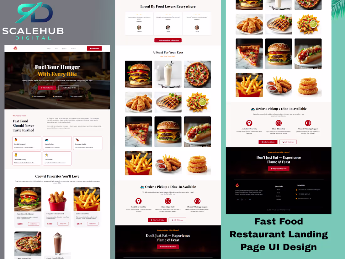
Designed a high-converting landing page for a fast food restaurant brand focused on increasing orders and improving customer action. The page was structured to showcase meals clearly, build trust fast, and guide visitors toward ordering through strong CTA placement, featured menu sections, and a clean mobile-responsive layout. Built to turn attention into real food orders, not just page visits.
0
81
Looking back at this design brings back memories.
This was one of my first website designs and also my first design on #GoHighLevel. I was so happy creating it at the time.
Now, with more experience, I can see where it could be better:
CTA not bold enough
weak visual hierarchy
some text too dense
section flow could be stronger
offer presentation could be clearer
Still proud of it, because this is where growth started.
This design reminds me how far I have come - and how much more intentional my work has become.
Growth is beautiful when you allow yourself to see it.
Every great designer starts somewhere.
0
73
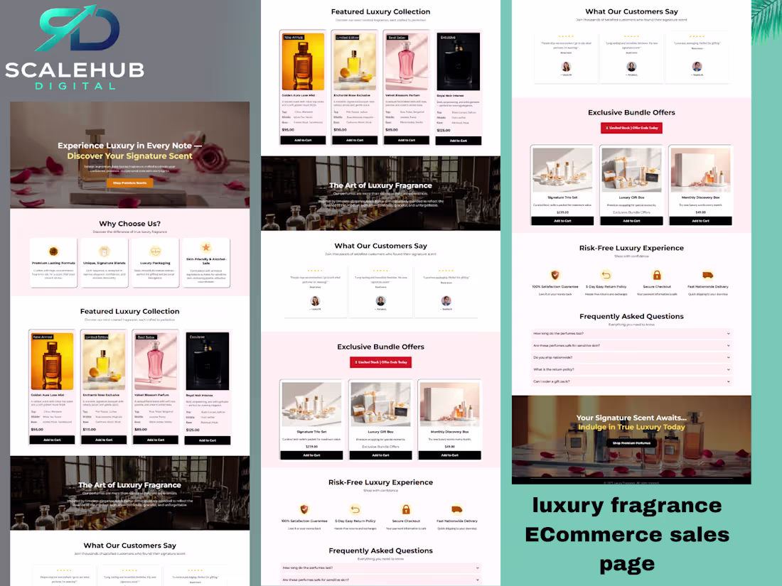
Designed a high-converting luxury fragrance eCommerce sales page focused on premium positioning, structured persuasion, and strategic CTA placement.
This project combined luxury aesthetics with conversion psychology - including bundle positioning, social proof integration, objection-handling FAQs, and value-driven product hierarchy.
Built not just to look premium - but to sell premium.
1
100
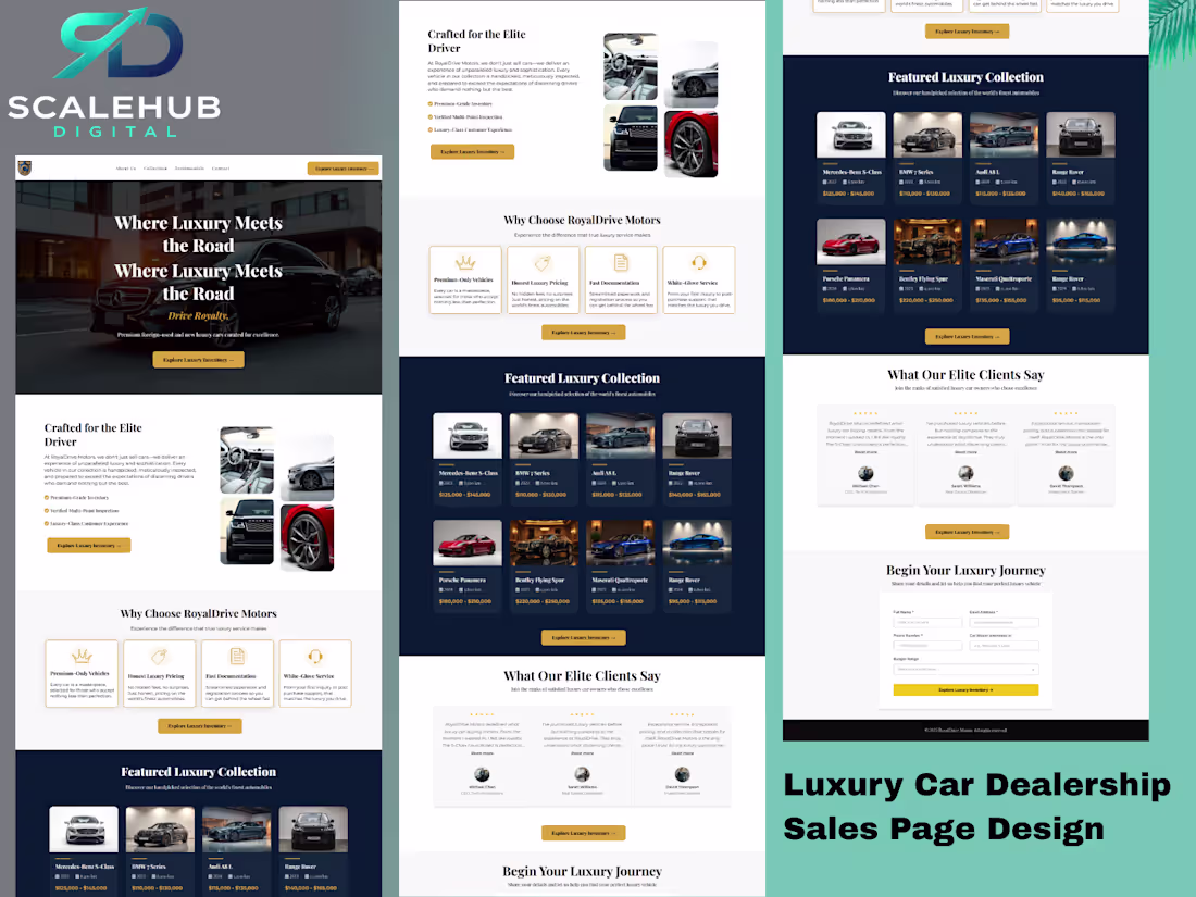
This project involved designing a high-converting sales page for a luxury car dealership brand.
The objective was to create a structured, persuasive long-form page that:
1 Clearly communicates exclusivity and premium positioning
2 Showcases high-end inventory in a structured layout
3 Increases perceived value through refined presentation
4 Handles buyer objections before inquiry
5 Drives test drive bookings and inventory exploration through strategic CTA placement
This wasn’t just about aesthetics - it was about building a complete luxury buying experience.
1
107
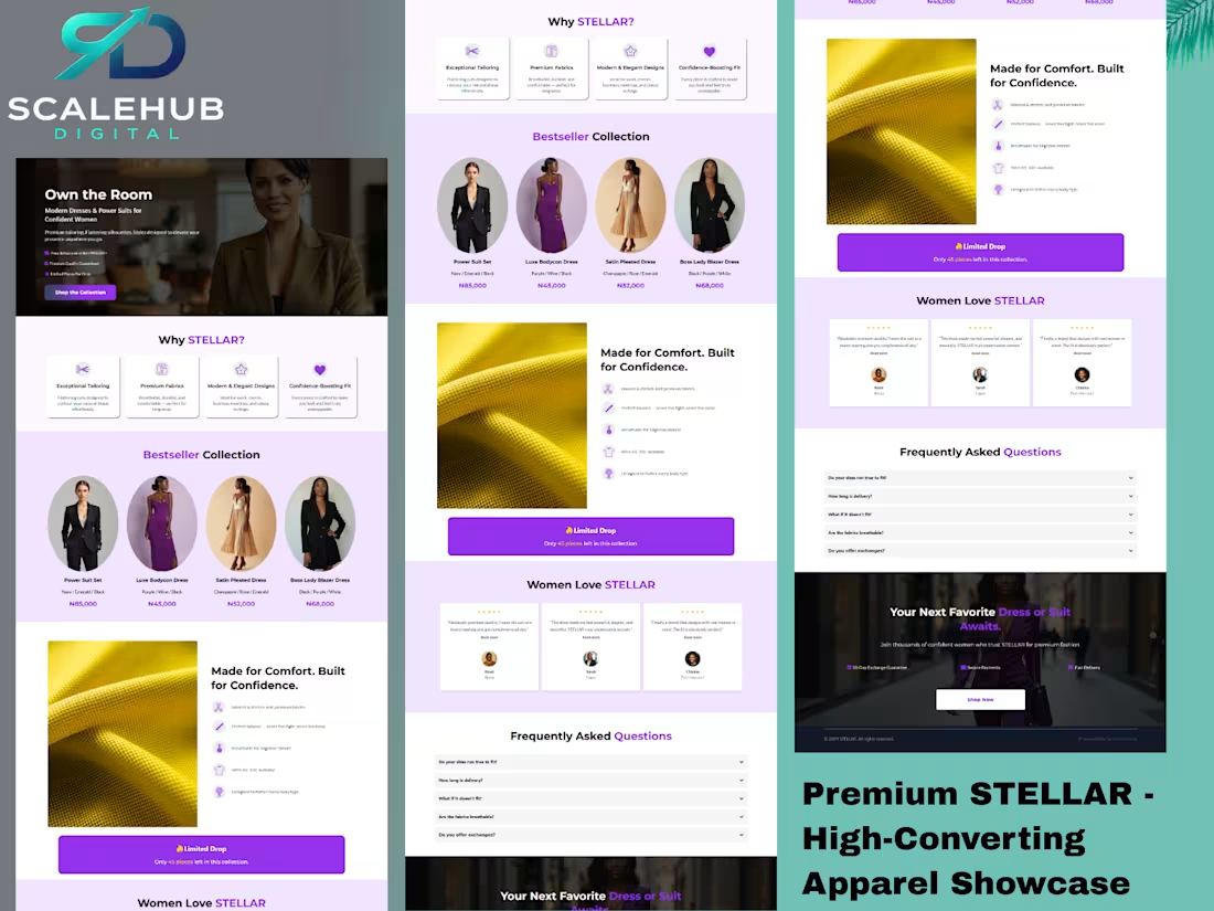
Designed a high-converting eCommerce sales page for a premium women’s fashion brand. The layout combines bold visuals, structured persuasion, value stacking, and strategic CTA placement to drive product purchases while positioning the brand as modern, confident, and high-end.
Project Overview
This project involved designing a high-converting sales page for a premium women’s fashion brand.
The objective was to create a structured, persuasive product-focused page that:
1 Clearly communicates product value and confidence appeal
2 Positions the brand as modern and premium
3 Breaks down features to increase perceived value
4 Handles buyer objections before checkout
5 Drives conversions through strategic CTA placement
This wasn’t just about aesthetics - it was about building a complete buying experience.
2
125
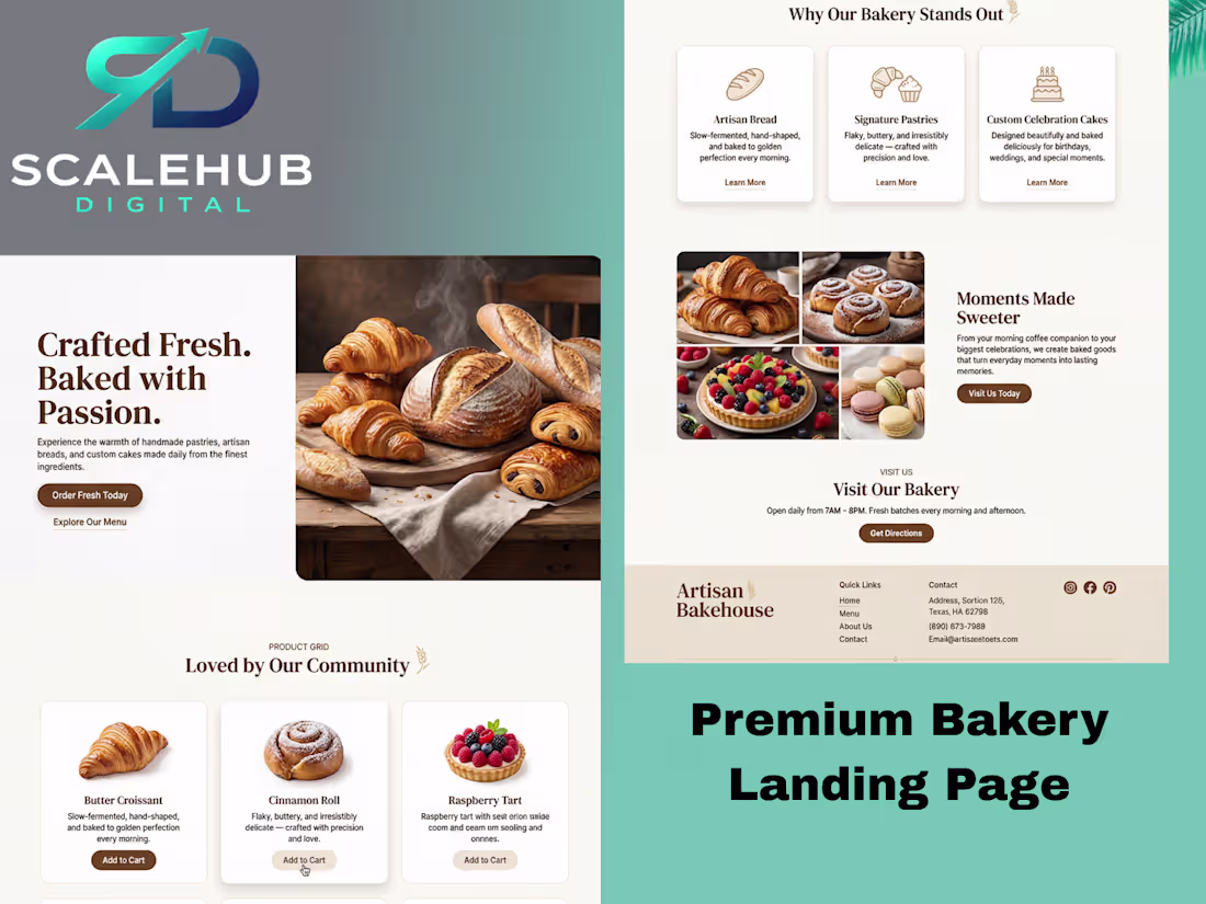
Premium Bakery Landing Page Design
A modern, conversion-optimized landing page built for artisan bakeries and food brands.
Key Features:
• Clean hero section with CTA
• Product grid layout
• Trust-building content blocks
• Warm, brand-focused aesthetic
Available for custom landing page projects.
Let’s build something that converts.
0
109
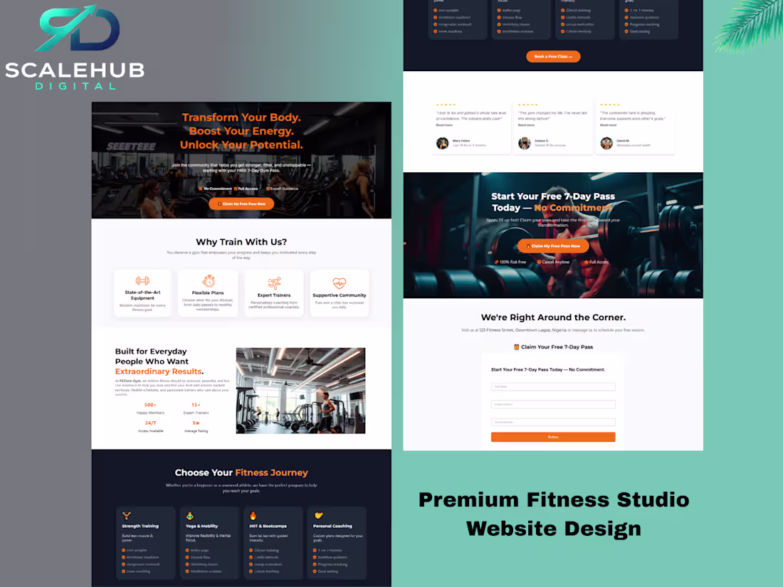
Designed a modern, conversion-focused website for a premium fitness studio aiming to increase 7-day free pass sign-ups and convert visitors into paying members.
The strategy centered around one core action: “Claim Your Free 7-Day Pass.”
Built with emotional transformation messaging, a bold premium aesthetic, strong CTA contrast, and a structured layout that guides users from motivation to commitment.
Focused on clear value positioning, high-impact visuals, streamlined mobile responsiveness, and persuasive content hierarchy to turn traffic into long-term memberships - not just website visitors.
0
110
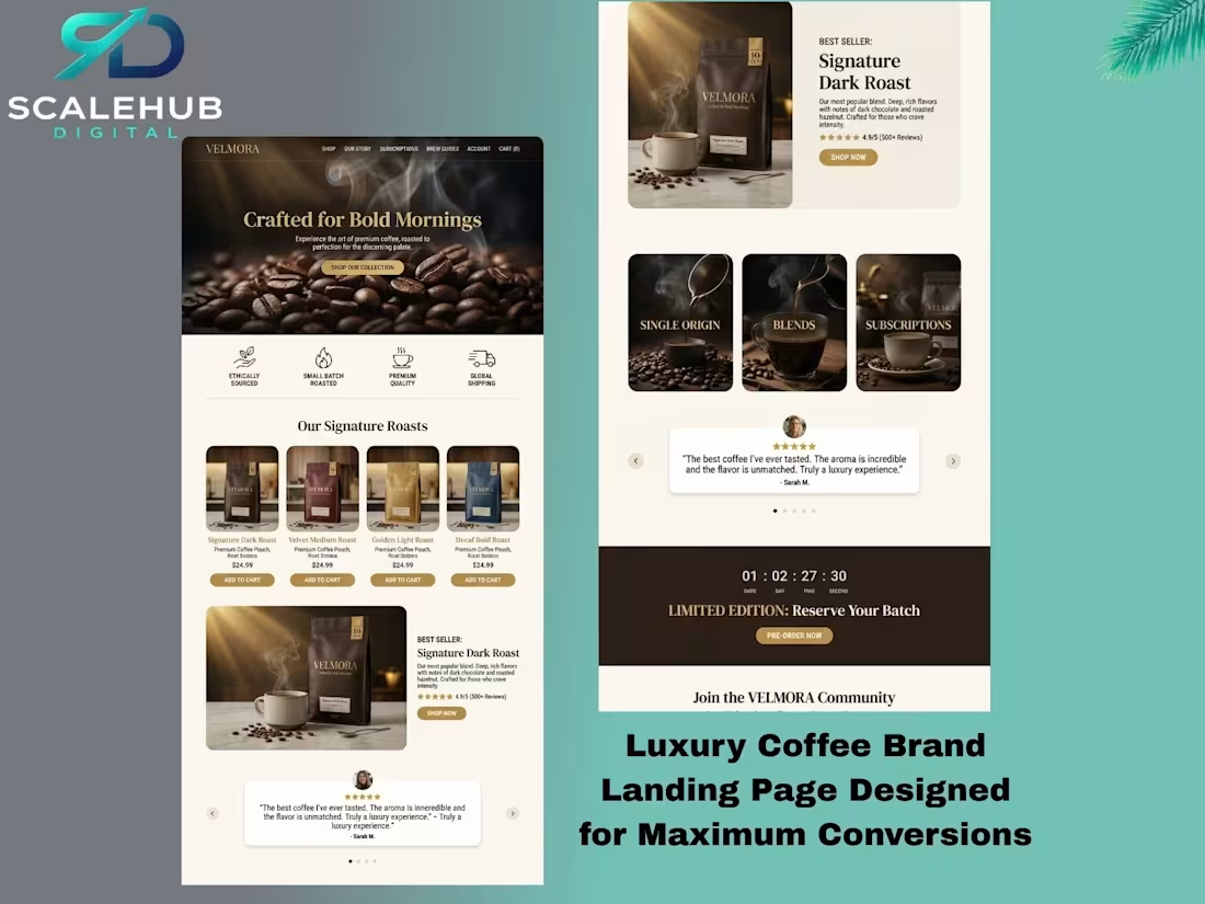
Velmora Coffee is a luxury direct-to-consumer coffee brand concept created to combine premium aesthetics with a high-converting digital experience.
The objective was to design a cohesive brand system - from product packaging to a strategically structured landing page - built to drive product sales and pre-orders.
Many coffee brands prioritize visuals but overlook layout flow, hierarchy, urgency, and strategic messaging. This project focused on solving that gap by blending branding with conversion psychology.
Key strategic elements included:
• Emotion-driven hero positioning
• Strategic social proof placement
• Structured conversion flow: Awareness → Interest → Trust → Desire → Action
The result is a seamless brand experience designed not just to look premium - but to guide visitors naturally toward purchase.
0
117
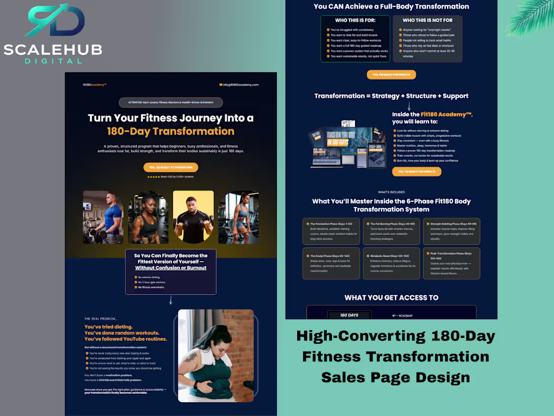
High-converting sales page designed for a 180-day fitness transformation program. The layout was strategically structured to guide visitors from awareness to purchase using clear messaging, strong CTAs, social proof, and value stacking. Built to position the program as a premium, results-driven coaching offer while maximizing conversions.
1
173
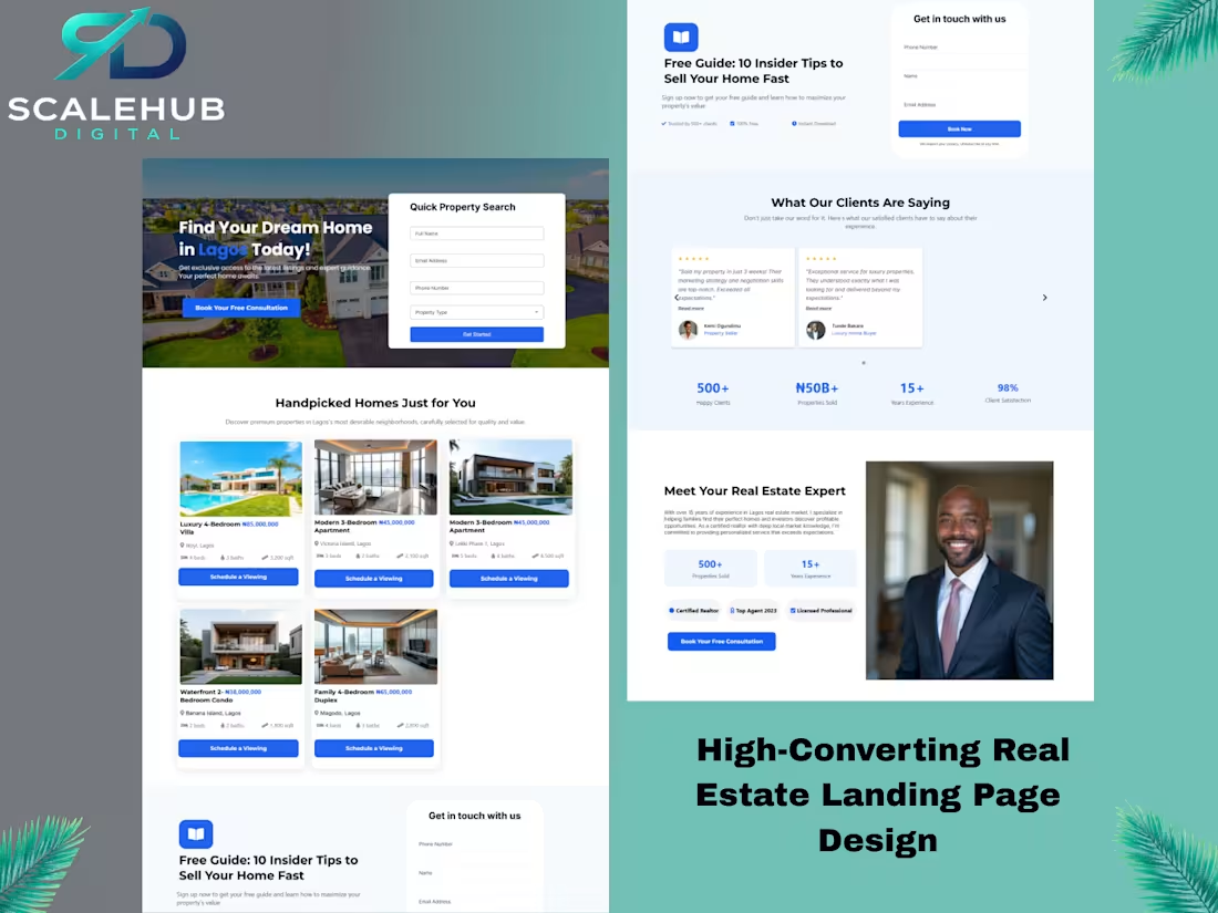
A high-converting real estate landing page designed to help a Lagos-based realtor attract qualified buyers, showcase premium listings, and generate consistent consultation bookings.
The goal was not just aesthetics - but structured lead generation.
0
143