
Nithin .
Transforming messy data into actionable insights
New to Contra
Nithin is building their profile!
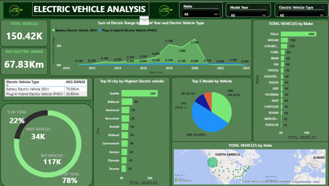
This dashboard provides a quick overview of electric vehicle trends, showing total EV count, average range, and the split between BEVs and PHEVs. It highlights growth over time, top cities and manufacturers, and geographic distribution to understand adoption patterns.
Key Points:
Total EVs: 150.42K with an average range of 67.83 km
BEVs dominate the market (78%) compared to PHEVs (22%)
Strong growth observed around 2017–2020
Tesla leads significantly among manufacturers
Seattle is the top city for EV adoption
EV usage is concentrated mainly in urban regions
0
10
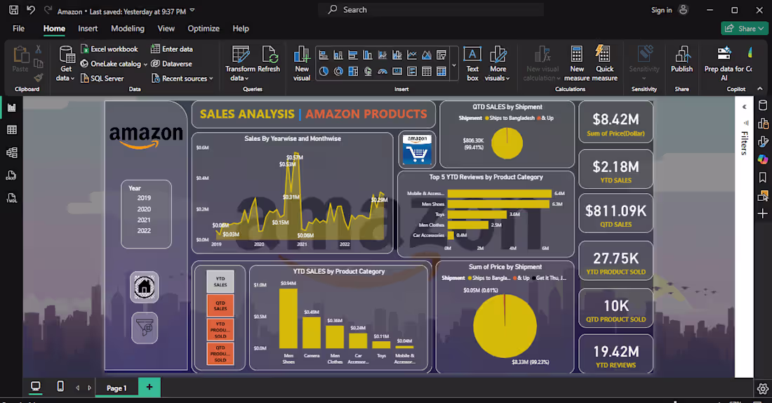
"SALES ANALYSIS | AMAZON PRODUCTS", which provides a detailed overview of Amazon product sales performance across multiple years and categories. Here’s a structured description:
📊 Dashboard Overview
Title: SALES ANALYSIS | AMAZON PRODUCTS
Branding: Amazon logo displayed on the left
Year Selection: Options for 2019, 2020, 2021, and 2022
📈 Sales Trends
Sales by Year & Month:
2019: $0.03M
2020: $0.15M
2021: $0.57M (peak year)
2022: $0.29M
🛒 Product Category Insights
Top 5 YTD Reviews:
Mobile & Accessories: 6.4M
Men Shoes: 3.6M
Toys: 2.5M
Men Clothes: 0.4M
Car Accessories: 0M
YTD Sales by Category:
Men Shoes: $0.94M
Camera: $0.49M
Men Clothes: $0.36M
Car Accessories: $0.24M
Toys: $0.11M
Mobile & Accessories: $0.04M
🚚 Shipment Analysis
QTD Sales by Shipment:
Ships to Bangladesh & Up: $806.30K (99.41%)
Sum of Price by Shipment:
Ships to Bangladesh & Up: $8.33M (99.23%)
Other option: $0.05M (0.612%)
📌 Key Performance Indicators
Total Price (Sum): $8.42M
YTD Sales: $2.18M
QTD Sales: $811.09K
YTD Products Sold: 27.75K
QTD Products Sold: 10K
YTD Reviews: 19.42M
Overall, the dashboard emphasizes 2021 as the best-performing year, Men Shoes as the top revenue driver, and Mobile & Accessories as the most customer-engaged category, with shipments concentrated in one region.
0
14
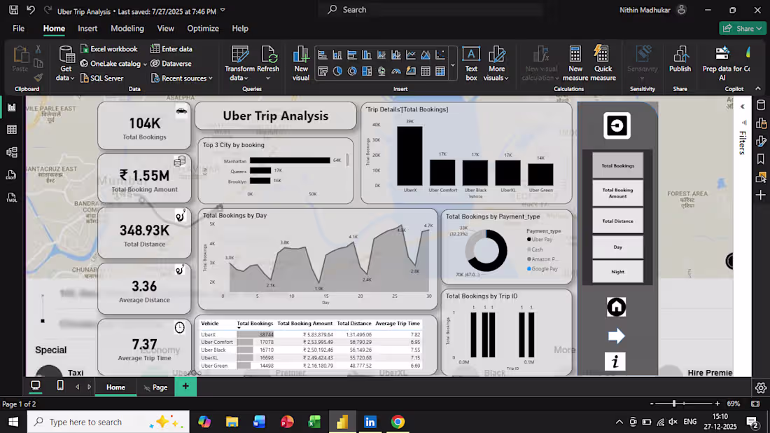
Developed an interactive Power BI dashboard to analyze Uber trip data and uncover key business insights.
This dashboard provides a complete overview of booking trends, revenue, distance traveled, and customer behavior.
Key Features:
Total bookings, total revenue, and total distance tracking
Vehicle-wise performance analysis (UberX, Comfort, Black, XL, Green)
Daily trip trends and distance analysis
Payment method insights (Cash, Uber Pay, Google Pay, etc.)
Geographic trip distribution using map visualization
Trip-level analysis with booking and distance metrics
Tools & Techniques:
Power BI for dashboard development
Data cleaning and transformation
Data visualization and KPI design
Outcome:
This dashboard helps stakeholders understand ride patterns, optimize vehicle usage, and make data-driven business decisions.
0
19
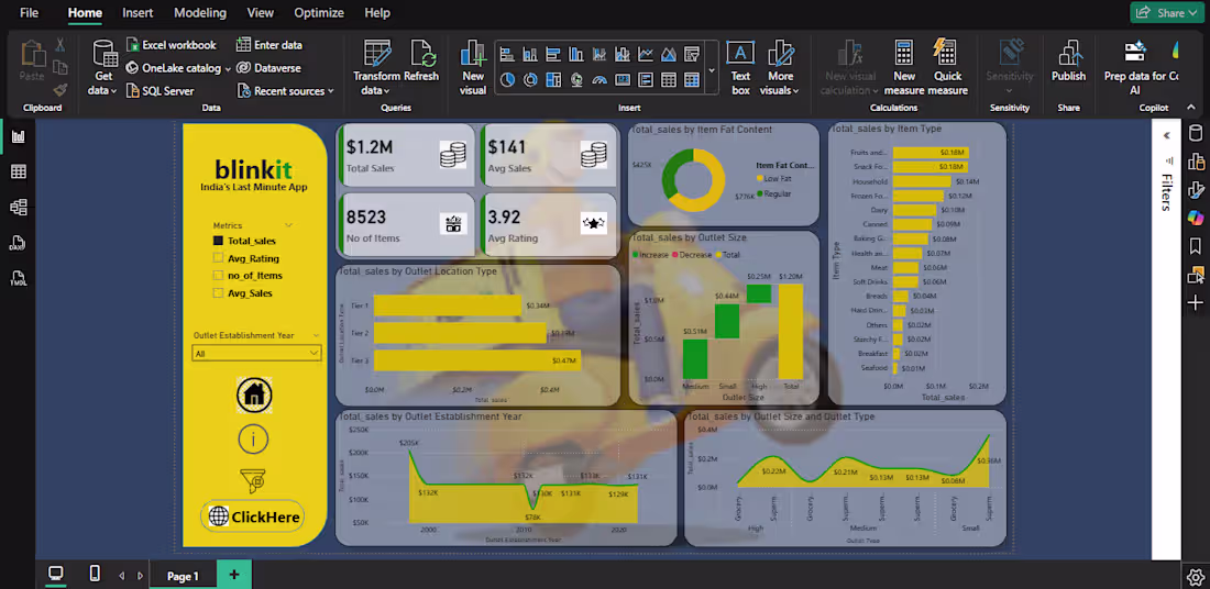
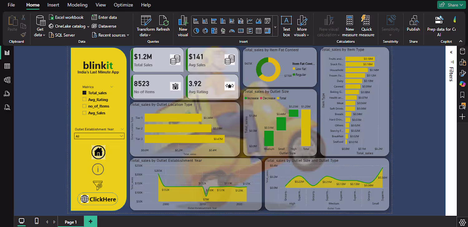
Created an interactive Power BI dashboard for Blinkit sales analysis.
Key features:
Total sales, average sales, and product insights
Outlet performance analysis
Category-wise sales breakdown
Interactive filters for better decision making
Tools used:
Power BI
Data Cleaning
Data Visualization
This dashboard helps businesses understand sales trends and improve decision-making.
0
23