
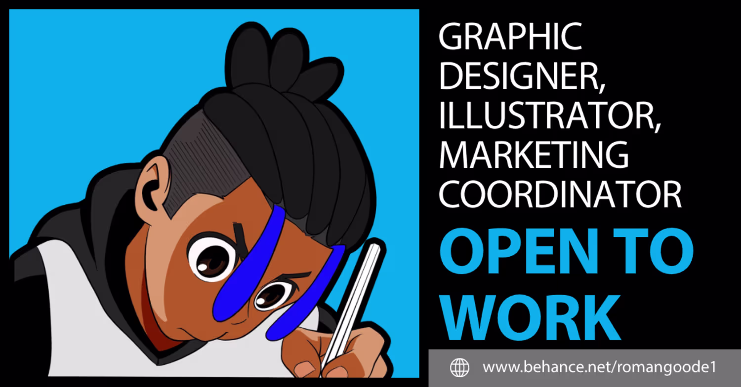
Roman Goode
Graphic Designer & Marketer | +279% Engagement Growth
Ready for work
Roman is ready for their next project!
Project Overview
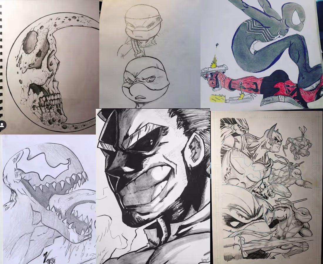
I created a collection of traditional pencil and ink illustrations focusing on character design, dynamic posing, and comic book aesthetics. This project highlights my foundational drawing skills through detailed, hand-drawn interpretations of highly recognizable characters.
Key Contributions
Traditional Drafting: Utilized graphite and ink to create complex character portraits and high-energy action scenes entirely by hand without digital assistance.
Cross-Genre Styling: Demonstrated versatility by adapting to diverse established art styles, ranging from classic western comic books to high-impact manga and anime.
Line Weight and Shading: Applied advanced shading and crosshatching techniques to build depth, texture, and high contrast lighting purely through manual rendering.
Results
This collection underscores a strong foundation in traditional illustration. It proves my ability to translate dynamic concepts directly onto paper, serving as the essential groundwork for complex visual storytelling and design projects.
2
28
Project Overview
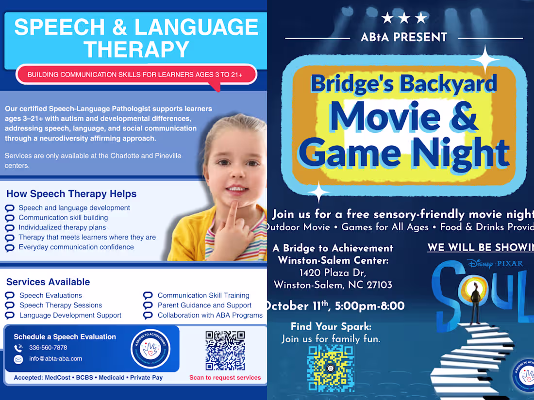
I developed a suite of community-focused marketing assets for a pediatric therapy provider, including clinical service directories and special event promotions. The project required balancing professional medical credibility with a welcoming, family-friendly aesthetic to encourage engagement within the local community.
Key Contributions
Integrated Branding: Unified the visual language across diverse service lines—from clinical Speech & Language Therapy to community events like "Bridge's Backyard Movie & Game Night"—ensuring consistent brand recognition.
Complex Information Layout: Designed the "Speech & Language Therapy" flyer to present clinical benefits, service lists, and insurance data in a scannable, non-intimidating format for parents.
Event Marketing: Created high-energy promotional materials for community events, utilizing custom typography and vibrant color blocks to drive attendance and foster a sense of belonging.
Call-to-Action Optimization: Seamlessly integrated QR codes and contact touchpoints to streamline the transition from physical print media to digital service requests.
Results
These assets successfully positioned the provider as both a clinical authority and a community pillar, contributing to a significant increase in service inquiries and event participation.
1
24
Project Overview
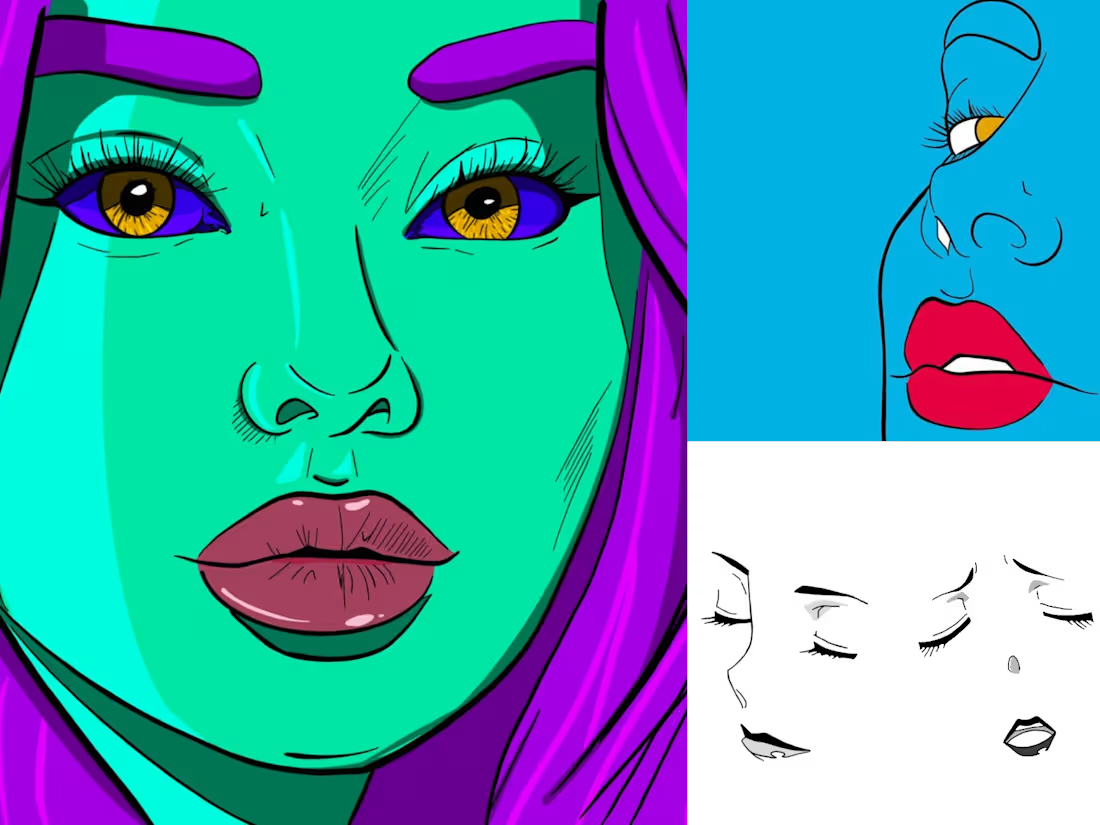
I developed a high-energy, stylized character portrait featuring a bold "Green skin lady" aesthetic. The project focused on pushing the boundaries of color theory and digital line work to create a standout piece for a character-driven portfolio.
Key Contributions
Custom Character Illustration: Crafted a unique persona using a vibrant, high-contrast palette, emphasizing expressive features and a modern, "alt-culture" aesthetic.
Vector Precision: Developed the piece using clean, scalable vector lines to ensure the artwork maintains its integrity across various digital and print formats.
Advanced Color Grading: Utilized the Adobe ecosystem to experiment with neon-inspired skin tones and complementary hair and eye colors for maximum visual impact.
Results
The final illustration serves as a core example of my ability to blend traditional character design principles with a vibrant, modern digital style, resulting in a piece that captures attention in a crowded digital landscape.
1
26
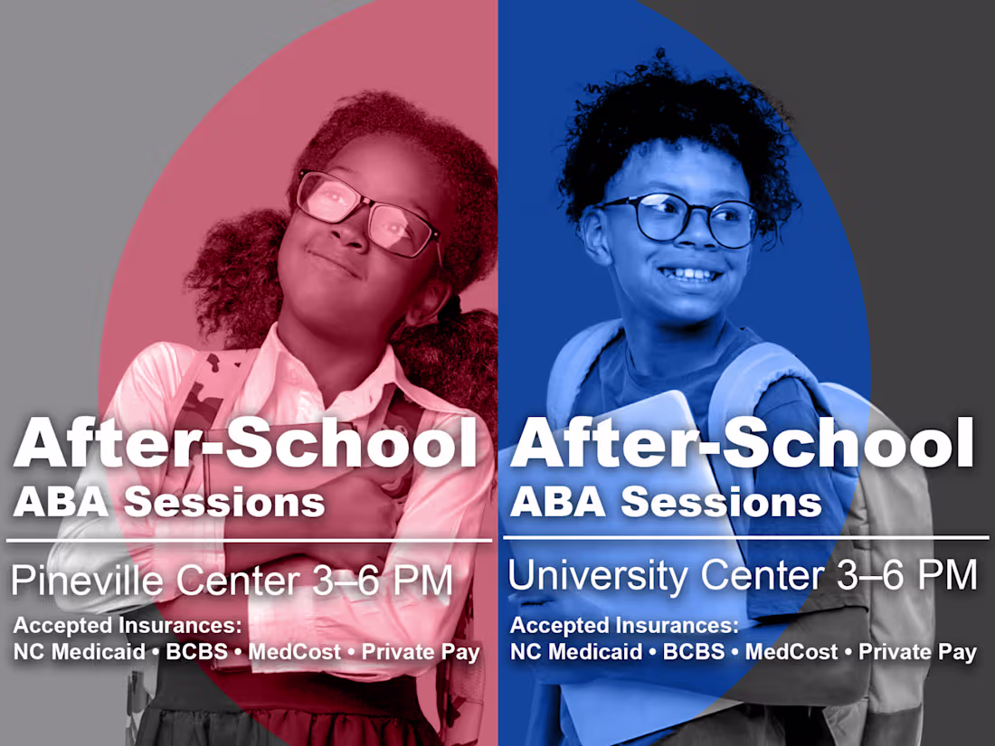
Project Overview
I designed a high-impact promotional graphic for a healthcare provider to announce new after-school Applied Behavior Analysis (ABA) sessions. The design focuses on clarity and accessibility, ensuring parents can quickly identify location-specific details and insurance compatibility.
Key Contributions
Targeted Information Design: Utilized a split-screen layout to distinguish between two different service locations (Pineville and University) while maintaining a unified brand feel.
Accessibility & Clarity: Prioritized essential data—times, locations, and accepted insurances (NC Medicaid, BCBS, MedCost)—to reduce friction for families seeking specialized care.
Visual Engagement: Combined professional photography with bold, clean typography to create a trustworthy and welcoming aesthetic for a clinical setting.
Results
The resulting asset provided a streamlined way for the organization to market recurring sessions across different regions, ensuring that complex insurance and scheduling information was digestible at a glance.
1
14