
Nicolás Cirillo
Art and Creative Director turned AI Brand Strategist
New to Contra
Nicolás is ready for their next project!

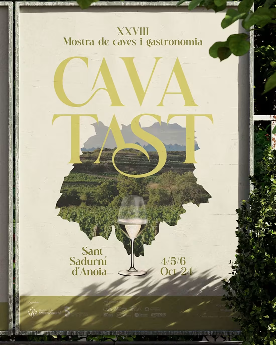
Cavatast is one of the most important cava festivals in Catalonia. The visual identity needed to feel festive without being loud, institutional without being cold.
Clean typography, restrained palette, and a graphic system that could live across signage, print and digital. Elegant by design.
0
3
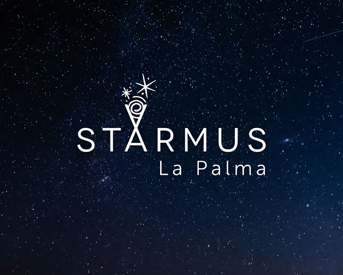
Starmus is an international festival where science, music and art collide. Stephen Hawking, Brian May, Nobel laureates on the same stage.
Art directing for an event at this scale means creating a visual language worthy of the ideas being discussed. It needs to feel as vast as space and as precise as science.
1
25

La Matería
La Matería is a space in the Malasaña neighborhood of Madrid dedicated to mate culture and Latin American traditions. As a Uruguayan who grew up with mate as a daily ritual, this project was different from day one.
The visual identity is built around the objects of the ritual itself: the gourd, the bombilla, the textures. The color palette comes directly from the natural tones of yerba mate.
The result is a brand that feels authentic because it came from the inside out.
1
23
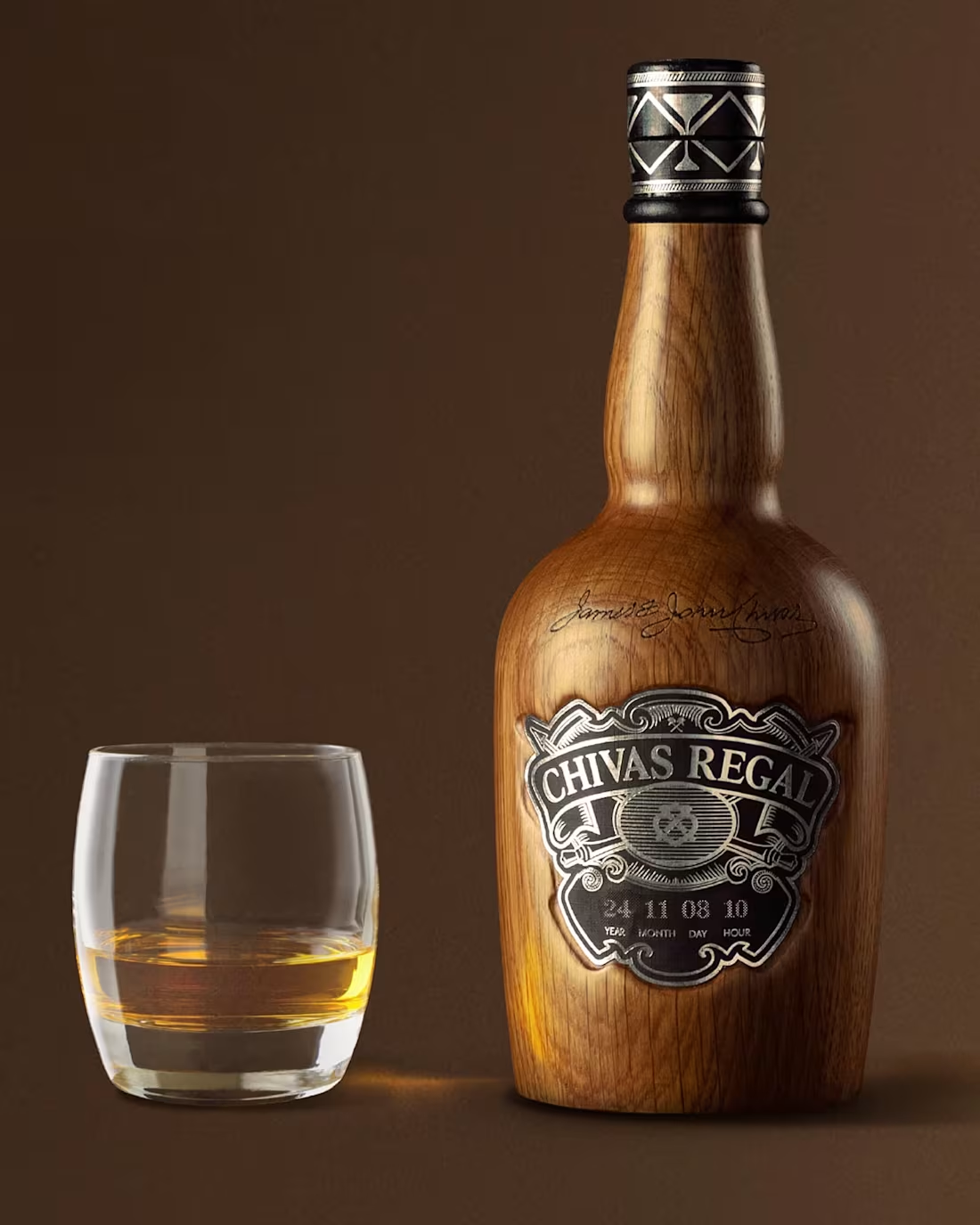
Chivas Regal "Eternity."
Some things transcend time. That was the idea.
We designed a special edition Chivas Regal bottle made from the same oak used in the aging casks, so the whisky could keep aging indefinitely, until its owner decided it was time. Luxury isn't a price tag. It's a philosophy.
This one won at New York Festivals and Ojo de Iberoamérica, and it's still one of the most elegant ideas I've been part of.
2
27
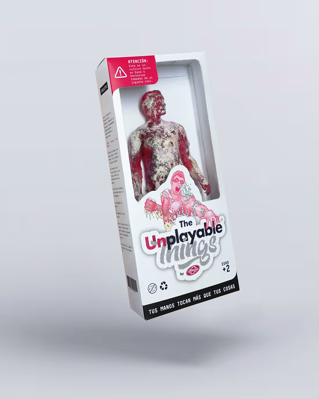
80% of toys carry dangerous microorganisms. A child's immune system isn't fully developed until age 10. The danger hides in the things that seem harmless. We decided to make it visible.
For Global Handwashing Day, we took bacterial samples from real everyday toys and created a line of toy packaging that literally cultivated those bacteria. The Unplayable Things.
Featured by Contagious Magazine. One of those campaigns that reminded me why I got into this. https://vimeo.com/308905233?fl=pl&fe=vl
1
30