James Nnamdi Ngwu
Sport Graphics Designer.
Ready for work
James is ready for their next project!

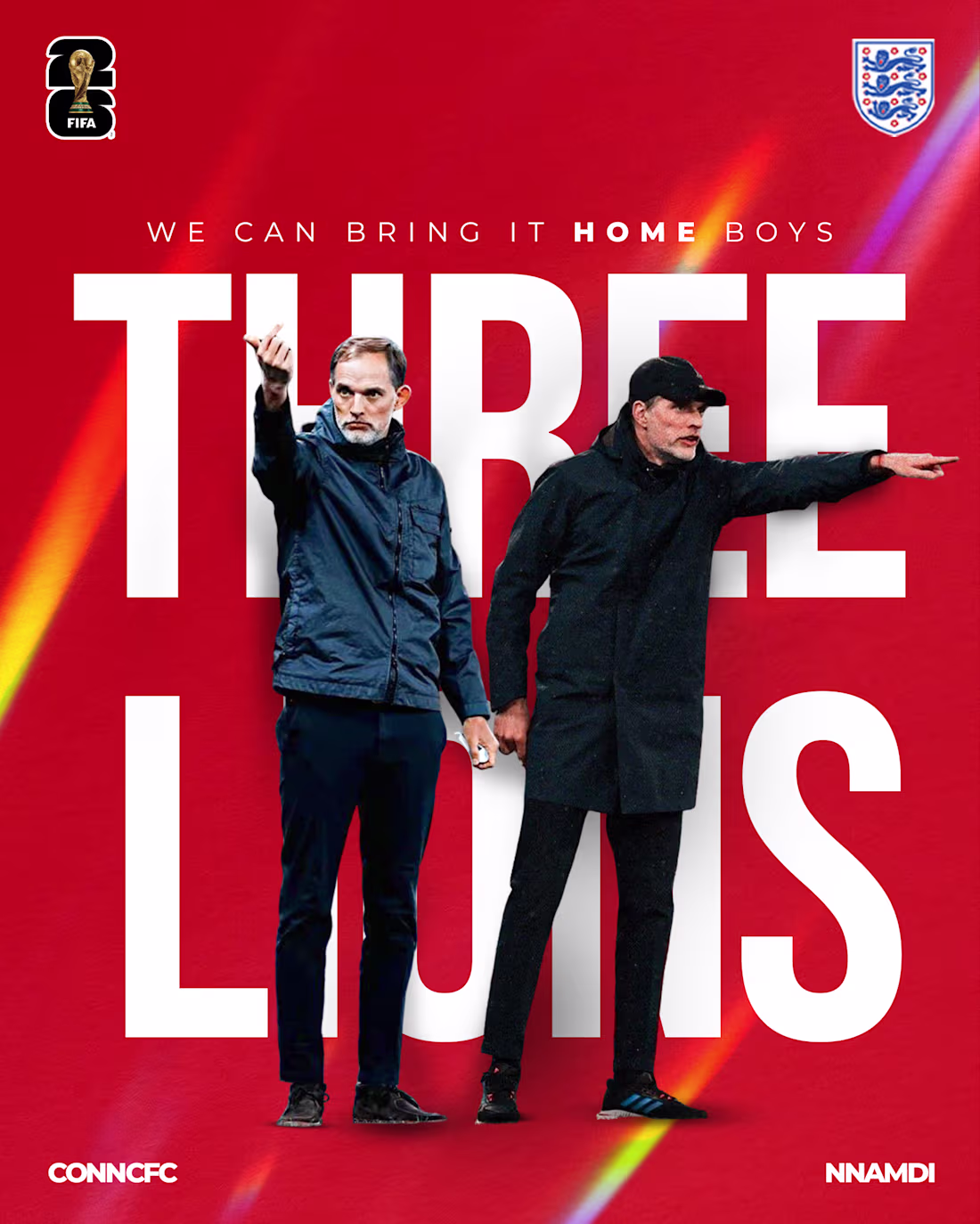
Design Approach — THREE LIONS (Tuchel / World Cup 2026)
The concept centers on the upcoming 2026 FIFA WORLD CUP and England's Head coach, Thomas Tuchel as the commanding presence behind England's World Cup ambitions. Two cutout images of Tuchel, both in directive, pointing poses are layered in front of and behind the oversized "THREE LIONS" typography, creating depth through a foreground/background composite technique.
The bold red background references England's national identity, while the prismatic light streak adds energy and visual tension without overwhelming the layout. The FIFA World Cup 2026 badge and Three Lions crest anchor the piece institutionally ,top left and top right respectively, giving it an official, editorial weight.
The headline copy, "We Can Bring It Home Boys," sits above the top of the graphics. This was specially designed for CONNCFC on X as he has high hopes that his fellow country men go all the way in the tournament.
The CONNCFC and NNAMDI credits at the bottom frame it as a collaborative piece within the sports graphics space..
1
35
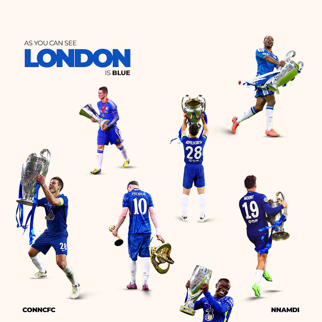
London is Blue design for @conncfc on X (Twitter)
1
58
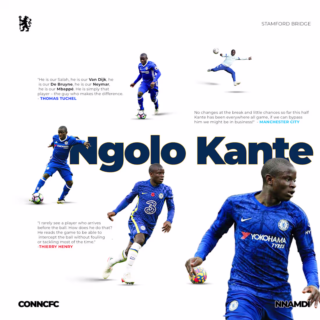
Pointing Ngolo Kante's excellence with some famous quote by players, opposition clubs and a top coach. DESIGN FOR CONNCFC on twitter (x)
3
54
Staring off the week strong with these two design.
2
128
The Jonny Walker Experience with SARZ
0
43
THE CITY WATER RESILIENCE CONFERENCE WITH OVE ARUP AND PARTNERS COLLABORATING WITH HOWDEN.
I led the editing and coordination of a conference announcement video for the collaboration between Arup and Howden, focused on their water resilience program.
My role went beyond just editing, I worked closely with both the internal team and Arup’s UK counterparts to make sure the messaging was clear, aligned, and delivered in a way that felt cohesive across all stakeholders. I structured the narrative, refined the pacing, and ensured the visuals supported the overall tone, which needed to feel professional, informative, and intentional.
It was a corporate communications piece, so I paid a lot of attention to clarity and flow, making sure the final video didn’t just look good but communicated the purpose of the conference effectively. The end result was a polished announcement video that positioned the event properly and reflected the standard expected from both organizations.
0
50
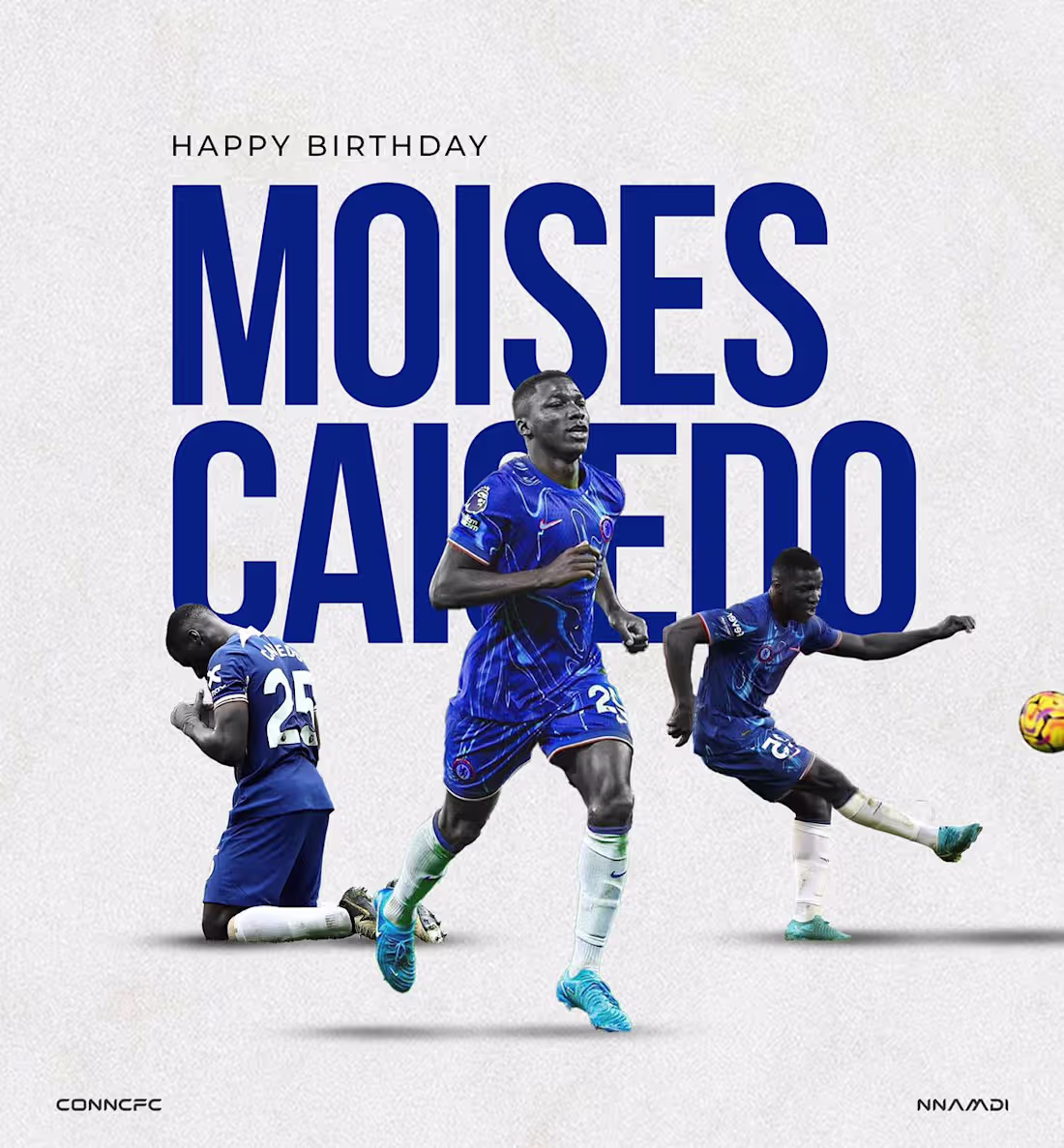
CAICEDO'S BIRTHDAY
0
73
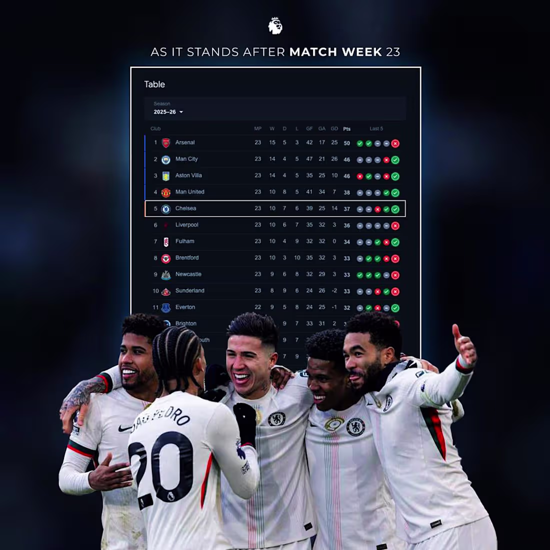
CHELSEA CURRENT STANDING AT MATCH WEEK 23 IN THE PREMIER LEAGUE FOR CHELSEA
0
62
Working for CONNCFC with the collaboration of CFC PSY For the creation of their new talk scape of both on titter and out on YOUTUBE called CHELSEA CENTRAL
0
64
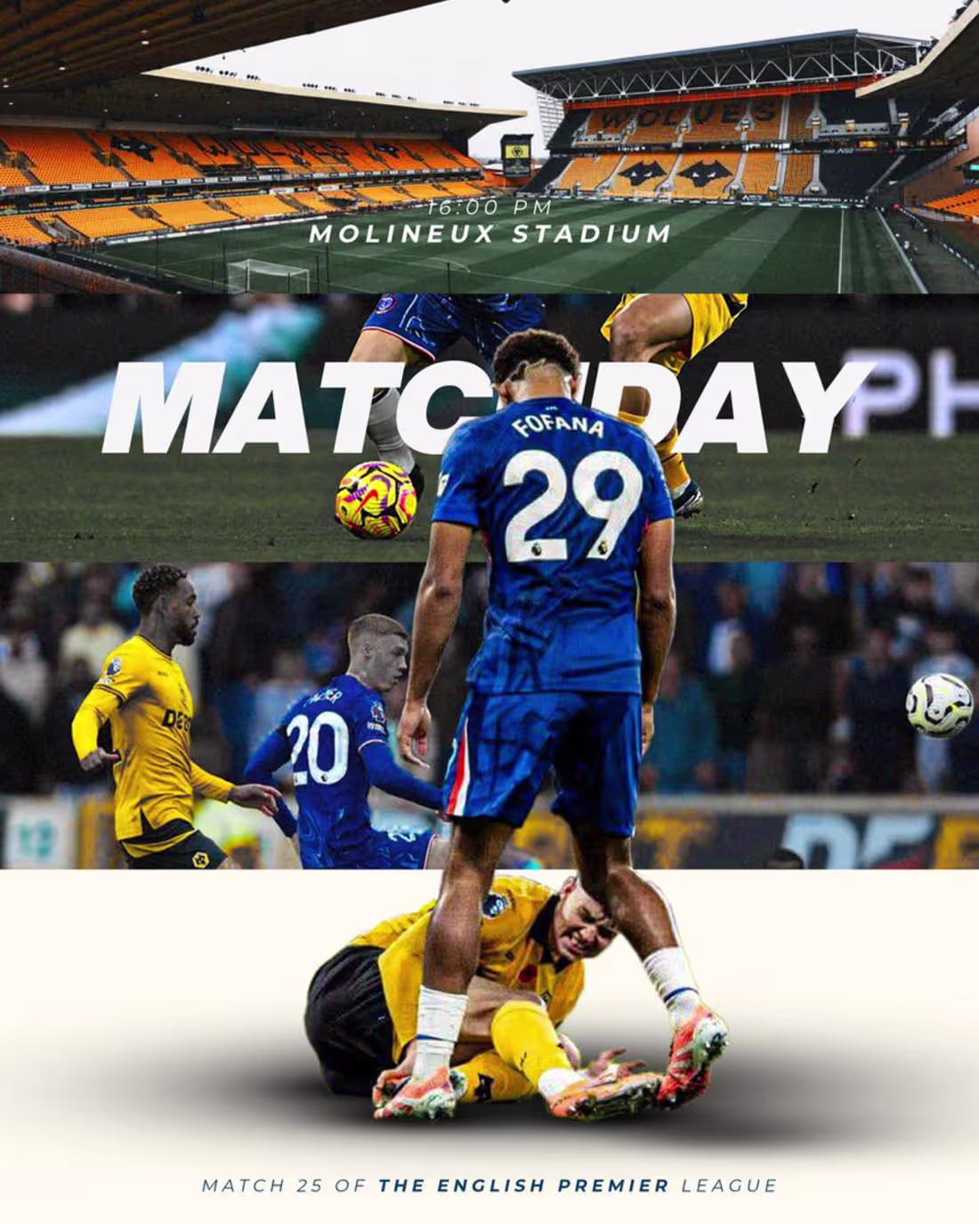
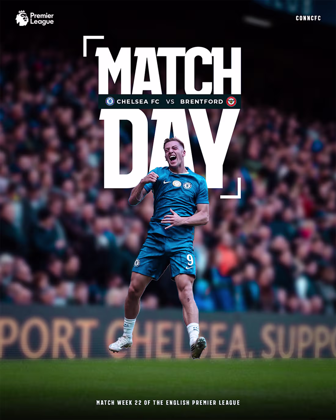
MATCH DAY VS WOLVES FOR CONNCFC ON X (Twitter)
0
58
CONNCFC COLLABORATION WITH CFC PYS ON TWITTER AND YOUTUBE
0
69
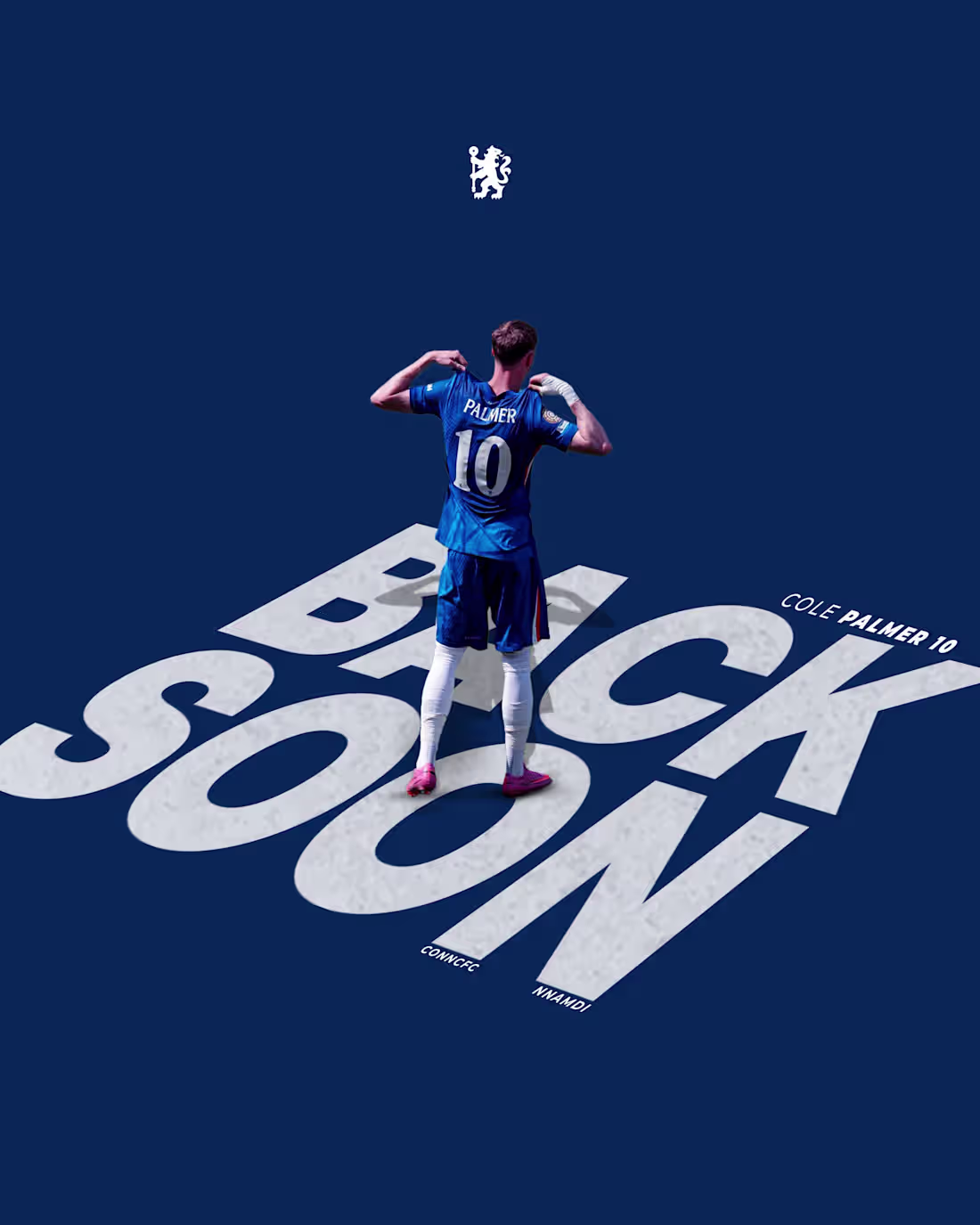
ANTICIPATING COLE PALMER RETURN FROM INJURY
0
63
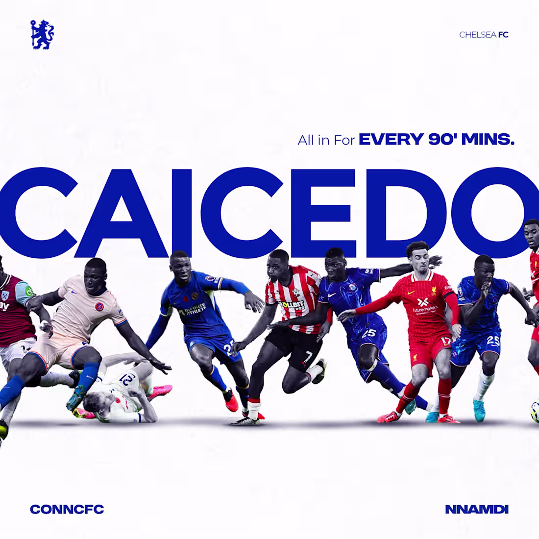
HIGHLIGHTING CAICEDO'S BRILLANCE
0
60
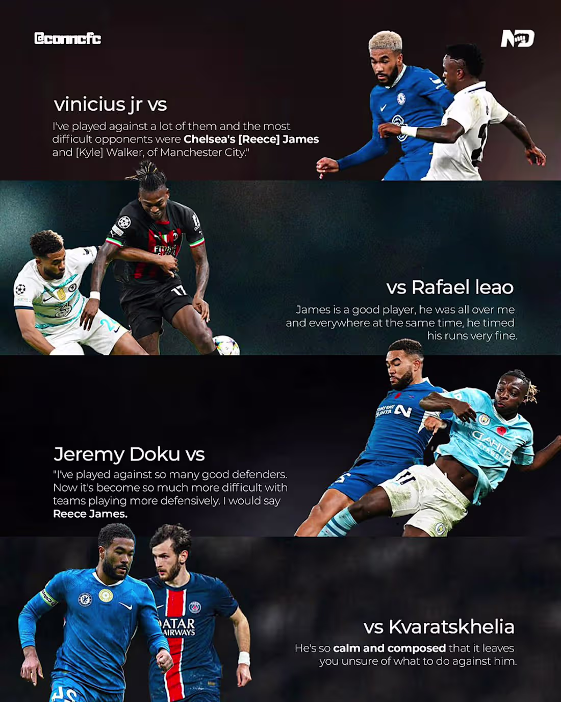
ONE OF OUR OWN REECE JAMES
0
58
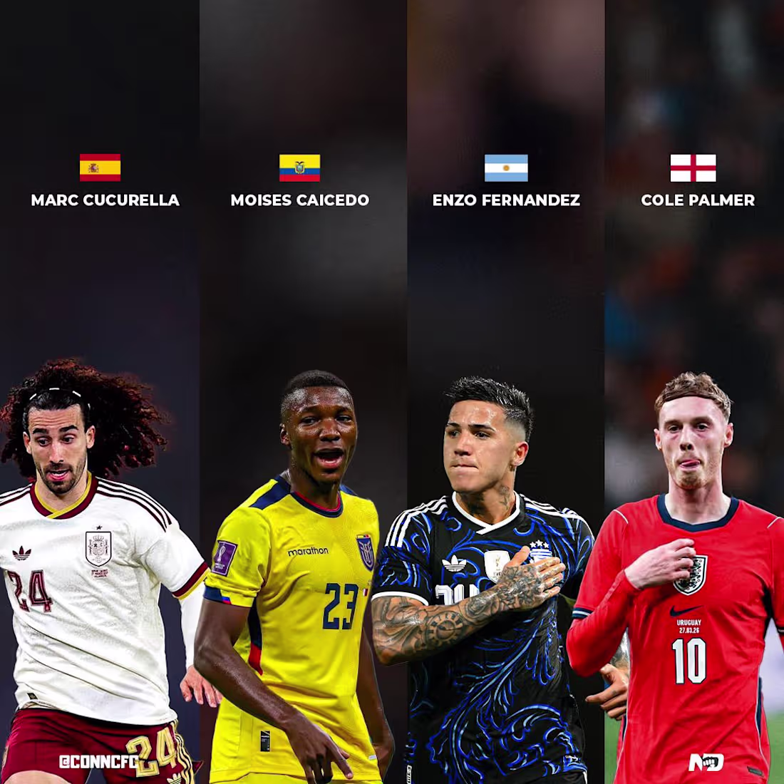
CHELSEA PLAYERS ON INTERNATIONAL DUTIES
0
67
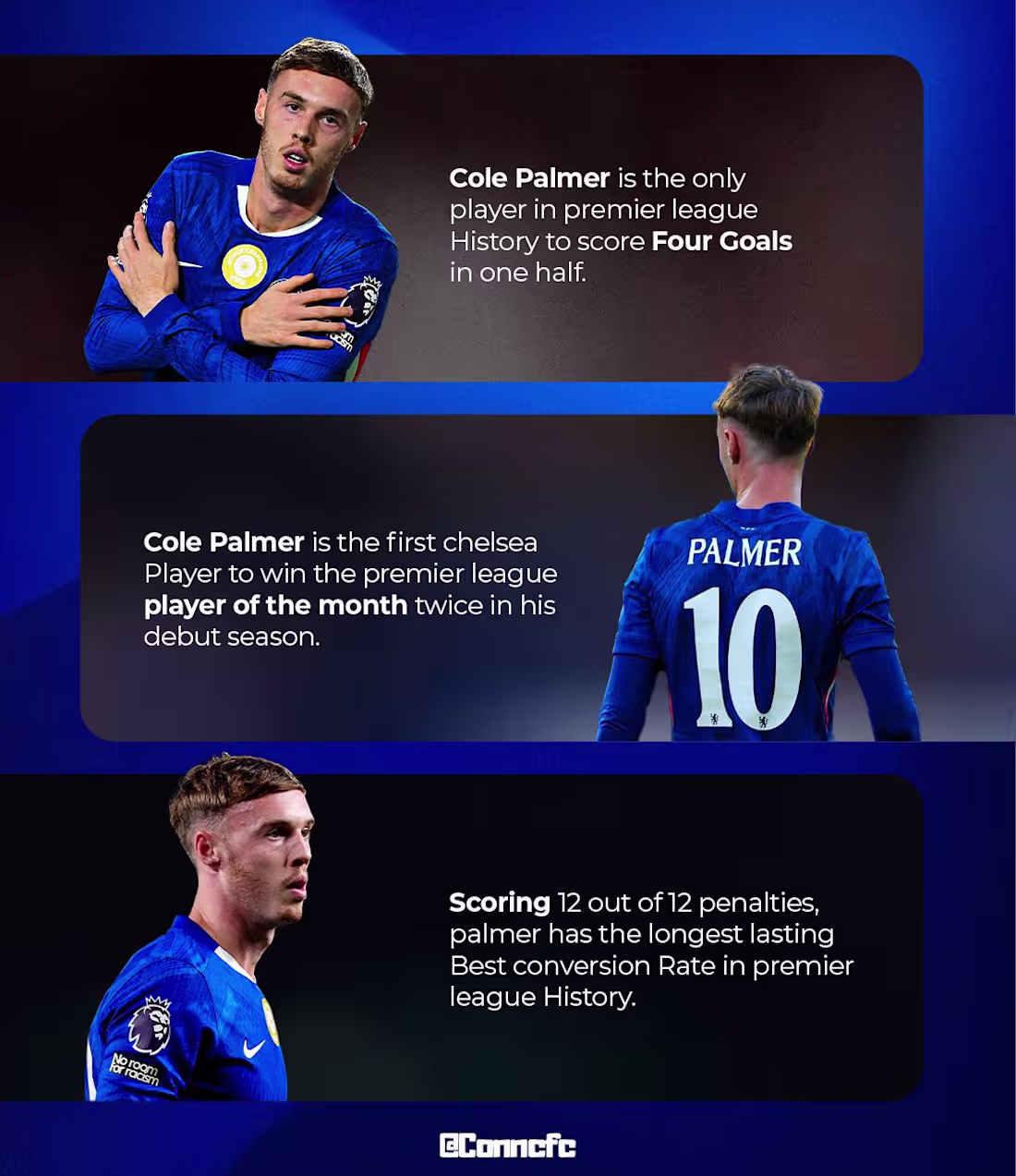
PALMER RECORDS SO FAR
0
71
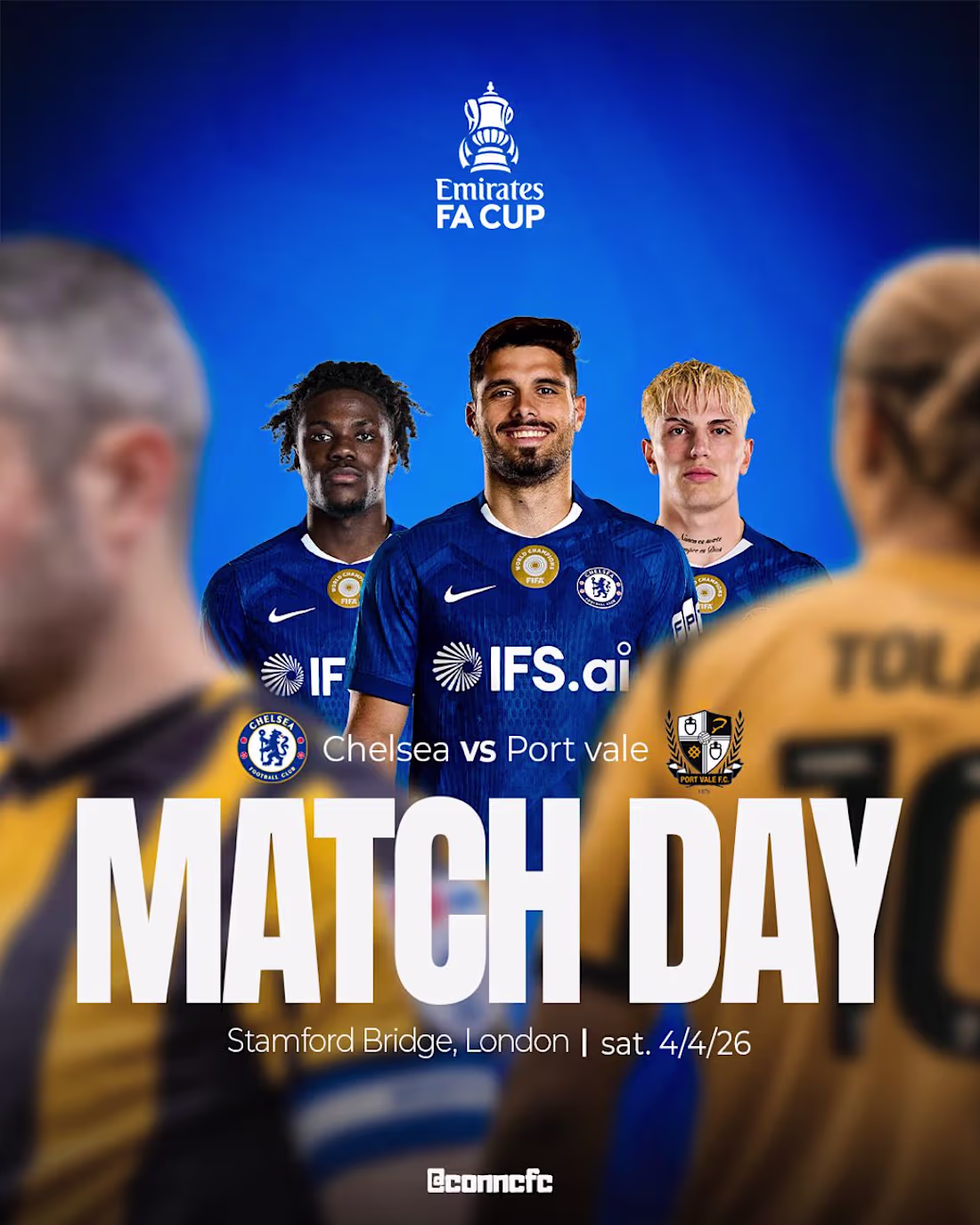
Match Day graphics vs Port value
0
66
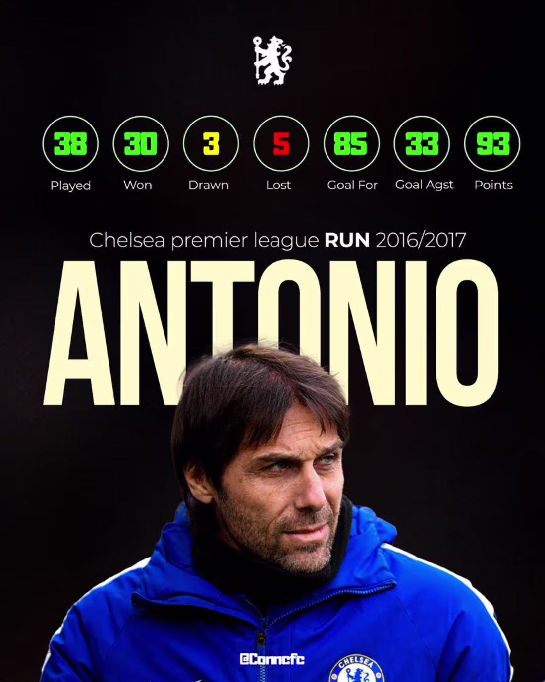
Showcase various Chelsea Fc statistics
0
70
more of my designs for conncfc
0
74
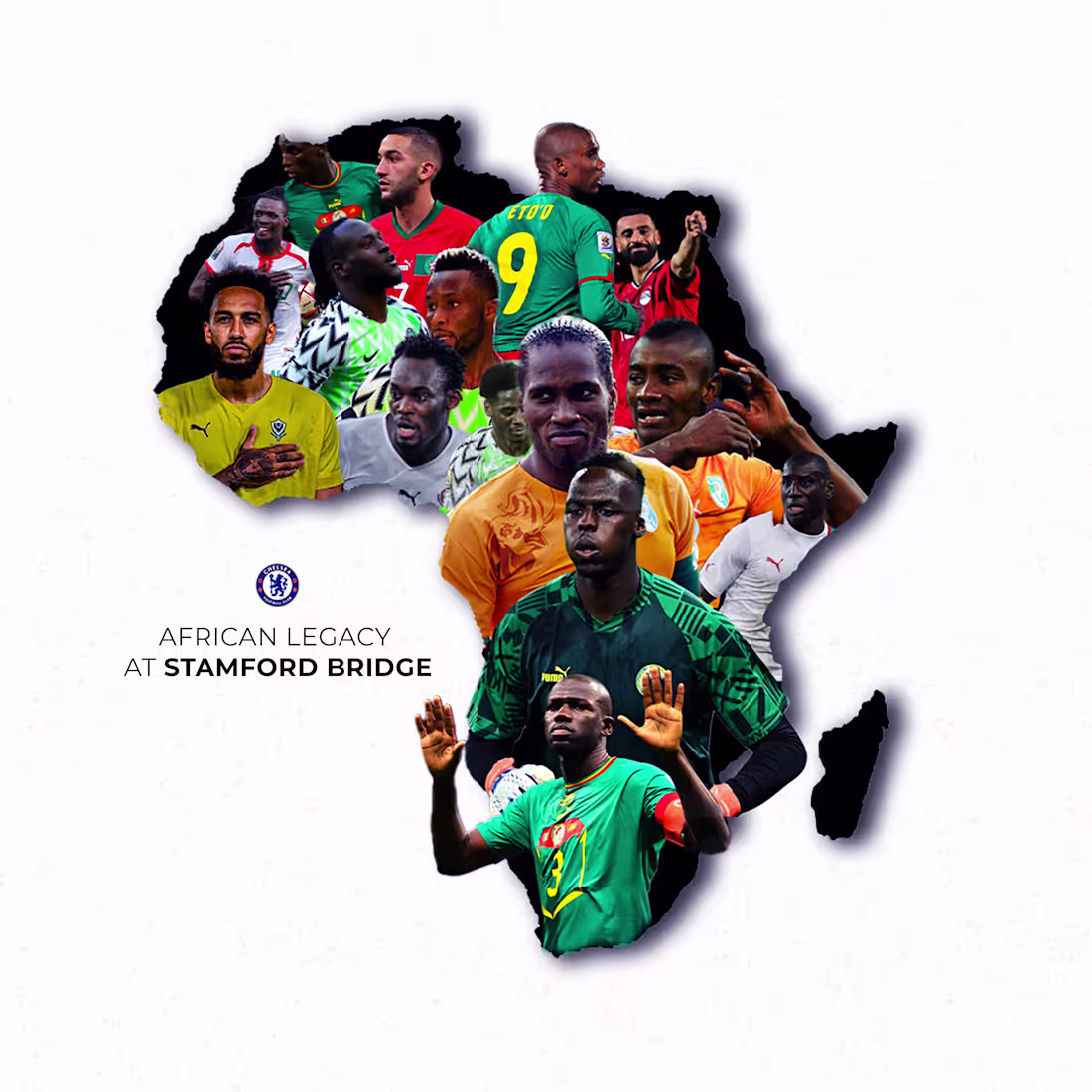
This one carries meaning beyond just aesthetics. The brief was to celebrate the African players who've represented Chelsea and the concept had to match that weight.
The idea of masking all the players inside the shape of the African continent was the centre piece of the whole design. In Photoshop, each player was individually cut out, colour-corrected, and composited inside a clipping mask shaped to the continent's silhouette. The layering had to be deliberate, players placed so they feel natural within the geography until couldn't fill them up in that manner anymore so i had to make due and also the positions and the way the player were cut out also played a key role, not just randomly stacked. The depth comes from varying the scale and position, with some figures bleeding slightly beyond the edges to give it dimension and life.
The torn, textured edge on the continent shape adds a raw, organic quality, it stops it from feeling too clean or corporate. And the light background keeps all the focus on the shape itself, letting the colour of the different kits do the talking naturally.
The typography is restrained on purpose. "African Legacy at Stamford Bridge" doesn't need to shout as the visual does all the heavy lifting. Simple, confident, and it lands exactly the way it should.
0
86
MATCH DAY GRAPHICS FOR @CONNCFC on x (Twitter)
1
96
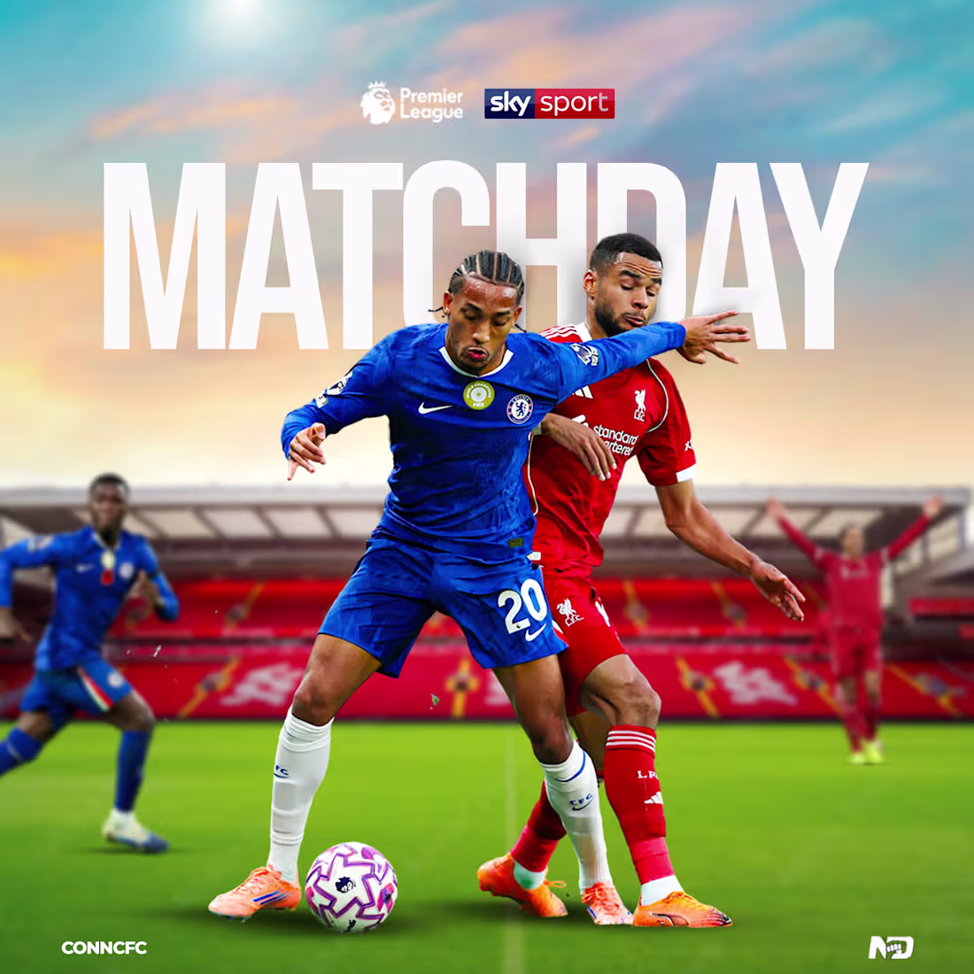
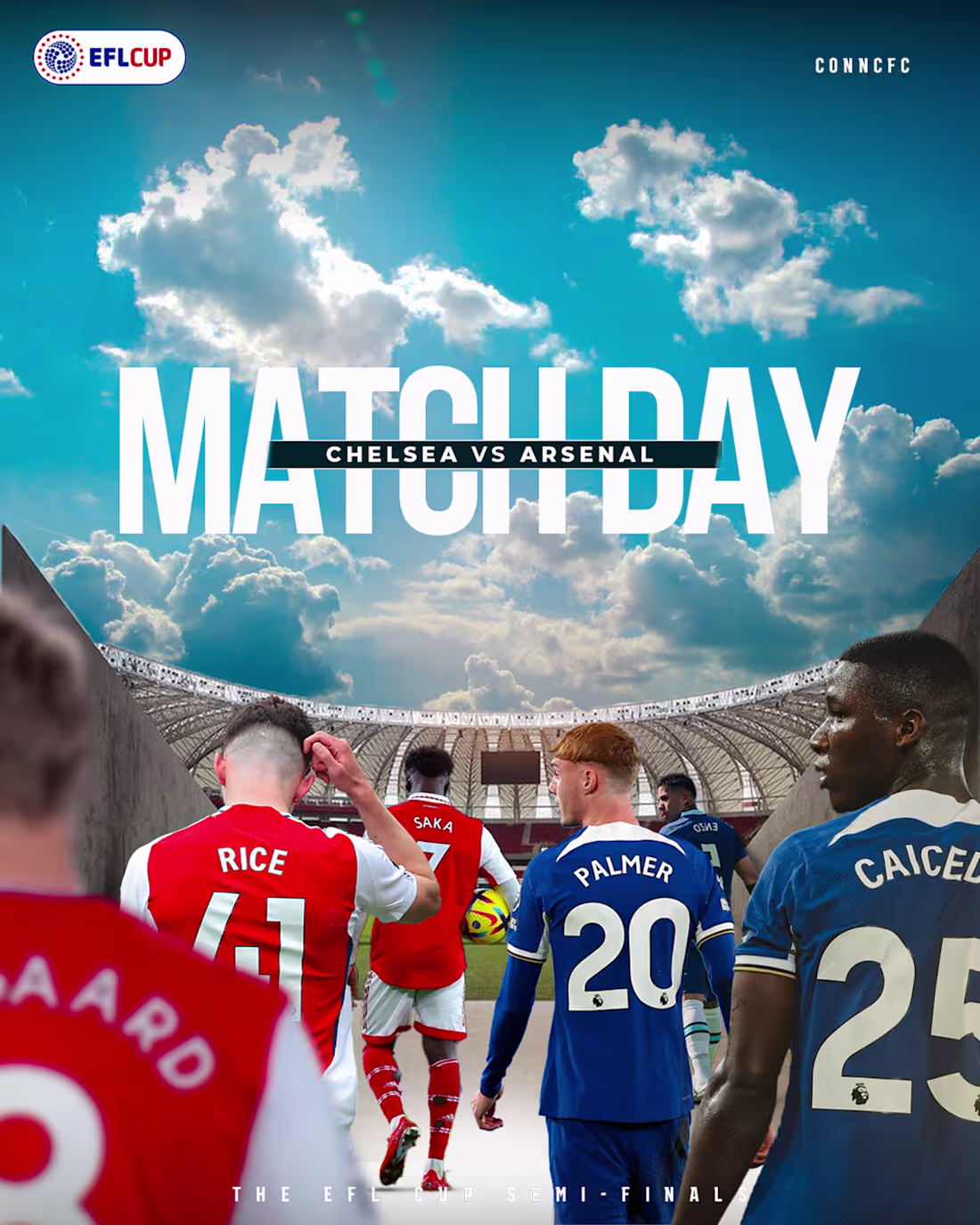
A design for @conncfc on X(Twitter)
Brief design idea:
This one was built for energy. Designing for a fan account means you're speaking directly to emotion, people who live and breathe the club ,so the graphic had to hit before they even read it.
of the player gotten in a very high resolution was properly converted to a smart object before being selected out from its own background.
The bold "MATCH DAY" type doing the heavy lifting was intentional. Oversized, fragmented across the player, it creates that layered depth that pulls you in. The subject, sitting behind it makes for a classic composite technique, but when it's executed cleanly it never gets old. The gaussian blur on the crowd keeps the atmosphere without the noise stealing focus.
The colour palette stays disciplined blues that feel native to Chelsea's identity, nothing forced. And the bracket corners framing the type give it that broadcast, official-feel aesthetic without being too rigid.
0
95