
Nayem khan Antor
SEO Strategist | GEO & AI SEO Specialist.
Ready for work
Nayem khan is ready for their next project!
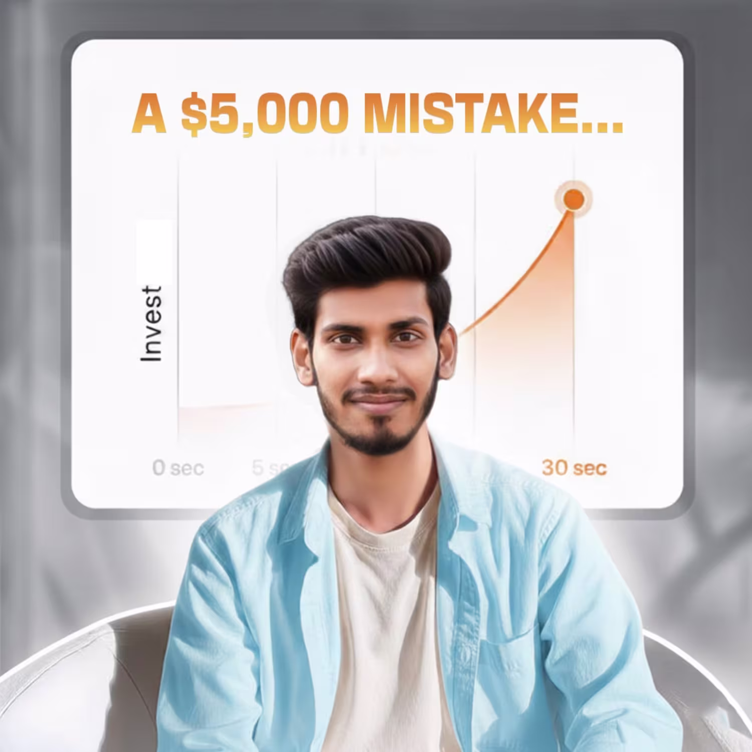
3 months ago, I started working on SEO for our clinic's website no big budget, just the right strategy and consistency.
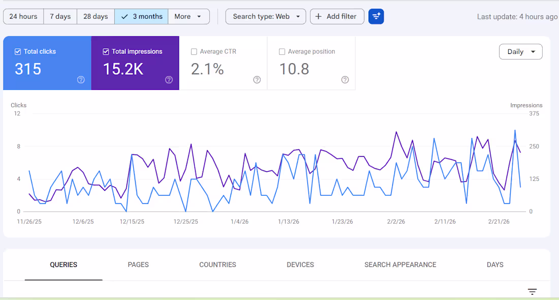
Checked Google Search Console today and the numbers genuinely surprised me:
That means thousands of people are searching on Google every month and our website is showing up in front of them.
Here's what I learned along the way:
✅ Ranking on Page 1 doesn't guarantee clicks your title & meta description need to be compelling
✅ More impressions ≠ , more clicks. Content relevance matters more than anything
✅ Position 10.8 means we're right at the edge of Page 1, a small push could get us into the top 5
✅ For a clinic, Local SEO is an absolute game-changer
SEO doesn't give you overnight results but if you stay consistent, the data speaks for itself.
Is your business website showing up on Google?
-Nayem
3
2
74
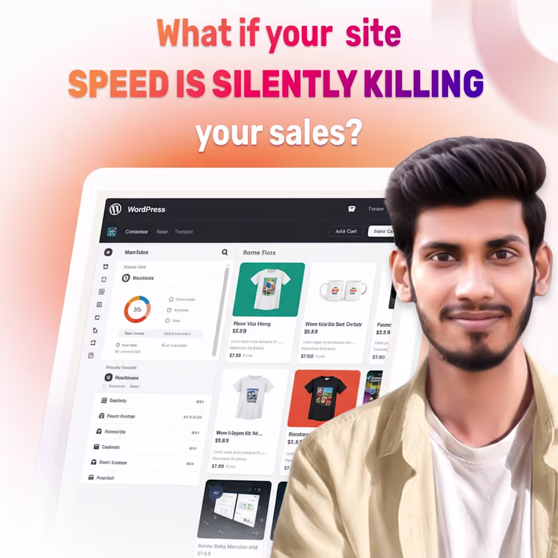
Your store loads in 6 seconds. Your competitor's loads in 2.
You already lost the sale.
A few months ago, I audited a WooCommerce store with decent traffic.
The product was awesome. The ads were running. The traffic was decent.
But the site loaded in 6.2 seconds on mobile.
That's not a marketing issue. That's a speed issue.
Here's what was secretly sabotaging their revenue:
Unoptimized images contribute 3MB+ to every page load
23 plugins running scripts on every single page
No caching. No CDN. No lazy loading.
Shared hosting is trying to handle 10k monthly traffic
We addressed the root issues.
Mobile load time reduced to 1.9 seconds.
Conversion rate increased without touching the ads.
Nobody shares this because it's not cool.
But a slow store is a leaky bucket.
You can pour as much traffic as you want. It won't fill.
1
29

Warning: Using OpenClaw for “Automated SEO” is a serious security risk.
Everyone is praising OpenClaw for putting SEO on autopilot.
But here’s the reality:
It runs with full system access.
Please provide your website credentials and API keys.
And it currently has 500+ documented vulnerabilities.
Security researchers found 40,000+ exposed instances online no authentication, no protection.
Attackers accessed API keys, Slack accounts, Telegram tokens, and even executed admin-level commands.
Worse, around 26% of its 31,000 marketplace skills contain vulnerabilities.
Some malicious plugins were already executed successfully.
Major cybersecurity firms like
👉 Cisco
👉 Sophos
👉 CrowdStrike
Now imagine connecting it to your Search Console, Analytics, and CMS.
Would you trust an AI agent with full access to your business data?
3
2
113

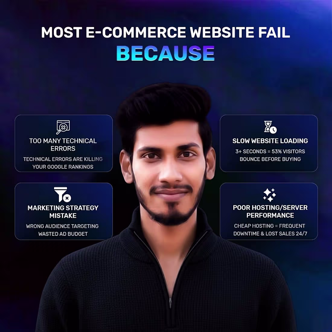
Most E-commerce founders can't f**king get loaded with money for a few of the same reasons.
Bloated product images sitting at 5-10 MB each
25+ plugins running wild in the background
Cheap shared hosting with no CDN
Database bloat from old orders, post revisions, and transients
Result?
A single 1-second delay kills 7% of conversions. Amazon loses 1% of sales for every 100ms of extra load time. For a store making $100,000 a day, that one-second delay can cost up to $2.5 million in lost revenue every year.
I've fixed exactly these issues for 50+ WooCommerce stores, dropping load times from 6-8 seconds to under 1.5 seconds and helping many double their revenue.
Want to avoid these 4 common mistakes and actually speed up your store in 2026?
Comment “SPEED” below. I’ll send you the free checklist
1
12

Why is your startup's growth stuck?
You're running ads. Creating content. Growing your team.
But conversions just aren't coming.
And nobody's telling you your website is taking 5 seconds to load.
In those 5 seconds, your potential customer is already on your competitor's page.
Research shows that if load time exceeds 3 seconds, 53% of users bounce immediately.
Website speed is not a technical issue. It's a business problem.
You're spending thousands on marketing, but if your website is slow, every single dollar is draining into a leaky bucket.
Fix it first. Scale it later.
What's your website speed right now? Check it today on GTmetrix or PageSpeed Insights.
👇 Drop your score in the comments!
♻️P.S If this was helpful, don't forget to repost.
-Nayem
1
41
Most e-commerce stores bleed money because of simple technical errors.
Last month, I helped a fashion store fix 4 critical issues:
Technical errors (404s, broken schema)
Slow loading speed (reduced from 5s to <2s)
Wrong audience retargeting
Poor hosting
The Result?
✅ 4x Conversion Rate
✅ Massive revenue boost
✅ 50% less cart abandonment
Investing in Technical SEO & Speed is the fastest ROI you’ll ever see.
Want a free audit? Comment "AUDIT" or DM me.
-Nayem
1
18

Most e-commerce sites optimize their homepages.
I focus on checkout pages.
Why?
Because that's where ready-to-buy customers are.
And most stores lose them in 3 seconds.
Here's what I found:
Homepage: 0.9s ✅
Checkout: 4.2s ❌
Cart abandonment: 71%
The shift: → Remove unnecessary scripts
→ Lazy load everything except forms
→ Optimize payment gateway
→ Cache strategy for checkout
Result:
Checkout: 1.1s
Cart abandonment: 28%
Revenue: $1000 in 30 days
Checkout pages aren't just a step.
They're your revenue engine.
Do you optimize checkout pages?
Yes/No?
♻️ P.S. Repost if someone needs this.
-Naeyem
1
20

People don't get that honesty is the best sales strategy.
As I work with more clients, I'm realizing how powerful truth is in this industry.
It's not just about closing deals.
It's not just about showing big numbers.
It's not just about the hustle.
That's why it breaks my heart when developers say "never tell clients it's easy."
I've turned down $1000 projects because the client didn't need me.
I've told clients "your site is fine, invest in marketing instead."
I've shared my techniques with competitors for free.
And guess what?
Those same clients referred 10 more.
Those competitors became partners.
The trust I built became my biggest asset.
If you solve the real problem first, not just sell your service, you win.
I truly believe that.
Stop gatekeeping knowledge.
Start building trust.
The money follows
-Nayem
1
22
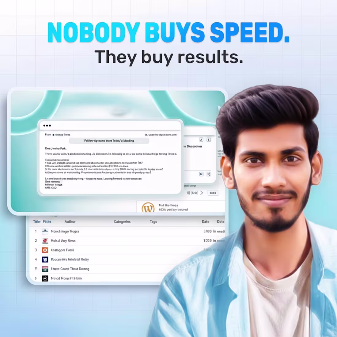
People don’t actually buy "WordPress Speed Optimization".
They buy Revenue
A client recently showed me his GTmetrix report.
It was a perfect 100/100 score.
But his sales were flat.
Why?
Because he was optimizing for Google bots, not for human buyers.
I told him the hard truth:
Nobody cares about your "A" Grade if they leave before the checkout page loads.
A slow site isn't a technical problem.
It is a Trust problem.
We stopped selling "seconds saved."
We started selling "sales recovered."
His conversion rate doubled in 7 days.
Clients don’t pay for speed because it’s cool.
They pay because they hate losing money.
Is your site chasing scores or sales?
Comment "Audit," and I’ll reveal how much revenue you are losing.
-Nayem
1
27

A 3-second delay costs you 40% of your visitors.
Why is website loading speed important?
I showed 50+ founders their site analytics last week. The pattern was brutal: slow sites, high bounce rates, zero sales.
Here's what you're losing:
Rankings. Google prioritizes sites under 2.5 seconds. Above 4 seconds? Page 3. Hidden forever.
Revenue. Every 100ms delay = 1% drop in conversions. Amazon calculated this at $1.6B annual loss per second.
Mobile traffic. 53% of users bounce after 3 seconds. Your competitors load in 1.5 seconds. Game over.
Visibility. Fail Core Web Vitals (LCP, FID, CLS), lose organic traffic. Google's rules. Not mine.
When did you last test your site on 3G?
1
24
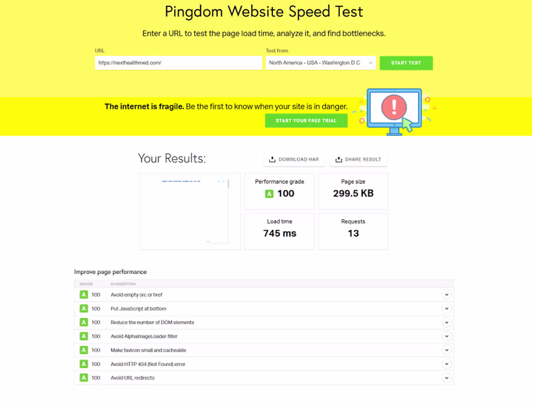
🚀 Performance Optimization Case Study: Perfect Scores Across Multiple Testing Tools
I recently optimized a website's performance, achieving exceptional results across industry-leading testing platforms!
📊 Results:
GTmetrix:
✅ Grade A - Performance: 100% | Structure: 99%
⚡ LCP: 510ms | TBT: 4ms | CLS: 0.04
Pingdom:
✅ Performance Grade: A (100)
⚡ Load Time: 745ms | Page Size: 299.5KB | Requests: 13
🔑 Key Optimizations:
Image Optimization - WebP format, lazy loading
Code Efficiency - Minified CSS/JS, removed unused code
Caching Strategy - Browser + CDN caching
Technical Setup - HTTP/2, GZIP compression
💡 The Impact: Fast website = Better UX + Higher SEO Rankings + Increased Conversions
📈 Performance isn't just about numbers it directly translates to business growth and user satisfaction!
3
42
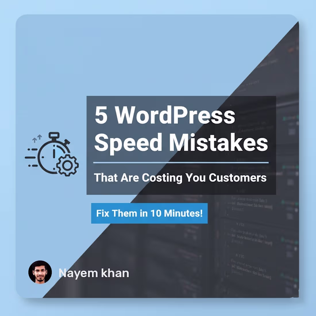
⚡ Your WordPress site loading slow? You're bleeding customers.
I've optimized 100+ sites. Everyone makes the SAME 5 mistakes:
1️⃣ Too Many Plugins → Keep only 12-15 essential ones
2️⃣ Huge Images → Compress to under 200 KB
3️⃣ No Caching → Install WP Rocket (instant 2-3 sec boost!)
4️⃣ Bloated Database → Delete old revisions monthly
5️⃣ Cheap Hosting → Upgrade to quality hosting
🎯 30 minutes of work = faster site = more sales!
Test your site NOW on GTmetrix. Over 3 seconds? You're losing money daily! 💰
Need help? Comment below! 👇
#WordPress #Speed #WebDev
1
24
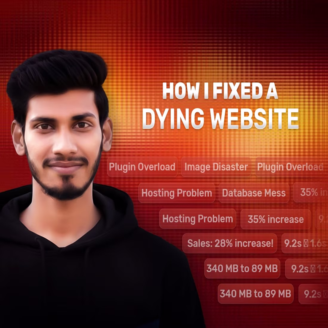
"Bro, why is my site so slow?" - I hear this 5 times a day. An e-commerce owner said, "Sales are dropping, can't figure out why."
I checked - 9.2 seconds load time!
Meaning customers wait 9 seconds just to see a product? Impossible!
What I did:
Plugins: 31 → 14
Converted images to WebP
Database: 340 MB → 89 MB
Cloudflare CDN (free)
Optimized caching
Results (1 week):
Load time: 9.2s → 1.6s
Bounce rate: 68% → 41%
Sales: 28% increase!
Is your site slow? 3 FREE tips:
Run the GTmetrix test
Shows exact problems
Install P3 Plugin Profiler
Find which plugin slows you down
Compress images
Use ShortPixel or Imagify
Remember:
Amazon's study - every 100ms delay = 1% sales loss!
Having speed issues?
Drop a comment, I'll give you free advice!
Share your GTmetrix screenshot, and I'll tell you exactly what to do.
-Nayem
1
17

Your website: 7 seconds
Competitor's: 2 seconds
Who gets the sale? 💰
I've optimized 50+ sites. Pattern is clear: Fast wins. Slow loses.
5 fixes (30 minutes total):
1️⃣ COMPRESS IMAGES
5MB → 200KB | TinyPNG (free) | Saves 3s
60% of load time = unoptimized images
2️⃣ ENABLE CACHING
One .htaccess line | 60% faster repeats
3️⃣ FIX MOBILE
70% traffic is mobile
Remove animations, simplify layouts
4️⃣ MINIFY CODE
WP Rocket/Autoptimize | Saves 1-2s
5️⃣ DELETE PLUGINS
Each unused = 0.1-0.3s delay
Found site with 47 plugins, 12 active
Deleted 35 → speed doubled
Cost? $0
Time? 30 min
Test: pagespeed
(http://pagespeed.web.dev)Your load time? 👇
2
37
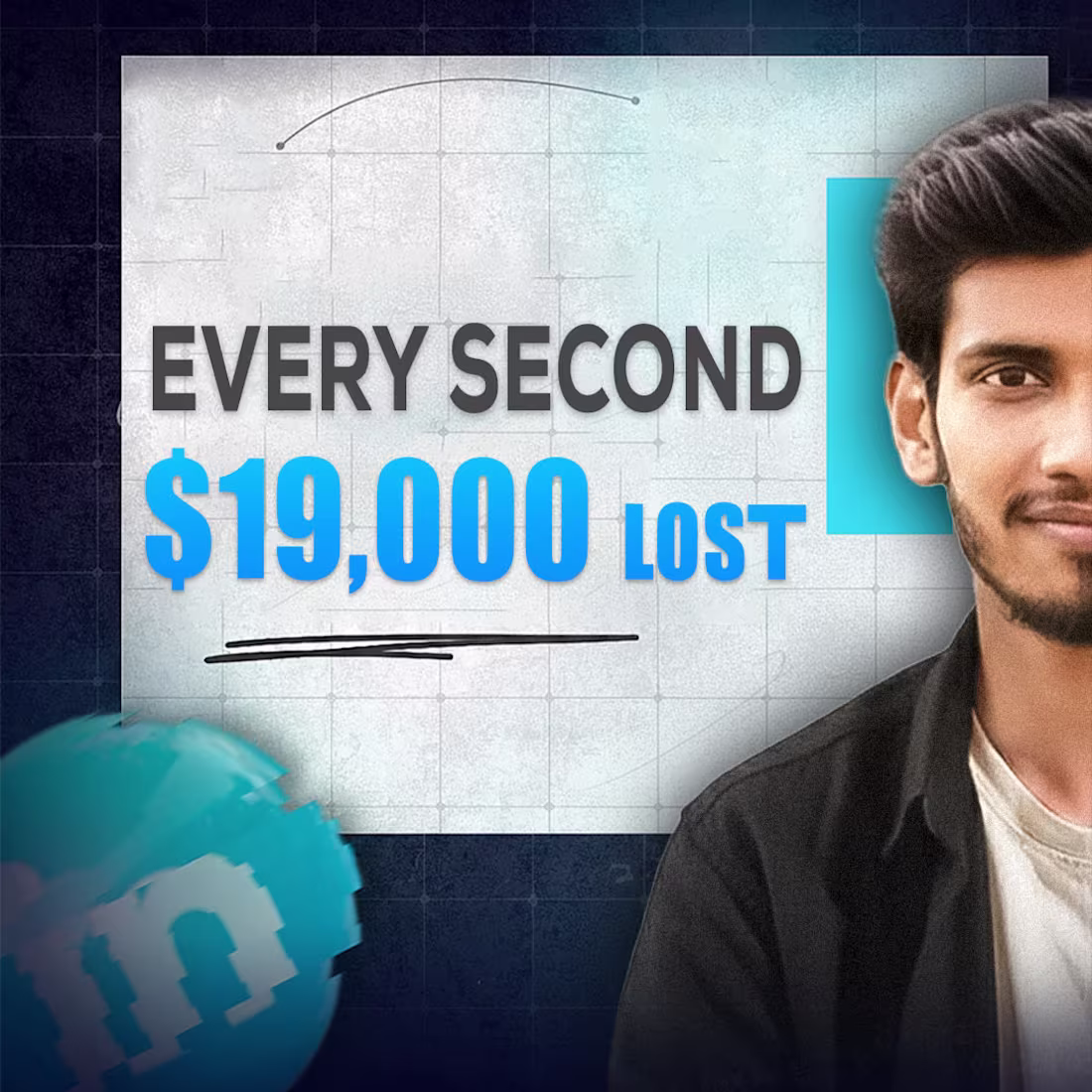
I analyzed 500 websites.
The cost of slow loading? Shocking.
Load time vs revenue (per 1,000 visitors):
1 second = $5,000 ✅ 2 seconds = $4,200 (-16%) ⚠️ 3 seconds = $3,100 (-38%) 🔴 4 seconds = $2,000 (-60%) 🔴 5+ seconds = $800 (-84%) 💀
Every extra second costs you THOUSANDS.
Real example: Site with 10,000 monthly visitors → 1s load time: $50,000/month → 3s load time: $31,000/month → Loss: $19,000/month = $228,000/year
Just 2 seconds slower.
Industry breakdown:
E-commerce: 2.8s (losing 34%)
SaaS: 3.2s (losing 42%)
Healthcare: 4.1s (losing 55%)
Real Estate: 3.9s (losing 51%)
The opportunity is MASSIVE.
Test your site: pagespeed.web.dev (http://pagespeed.web.dev)
What's your load time? 👇
Nayem
1
27

Just buy expensive hosting, and your site will be fast."
WRONG.
I've seen websites on $200/month hosting load in 8+ seconds.
And sites on $10/month hosting load in under 2 seconds.
Here's the truth nobody tells you:
Expensive hosting ≠ , Fast website
Optimized code = Fast website (on ANY hosting)
Real example:
The client was paying $150/month for "premium" hosting.
Site still scored 35/100 on PageSpeed.
What I did:
✓ Optimized images (saved 4.2 seconds)
✓ Minified CSS/JS (saved 1.8 seconds)
✓ Implemented lazy loading (saved 2.1 seconds)
✓ Moved to $15/month hosting
New score: 94/100
New load time: 1.9 seconds
Saved: $1,620/year
Stop wasting money. Start optimizing.
Want me to audit YOUR site? Comment "AUDIT" below
-Nayem
1
23

That's all it takes to lose 53% of your potential customers.
Google's research revealed something shocking: if your website takes longer than 3 seconds to load, more than half of your visitors will leave before they even see what you offer.
You're spending money on:
→ SEO to get found
→ Ads to drive traffic
→ Beautiful design to impress visitors
But if your site loads slowly?
53% of that investment is wasted. Gone. Just like that.
The good news?
This is completely fixable. Most website performance issues can be resolved in days, not months.
Ask yourself: When did you last check your website's loading speed?
How many potential customers are you losing right now?
What would a 53% increase in conversions mean for your business?
Your website is often the first impression customers have of your business. Make sure it's a fast one.
2
44

Classic Elegance for Massa Restaurant ✨
Presenting the new visual identity for Massa Restaurant.
For this project, the client wanted a look that felt established, premium, yet inviting.
I focused on a badge-style logo that works perfectly on everything from signage to menu covers.
Key Design Elements:
✅Typography: Combining a strong Serif font with a fluid Script font creates a balance between tradition and elegance.
✅Iconography: The central "M" acts as a standalone monogram for social media icons and napkins.
✅A strong brand identity is the first course of a great dining experience. 🍽️
If you are looking to refresh your restaurant or business branding, feel free to DM me!🖲
1
1
45

s your in-house design team overwhelmed by the end-of-month rush? 🛑
Piling pressure on your team kills creativity, but hiring full-time for short spikes is expensive. That’s where I step in. 🤝
I understand the Agency Ecosystem. I provide:
✅ Clean Source Files: Organized layers so your team can edit easily.
✅ Quick Turnaround: I respect your tight deadlines.
✅ White Label: I do the work, you take the credit.
Think of me as your agency's "Back-up Power." You might not need me today, but let's connect before the next crisis hits!
1
37

Hi, I am Nayem
Born and raised in Bangladesh, I come from a hardworking middle-class family that shaped my determination and creativity
I discovered my passion for graphic design early on and instantly knew this was the world I wanted to be part of
I completed my design training from a professional design institute, the starting point of my creative journey
Over the years, I’ve worked multiple jobs and completed countless freelance projects, gaining experience with a wide range of clients
I’ve had the opportunity to work with companies like Auto Dogz and A2Z Builders, contributing to meaningful design projects
I specialize in creating clean, modern, and brand-focused designs that bring ideas to life
My style blends modern simplicity with thoughtful, meaningful details
1
41
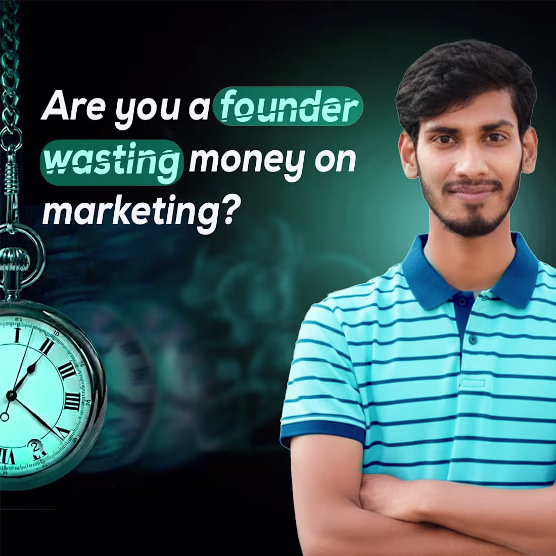
Many startups pour money into marketing first,
But they forget one simple truth
“People don’t trust what they don’t understand.”
Without a strong visual identity,
your message, value, and product clarity
all become blurry to your clients and customers.
Design isn’t just about making things look nice
It’s the shortcut to building trust.
So if you're a founder,
Focus on communication before you focus on marketing.
Design is how your startup speaks.
1
37
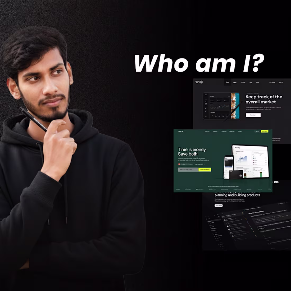
Who am I?
This is Nayem, a Graphic Designer.
Am I really just a Graphic Designer? No! I’m not just a Graphic Designer, I’m a Result-Oriented Graphic Designer.
🎨 In my designs, you will find value, not just fancy color gradients or random colors. I don’t just mention the brand name; I provide clarity, which is the most important thing in design.
Some people create designs with lots of content and posts. Others design but don’t get to reach.
✅ When you use the right thing in the right place, that’s when you get results. Don’t just say the brand name or logo; anyone can do that. Proper usage brings results.
💡 Confused about how to do it? Hit me up in the inbox.
⚡ One last thing: not beauty, but clarity is the most important.
If you like it, save it and share it.
— Nayem
1
29
A logo isn’t just a design—it’s your brand’s identity. First impressions matter.
I redesigned a client’s logo with a brand focus:
✅ Researched their business & audience
✅ Kept it simple & clear
✅ Made it instantly recognizable
✅ Used appealing colors & fine details
Result? ✅ More response, happy client.
Clarity > Beauty. Always.
– Nayem
1
41

Rafugram: Heritage & Handcrafted Emblem Logo
Project Overview: RAFUGRAM (Heritage Textiles, Handicrafts, or Artisanal Products).
Goal: To create a classic, trustworthy logo that communicates rural heritage, handmade quality, and the simplicity of village life.
Solution (The Rural Seal): The primary concept is 'Earth and Sunlight'. A circular emblem was chosen to represent tradition, reliability, and wholeness.
Mark Details:
The central image is a stylized traditional hut/cottage, directly referencing the 'Gram' (village/rural) aspect of the brand name.
The sun rays emerging from the roof symbolize quality, optimism, and authenticity.
2
47

MASSA Restaurant: Classic Fine Dining Emblem
Project Overview: MASSA Restaurant (Fine Dining / European Kitchen).
Goal: To create a classic, premium, and heritage-inspired logo that reflects the restaurant's high-quality standards.
Solution: The design is built around the concept of 'Tradition meets Freshness'.
Mark: An ornate, scalloped Emblem/Badge was chosen to evoke the feel of old European restaurant seals.
Focus: A classic serif 'M' Monogram is centered to signify prestige and exclusivity.
Color Palette: Deep Green signifies freshness and quality ingredients, contrasted with the Yellow background that hints at dough/pasta, creating a strong culinary connection.
Typography: The mix of premium Serif and elegant Script fonts reinforces the classic fine-dining atmosphere.
1
34
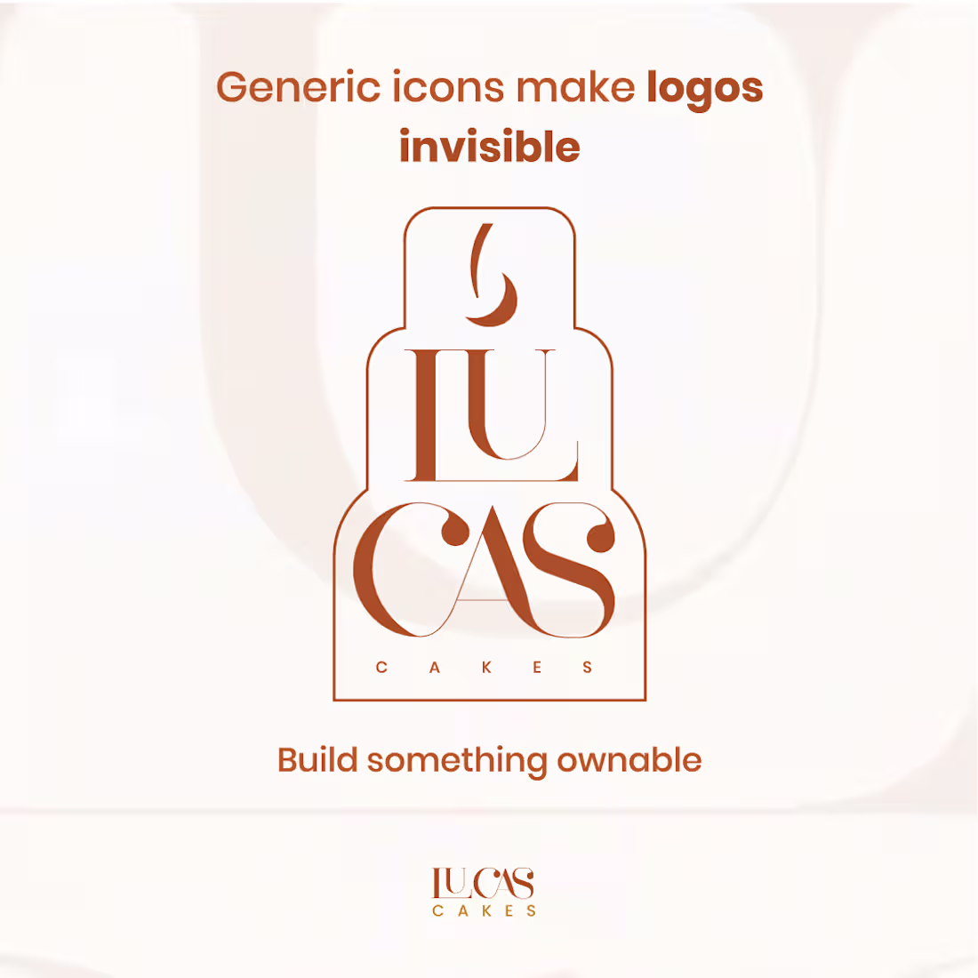
Generic icons make brands disappear, but a professional logo makes them unforgettable.
Your logo isn’t just a mark; it’s your brand’s first impression, your story in one symbol.
A professional design builds trust, creates recognition, and gives your brand an identity that feels truly yours.
Just like this one, clean, elegant, and ownable.
✨ Build something people remember.
Build something that belongs to you.
-Nayem
1
43

The Cost of a Confusing Dashboard
A messy dashboard can quietly become one of the biggest reasons your SaaS loses users. They don’t leave because it’s bad; they leave because it’s unclear or overwhelming.
If new users can’t tell where to start or what things mean, they’ll drop off fast, and that’s where growth stalls.
Pro Tip:
Map your user journey. See where users hesitate or get lost, then simplify those friction points.
A clean, intuitive flow builds confidence and keeps users around longer.
Remember: Complexity is not a sign of intelligence. Simplicity is power.
— Nayem
1
35
Does design only look beautiful to a designer's eye? 🤔
I recently worked on a project based on a client's requirements. The core principle of my design was 'Storytelling'. That's because people don't remember the design, they remember the story inside that design.
A few days after the design delivery, I noticed the value of my work increasing significantly. From this experience, I learned one thing for sure: To make a design memorable to others, there is no substitute for emotion and a strong story! 💡
Good design only pleases the eye, but a good story takes a place in people's hearts.
Do you agree with me? Share your thoughts. 👇
#DesignStorytelling #ClientSuccess #UXDesign #MemorableDesign #StoryOverDesign
1
36
Most websites fail because they look like websites.
Read that again.
People don’t connect with templates; they connect with stories.
When I built my site, I didn’t just show features.
I showed why it matters who it helps, and how it feels.
Your site shouldn’t just inform.
It should inspire.
Start with emotion, not design.
Show transformation, not just buttons.
Because people don’t remember your layout
they remember how your site made them feel.
0
35

This logo had potential ✨
But the concept? Not bold enough to make a mark.
So we stepped in, refined the idea,
and added a touch of modern elegance
Now it perfectly reflects the brand
clean, confident, and unforgettable.
The client didn’t ask for a transformation,
But what if they did?
Because a strong brand deserves a powerful logo.
1
51

Why This Design Hits Hard: A VR Platform Teaser Analysis!
This promotional graphic from Nexus instantly screams VR/Metaverse platform launch! It’s a powerful teaser that perfectly builds excitement.
The Design Magic: Color Psychology: The mix of Deep Purple and Neon Pink creates a futuristic, high-tech, and luxurious vibe, the perfect look for a virtual world.
The Teaser Technique: The main question, "When will the WEBSITE be ready?", is the core trick. It sparks curiosity and keeps the audience waiting for the big reveal.
Clear Messaging: The line "Explore Beyond the Ordinary" clearly sells the platform’s main benefit: an experience far better than the status quo.
This strategic blend of color, questions, and bold messaging makes the design highly effective!
What are your thoughts on this futuristic design? Let me know below!
0
48

Nexus Creative Design Agency
Goal:
To create a crisp and energetic visual identity for Nexus, a modern design agency that represents innovation, confidence, and creativity. The aim was to develop a design that feels fresh, vibrant, and professional at first glance.
Process:
A vibrant magenta and clean white color palette was chosen to express creativity and energy.
The typography and layout were designed with balance and clarity in mind, ensuring every element feels bold yet approachable. Each design choice, from spacing to color contrast, supports a cohesive, modern look.
Result:
The final identity reflects Nexus’s creative energy and strong personality.
It delivers a fresh and modern brand presence that helps the agency stand out and connect confidently with its audience.
0
49
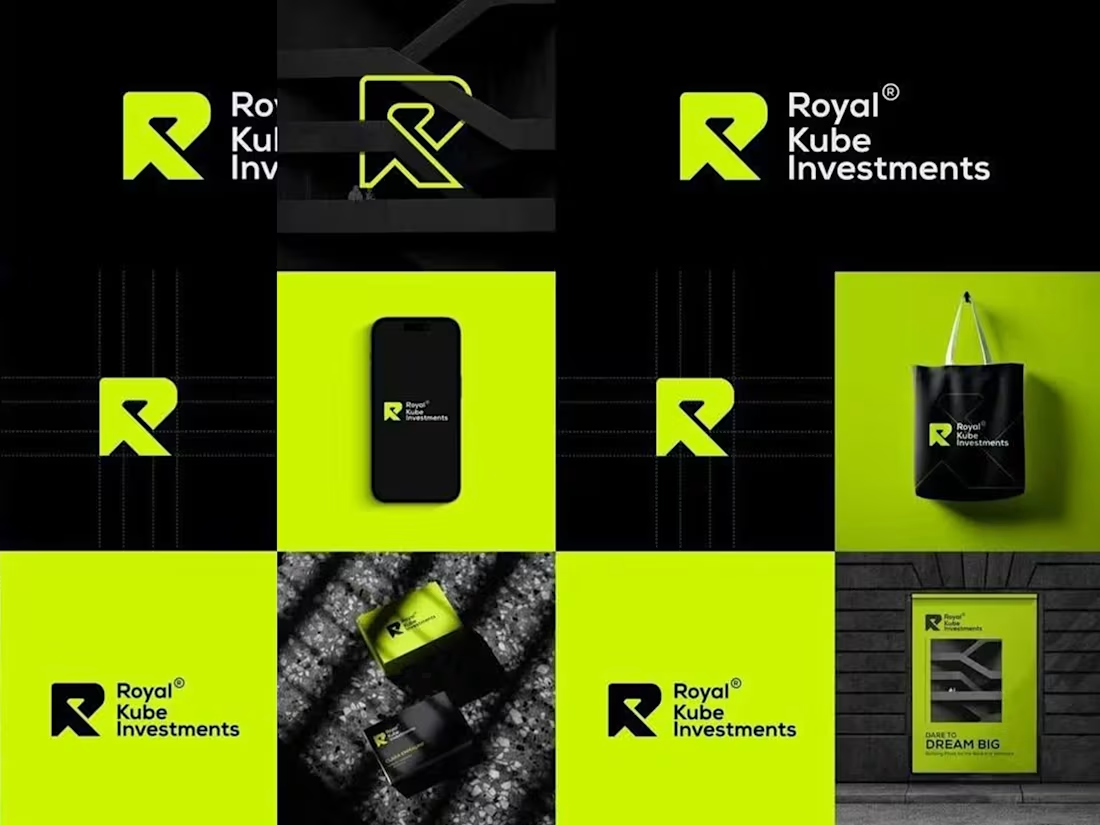
Royal Kube Investments Brand Identity Design
To create a bold and trustworthy visual identity for Royal Kube Investments, a brand that values innovation, confidence, and modern growth.
I designed a clean and geometric “R” mark that reflects both strength and stability. The use of neon green with deep black builds contrast and captures attention, symbolizing ambition and reliability. The brand system was extended across digital and print assets to ensure visual consistency.
The final identity delivers a strong corporate presence while maintaining a modern edge, perfectly aligning with the brand’s vision to inspire growth and trust.
2
1
67

Design That Drives Business: 52% CTR Increase!
The client's challenge was simple: boost views in the highly competitive finance category.
Using design as a performance tool, I created a 'Click Magnet' thumbnail employing high-contrast (red color), bold typography, and visual hierarchy to capture attention while scrolling.
The result? CTR increased by 52%, bringing in 200,000 extra views within the first 24 hours!
1
31
232

Modern Brand Design That Adds Real Business Value
This design focuses on blending creativity with strategy, not just looking good, but helping the brand connect better with its audience.
Every color, font, and layout choice was made to reflect growth and trust.
#GraphicDesign #BrandDesign #VisualIdentity #CreativeWork #DesignForGrowth #ContraDesign #Branding #DesignPortfolio
21
182