
Muhammad Zeeshan
CMS Expert | Webflow, WordPress & Shopify Developer
Ready for work
Muhammad is ready for their next project!
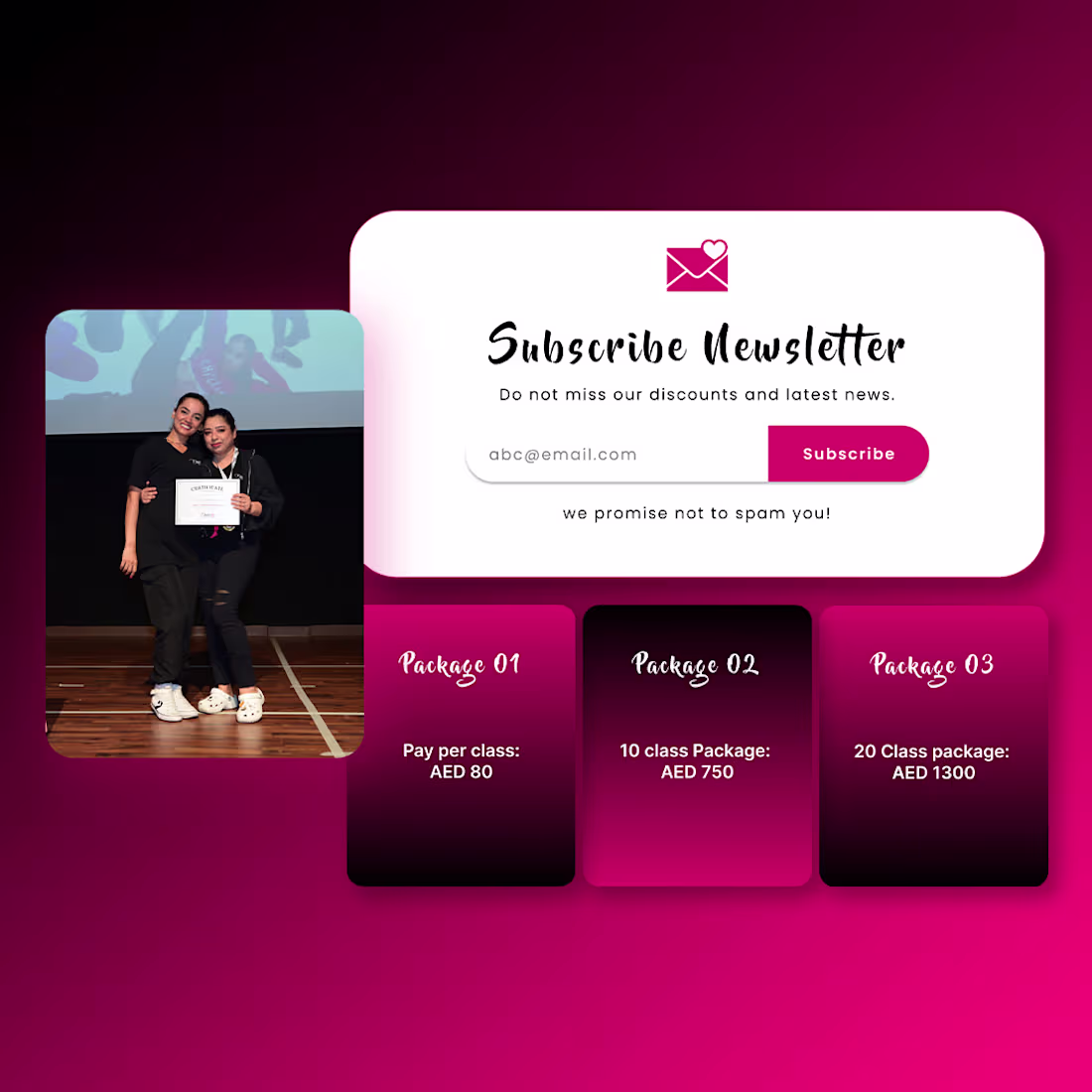
New project completed!
Designed and delivered a complete brand identity, including logo design, typography, color palette, and brand guidelines. Always focused on creating brands that are memorable, scalable, and ready for growth.
#Branding #LogoDesign #BrandIdentity #Freelancer #GraphicDesign #Contra #CreativeDesign
3
16
Figma + Gemini = Next Level UI/UX Workflow 🚀
Designing smarter and faster with AI-assisted creativity. This combo is seriously changing the way I work on web and app UI projects.
2
81
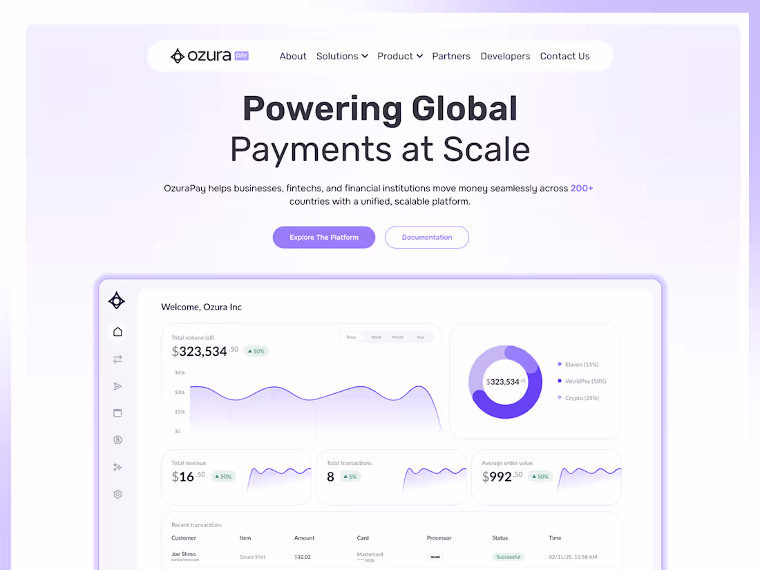
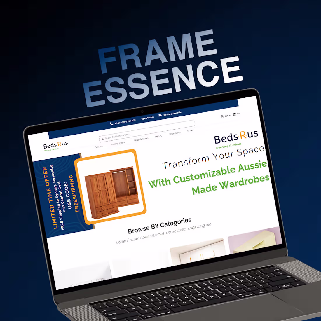
Shipped OZURA designed in Figma, built on Framer CMS. www.ozurapay.com
(http://www.ozurapay.com)What I designed (Figma): Complete design system with purple accent theme Component library & design tokens Information architecture for payments platform Premium SaaS aesthetic (light + modern) Mobile-first responsive layouts Interactive prototypes & user flows
What I developed (Framer CMS): Built on Framer (modern design-to-code platform) High-performance, zero-config hosting Dashboard with real-time data visualization Dynamic content management Fully responsive across all devices Design system implemented with zero friction
The result: A sleek payments platform website that communicates global scale and builds trust instantly.
This is what modern web design looks like designed beautifully, built fast.
hashtag#WebDesign (https://www.linkedin.com/search/results/all/?keywords=%23webdesign&origin=HASH_TAG_FROM_FEED) hashtag#Figma (https://www.linkedin.com/search/results/all/?keywords=%23figma&origin=HASH_TAG_FROM_FEED) hashtag#Framer (https://www.linkedin.com/search/results/all/?keywords=%23framer&origin=HASH_TAG_FROM_FEED) hashtag#SaaS (https://www.linkedin.com/search/results/all/?keywords=%23saas&origin=HASH_TAG_FROM_FEED) hashtag#DesignToCode (https://www.linkedin.com/search/results/all/?keywords=%23designtocode&origin=HASH_TAG_FROM_FEED) hashtag#ModernWeb (https://www.linkedin.com/search/results/all/?keywords=%23modernweb&origin=HASH_TAG_FROM_FEED) hashtag#StartupDesign (https://www.linkedin.com/search/results/all/?keywords=%23startupdesign&origin=HASH_TAG_FROM_FEED)
2
57
Just a quick website concept demo created using AI-assisted workflow and Webflow.
Exploring faster creative direction, smoother UI building, and modern interactions while keeping the overall experience clean and conversion-focused.
1
77

Design meets performance.
A modern, high-end website experience crafted with clean structure, strong typography, and seamless interactions. The goal was to create a visually engaging interface while keeping the user journey smooth, fast, and conversion-focused across all devices.
From layout to execution, every section is built with clarity, hierarchy, and scalability in mind, delivering a premium digital presence that reflects innovation and precision.
Let’s build something that stands out.
3
151
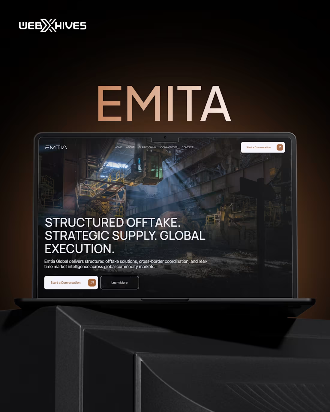
Recently completed a project built a modern website for EMTIA Global. A company operating in structured offtake, strategic supply, and commodity markets.
The goal was to create a premium digital experience that reflects trust, global operations, and industrial strength while keeping the interface clean, modern, and conversion-focused.
The project included:
• Full website UI/UX design
• Responsive layouts
• Brand-aligned visual direction
• Webflow development
• Modern typography and structured content hierarchy
Live website URL: :emtiaglobal.com (https://emtiaglobal.com/)
1
101
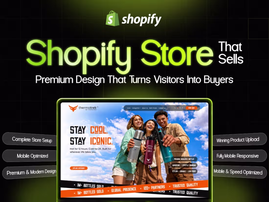
My Recnt work:
A Shopify Store for Clothing, Fashion, and Apparel.
I handle everything from store setup and design to product uploads and essential features, ensuring store is ready to launch and perform effectively.
1
104
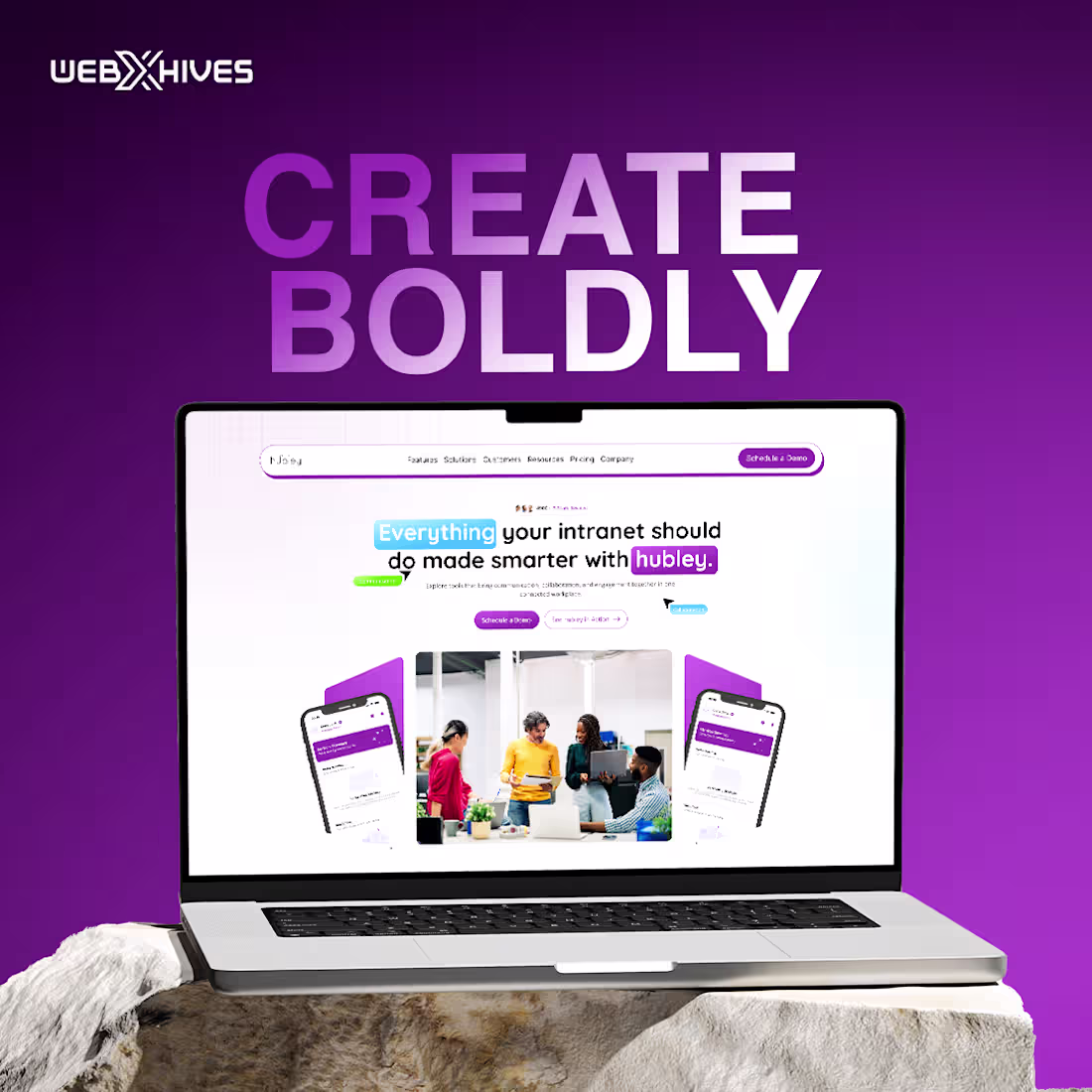
Create Boldly. Design with Purpose.
Designed a modern SaaS website for a workplace intranet platform, focused on clarity, collaboration, and engagement. The experience blends bold typography, soft gradients, and intuitive layouts to make complex internal tools feel approachable, human, and easy to use.
From feature storytelling to conversion-focused sections, the design supports seamless onboarding and encourages teams to connect, communicate, and work smarter across all devices.
2
153
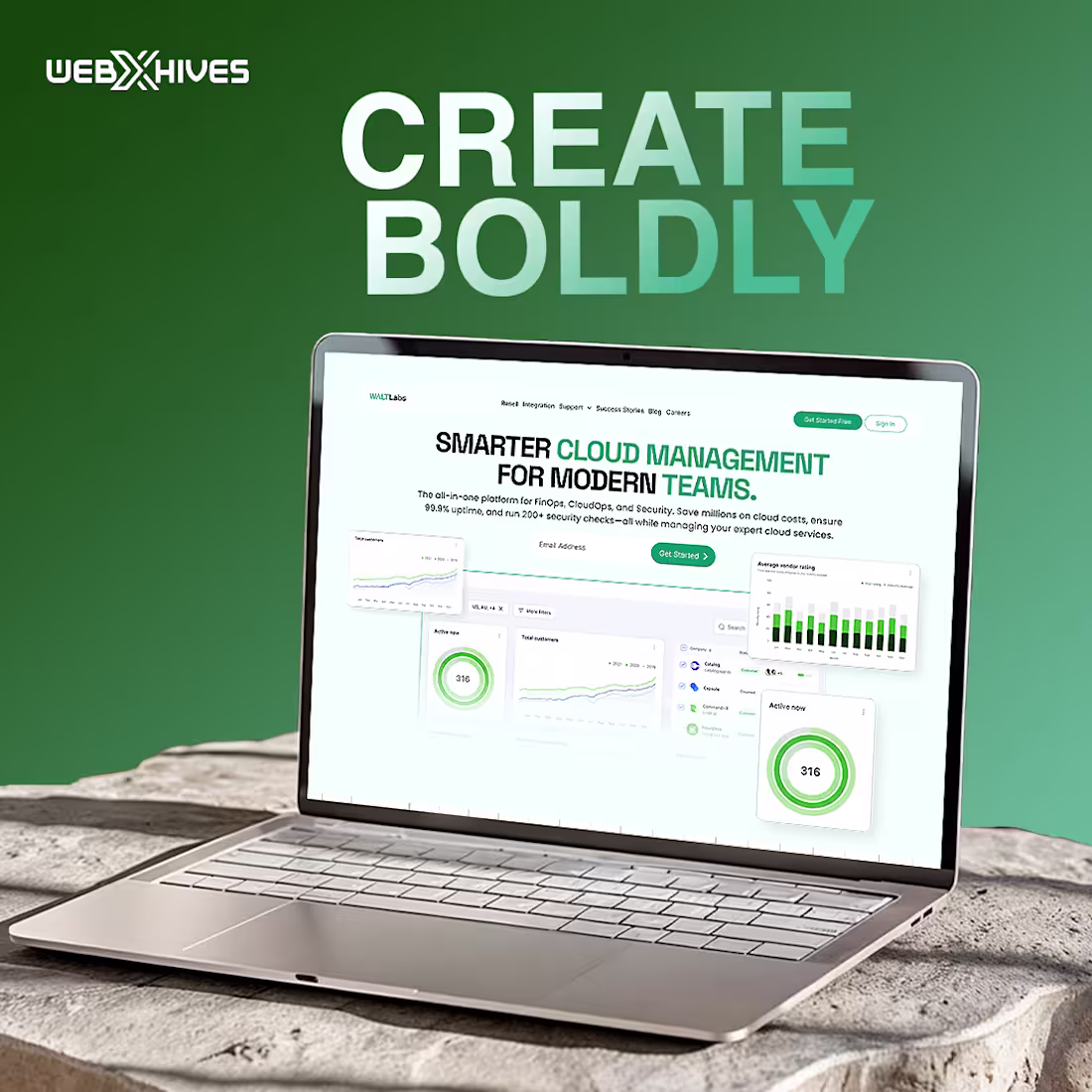
Create Boldly. Build Smarter.
Designed a high-conversion SaaS website focused on clarity, performance, and scalability for modern cloud-driven teams. The experience blends clean UI, data-focused layouts, and intuitive dashboards to communicate value instantly while supporting product-led growth.
Every section was designed to guide users clearly from feature discovery to action while maintaining a bold yet minimal visual identity across desktop and mobile.
4
134
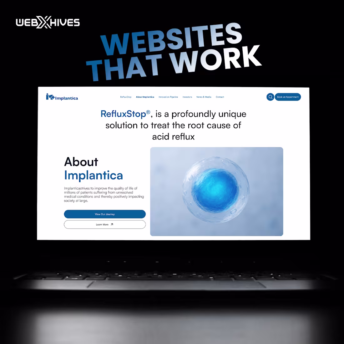
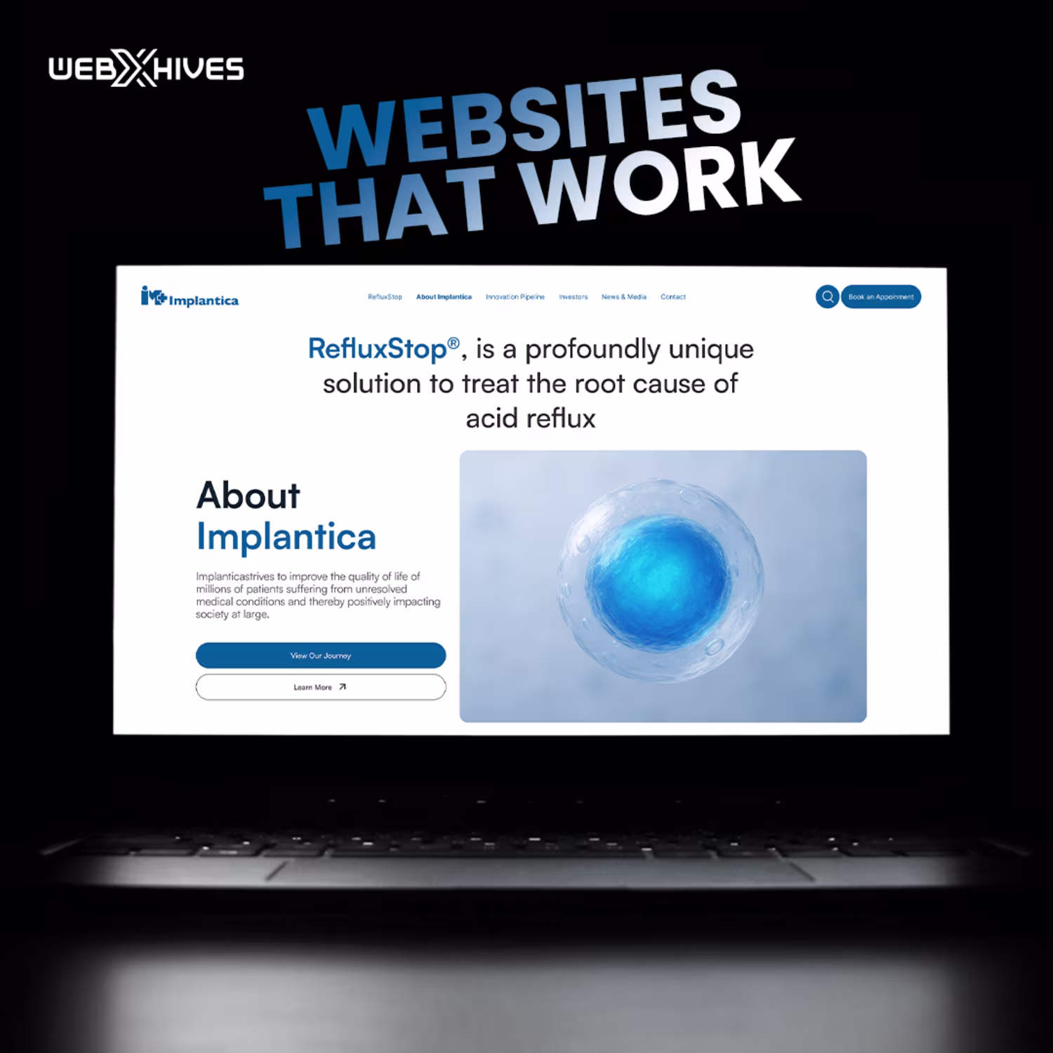
Designed and developed a modern, healthcare-focused website for a medical technology brand, with a strong emphasis on clarity, credibility, and conversion. The experience balances clean UI, intuitive navigation, and professional storytelling to build trust with patients, partners, and investors.
From structured content layouts to responsive design and accessibility-friendly visuals, every section was crafted to communicate complex medical information in a simple, confident, and human way.
2
120
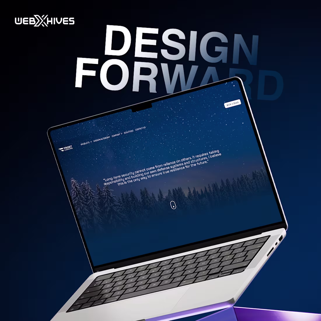
Worked on a modern, high-performance website design focused on clean UI, strong visual hierarchy, and immersive storytelling. The goal was to create a future-ready digital experience that feels premium, credible, and conversion-focused across all devices.
From layout structure to visual consistency and smooth interactions, every detail was designed to move the brand forward.
2
113
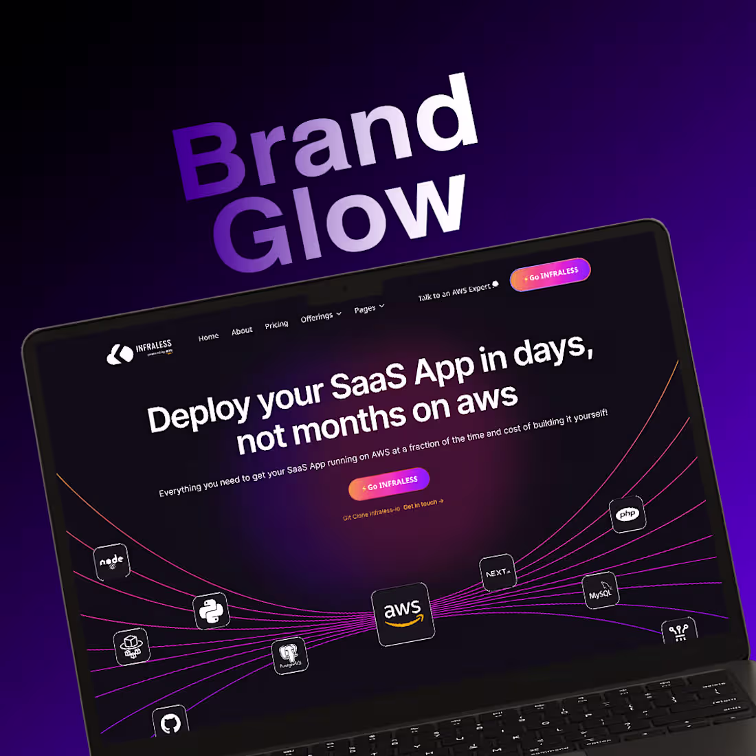
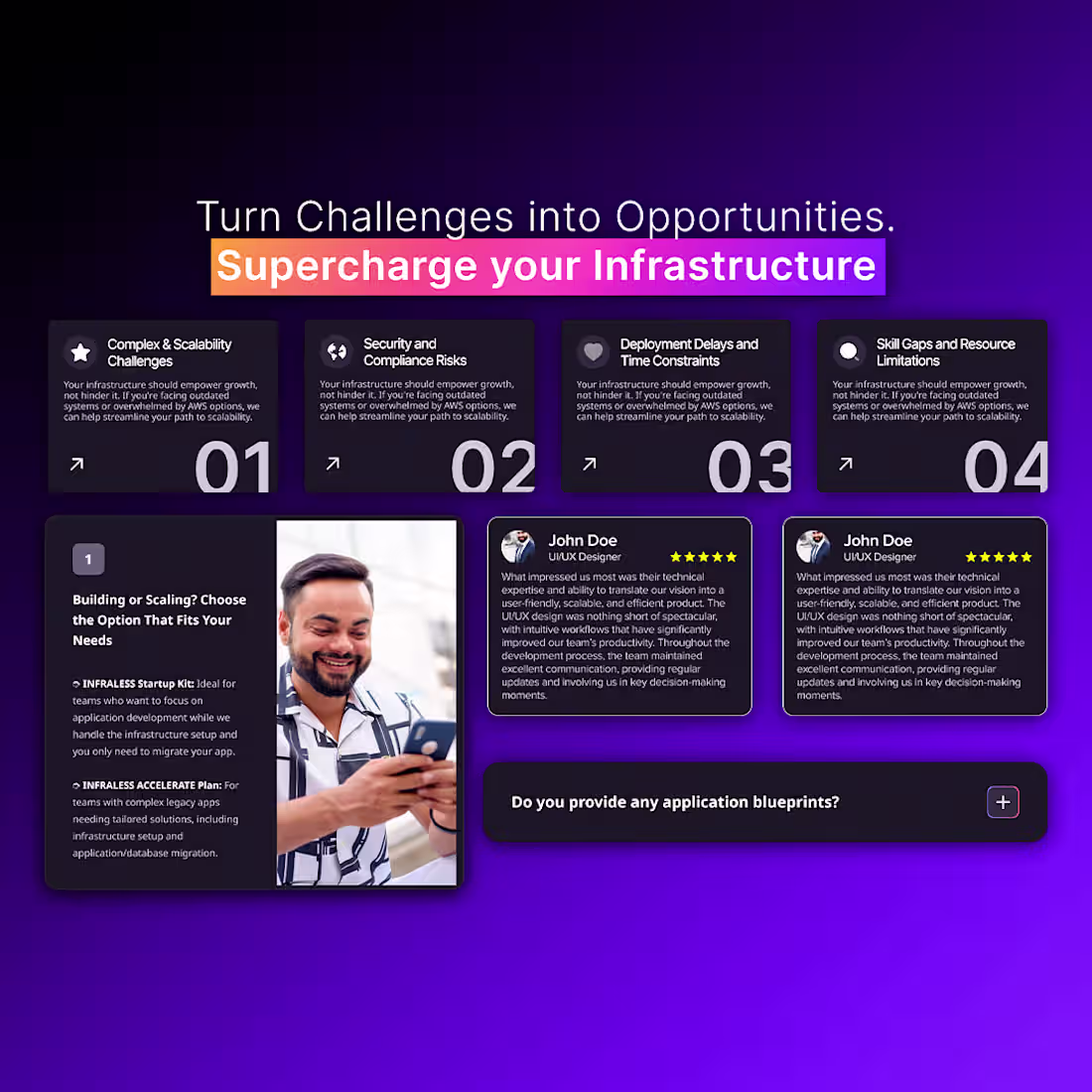
A bold, high-impact SaaS website crafted to communicate speed, scalability, and technical confidence. The design uses glowing gradients, dark UI depth, and structured content blocks to simplify complex cloud and infrastructure concepts. Clear value propositions, problem-solution sections, and social proof work together to position the product as a fast, reliable alternative for deploying and scaling SaaS applications on AWS.
2
89
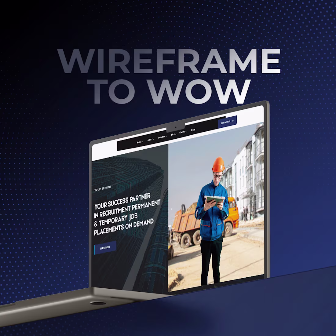
A recruitment-focused website concept transformed from wireframe to a polished, high-impact interface. The layout emphasizes clarity, industry relevance, and trust through strong visuals, sector-based navigation, and a guided hiring flow. By combining real-world imagery with a structured step-by-step process, the design makes complex recruitment journeys feel simple, actionable, and results-driven for industrial and technical sectors.
2
85
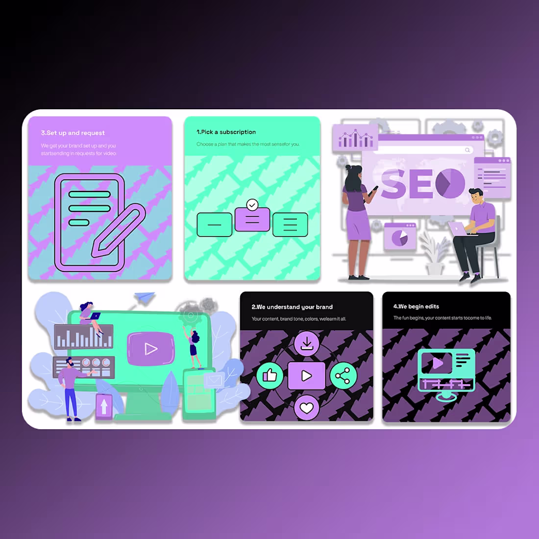
A vibrant, conversion-focused website built for a short-form content and SEO service. The design blends bold gradients, playful illustrations, and a clear step-by-step workflow to explain the process quickly and visually. Strong headlines, focused CTAs, and modular sections simplify complex services, making it easy for brands to understand the value and move confidently from interest to subscription.
2
82
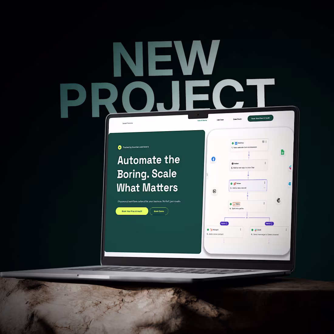
A modern SaaS website designed to position automation as a growth enabler rather than a technical hurdle. The interface combines calm, professional visuals with clear workflow storytelling, social proof, and step-by-step onboarding to build confidence quickly. Strategic CTAs, testimonials, and guided sections simplify decision-making while reinforcing scalability, efficiency, and measurable business impact.
2
76
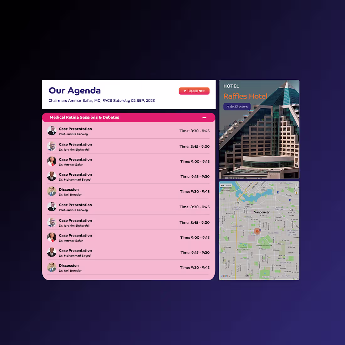
A bold, event-focused website experience designed to elevate a global retina conference brand. The interface combines strong visual identity, dynamic layouts, and structured information to balance inspiration with clarity. From speaker highlights to agenda flow and venue details, the design guides attendees seamlessly while reinforcing credibility, global collaboration, and professional authority within the medical community.
2
70
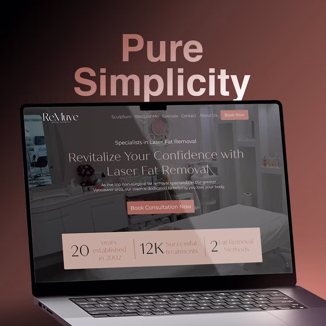
A refined, minimal website experience crafted for a non-invasive fat removal clinic, focused on clarity, trust, and ease of conversion. Soft tones, spacious layouts, and confident typography create a calming medical-aesthetic balance, while step-by-step guidance, credibility stats, and strong CTAs simplify the decision journey. The design prioritizes reassurance and flow, helping users move seamlessly from curiosity to consultation.
2
68
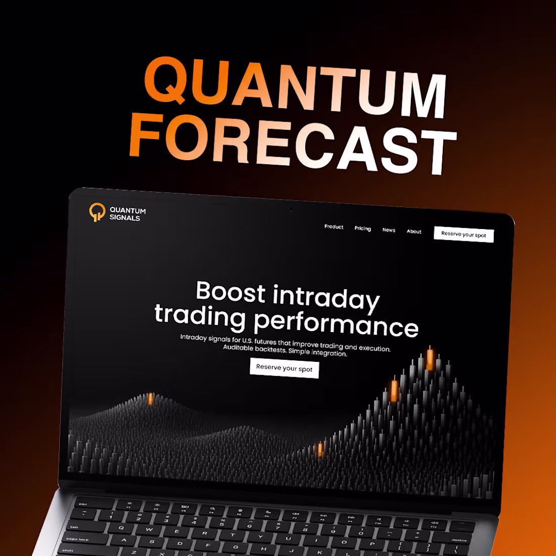
A dark, data-driven website designed for an AI-powered intraday trading platform. The interface uses bold contrast, minimal layouts, and dynamic data visuals to communicate precision, speed, and trust. Clear value messaging, structured product sections, and focused CTAs guide users from insight to action, positioning the platform as a serious, performance-focused solution for professional traders.
2
66
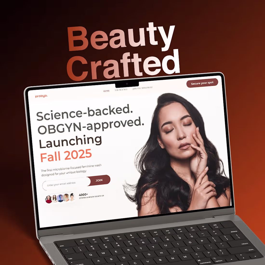
A thoughtfully crafted product landing page designed to communicate trust, science, and transparency in women’s wellness. The layout blends soft visuals with clear educational messaging, highlighting clinically backed ingredients, OBGYN approval, and user benefits without overwhelming the audience. The warm color palette, structured content blocks, and focused CTAs work together to build credibility, encourage early sign-ups, and position the brand as both premium and honest.
2
61
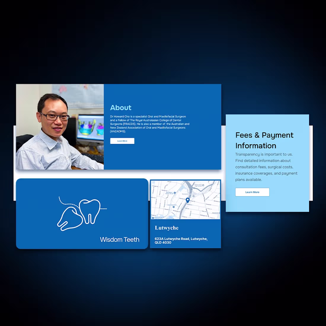
A calm, patient-focused website designed for a specialist oral & maxillofacial clinic. The interface balances medical precision with a warm, reassuring tone, using clear navigation, soft visuals, and structured service cards to guide users effortlessly from information to appointment booking. The result is a modern, trustworthy experience that prioritizes clarity, accessibility, and patient confidence.
2
60
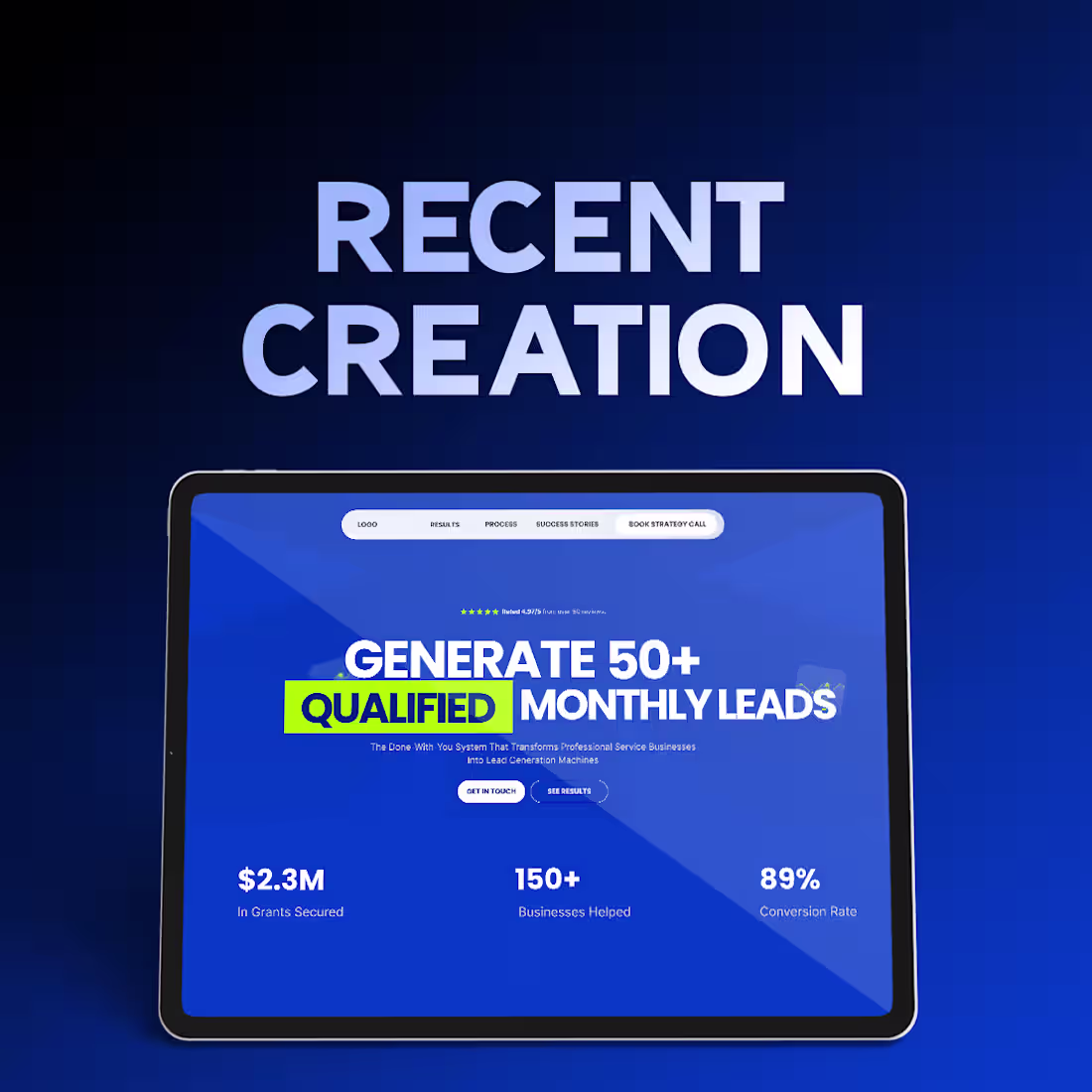
This project focuses on clarity, trust, and results. The design is clean and structured to highlight real outcomes, strong credibility, and consistent lead generation. Clear typography, bold visuals, and a focused layout guide users smoothly through the page, keeping attention on growth and conversion. The overall experience feels professional, confident, and built to drive action.
2
55
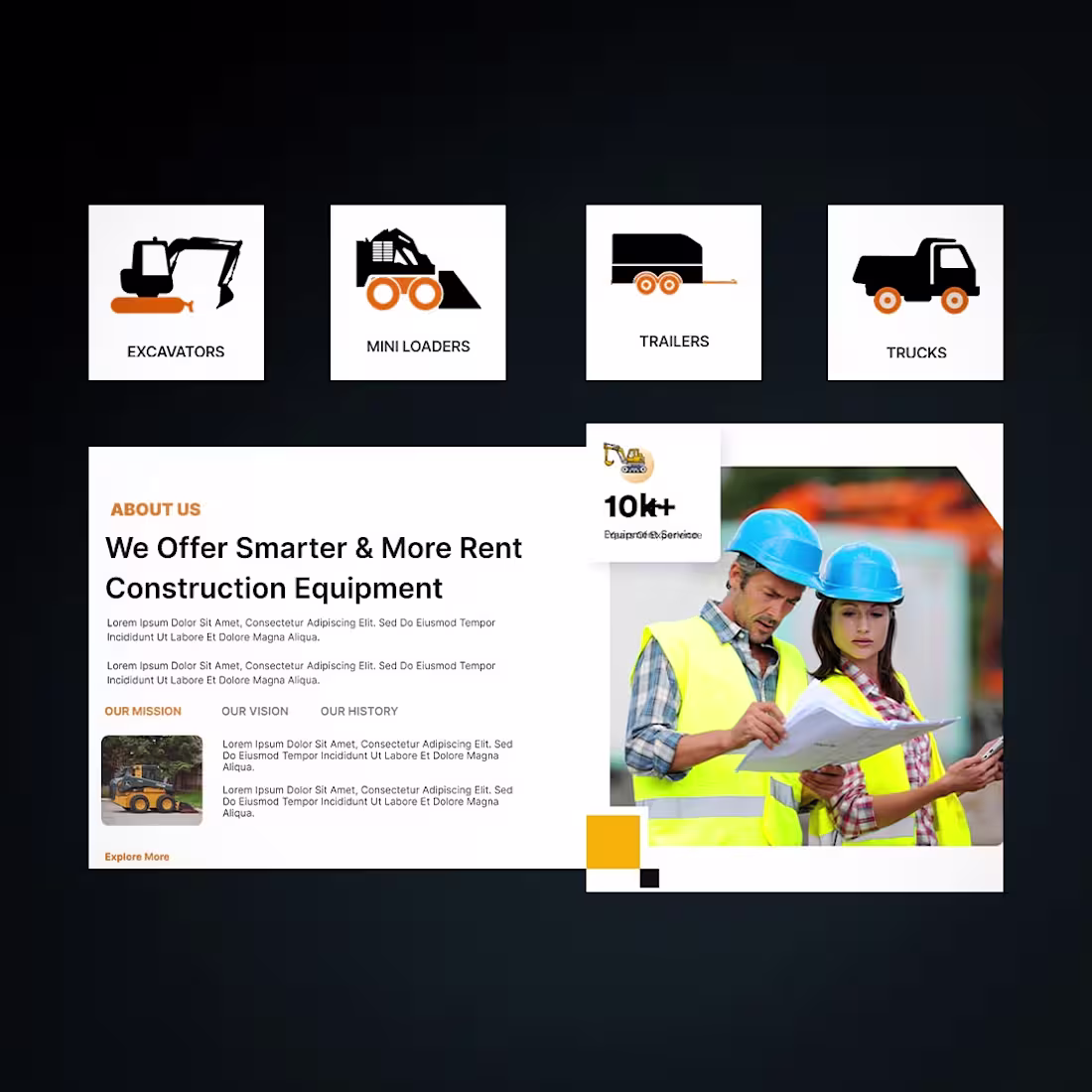
This project focuses on creating a strong and practical digital presence for a construction equipment rental business. The goal was to design a website that feels as solid and dependable as the machinery it represents, while keeping the user journey simple and conversion-focused.
The visual style is driven by bold orange and dark tones, reflecting energy, safety, and industrial strength. The layout is clean and structured, allowing users to quickly find equipment, understand the rental process, and request a quote without friction
2
60
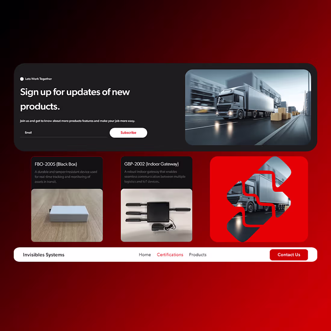
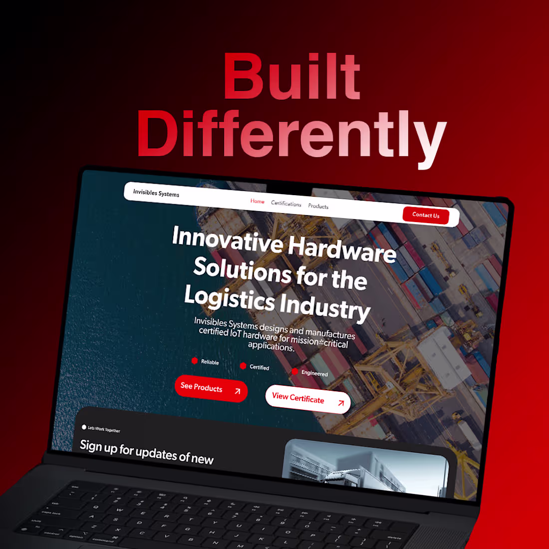
This project was designed for a brand that builds mission-critical hardware for the logistics industry. The goal was to create a bold, reliable, and professional website that instantly communicates trust, certification, and industrial strength.
The visual direction focuses on strong red and dark tones, representing power, urgency, and reliability. The layout is clean and structured, making it easy for enterprise users to understand the products, certifications, and use cases without distractions.
2
64
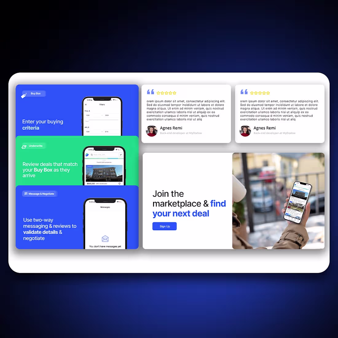
Recent addition 📈
This project was designed to help investors move faster and smarter with confidence. The goal was to present complex real estate data in a clean, actionable, and easy-to-scan experience without overwhelming the user.
I focused on strong hierarchy, trust signals, and clear pathways from discovery to action. Personalized deal flows, trending properties, and performance stats were visually structured to support quick decisions while maintaining transparency and credibility.
The overall experience balances scale and simplicity making it easy for investors to explore opportunities, validate deals, and take action with clarity and control.
2
54
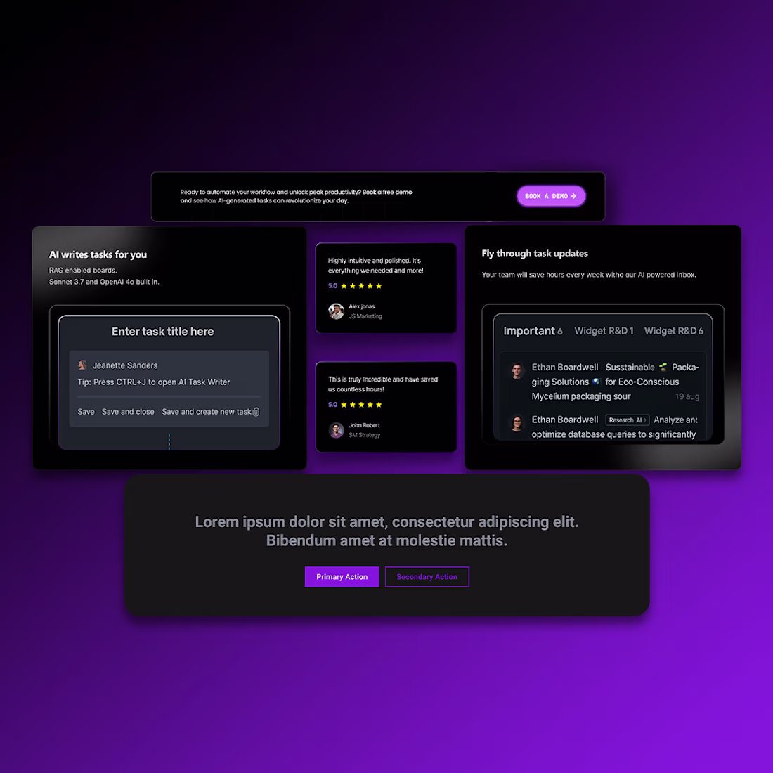
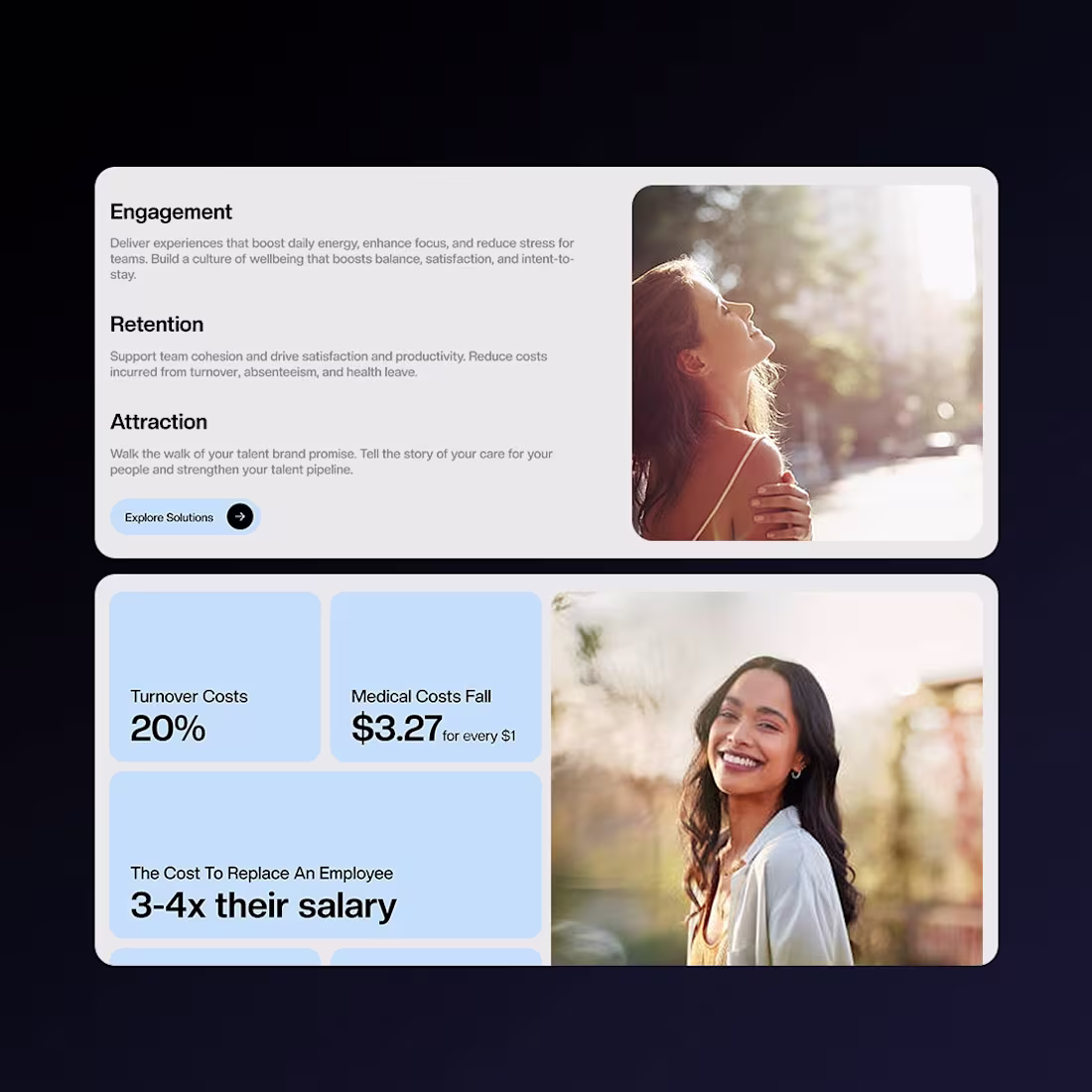
Future focused 🤖
This project was designed around a simple idea: reducing chaos and giving people clarity through AI. The goal was to make project management feel lighter, smarter, and more intuitive not overwhelming.
I focused on a dark, futuristic interface with clear hierarchy and focused task views, allowing users to move fast without distraction. AI-powered actions, smart task writing, and real-time updates were visually organized to feel helpful, not complex.
The experience is designed to support modern teams saving time, reducing friction, and letting users focus on what truly matters, while AI handles the noise in the background.
2
54
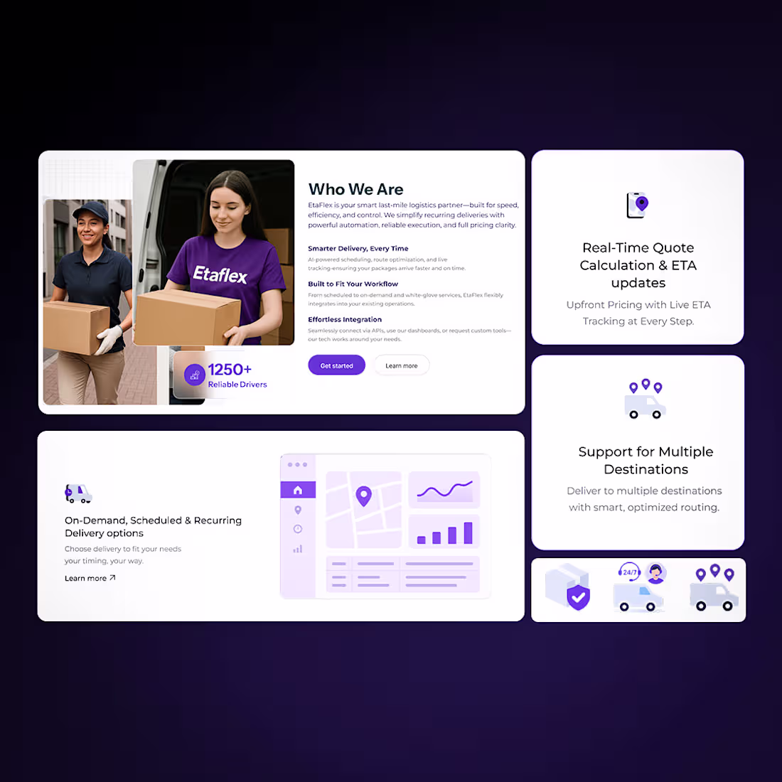
A modern B2B website designed for clarity, trust, and operational confidence.
Structured layouts, real-time features, and a professional tone combine to make complex logistics feel simple and reliable.
I focused on strong visual hierarchy, clear messaging, and modular sections to highlight reliability, scale, and real-time operations. From service statistics to delivery options, every element was designed to communicate trust, speed, and control the three things businesses care about most in logistics.
The result is a modern, professional interface that feels dependable and efficient, helping businesses quickly understand the value and move toward action without friction.
2
56
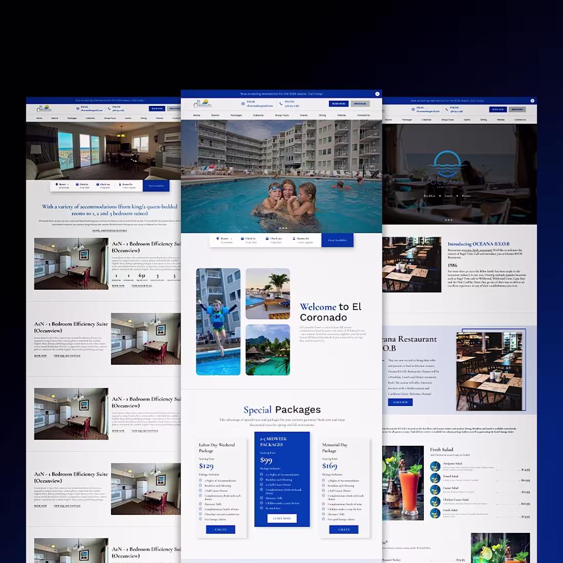
A hospitality website designed around comfort, ease, and trust.
Clean layouts, clear information, and welcoming visuals come together to create a smooth booking experience that feels relaxed and family-friendly.
2
52
This website was designed as a celebration of feminine confidence, strength, and self-expression.
The goal was to create a space where women feel seen, empowered, and comfortable being themselves, whether they are beginners, professionals, or simply exploring dance as a form of freedom.
The visual language is bold yet graceful, combining vibrant colors, soft curves, and expressive imagery to reflect movement, confidence, and individuality. Each section is designed to feel welcoming, not intimidating, encouraging women of all ages to step forward, grow, and express themselves without hesitation.
More than just a dance website, this experience represents freedom, self-belief, and joy a reminder that confidence grows when women are given a space that truly understands them.
2
63
Designed a calm, structured e-commerce experience for a furniture brand.
The goal was to make browsing feel easy and natural clean layouts, clear categories, and a layout that lets the products breathe while maintaining a strong commercial flow.
2
49
Latest project ✨
Recently designed a modern, human-centered website for Aurra, a wellness agency focused on burnout resilience for high-performing teams.
I really enjoyed working on this project because the brand needed to feel calm, trustworthy, and uplifting without losing clarity or structure. I focused on soft layouts, breathable spacing, and emotionally resonant visuals to support Aurra’s core message: when people feel better, they perform better.
The design process started with understanding the audience and brand tone, followed by a clean content hierarchy, modular sections, and conversion-focused CTAs. The result is a smooth, approachable experience that balances wellbeing storytelling with business impact.
2
51
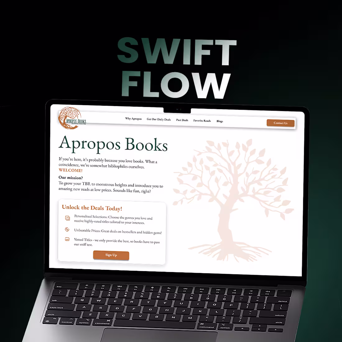
Apropos Books Online Book Marketplace
Created a refined, content-first UI with a strong editorial feel. The design emphasizes readability, structured layouts, and intuitive navigation to guide users seamlessly from discovery to checkout.
2
49
Think. Code. Trade 🚀
Designed a dark, futuristic landing experience for an AI-powered trading platform. Clean layouts, glowing visuals, and clear CTAs focused on trust, performance, and real-time decision making.
2
59
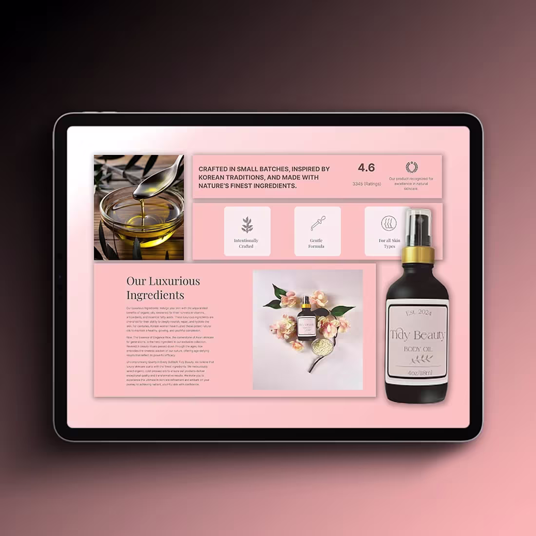
Tidy Beauty, Skincare E-commerce Website
Created a refined, minimal UI that highlights natural ingredients, product storytelling, and brand credibility. The design focuses on soft color palettes, balanced typography, and a smooth browsing experience tailored for beauty and wellness audiences.
2
58
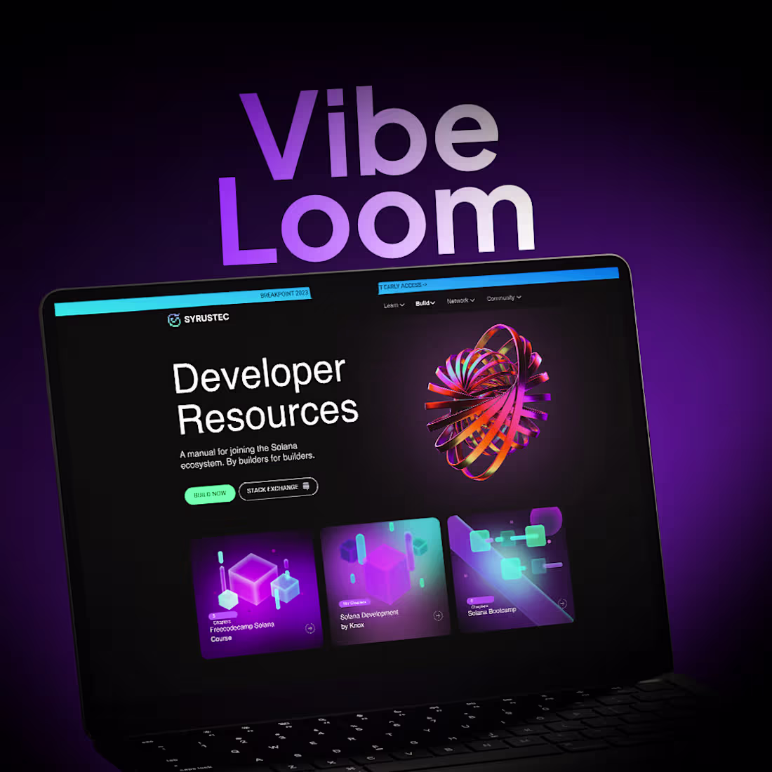
Vibe Loom Developer Resources Platform
Created a modern, dark-themed UI with vibrant gradients and a structured content layout for developers. The design focuses on discoverability, visual hierarchy, and an engaging learning flow while maintaining a premium, tech-forward aesthetic.
2
53
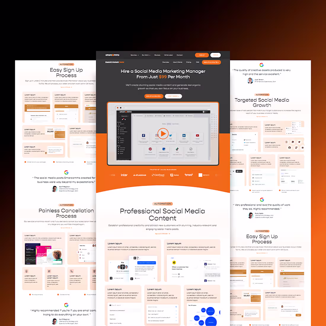
Fresh look 🚀
Designed a modern, conversion-focused website for a Social Media Marketing service.
Clean layout, strong visual hierarchy, and clear CTAs built to highlight value, pricing, and ease of signup while keeping the experience smooth and professional.
2
55
working on a SaaS website design for a cloud infrastructure platform.
The focus is on clarity, scalability, and trust, translating complex AWS infrastructure concepts into a clean, confident, and conversion-focused interface.
Designed with strong hierarchy, dark UI aesthetics, clear CTAs, and visual storytelling that supports technical buyers and decision-makers.
2
3
83
Working on a modern website design for an industrial hardware company in the logistics space.
The focus is on credibility, clarity, and product-led storytelling, presenting complex IoT hardware solutions in a clean, confident, and easy-to-navigate interface.
Designed to support enterprise buyers with strong hierarchy, clear CTAs, certification highlights, and a bold, engineered visual system.
2
77
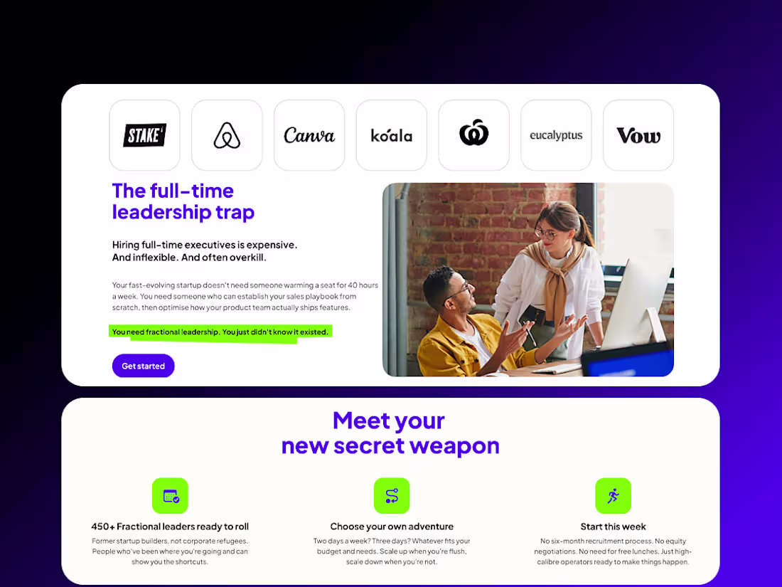
Fractional Leadership Marketplace Website Design
2
2
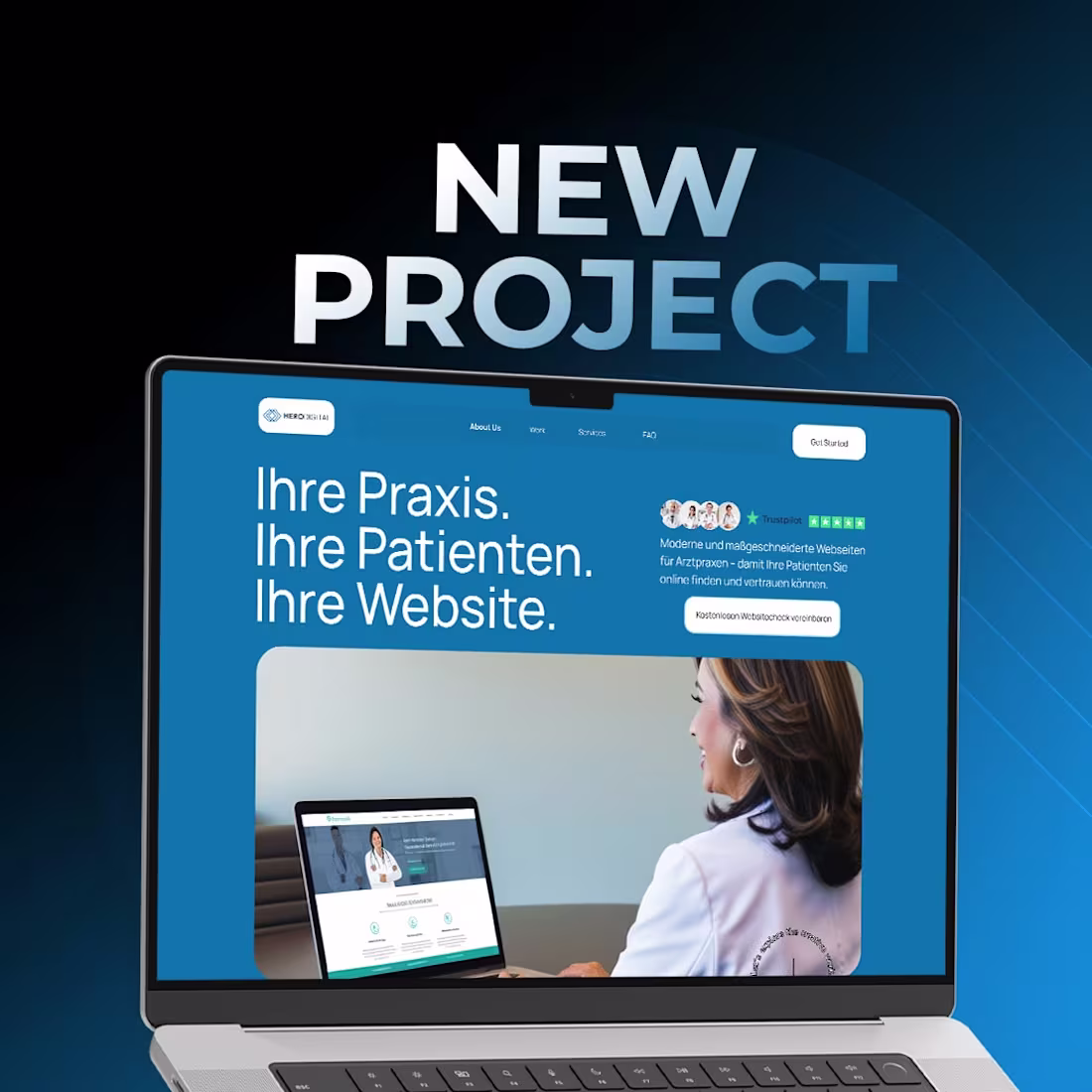
working on a modern website design for healthcare professionals, focused on trust, clarity, and patient conversion.
The design balances a clean medical aesthetic with strong visual hierarchy, clear benefits, and service-focused sections that help practices attract and convert patients online.
Built with a professional, calm visual system and a UX optimized for bookings, credibility, and long-term growth.
2
70
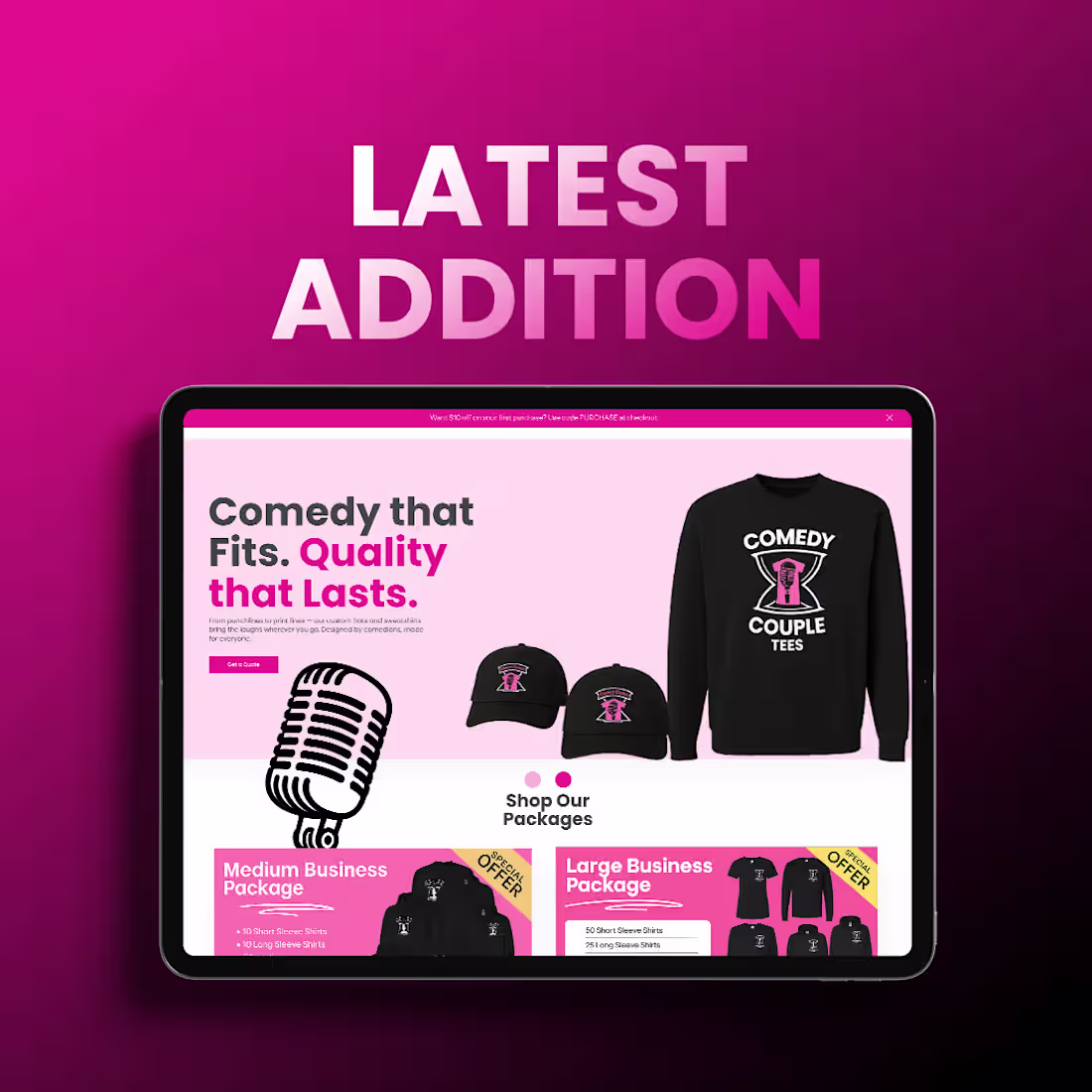
Working on a Shopify store update for a comedy-driven apparel brand.
This update focuses on clear product discovery, bold branding, and smoother shopping flow, making it easier for customers to browse categories, understand value, and purchase quickly.
Designed with a playful but structured UI, strong color contrast, and conversion-focused sections to support both merch sales and brand personality.
2
72
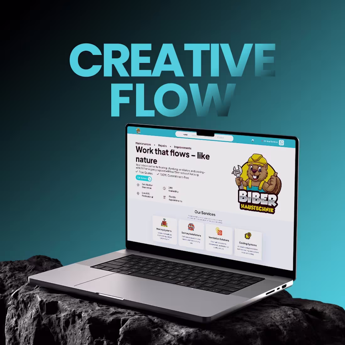
Working on a service-based business website design focused on trust, clarity, and local conversions.
The goal is to combine friendly branding, clear service presentation, and strong CTAs to help users quickly understand the offer and take action.
Designed with a clean layout, clear hierarchy, and mobile-first flow optimized for bookings and direct calls.
2
66
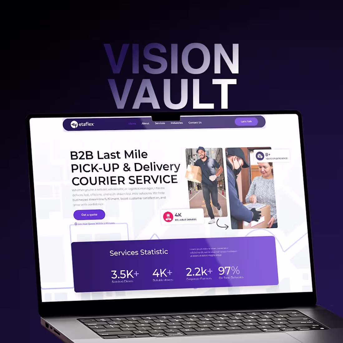
Working on a B2B logistics website design focused on clarity, credibility, and conversion.
The goal is to present complex last-mile delivery services in a clean, structured, and easy-to-understand interface that builds trust with enterprise clients.
Emphasis on strong hierarchy, modular sections, clear CTAs, and a professional visual system designed to support decision-makers.
2
79
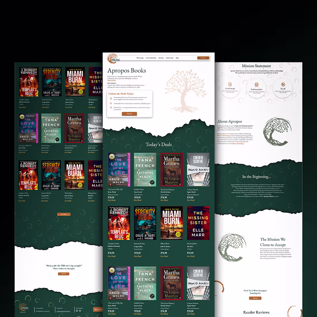
Working on a conversion-focused e-commerce website design for a book marketplace.
The goal is to create a warm, premium reading experience with clear hierarchy, smooth browsing flow, and layouts that make discovering and purchasing books feel effortless.
2
65
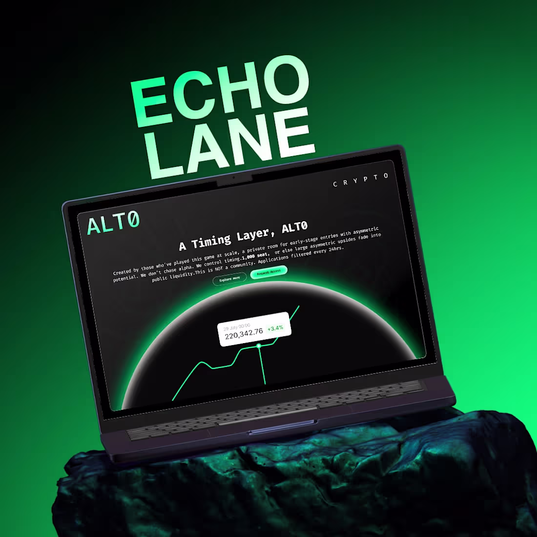
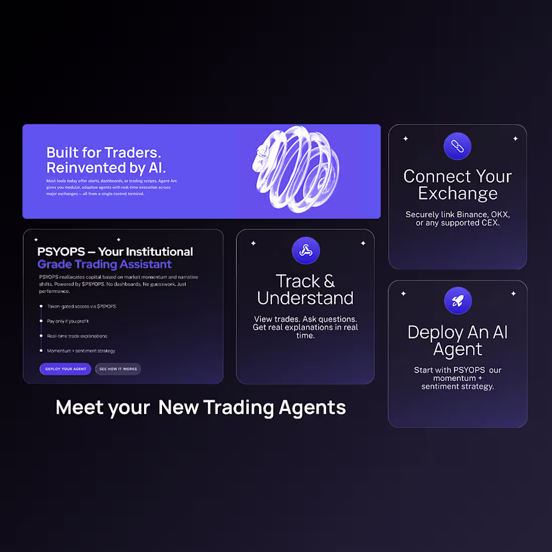
Working on a premium crypto platform UI focused on clarity, exclusivity, and authority.
This concept explores private access, alpha-level insights, and a dark, high-contrast interface designed to feel intentional, controlled, and investor-grade.
Emphasis on clean hierarchy, minimal copy, strong visual focus, and a flow that supports decision-making.
1
3
84
AI Agents SaaS CRO Focused UI for Customer Support Automation
2
3
I handled the full UI/UX and Webflow development, focusing on clarity, trust, and conversion.
The site simplifies a complex offer, highlights real results, and guides users toward booking calls all with a clean, mobile-first experience.
Live preview:
https://ascension-14f80b.webflow.io/
2
154
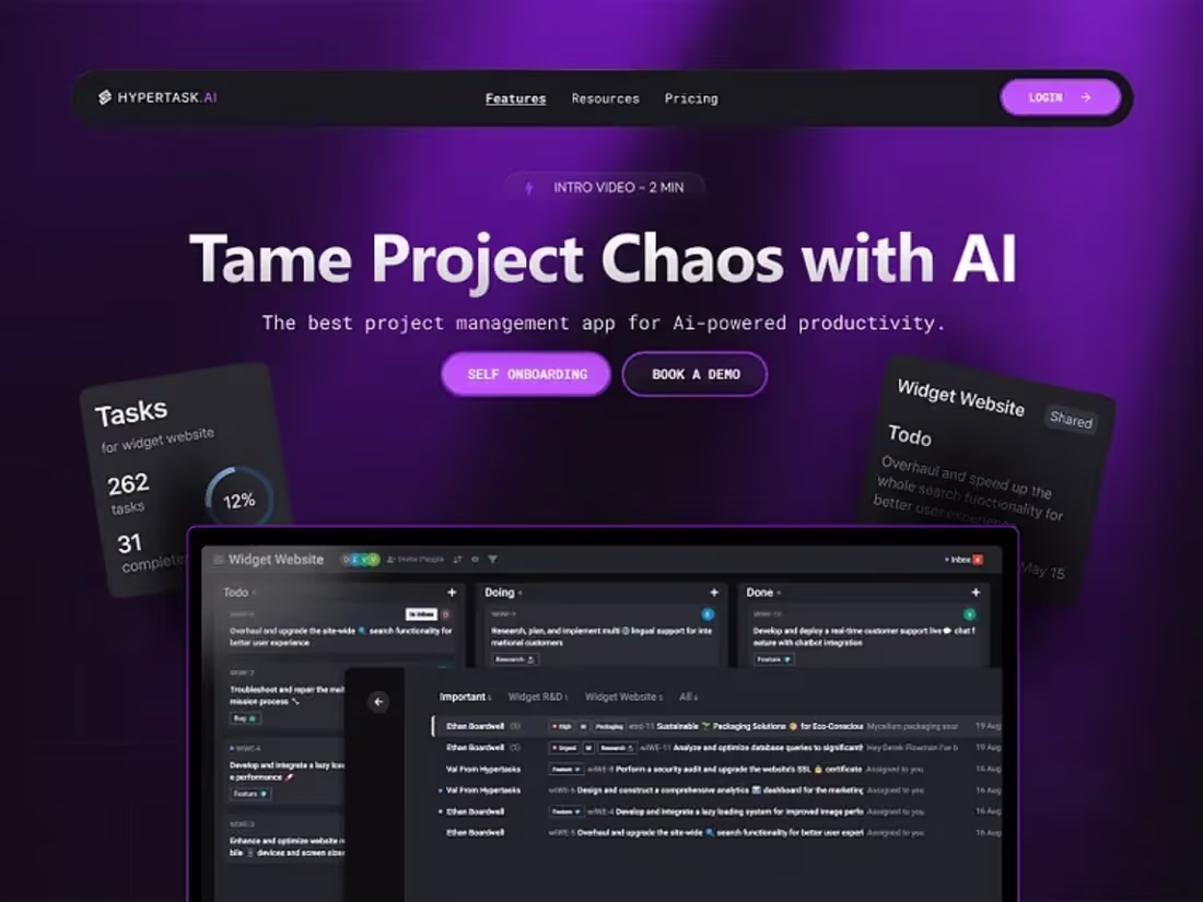
Tame Project Chaos with AI – Smart Project Management Dashboard
2
134
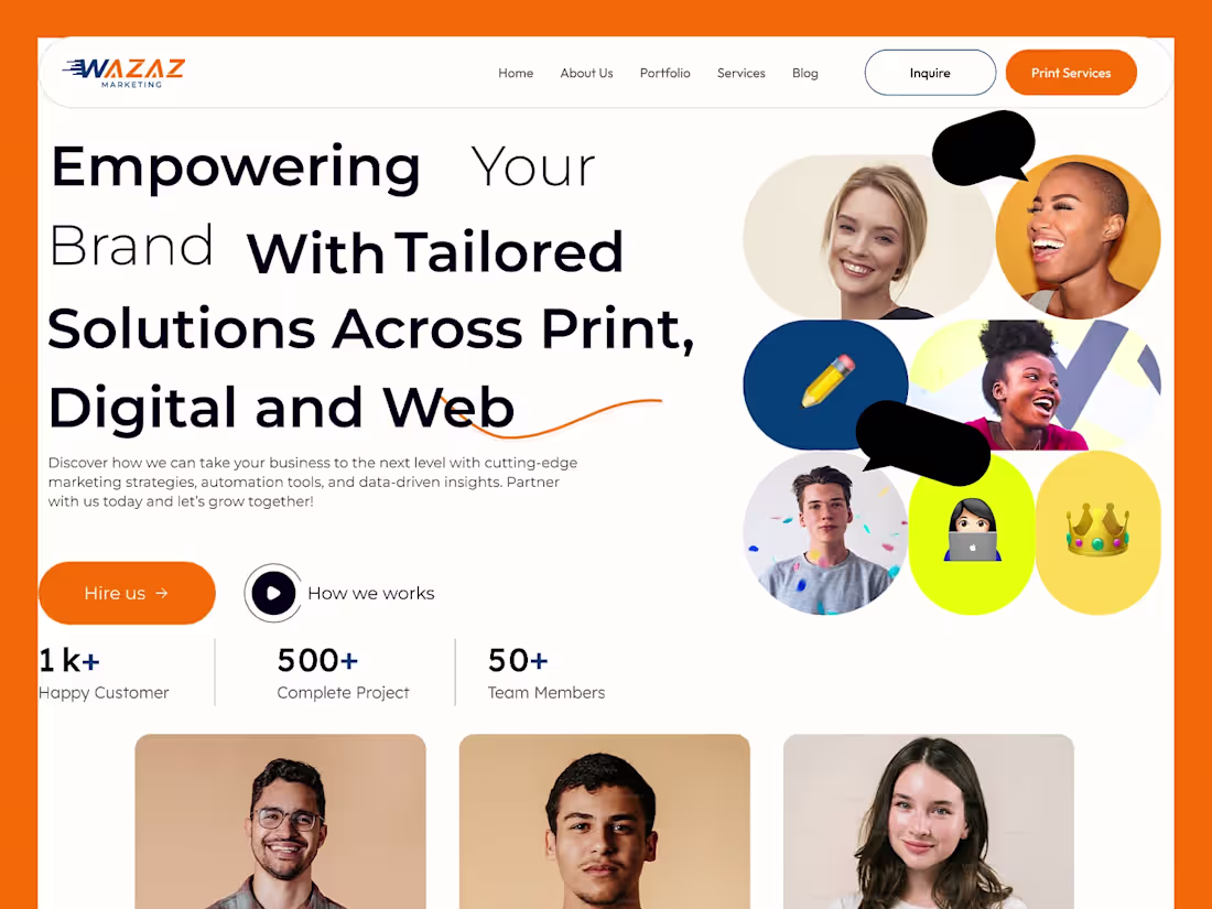
Modern Marketing Agency Website – Bold & Responsive Design
2
2