
Muhammad Kamran
Creative graphic design that makes your brands stand out
New to Contra
Muhammad is building their profile!
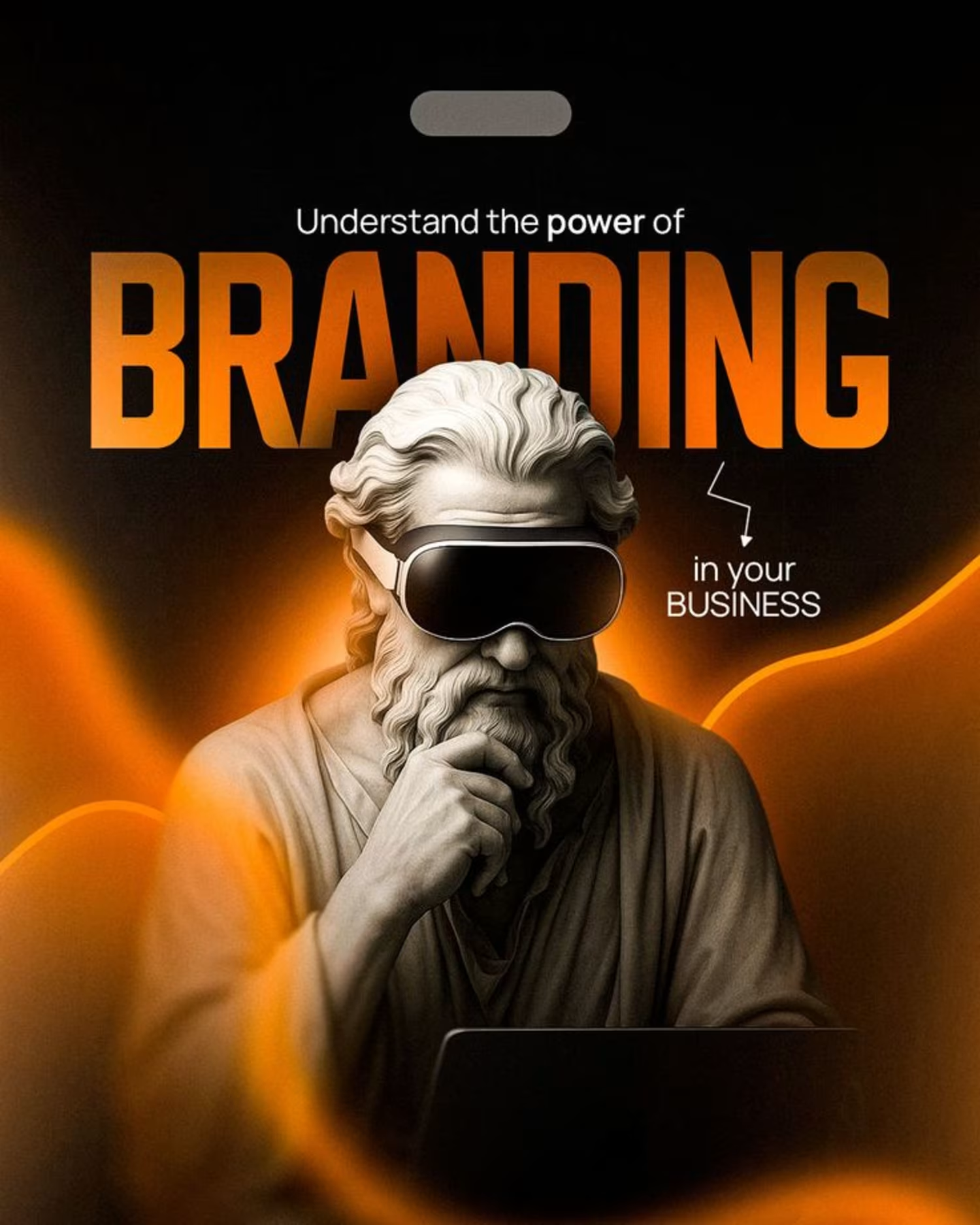

The real difference between an average marketer and a great one? Strategy.
It’s not about posting more.
It’s about understanding data, reading patterns, and making calculated decisions.
Because when strategy leads, growth follows.
#digitalmarketing #marketingstrategy
#performancemarketing #brandgrowth
1
37
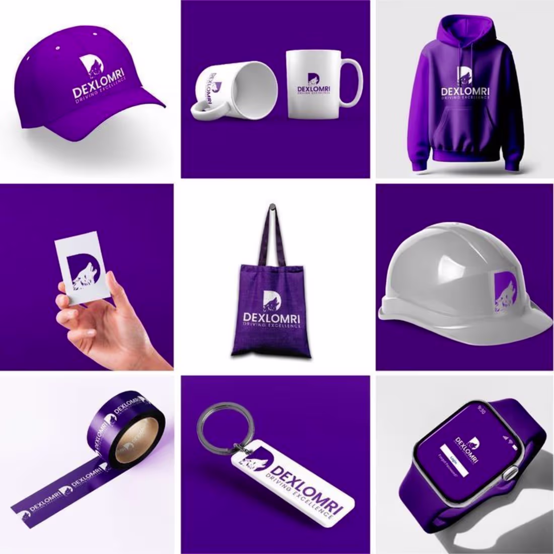
DEXLOMRI – Brand Identity & Merchandise Design
This project presents a comprehensive brand identity design for DEXLOMRI, centered around the theme Driving Excellence. The visual identity is built on a bold purple and white color palette, reflecting innovation, strength, and professionalism.
The logo has been strategically applied across a wide range of branded materials including apparel, corporate stationery, promotional merchandise, safety gear, and digital interfaces. Each element demonstrates consistency, scalability, and strong visual impact across both physical and digital touchpoints.
This work highlights expertise in brand strategy, logo design, visual identity development, and real-world brand application. The cohesive presentation showcases how a strong identity system can enhance brand recognition and market presence.
0
29

How I Grew on LinkedIn – Secret Tips
This image highlights LinkedIn growth and personal branding success. A confident young professional is shown celebrating achievement, with bold text “How I Grew on LinkedIn – Secret Tips” displayed prominently. The blue-themed background, LinkedIn icons, and upward growth graph symbolize professional growth, networking power, and career success.
Perfect for content related to LinkedIn growth, personal branding, social media strategy, and professional development.
2
2
68
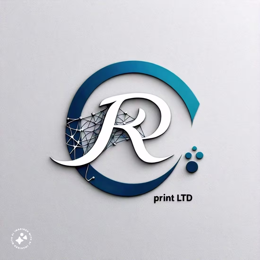
This logo is designed to represent professionalism, growth, and strong brand identity. The geometric structure symbolizes stability and progress, while the clean lines reflect precision and modern design standards.
The color palette is carefully selected to convey confidence, creativity, and trust. The combination of bold and neutral tones ensures strong visibility across both digital and print platforms.
The typography is clean and balanced, complementing the icon while maintaining high readability. The logo is fully scalable and adaptable, making it suitable for websites, social media, business cards, packaging, and corporate branding materials.
Key Highlights:
Modern & Minimal Design
Strong Visual Identity
Scalable Vector Format
Print & Web Ready
Consistent Brand Representation
0
35
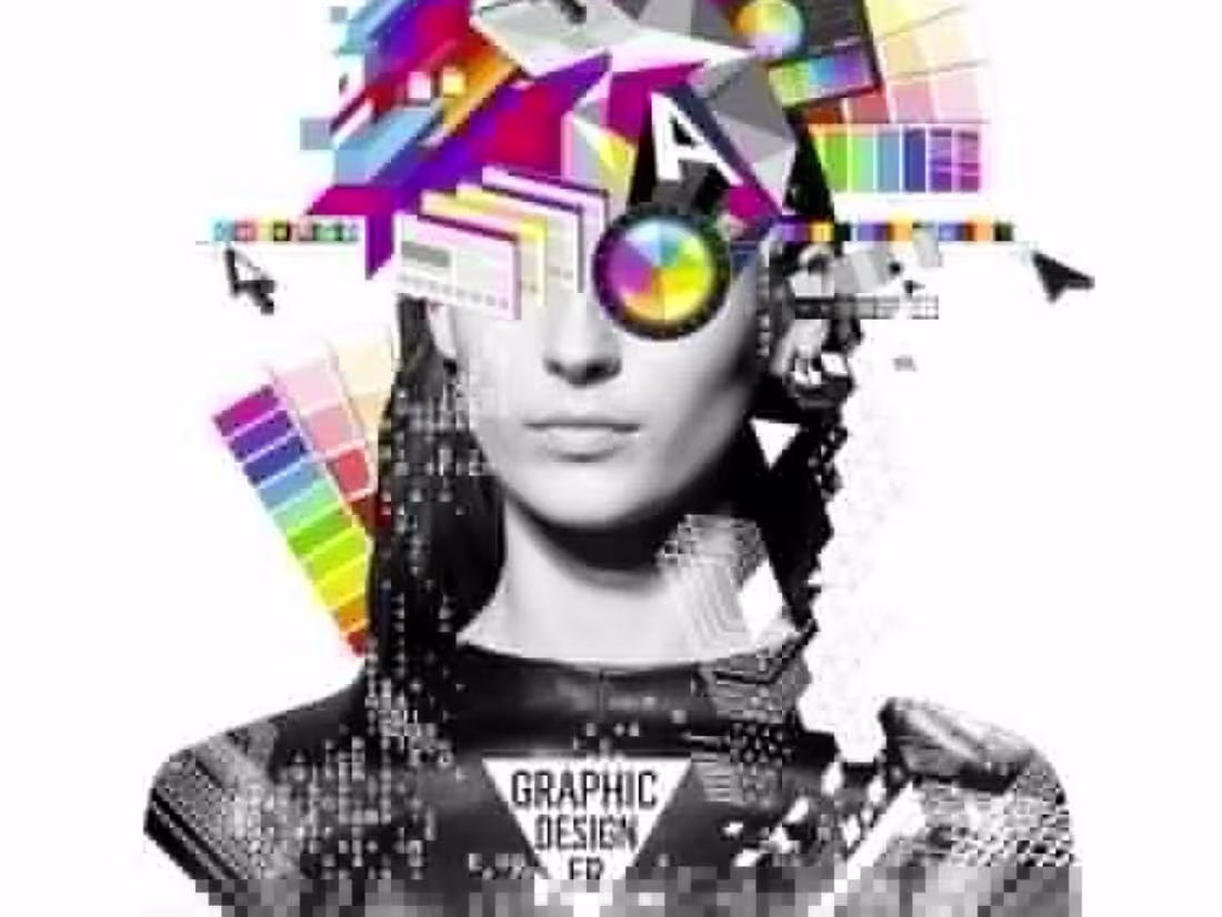
This project focused on creating a clean and professional brand identity for a growing business. The goal was to design a modern, scalable logo that reflects trust, innovation, and professionalism.
The process included concept sketching, digital vector creation, typography selection, and color palette development. Multiple logo variations were delivered, including icon-based, horizontal, and minimal versions.
Deliverables:
Primary & Secondary Logo
Brand Color Palette
Typography Guidelines
Business Card & Stationery Mockups
Print & Web-Ready Files
0
50