Moutie Ben amor
Product Designer who codes | React, Figma & express.js
New to Contra
Moutie is building their profile!

Where matter becomes thought.
Where thought becomes form. 💎
EL_MOUTII. is now live — an interactive exploration of fluid dynamics, ray marching, and custom shader design.
Engineered with React + Three.js.
Designed for mathematical elegance.
Discover it here:
🔗 https://lnkd. (https://lnkd.in/dAKAwVHC)
0
9
Reimagining the scroll experience with React + Vite.
Just pushed the code for Hyper Scroll — an immersive 3D web experience exploring performance and interactivity.
Under the hood: Smooth scrolling (Lenis) Real-time procedural audio engine (Web Audio API) CSS 3D Transforms & Glassmorphism
Check out the repo here: https://lnkd.in/d-E_hqgm
(https://lnkd.in/d-E_hqgm)#reactjs (https://www.linkedin.com/search/results/all/?keywords=%23reactjs&origin=HASH_TAG_FROM_FEED) #frontend (https://www.linkedin.com/search/results/all/?keywords=%23frontend&origin=HASH_TAG_FROM_FEED) #webdevelopment (https://www.linkedin.com/search/results/all/?keywords=%23webdevelopment&origin=HASH_TAG_FROM_FEED) #creativecoding (https://www.linkedin.com/search/results/all/?keywords=%23creativecoding&origin=HASH_TAG_FROM_FEED) #javascript (https://www.linkedin.com/search/results/all/?keywords=%23javascript&origin=HASH_TAG_FROM_FEED)
0
21
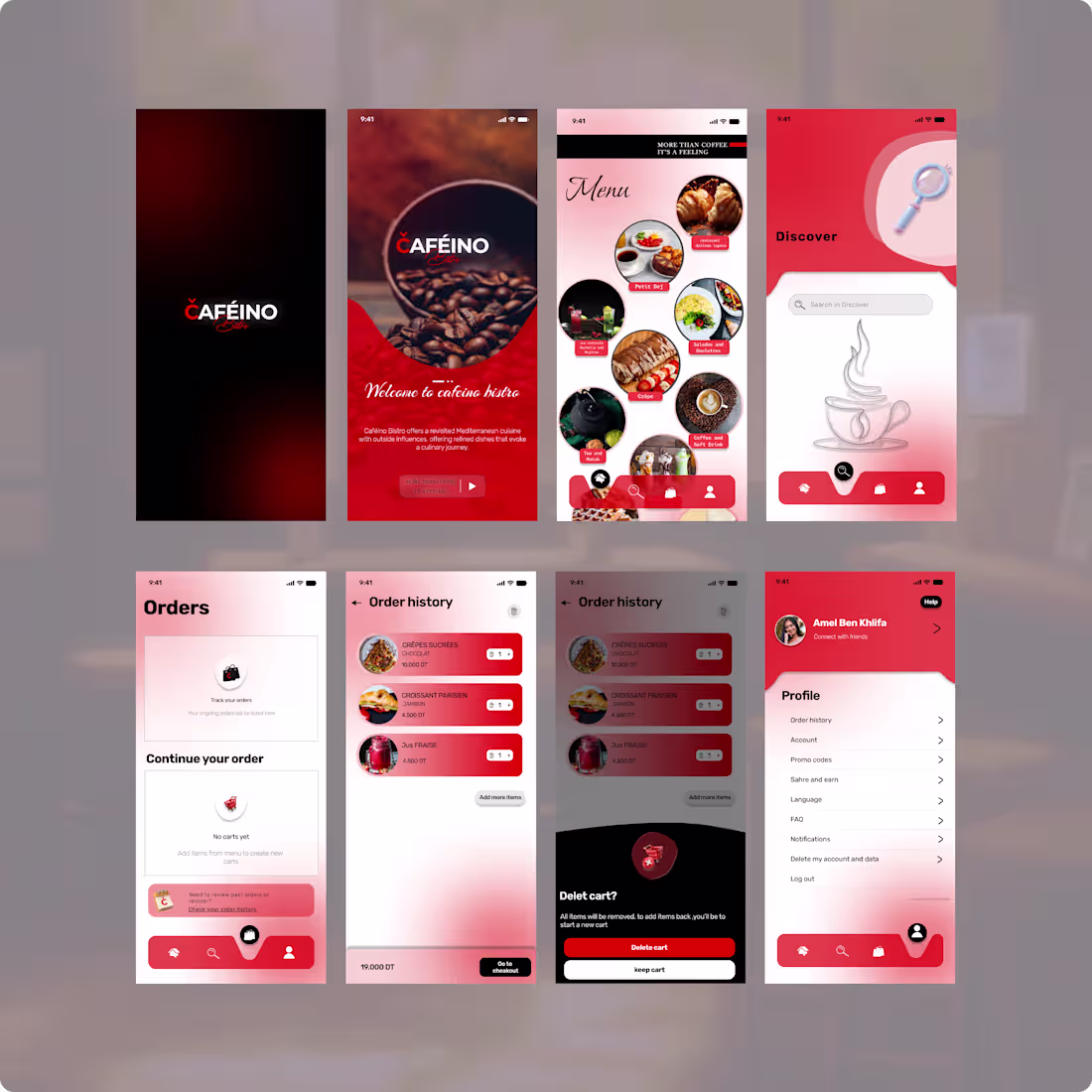
Designing Caféino Bistro – Simple, Warm, and Functional
Good coffee deserves a great digital experience.
I recently worked on a clean UI concept for Caféino Bistro – a cozy coffee shop that values speed, health, and flavor.
The goal was simple:
- Minimal layout
- Easy access to orders, menu, and profile
- A calm, intuitive flow for both new and returning customers
No clutter. Just a smooth path from “I want coffee” to “order completed.”
* Key screens:
Order overview with social proof
Menu & discovery section
Profile & history management
Designing for small businesses like Aféino reminds me that great UX doesn’t need to be complex – it just needs to feel right.
Would you use an app like this for your local coffee shop?
1
20
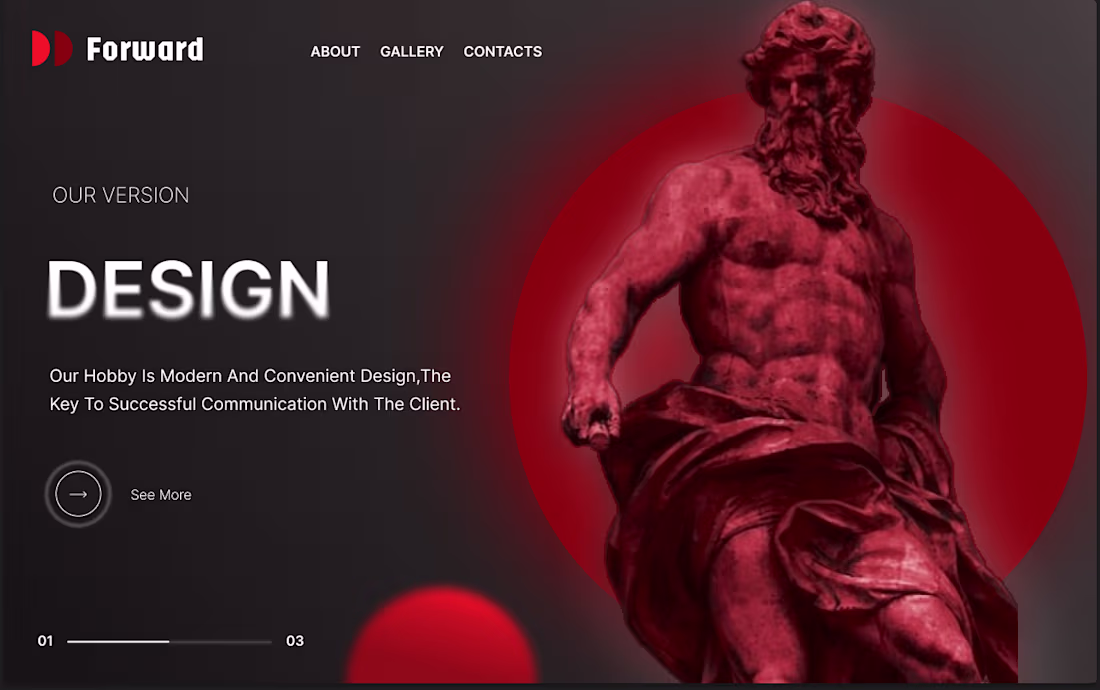
The Aesthetic – Sometimes the most powerful statement is simplicity. This section embraces a minimalist approach where modern design becomes the bridge between brand and client. Clean lines, thoughtful spacing, and a refined visual hierarchy communicate sophistication without saying a word. It proves that great design isn't just about what you see—it's about how effortlessly the message connects
1
22
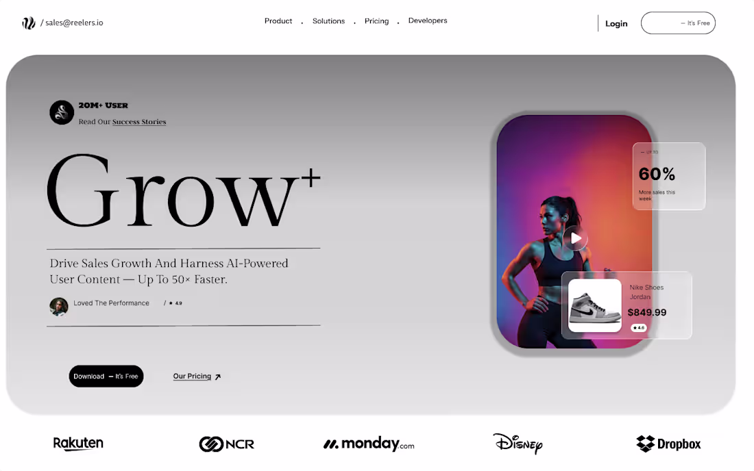
The High-Performer – Form meets function with a focus on results. This hero section is engineered for conversion, combining AI-powered efficiency with undeniable social proof (★ 4.9). From the urgent sales trigger "60% More sales this week" to the friction-free pricing model, every element is optimized to drive action. Speed, credibility, and performance—all in one layout.
1
25
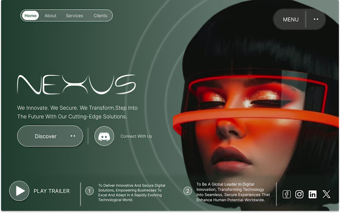
The Future Focus – Built for brands that think ahead. This hero section centers on a bold mission: "We Innovate. We Secure. We Transform." It's designed to establish trust and authority from the very first glance, positioning the brand as a leader in cutting-edge tech solutions. The layout balances vision with action—inviting users to step into the future while keeping the messaging clear and confident.
1
26