
Moody Kamel
Graphic designer crafting bold brands & identities
New to Contra
Moody is ready for their next project!
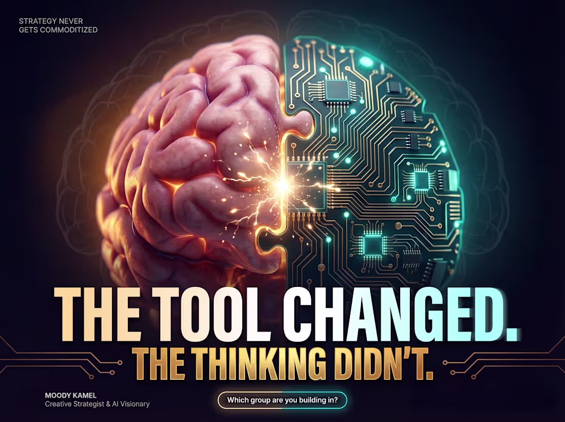
The most dangerous designer in 2026 isn't the one who knows every Photoshop shortcut or AI tool.
It's the one who can THINK.
AI generates 1,000 logos, but can't answer: "What does this brand STAND FOR?"
AI picks perfect colors, but can't understand a customer's fears.
AI makes posts, but can't build trust.
The industry is splitting:
Group A: Designers letting AI do the thinking.
Group B: Designers using AI as a superpower while focusing on strategy and story.
I'm in Group B. Tools get commoditized. Strategic thinking never does. YOU CAN FEEL IT, AI CANNOT.
💬 Which group are YOU in? What skill are you investing in to stay ahead?
0
25
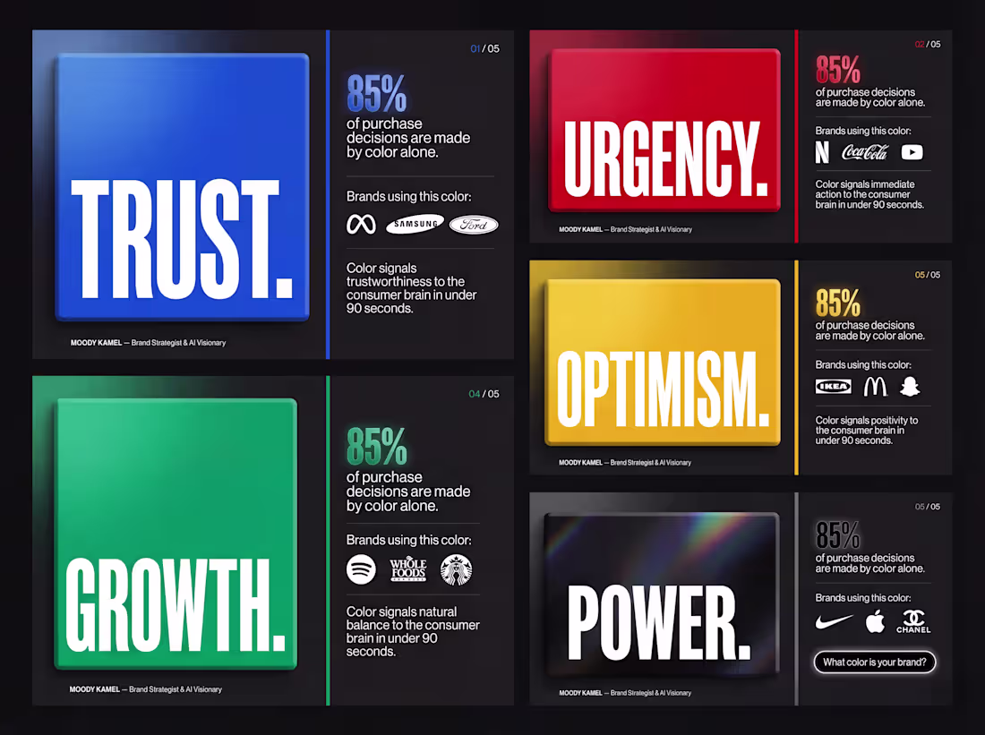
Most business owners pick brand colors because they "look nice."
That's costing them customers.
Here's what the research actually says:
📊 85% of consumers name color as the primary reason they choose one product over another even when quality is identical.
📊 62–90% of snap judgments about a brand are made within 90 seconds based on color alone.
📊 Consistent brand colors increase recognition by up to 80%.
So when a startup says "I want blue because I like blue" I stop the conversation.
Color is psychology.
Color is strategy.
Color is your brand's first handshake with a stranger.
Before you pick a palette ask: what do I want people to FEEL?
💬 What color is your brand and did you choose it strategically or intuitively? Tell me below.
0
35
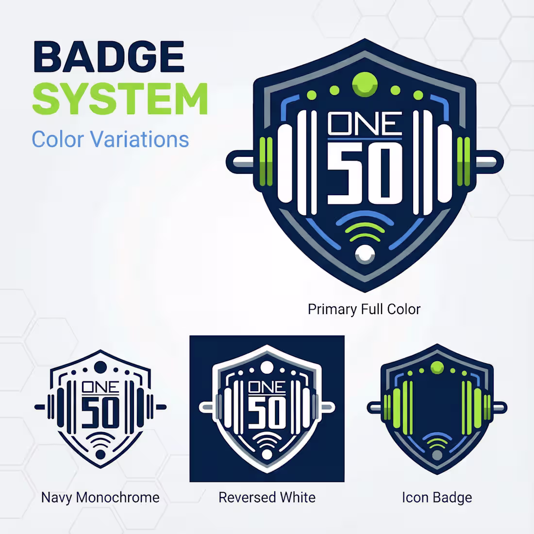
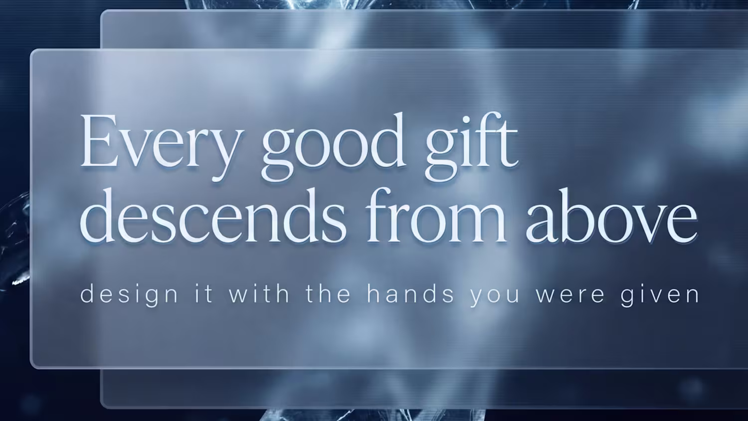
When the "One That Got Away" is still a Win. ⚡️
Design is subjective. As a creative, you can pour strategy, data, and soul into a brand identity, and sometimes the client just goes in a different direction.
That was the case with my recent project for ONE 50 Gym. While they ultimately chose a different path, I’m incredibly proud of the "Fitness Redefined" ecosystem I built for them.
The Vision:
I wanted to bridge the gap between heavy iron and high-tech. The badge system was designed to feel like a "seal of excellence," using a high-contrast Navy and Lime palette to trigger both focus and energy.
How do you handle it when a client passes on a concept you’re obsessed with? Do you archive it, or do you share it with the world?
To the fitness pros: Does this look like a gym you’d join? 🏋️♂️
Let’s talk in the comments! 👇
0
37
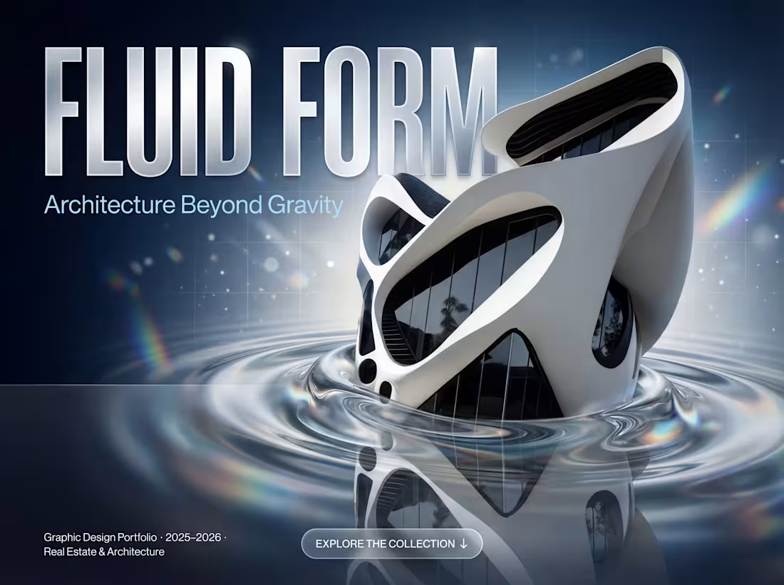
What if a building could defy gravity? 🌊🏛️
Fluid Form Architecture Beyond Gravity.
A self-initiated architectural visualization exploring the boundaries between structure and sculpture. No straight lines. No rules. Just pure form emerging from water, light, and imagination.
🔵 This is what I call designing without a ceiling.
👉 Full project on Behance: https://lnkd.in/d4gg7nrE
(https://lnkd.in/d4gg7nrE)Concept visualization not affiliated with any architectural firm or developer.
1
71
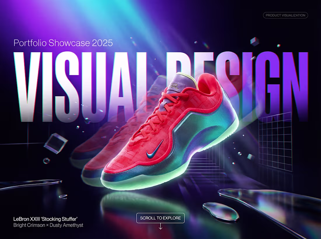
This project was a deep dive into high-energy product storytelling, focusing on the vibrant LeBron XXIII 'Stocking Stuffer' edition. My goal was to translate the explosive energy of the court into a digital space.
The Concept: I utilized a "Cyber-Neon" aesthetic, playing with high-contrast lighting and prismatic light leaks to make the shoe appear as if it’s charged with energy.
Design Execution: I combined a 3D-inspired environment with liquid textures and chromatic aberration effects. The bold, oversized "VISUAL DESIGN" typography serves as a backdrop that frames the product while emphasizing its sleek silhouette.
0
53
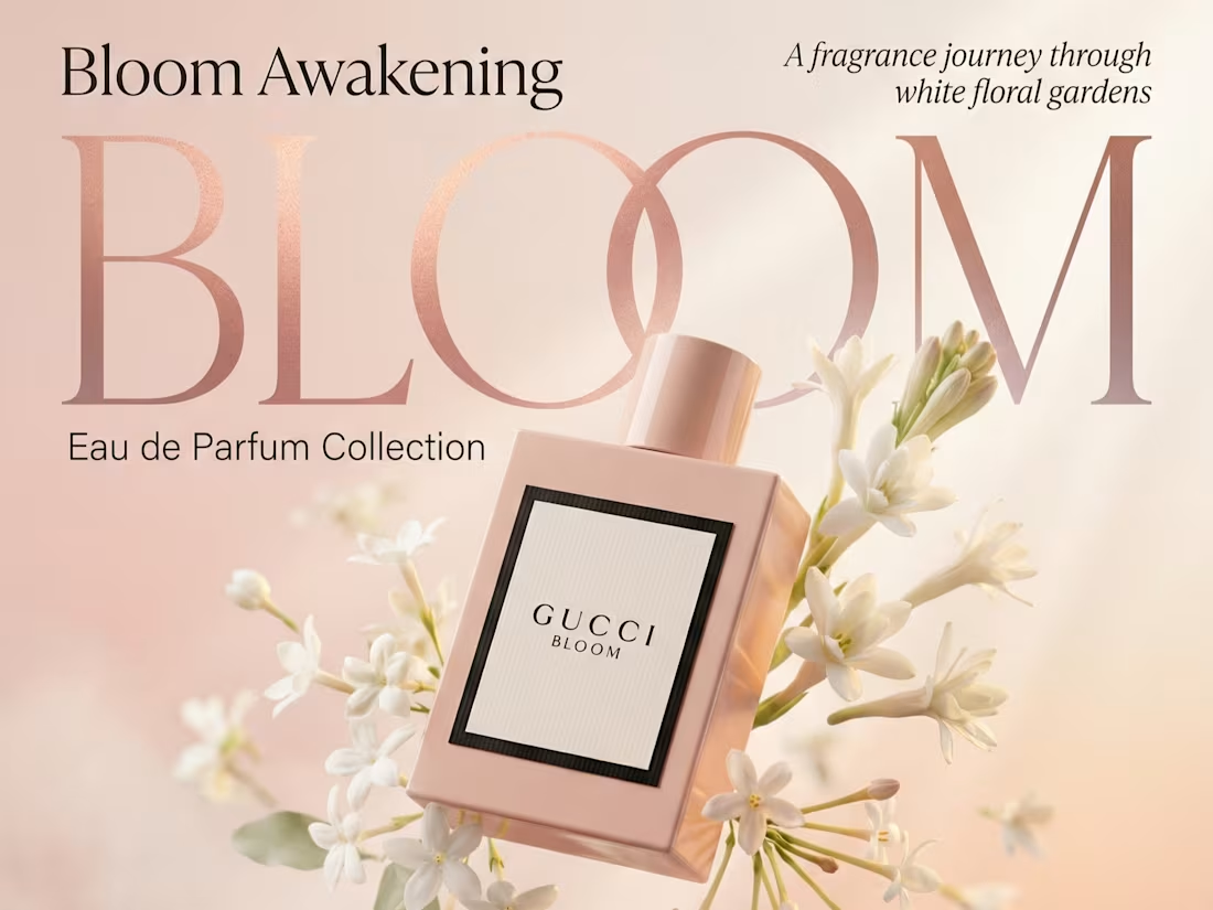
This project was a conceptual exploration into the sensory world of the Gucci Bloom Eau de Parfum. The goal was to create a visual identity that feels as light and fragrant as the scent itself.
The Vision: I focused on a "dreamlike garden" aesthetic, using a soft, ethereal color palette and floating botanical elements to symbolize the awakening of the fragrance.
Design Execution: The centerpiece is the iconic pink bottle, surrounded by dynamic, gravity-defying white florals. I utilized a sophisticated rose-gold gradient for the primary typography to add a layer of premium warmth and luxury.
0
54
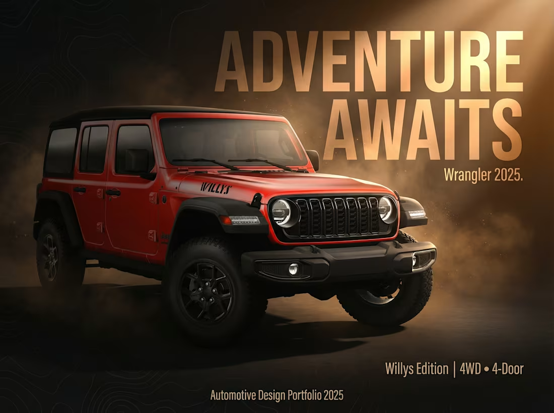
Focused on the intersection of brand identity and automotive design, this piece explores how to market a legendary vehicle to a modern audience.
The Strategy: By focusing on the "Willys" heritage and the 4WD capability, the design speaks directly to off-road enthusiasts while maintaining a premium, "portfolio-ready" aesthetic.
Visual Balance: The composition balances a detailed product render with a clean, professional layout, ensuring the message "Adventure Awaits" is the first thing the viewer feels.
0
60
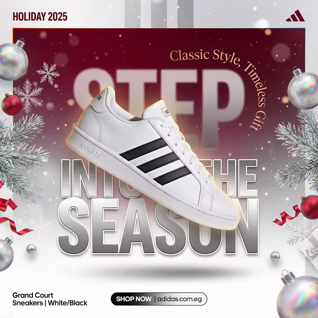
For this project, I conceptualized and designed a cohesive visual campaign for the Adidas Holiday 2025 collection, specifically highlighting the iconic Grand Court sneaker. The goal was to position a brand classic as the "must-have" gift of the season.
The Vision: Blending high-end product rendering with festive art direction to create a "premium gift" feel.
The Execution: I developed three distinct visual styles: a 3D-inspired unboxing shot, a bold graphic-led seasonal layout, and an authentic lifestyle scene.
The Result: A high-impact series of assets designed for social media and digital storefronts, balancing brand heritage with seasonal urgency.
0
77