
Mirza Yaumil
I build brands that look established from day one
New to Contra
Mirza is ready for their next project!

A simple idea, thoughtfully crafted.
Quintela is built around clarity, confidence, and human connection. Every curve was designed to communicate approachability while maintaining a modern tech aesthetic.
Sometimes the strongest identities are the simplest ones.
💙 Feedback is always welcome.
#LogoDesign #BrandIdentity #Branding #VisualIdentity #GraphicDesign #LogoDesigner #MinimalLogo #DesignProcess
3
4
34
Ecowaii
0
0
B2B doesn't have to mean boring.
Quintela is an HR tech platform competing in a space dominated by enterprise giants. They needed a brand identity that felt credible, modern, and human — without losing the professionalism their clients expect.
The result: a clean visual system built for scale, from logo mark to full brand guidelines.
Brand Identity & Visual Systems — this is what I do.
0
30
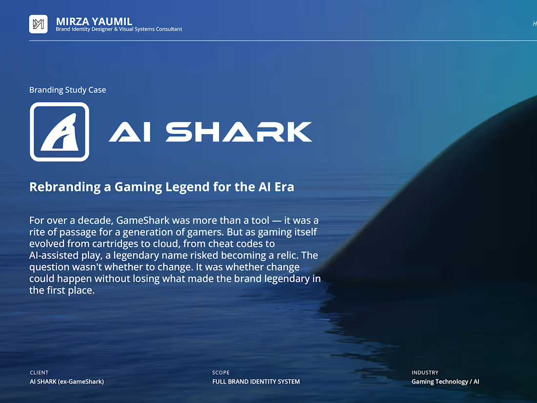
Rebranding a gaming platform from the ground up.
AI Shark needed an identity that felt aggressive, intelligent, and built for a global audience — not just another esports logo.
The result: a visual system anchored by a bold mark, high-contrast palette, and brand language that scales from in-game assets to merchandise.
Brand Identity & Visual Systems — this is what I do.
0
39