Miche Q
UX Researcher and Creative Strategist, Narrative Designer
New to Contra
Miche is building their profile!
Meet Anna & Alfie. When AI Ethics and UI Creativity combine, we can tell a story about awareness — about what to watch out for. In this case, automation bias. We can trust AI as a companion, but ensure responsible use through subtle reminders that we make the powerful call.
Would this style make learning AI ethics more interesting for Contra Creators?
0
15
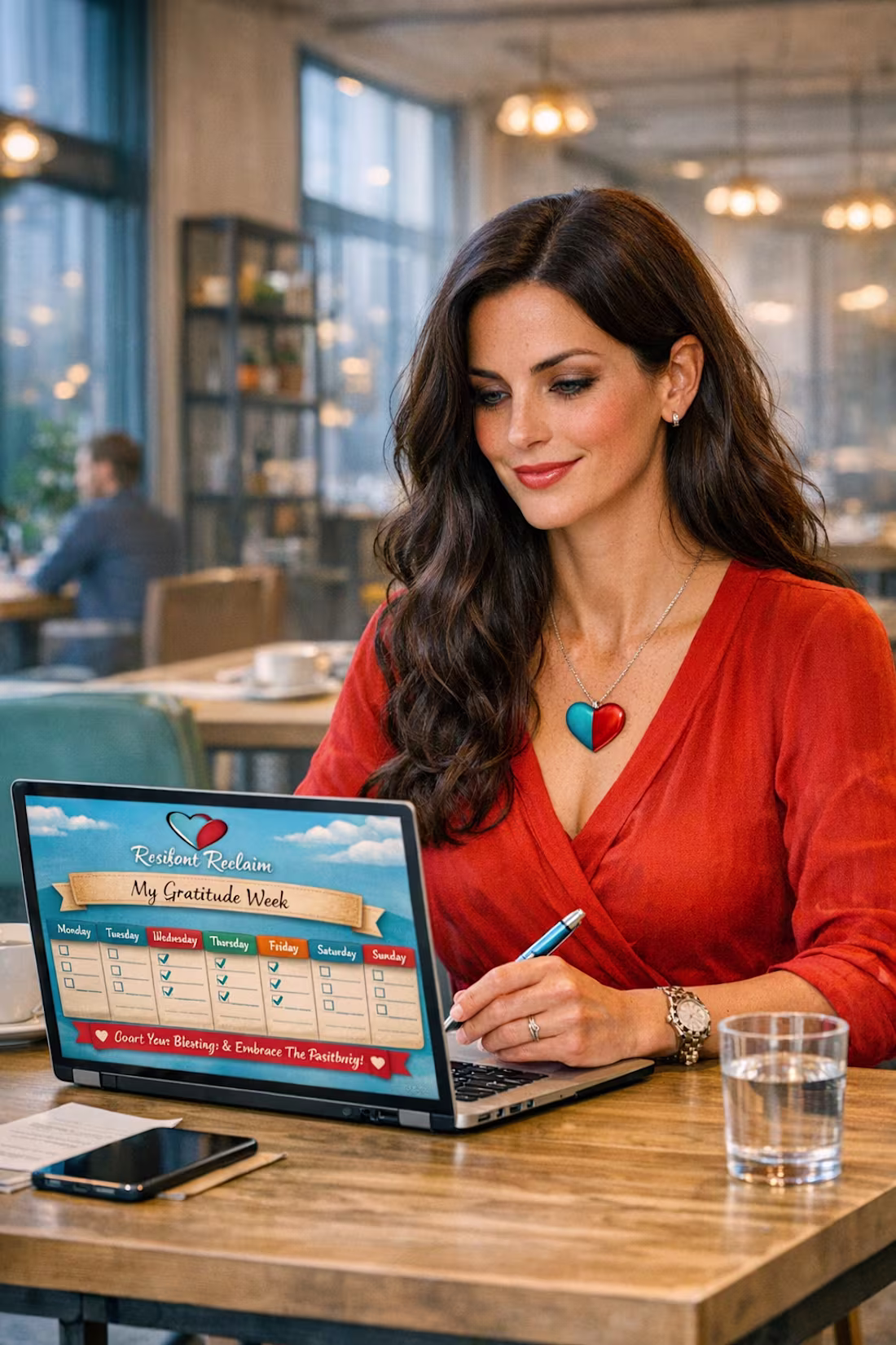
Gratitude helps us stay grounded even as the world accelerates — across technology, storytelling, philosophy, and everything in between.
Personally, I’ve been focusing on upskilling creatively and studying in areas that once felt out of reach, like UI/UX, creative design etc (Like how to design visuals like this with so much ease).
The abundance of choice can feel overwhelming, yet it’s also a privilege to have the ability to follow different paths.
It's a blessing to have the tools to understand where our strengths naturally sit — because that’s where possibility becomes direction.
That’s where ambition becomes real in an age where so much is possible, and where we begin to create work that holds real value.
What tools and skills have helped others on their creative path?
1
38
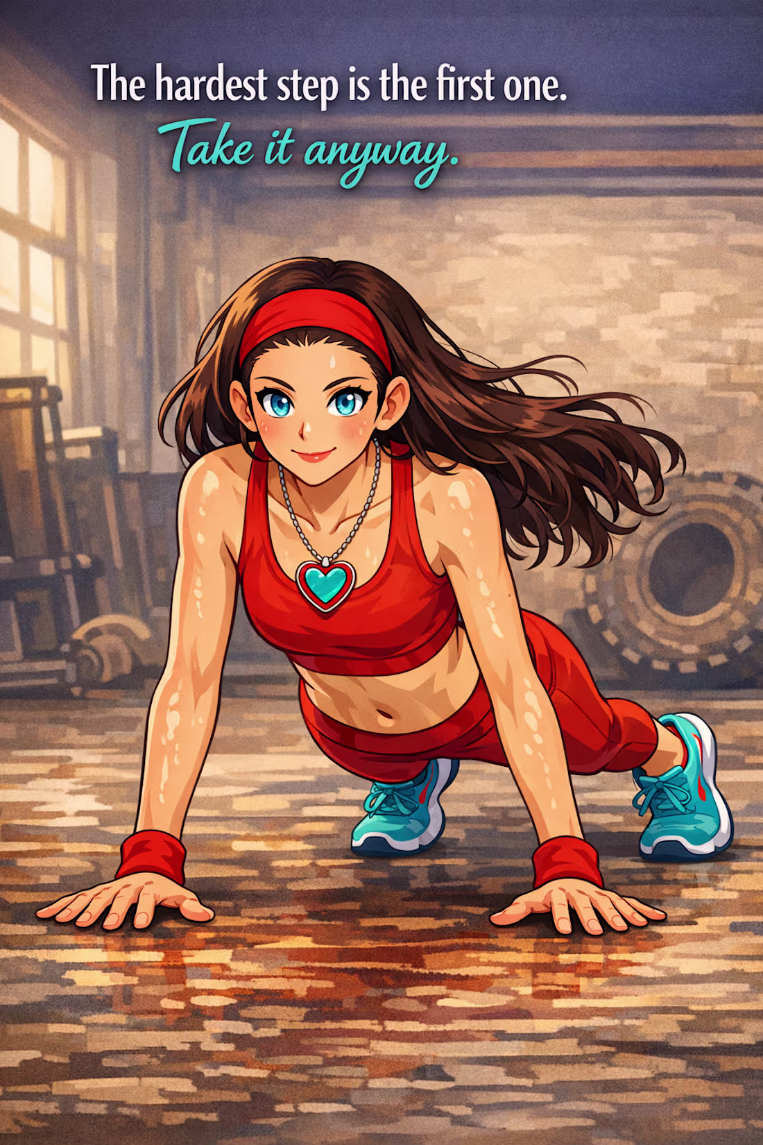
AI Branding Image; when we do the hard things first; we gain momentum, confidence and strength plus the endorphins we feel.
I created this with copilot AI imaging. Does the messaging stand out?
1
38
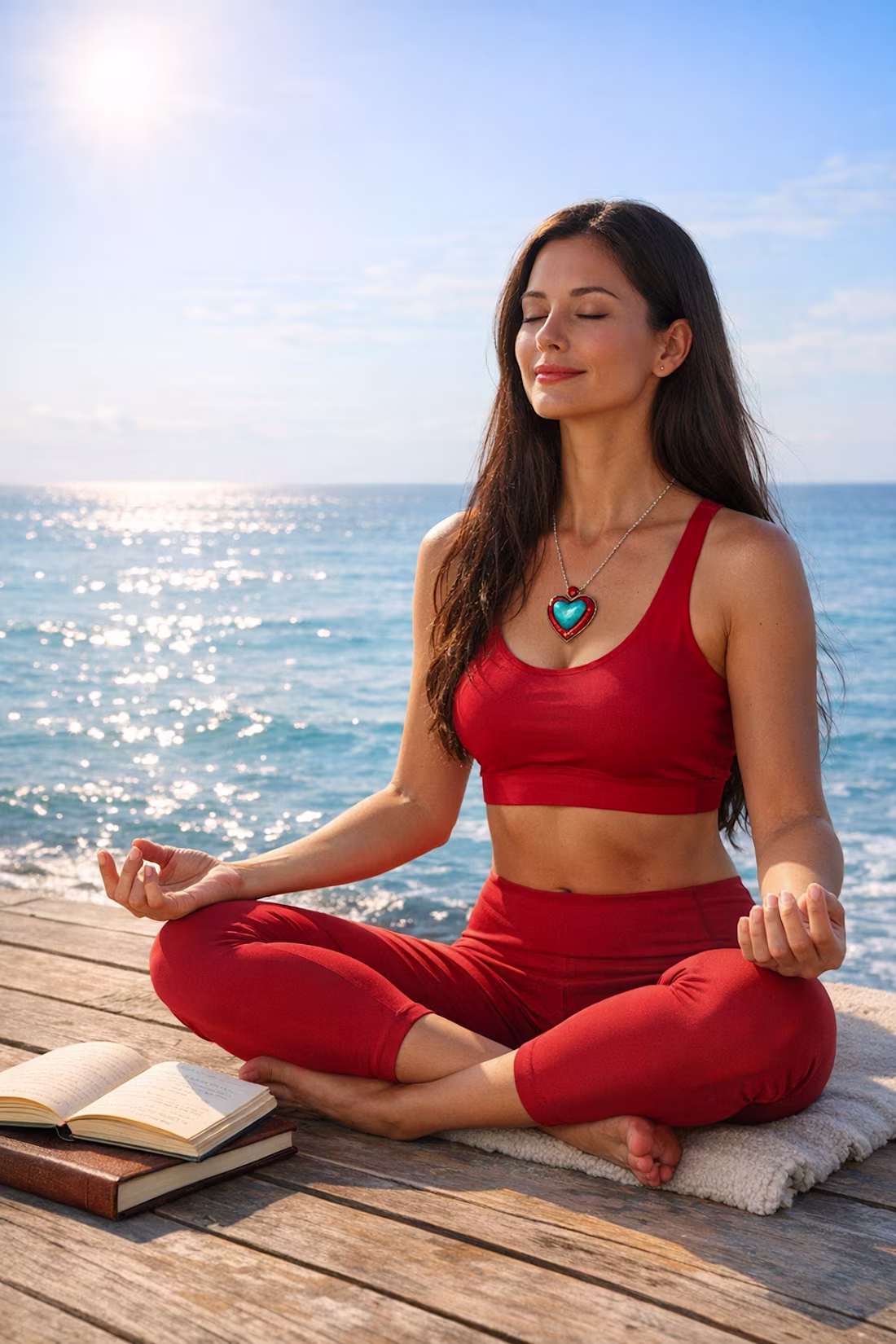
Theme: The Universe is working in our favour even if we can't see it YET!
Prompt: Woman sits calmly meditating overlooking a calm, glistening sea. The sun is shining, the waves are gentle, and the air feels hopeful and optimistic, reflected in her serene demeanour. The scene conveys peace, purpose, and trust in life’s journey — inspired by the idea that everything happens for us, and that each step contributes to growth and alignment with the universe’s plan.
0
52
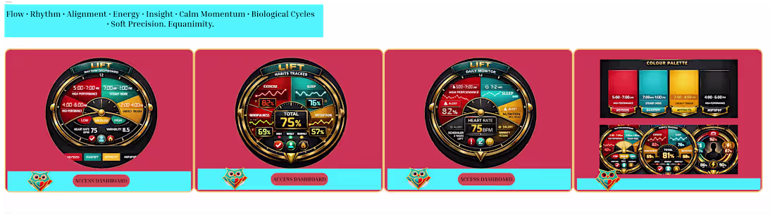
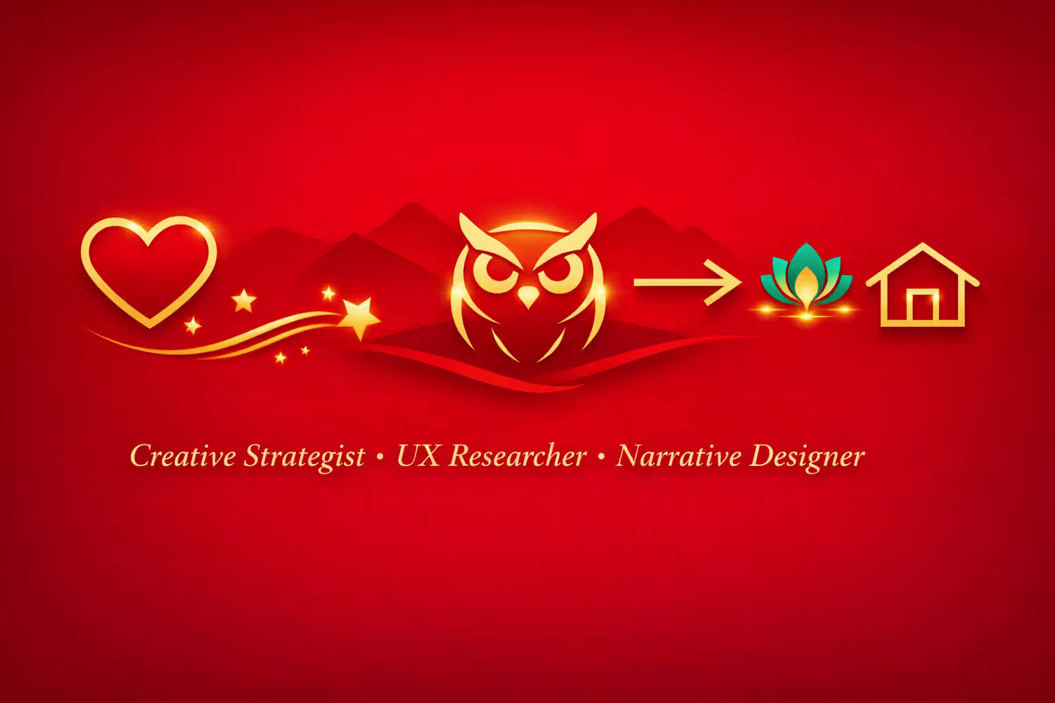
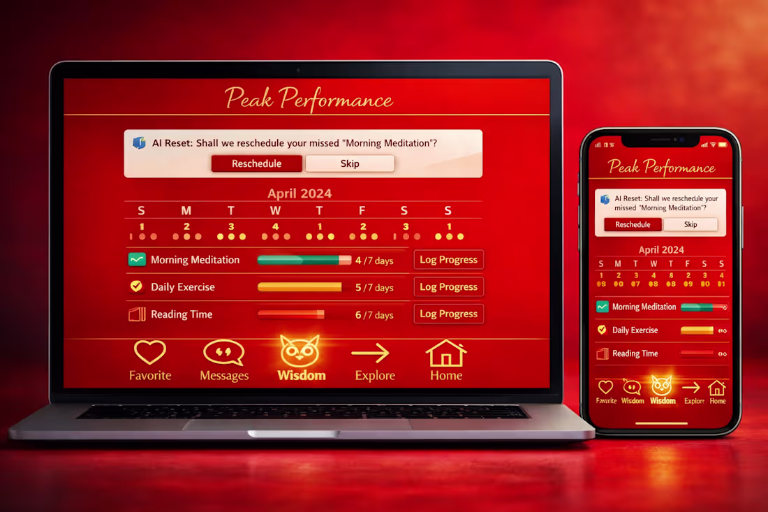
LIFT — Peak Performance Rhythm Tracker
Bringing an idea to life through vibrant design and purpose.
Each dashboard reflects rhythm, habit, and daily flow — powered by Action Red for momentum and Intuitive Turquoise for calm focus.
The logo, an owl within a diamond, symbolizes wisdom and strength — guiding users toward balance and insight.
Every element is crafted to align with the brand’s values: aesthetically refined, practical, and emotionally resonant.
Would anyone be keen to use an app that tracks your rhythm and habits this way?
1
82
Resilient Reclaim is a storytelling‑driven creative identity built around empowerment, emotional truth, and bold visual symbolism.
The palette — Ember Red, Storm Turquoise, and Warm Gold — reflects the duality at the heart of the brand: fire and renewal, vulnerability and strength, raw honesty and intentional design.
This portfolio brings together UX thinking, creative narrative, and AI‑supported strategy to show how resilience can be translated into visual identity.
Every element — the logo, the colour system, the typography, the imagery — is crafted to feel authentic, human, and unapologetically empowered.
Real. Raw. Reclaimed. — a design philosophy.
A commitment to telling stories that honour the fire people walk through, and the clarity they gain on the other side.
My work explores how symbolism, colour, and narrative structure can create experiences that feel emotionally grounded and creatively elevated. This portfolio is a reflection of that approach: intentional, expressive, and rooted in lived experience.
0
71
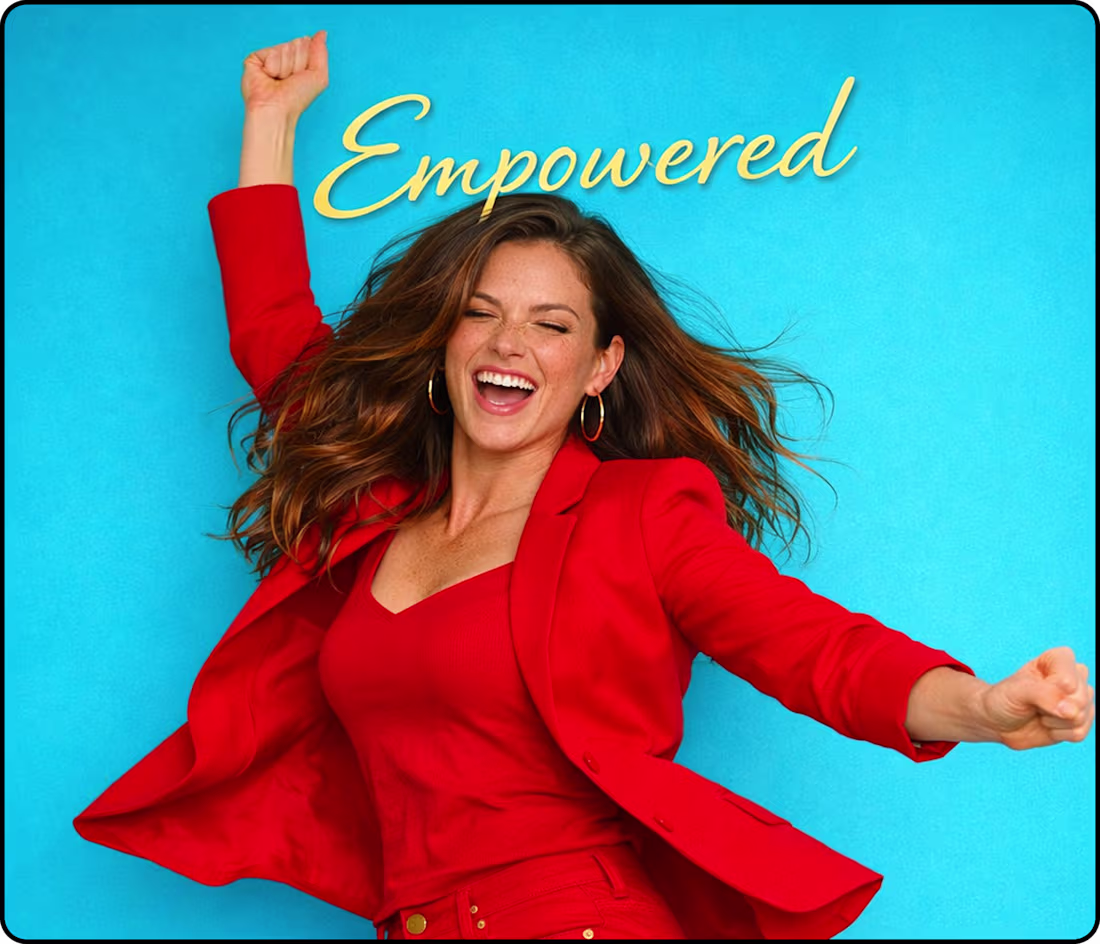
Branding Portfolio - Empowered in Red and Turquoise
0
66
Remember "A diamond is a chunk of coal that did well under pressure," Visual Narrative, visual Storytelling.
Who likes Diamonds? ❤️
1
97
Lovered Brand Identity Sampling - Red, Turquoise and Gold Palette representing Strength, Passion, Courage, Protection and Equanimity!
1
94

Hi everyone — I’m new to Contra! I’m really excited to be part of this creative community and genuinely inspired by the talent I’ve seen here. I’m looking forward to contributing and connecting with others who are building thoughtful, expressive portfolios and expanding their creative repertoire.
2
2
126
Hi everyone,🎉
I’m new to Contra! I’m already inspired by the creativity here and excited to connect with people who love crafting meaningful, expressive work. I’m building my project Lovered Solutions, and I’m here to grow, share, and learn alongside this community.
This post is part of my personal project, Lovered Solutions — a rhythm‑based concept exploring how creativity and emotion can shape better ideas. Thought this looked cute, and I’d love any pointers or feedback! ♦️❤️
0
67
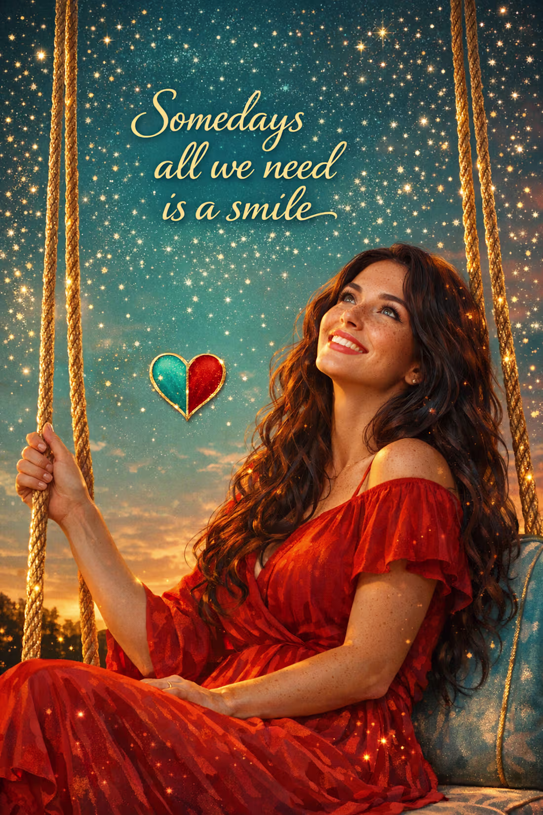
'Someday's all we need is a smile' Beautiful background representing equanimity, calmness and grace.
1
72
Visual Art/Creative Branding; feels like stepping into a story where reality bends, scale plays tricks, and imagination leads the way.
A bold Ember Red background. surrounded by a magical garden inspired by Alice in Wonderland — oversized flowers towering like trees, tiny mushrooms glowing at ankle height.
A circular staircase spirals upward from the garden, The balcony overlooks the garden like a portal to another world — mysterious, enchanting, and slightly surreal.
1
74
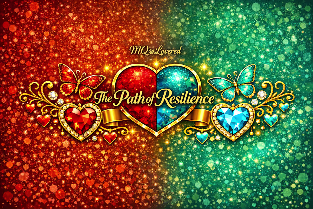
Logo for The Path of Resilience
A visual identity built on symbolism and emotional truth.
The diamond represents pressure, endurance, and the strength forged through challenge. The heart anchors the brand in love, unity, and human connection.
The butterflies embody evolution — the courage to transform, grow, and rise.
A touch of mystical sparkle and magic reflects the wonder of life and the unfolding journey we all walk.
1
56
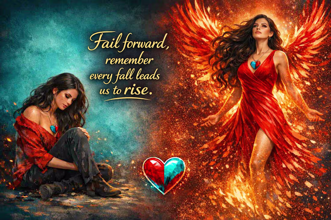
A creative narrative capturing the reality of life — we fall, we break, we doubt, yet we keep moving forward. This visual reflects the journey from collapse to transformation: the quiet, painful moments where we sit with ourselves, and the fiery rise that follows when we turn that pain into fuel.
The heart at the centre symbolises — the hurt and the healing, the fall and the rise, the softness and the strength. The flames represent transformation, resilience, and the courage to rebuild. The cool tones on the left show the weight of struggle; the warm tones on the right show the power of becoming.
This piece mirrors real life: every fall teaches us, every setback shapes us, and every rise proves that failing forward is how we grow.
1
65
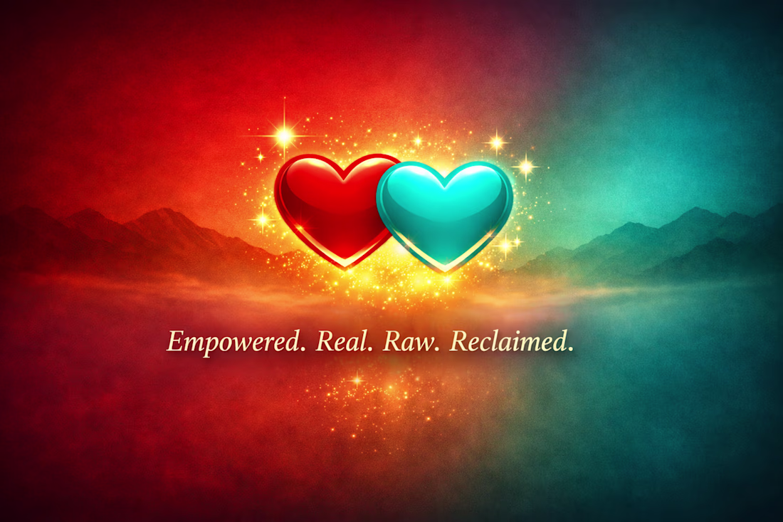
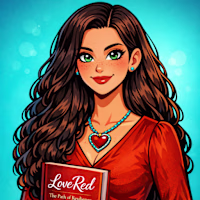
Lovered Contra Hero Image
With Brand Hearts and Bold Colours — Turquoise, Red & Gold
Symbolising Passion, Resilience, and Renewal, the twin hearts embody the essence of my brand. The gold glow adds warmth and purpose, illuminating the balance between strength and compassion.
The brand voice speaks through this image — a declaration of Resilience and Empowerment, grounded in the freedom to be authentically real and raw. It reflects the vastness and beauty of the world we live in, reminding viewers that authenticity is power and vulnerability is strength.
1
71
Lift - Is a Peak Performance Natural Rhythm Tracker & Scheduler
1
74
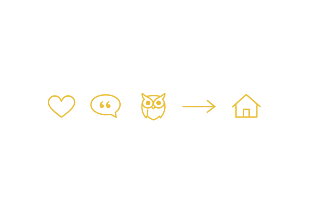
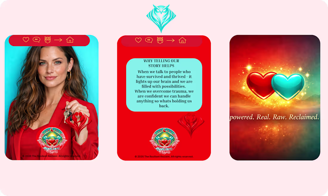
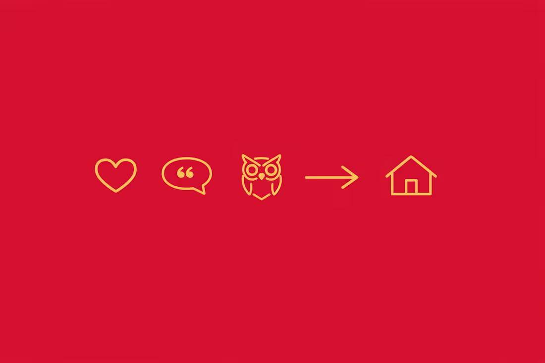
Navigation Keys Tailored to the Resilient Reclaim Branding
1
67
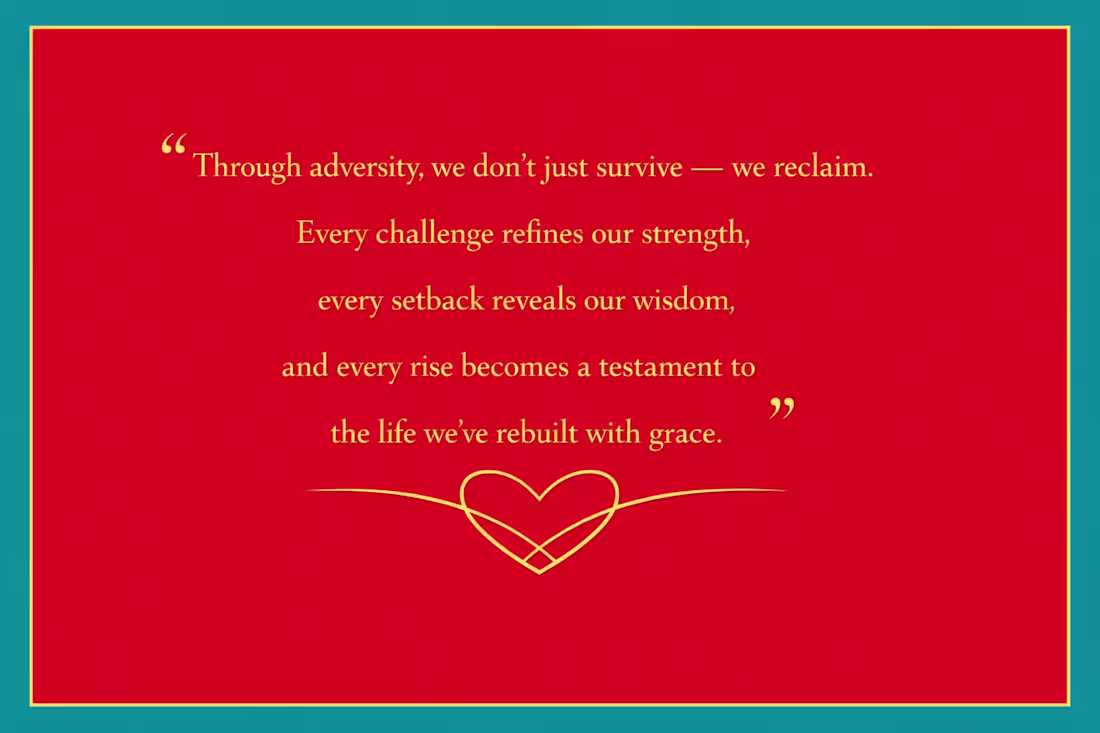
Resilience Reclaim
0
67
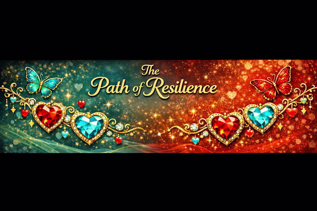
The Path Of Resilience Branding Banner
1
65