
Mevada Bhavya
Solving product problems through clean, user-centered design
New to Contra
Mevada is building their profile!
A short UI motion exploration focused on creating a premium, calm, and intentional experience.
This concept experiments with how subtle transitions, spacing, and timing can elevate an interface without overwhelming the user.
What I explored:
Smooth, restrained motion
Clear visual hierarchy
Minimal, premium UI feel
Motion that supports usability, not distracts from it. The goal was to show how small details in motion design can make an interface feel more polished and confident.
Feedback is welcome 👋
0
2
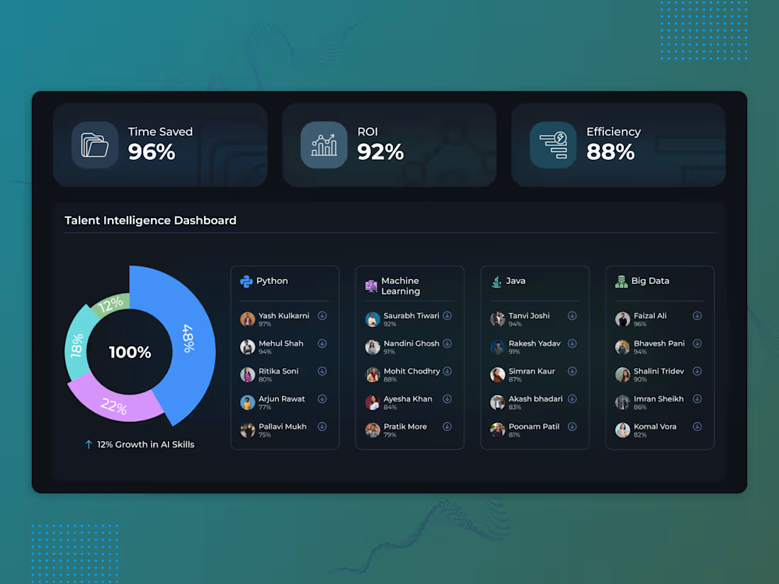
Talent Intelligence Dashboard UI
Designed a dark-mode Talent Intelligence Dashboard focused on clarity, scalability, and faster decision-making.
The goal was simple: help hiring teams understand talent data quickly, not just view it.
Focus areas:
Clear KPI hierarchy (Time Saved, ROI, Efficiency)
Scannable data visualizations
Modular, scalable card system
Calm dark UI built for long sessions
Practical SaaS usability over visual noise
Built to feel confident, intelligent, and production-ready.
4
38
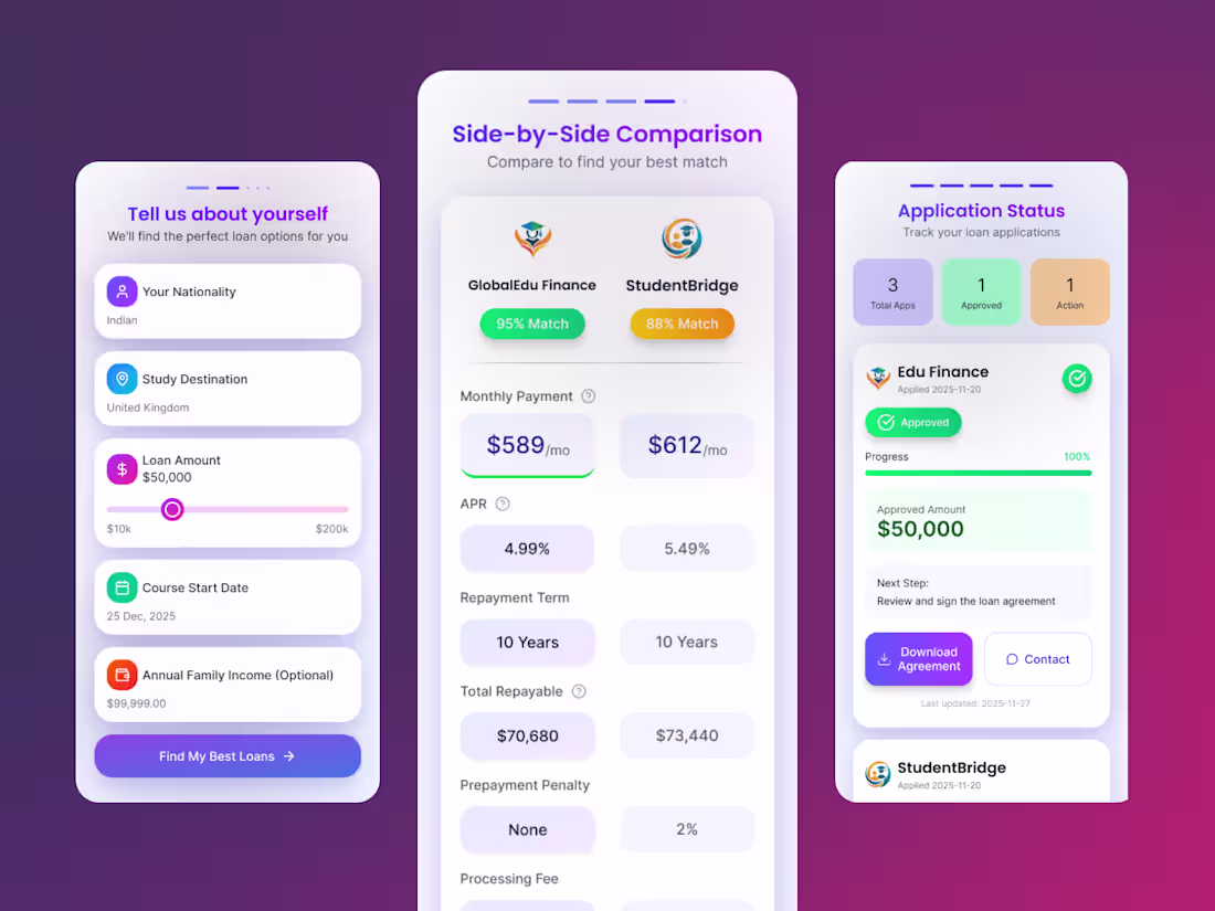
Nomad Credit Redesign: Modernizing Student Loans for Gen-Z
Redesigned the entire Nomad Credit ecosystem to make student loans feel less like a "stressful bank process" and more like a "lifestyle upgrade.
✨ Key Highlights:
🎨 Visual Overhaul: Switched from a cluttered interface to a premium Dark Mode + Glassmorphism aesthetic to build trust.
🧠 Smart UX: Transformed complex financial data (APRs, EMIs) into clean, scannable cards for faster decision-making.
1
22