
md Shanto
Business Intelligence & Automation Specialist
New to Contra
md is building their profile!

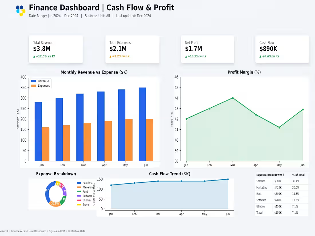
Finance Dashboard | Cash Flow & Profit Analysis
Project Overview
A comprehensive financial analytics dashboard built in Power BI to track cash flow, revenue generation, net profitability, and cost distribution. It provides decision-makers with clear visibility into corporate financial health and expense drivers.
Key Highlights & Features
Executive Summary (KPIs): High-level metrics tracking Total Revenue ($3.8M), Total Expenses ($2.1M), Net Profit ($1.7M), and Net Cash Flow ($890K) with year-over-year (YoY) comparison.
Monthly Revenue vs. Expense: Visual comparison of monthly income against operational expenditures to monitor cash dynamic stability.
Profit Margin (%) Trend: Tracks percentage margin fluctuations over time (averaging between 41% to 44%).
Expense Breakdown & Top Costs: Detailed table and chart categorizing operational expenses—highlighting Salaries ($800K | 38.1%), Marketing ($420K | 20.0%), and Rent ($300K | 14.3%).
Cash Flow Trend: Continuous monitoring of net liquidity movement across the months.
Tools & Technologies
Power BI (Financial Modeling & DAX)
Financial Analytics & Cash Flow Management
Data Visualization & Reporting
2
57
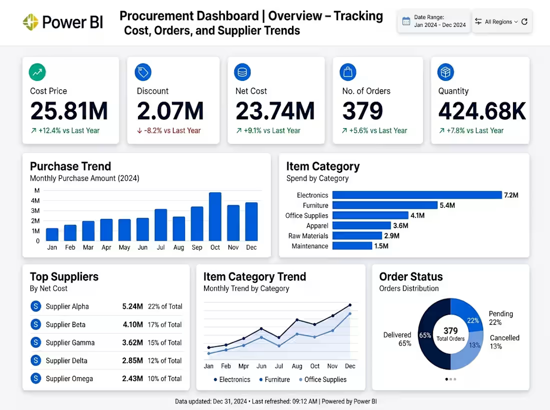
Project Overview
A data-driven Procurement Analytics Dashboard built in Power BI to monitor purchasing performance, vendor concentration, and order lifecycle management. It helps business managers optimize procurement costs and improve supply chain efficiency.
Key Highlights & Features
Financial Metrics (KPIs): Tracks total cost ($25.81M), discounts achieved ($2.07M), net procurement cost ($23.74M), and overall order quantities.
Spend by Category: Visualizes expense breakdown across key categories such as Electronics ($7.2M), Furniture ($5.4M), and Office Supplies.
Supplier Analysis: Identifies top suppliers by net spend (e.g., Supplier Alpha at 22% of total spend) to evaluate vendor risk and dependency.
Order Status Breakdown: Real-time visibility into order execution (65% Delivered, 22% Pending, 13% Cancelled).
Monthly Purchase Trends: Highlights spending patterns across the year (2024) to assist in seasonal budget planning.
Tools & Technologies
Power BI (Dashboard Design & DAX Visualizations)
Data Analytics & Visualization
Supply Chain & Financial Insights
1
46
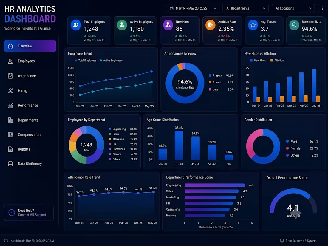
HR Analytics Dashboard | Power BI Interactive Dashboard
Description
Designed an interactive HR Analytics Dashboard in Power BI to help HR teams monitor workforce performance, employee trends, hiring, attendance, and business KPIs in real time.
Key Features
✅ Employee Overview Dashboard
✅ Hiring & Attrition Analysis
✅ Attendance Monitoring
✅ Department Performance Analysis
✅ Gender & Age Distribution
✅ Interactive Filters & Slicers
✅ KPI Cards and Executive Reports
✅ Trend Analysis with Dynamic Visualizations
Tools Used
Microsoft Power BI
Power Query
DAX
Excel
Data Modeling
Business Value
Provides HR managers with real-time insights to make data-driven decisions, improve employee retention, optimize hiring strategies, and monitor workforce performance efficiently.
1
63
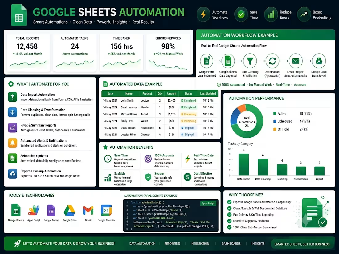
Google Sheets Automation with Apps Script | Workflow & Reporting
Description
Built a complete Google Sheets automation system using Google Apps Script to eliminate repetitive manual tasks and improve business efficiency.
Key Features
✅ Automated data import from Google Forms, CSV files, and APIs
✅ Data cleaning, validation, and transformation
✅ Auto-generated reports and Pivot Tables
✅ Email notifications and scheduled reports
✅ Google Drive backup and file management
✅ Dashboard with real-time KPIs and performance tracking
✅ Automated workflows using Google Apps Script
Tools Used
Google Sheets
Google Apps Script
Google Forms
Google Drive
Gmail API
Google Calendar
Outcome
Reduced manual work by up to 90%, improved data accuracy, and saved significant time through fully automated workflows.
1
70