
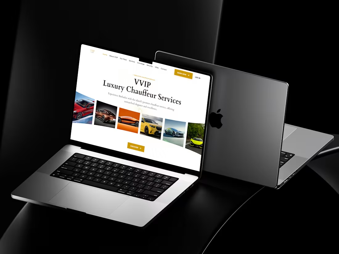
VVIP Luxury Chauffeur Hero Section – Premium Experience Design
A refined and elegant hero section designed to capture the essence of luxury from the very first glance. The layout blends sophisticated typography with a smooth visual flow of premium vehicles, instantly communicating exclusivity and high-end service.
The use of subtle background patterns, balanced whitespace, and gold-accented call-to-actions creates a polished, upscale feel. Every element—from the navigation to the imagery—works together to position the brand as premium, trustworthy, and experience-driven.
It’s not just a hero section, it’s a statement of class and confidence.
What Makes It Special:
• Premium visual storytelling with a dynamic car showcase
• Elegant typography that enhances luxury perception
• Subtle background patterns adding depth without distraction
• Strong CTA hierarchy with high-converting placement
• Clean, spacious layout that reflects a high-end brand identity
0
19
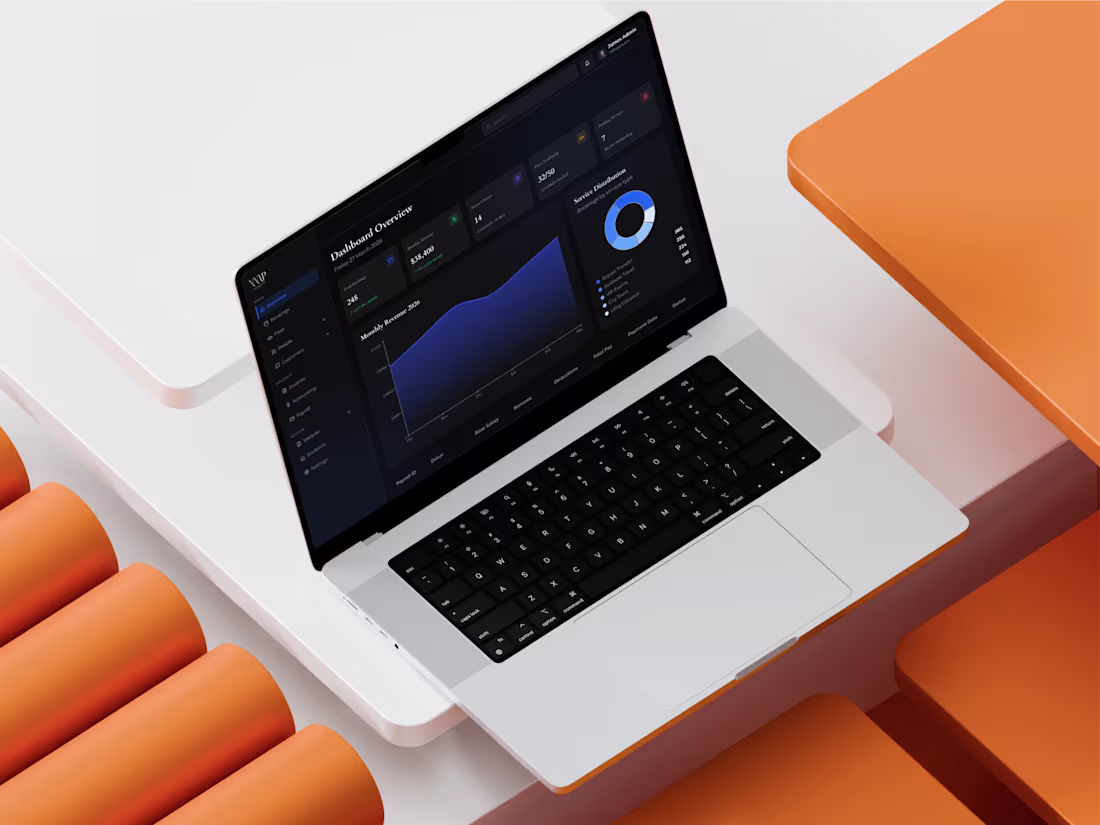
Luxury Transport Admin Dashboard – Data-Driven Control UI
A sleek and powerful dashboard experience crafted for managing high-end transportation operations with clarity and precision. The dark theme, combined with subtle gradients and structured data visualization, creates a premium feel while keeping everything highly readable and actionable. From tracking bookings and revenue to monitoring fleet availability and driver activity, the interface brings all critical insights into one unified workspace. The layout balances analytics and operations beautifully, helping admins make faster, smarter decisions without feeling overwhelmed.
What Makes It Special:
• Clean data hierarchy with instantly scannable key metrics
• Elegant dark UI that enhances focus and reduces visual fatigue
• Integrated charts for revenue trends and service distribution
• Detailed tables for payroll and operational tracking
• Well-structured sidebar for seamless navigation across modules
0
12
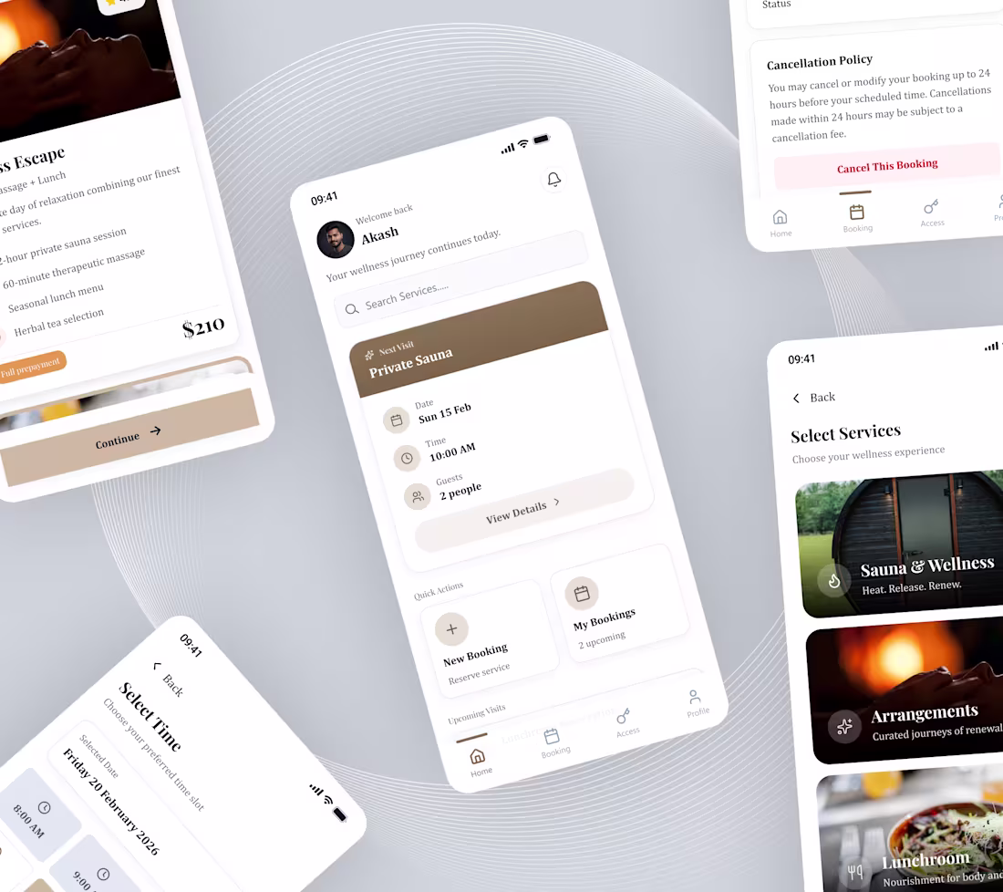
Wellness Booking App – Calm & Seamless Experience UI
A soft and elegant mobile experience designed to make wellness booking feel effortless and relaxing from the very first interaction. The interface uses calm tones, spacious layouts, and clear content blocks to guide users through selecting services, choosing time slots, and managing bookings without friction.
From discovering experiences like sauna sessions to confirming appointments, every step feels smooth and intentional. The design focuses on reducing cognitive load while maintaining a premium, soothing aesthetic that aligns perfectly with the wellness space.
What Makes It Special:
• Calm visual design that reflects the wellness experience
• Clear booking flow from service selection to confirmation
• Well-structured cards for time, date, and guest details
• Quick actions that simplify managing bookings
• Minimal and elegant UI that enhances user comfort
—
Hey! If you need a design buddy for your next project, just shoot me a message. I’d love to chat about how I can help you reach your goals!
0
21
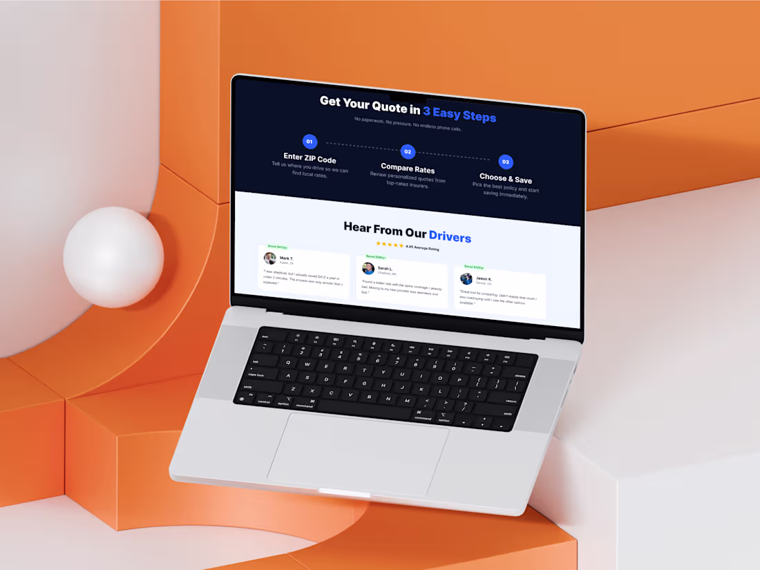
This section is designed to guide users through the process while building trust with real feedback. It breaks the journey into three simple steps, making the experience feel effortless. Below, testimonials showcase real savings and positive user experiences, adding credibility. This blend of guidance and social proof effectively reduces confusion and builds confidence, all within a simple and structured layout that enhances user trust and encourages action.
What Makes It Special:
• Clear 3-step process that simplifies complex workflows
• Strong visual flow guiding users from action to trust
• Real testimonials that build credibility and confidence
• Balanced layout combining process and social proof
• Designed to reduce friction and improve conversions
0
37
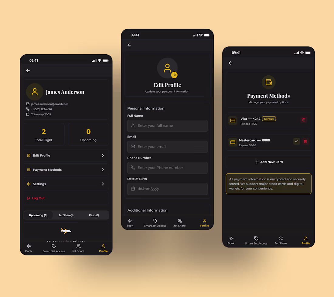
A streamlined profile management interface that gives users control over their personal information and payment options. The layout emphasizes clarity and convenience, allowing easy updates to details, management of saved cards, and review of account activity all in one place. With a modern dark design and clear section hierarchy, users can complete tasks quickly and without confusion.
What Makes It Special:
• Clear profile overview with quick access to account actions
• Organized edit profile form for updating personal information
• Secure payment management with saved card overview
• Simple navigation structure that keeps important settings accessible
• Modern dark interface that improves focus and readability
0
20
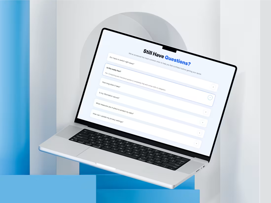
An inviting FAQ section designed to alleviate doubts before users act. The layout emphasizes clarity with expandable accordion cards, allowing visitors to quickly scan questions and reveal answers as needed. This keeps the interface light while offering valuable information that fosters trust. With soft spacing, simple interactions, and a clear visual hierarchy, users can easily find answers without feeling overwhelmed, enhancing their confidence and boosting conversions.
What Makes It Special:
• Clean accordion layout that keeps information organized and easy to scan
• Progressive disclosure that shows answers only when users need them
• Clear typography hierarchy that improves readability
• Subtle interaction cues that guide users through questions smoothly
• Trust-building design that removes friction before conversion
0
6
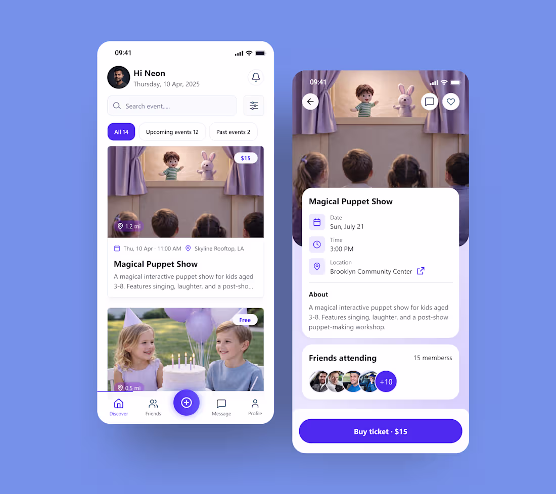
Event Discovery Mobile App – Event Listing & Ticket Booking UI
A friendly and engaging mobile interface designed to help users discover local events and book tickets effortlessly. The layout blends vibrant imagery with clean cards to highlight upcoming activities, making browsing feel natural and enjoyable. By combining event previews, quick filters, and clear ticket actions, the experience guides users from discovery to booking without friction.
What Makes It Special:
• Event card layout that makes browsing activities fast and intuitive
• Clear filters for upcoming and past events to organize discovery
• Detailed event view with time, location, and attendee insights
• Social elements showing friends who are attending
• Strong call-to-action that makes purchasing tickets simple and quick
0
14
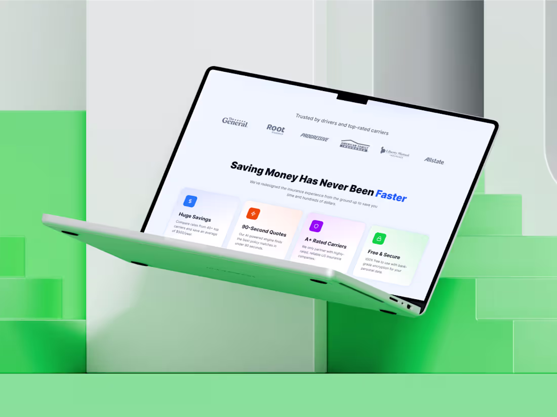
Insurance Benefits Section – Trust & Value Proposition UI
A clean value-focused section designed to quickly communicate why users should trust the platform. By combining recognizable insurance brand logos with clear benefit cards, the layout builds credibility while highlighting the product’s key advantages. The structured grid and soft color accents make each feature easy to scan, helping users instantly understand the value before taking action.
What Makes It Special:
• Trust-building layout using well-known insurance carrier logos
• Clear benefit cards that highlight the product’s strongest advantages
• Balanced color accents that visually separate each value point
• Simple grid structure designed for fast scanning and readability
• A layout focused on building confidence before conversion
0
22
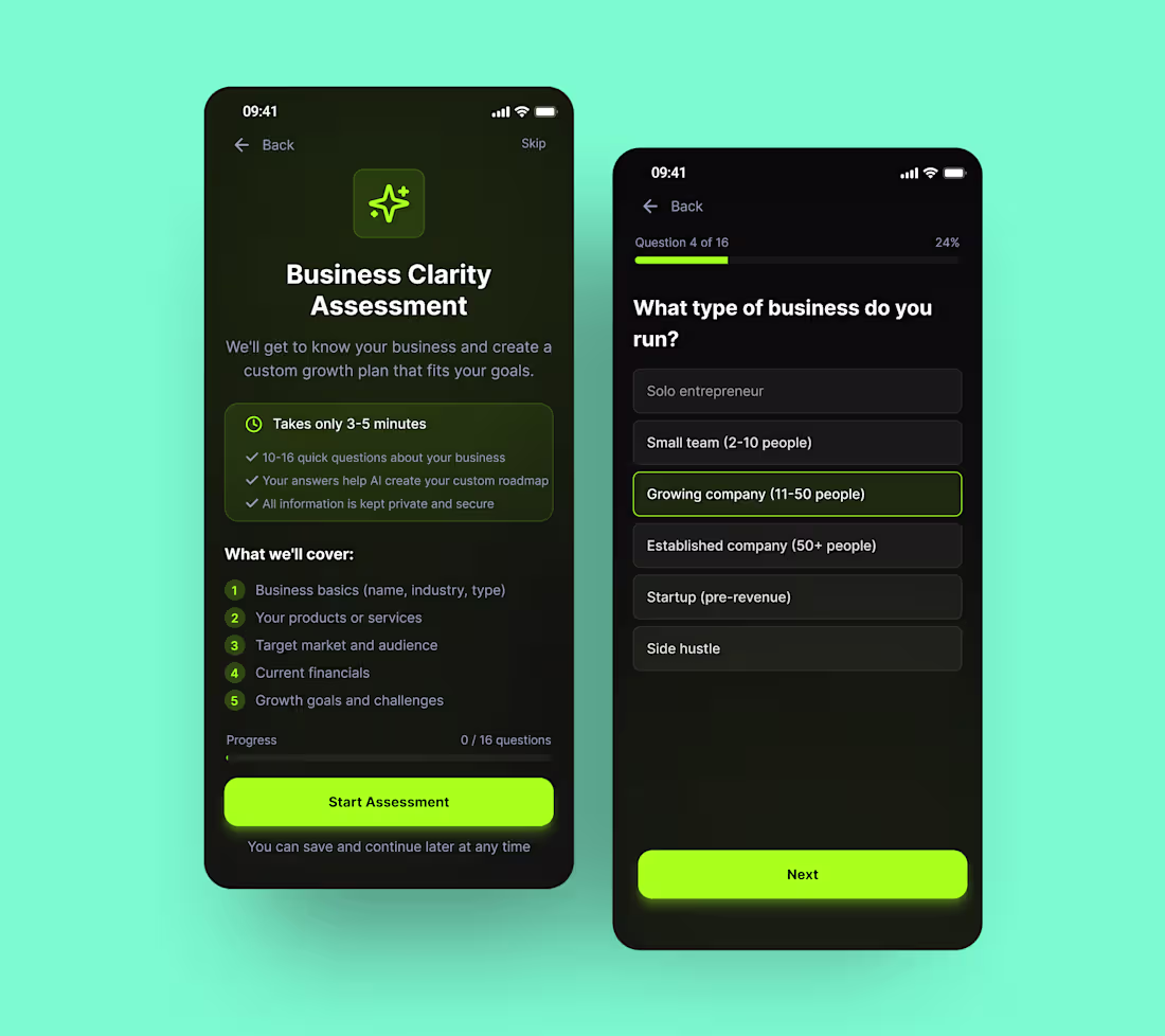
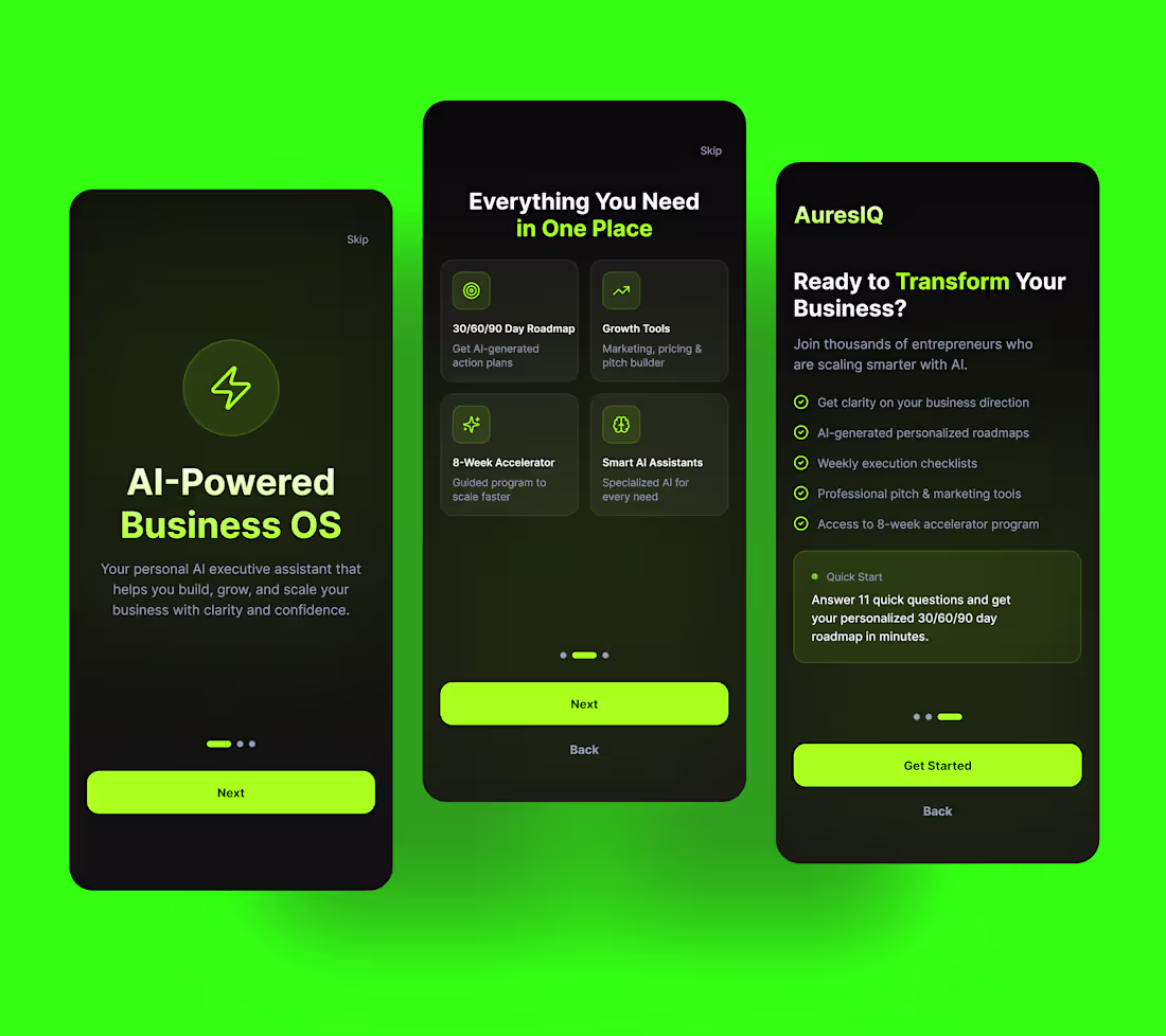
A focused onboarding-style assessment designed to help entrepreneurs gain clarity about their business direction. The interface guides users through a short set of questions while maintaining a calm, distraction-free experience. Clear progress indicators, simple choice cards, and bold action buttons make the flow feel quick and approachable — turning what could be a complex business analysis into a smooth, guided journey.
What Makes It Special:
• Step-by-step questionnaire flow designed to reduce decision fatigue
• Clear progress indicators that keep users motivated through the assessment
• Simple choice-based inputs that make answering quick and intuitive
• Calm dark interface with neon accents to highlight key actions
• Designed to translate user responses into personalized AI-driven insights
1
1
43
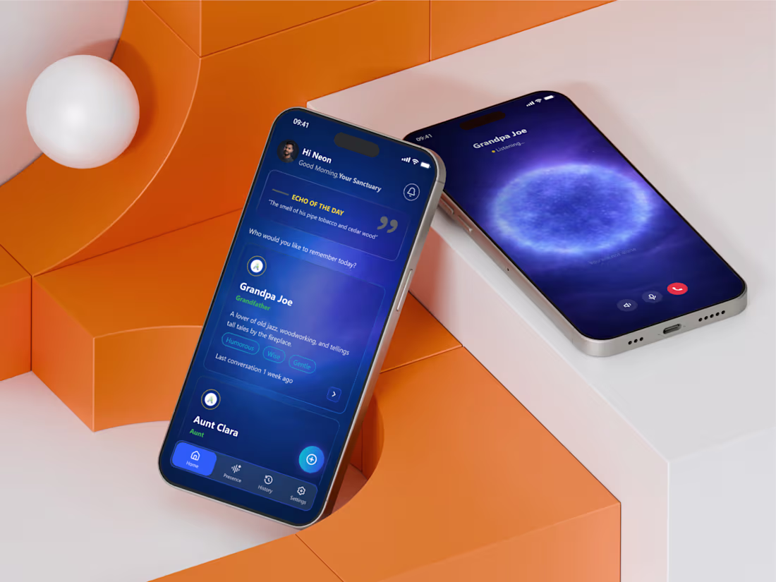
AI Memory – Voice Interaction Mobile App UI
A deeply human-centered mobile experience designed around memory, presence, and emotional connection. This interface introduces a unique concept where users can reconnect with the voices and personalities of loved ones through AI-powered conversations. The calming gradients, soft lighting effects, and minimal UI elements create a peaceful digital space that feels less like an app and more like a moment of reflection.
What Makes It Special:
• Emotion-driven design focused on memory and connection
• Calm visual atmosphere using soft gradients and ambient glow effects
• Character cards that humanise AI interactions with personality traits
• Voice interaction screen designed to feel immersive and comforting
• Minimal navigation that keeps the experience focused and distraction-free
1
1
19
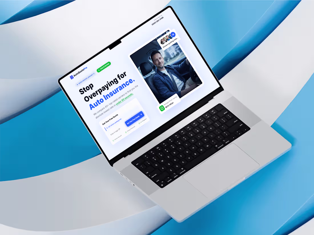
A clean, conversion-driven hero section designed to help users quickly compare auto insurance rates and get a quote in seconds. The layout focuses on clarity and trust, combining bold messaging, social proof, and a simple input form to reduce friction. By pairing a friendly visual of a real driver with strong call-to-action elements, the design instantly communicates credibility while guiding users toward the main goal — getting their free quote.
What Makes It Special:
• Conversion-focused hero layout built around a quick quote form
• Clear trust signals like active users, savings indicators, and security badges
• Strong headline hierarchy that communicates value instantly
• Balanced visual composition using real-life imagery and product UI • Mobile-friendly structure designed for fast lead generation
0
13
A sleek onboarding experience designed to introduce users to an AI-powered business operating system. The flow focuses on clarity and momentum, guiding entrepreneurs through the platform’s core capabilities step by step. With bold neon accents, dark UI surfaces, and clear messaging, the screens quickly communicate value while keeping the experience simple and motivating for new users.
What Makes It Special:
• Step-by-step onboarding that clearly explains the product’s value
• Bold dark UI with neon highlights for a futuristic AI feel
• Card-based feature previews that make complex tools easy to understand
• Clear call-to-action flow that keeps users moving forward
• Focused messaging designed for startup founders and entrepreneurs
—
0
10
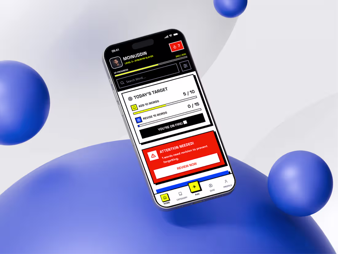
Vocabulary Learning App Dashboard – Gamified Mobile UI Design
A bold, gamified mobile dashboard designed to make vocabulary learning feel engaging and motivating. The interface blends clear progress tracking, daily learning targets, and AI-powered suggestions into one focused learning hub. Bright color blocks and structured cards create strong visual hierarchy, helping users quickly understand what to do next — whether it’s reviewing words, starting a quiz, or tracking weekly progress.
What Makes It Special:
• Gamified progress system with XP tracking and level indicators
• Clear daily learning targets that guide user habits
• AI-powered vocabulary suggestions for personalized learning
• Strong visual hierarchy using bold color blocks and cards
• Activity analytics that help users track their learning momentum
0
7
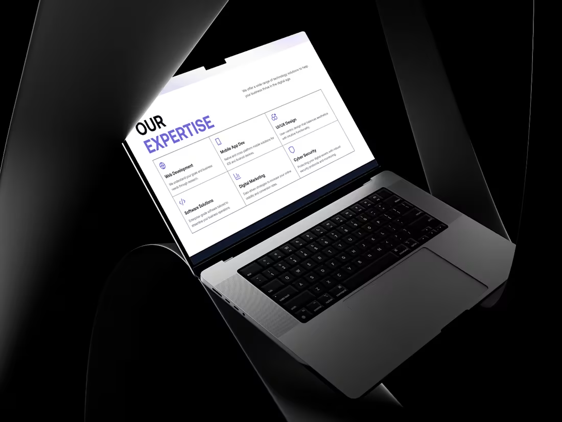
Our Expertise – Services Section UI Design
What Makes It Special:
• Balanced grid layout that keeps multiple services organised and readable
• Minimal icon system that visually supports each service category
• Clear typography hierarchy that guides users through the section
• Responsive structure designed to adapt smoothly from desktop to mobile
• A calm, professional layout that communicates expertise and trust
0
16
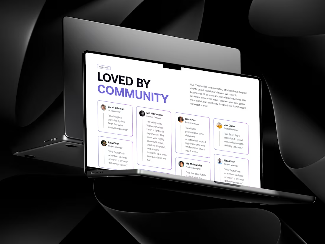
Loved by Community – Testimonial Section UI Design
A clean and trust-driven testimonial section designed to highlight real user voices in a simple, authentic way. The layout focuses on clarity, soft spacing, and balanced typography so each review feels personal rather than promotional. Subtle borders and structured cards create rhythm while keeping the spotlight on the feedback itself. It’s a section built to build credibility — without overwhelming the user.
What Makes It Special:
• Clean card-based layout that keeps reviews easy to scan
• Soft visual hierarchy that highlights names and key quotes naturally
• Generous whitespace for a calm, premium feel
• Mobile-friendly stacked structure for seamless responsiveness
• Designed to strengthen social proof without visual noise
0
8
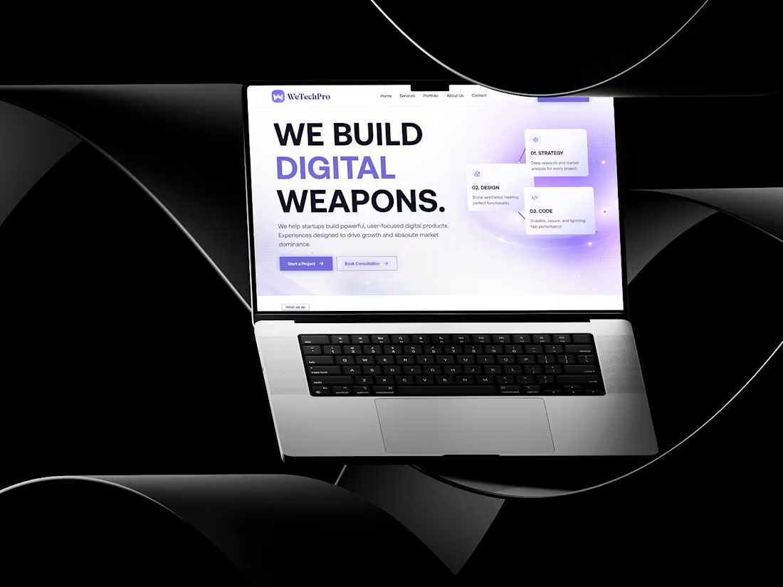
Digital Agency Landing Page Hero UI
A bold and modern digital agency landing page designed to position the brand as powerful and growth-driven. The hero section uses strong typography, gradient lighting effects, and structured service highlights to communicate strategy, design, and development expertise. Clear call-to-action buttons and a clean layout enhance conversion while maintaining a premium, tech-focused aesthetic. Ideal for digital agencies, tech startups, software studios, and product development companies.
1
31
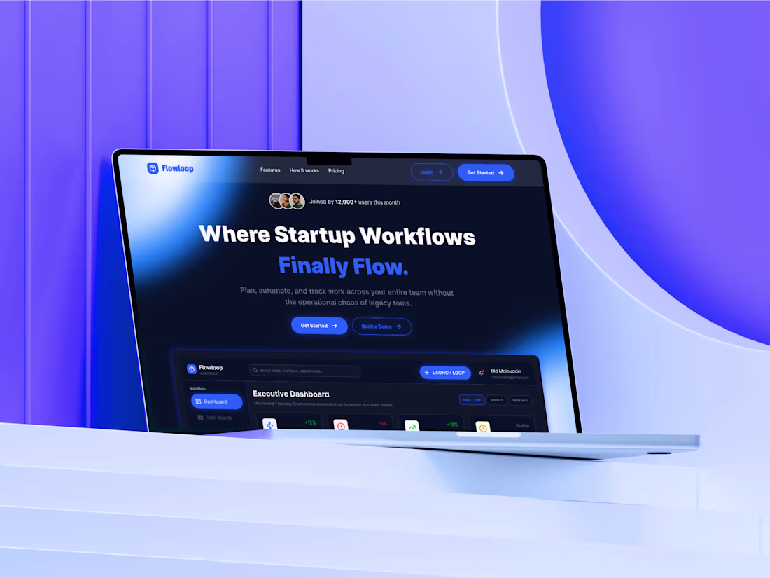
Startup Workflow SaaS Landing Page UI
A modern SaaS landing page designed for a workflow automation platform focused on startups and growing teams. The hero section emphasizes clarity, momentum, and efficiency with bold typography, gradient lighting effects, and strong call-to-action buttons. Trust indicators and dashboard previews reinforce credibility while showcasing product capability. Ideal for productivity tools, workflow management platforms, and B2B SaaS startups aiming for high-conversion landing experiences.
0
6
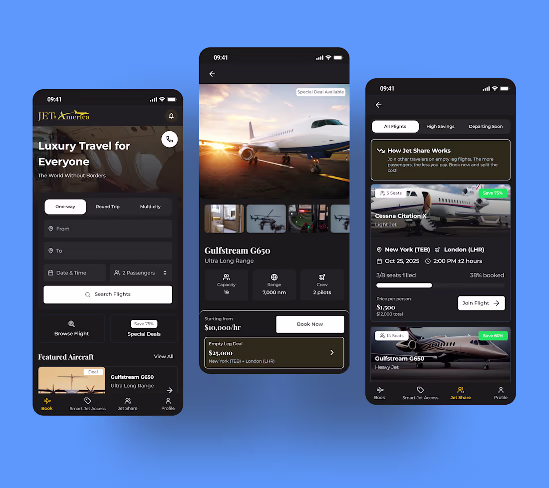
JetAmerica – Luxury Private Jet Booking Mobile App UI
0
21
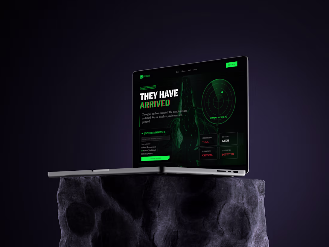
Xenon – Futuristic Alien Invasion Hero sectionA cinematic, sci-fi themed landing page designed around an alien invasion narrative. The interface uses dark atmospheres, neon green accents, radar visuals, and glitch-inspired typography to create tension and immersion. Interactive elements like mission selection, status indicators, and real-time scan data reinforce a storytelling-driven experience. Ideal for experimental web design, sci-fi brands, game landing pages, NFT projects, or futuristic concept showcases.
1
39
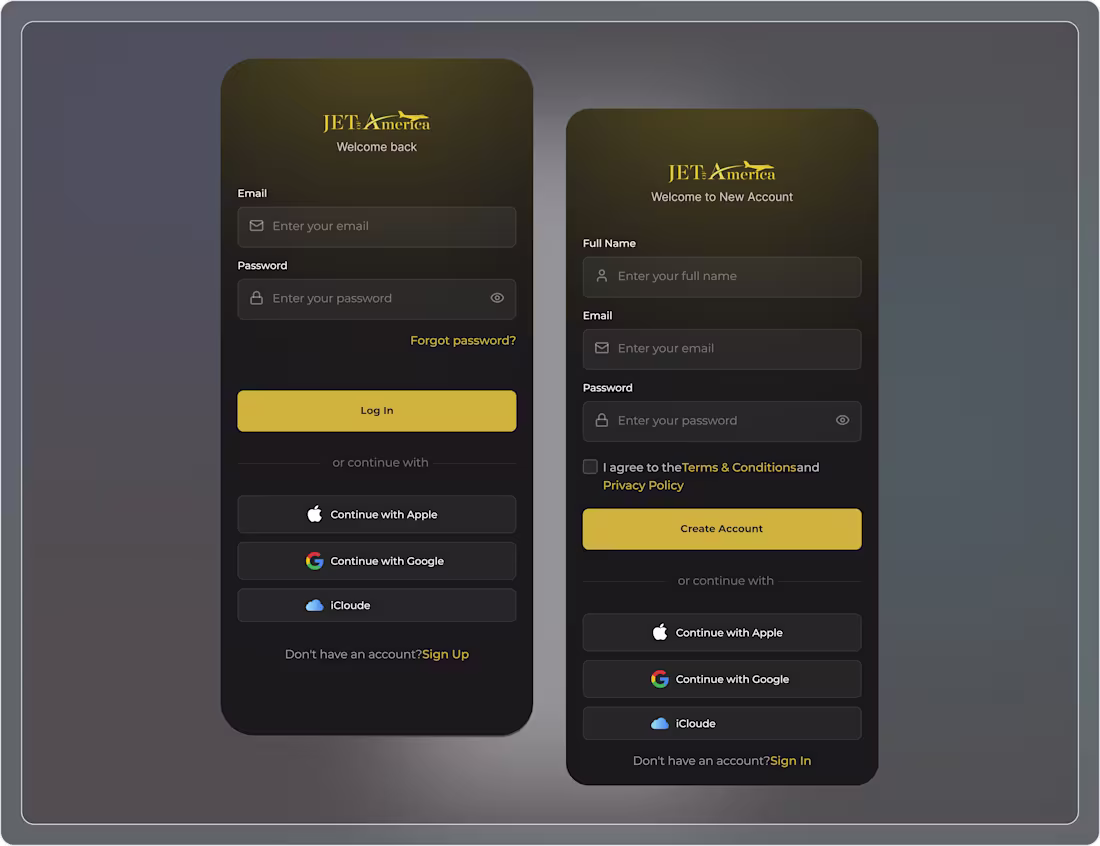
JetAmerica – Premium Sign In & Sign Up UI Design
A premium dark-themed authentication interface designed for a luxury aviation brand. The sign-in and sign-up screens feature elegant gradients, gold accent highlights, and clean form layouts to convey trust, exclusivity, and professionalism. Multiple authentication options—including Apple, Google, and iCloud—enhance convenience while maintaining a refined user experience. Ideal for premium brands, fintech platforms, travel services, and high-end SaaS products.
2
37
Prototype Traditional Platter Style – Food Product Landing Page UI
1
62
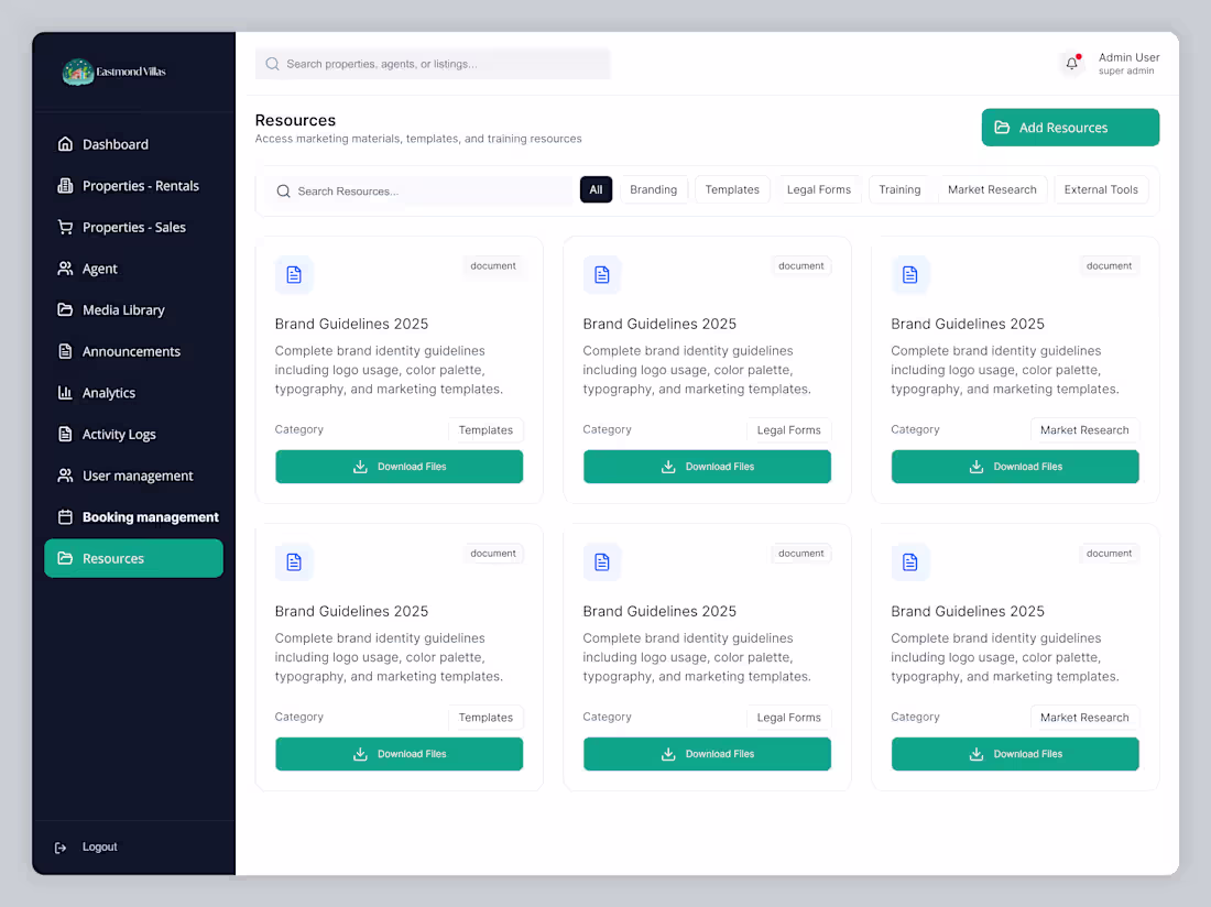
Real Estate Resources & Document Management Dashboard UI
A clean and organized resources dashboard designed for a real estate admin platform. This interface enables administrators and agents to browse, filter, and download essential documents such as brand guidelines, templates, legal forms, training materials, and market research. The card-based layout, category filters, and clear call-to-action buttons provide quick access to resources while maintaining a professional and user-friendly experience. Perfect for real estate SaaS products, internal admin systems, and document management platforms.
2
2
115
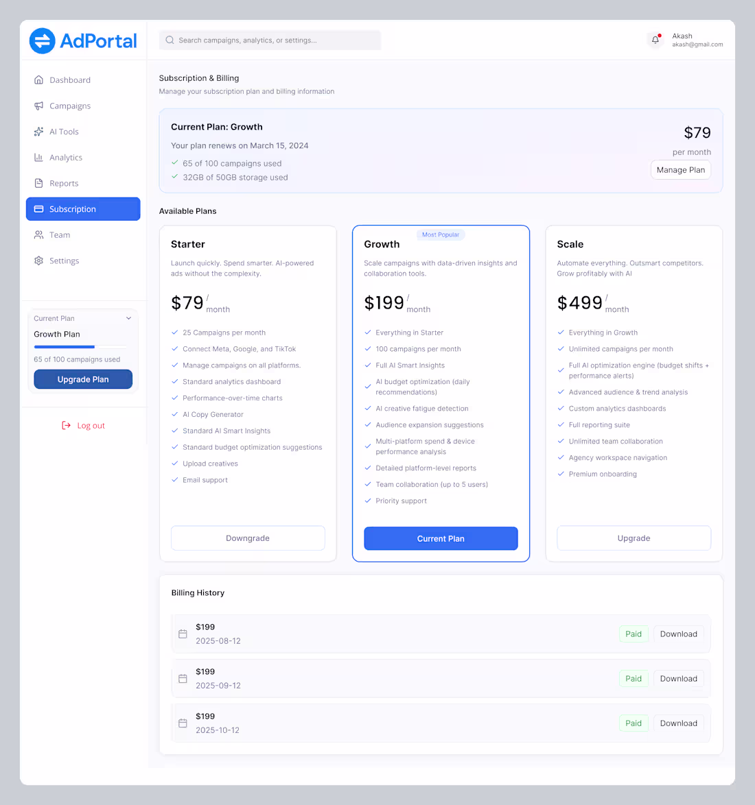
AdPortal – Subscription & Billing Dashboard UI Design
2
85
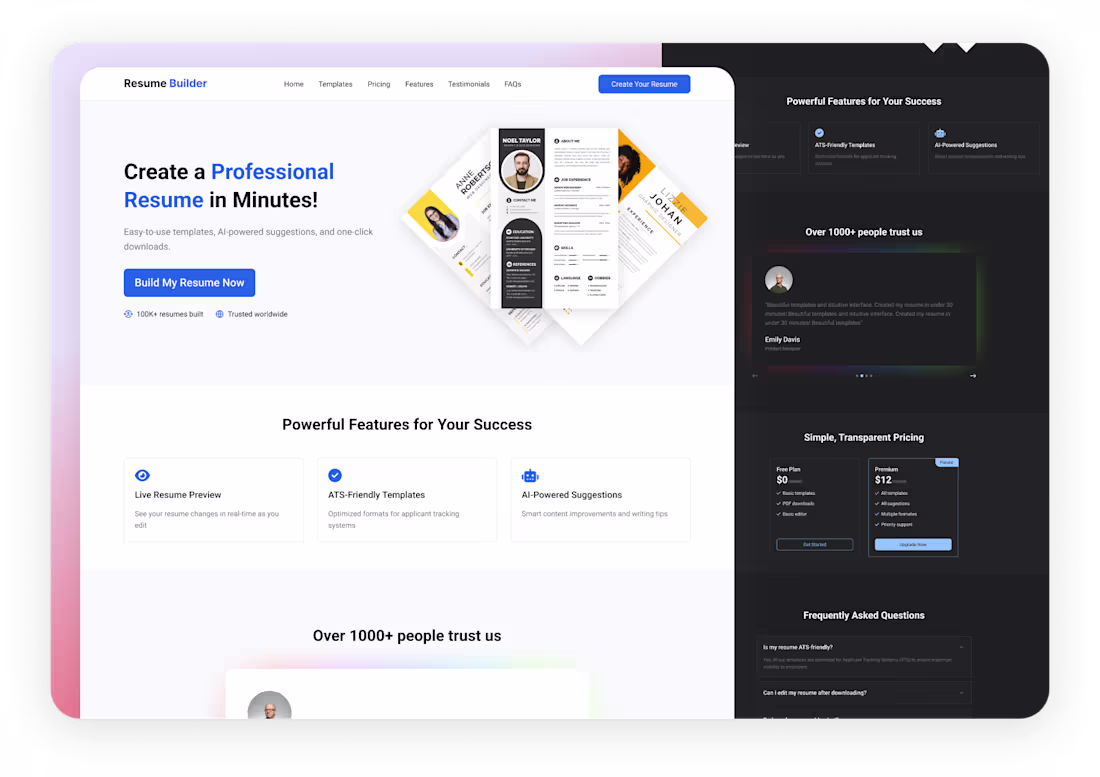
Light-Mode & Dark Mode Resume Builder Landing Page
0
2
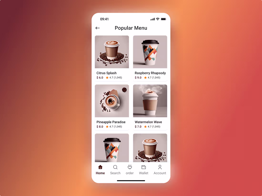
Modern Coffee Ordering App – Popular Menu Screen
1
2