
Md Abdul Awal Rafsun
Data viz & dashboards. Maps, maritime, AI-assisted builds.
New to Contra
Md Abdul Awal is ready for their next project!
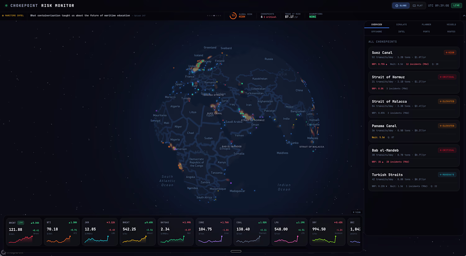
An interactive dashboard monitoring the world's critical maritime chokepoints, the narrow sea passages that global trade depends on. Tracks vessel traffic patterns, commodity flows, and risk indicators across waterways like the Strait of Hormuz, Suez Canal, Bab el Mandeb, Malacca, and others. Built to turn scattered maritime data into a single situational view useful for traders, analysts, and logistics teams. Combines live map rendering, chokepoint specific panels, and risk context in a clean dark mode interface. Fully deployed and live at chokepoint-risk-monitor.vercel.app (http://chokepoint-risk-monitor.vercel.app).
0
44
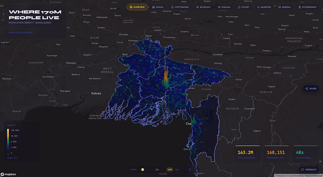
An interactive 3D web map visualizing population density across Bangladesh as extruded spike columns, built with MapLibre GL JS. Users can pan, rotate, and zoom through the landscape to explore how people are distributed across districts and cities. The project required processing raw population data into a clean geospatial format, designing a visual system that reads clearly at multiple zoom levels, and optimizing rendering performance for smooth interaction in the browser. Fully deployed and live.
0
51
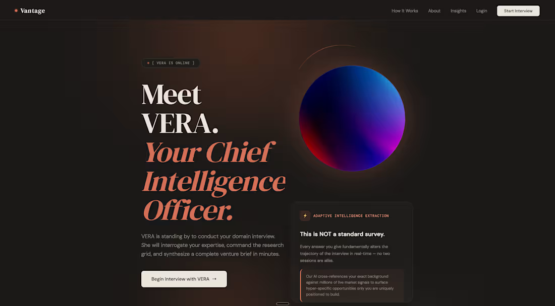
Vantage is an AI powered platform that helps domain experts discover startup ideas only they can build. Users complete a 4 minute adaptive voice interview with VERA, an AI agent that maps their expertise, constraints, and unfair advantages without requiring any typing.
A proprietary multi agent research system then cross references the user's profile against real time market signals and returns 5 ranked startup opportunities, each with signal strength scoring, competition analysis, MVP outlines, and profit estimates. Premium users can unlock deeper market research reports for individual ideas.
Built end to end as a full stack AI product including the voice interview flow, multi agent research pipeline, ranking logic, and monetized premium tier.
0
34
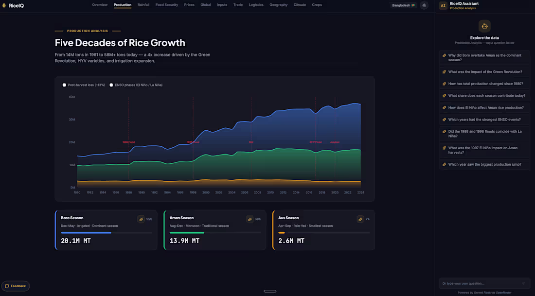
A dark mode interactive dashboard that turns Bangladesh's rice economy into a single explorable interface. Pulls in cleaned datasets from FAOSTAT, USDA PSD, WFP, and HDX to show production, yield, imports, exports, consumption, and price trends over time. The build required a full data pipeline from raw public sources into normalized JSON, a custom design system for data dense screens, and chart components that stay readable across dozens of indicators. Deployed and live, designed for analysts, traders, and policy readers who need fast answers.
0
46