
Mayank Sahani
Analyst extracting actionable insights and driving growth
New to Contra
Mayank is building their profile!
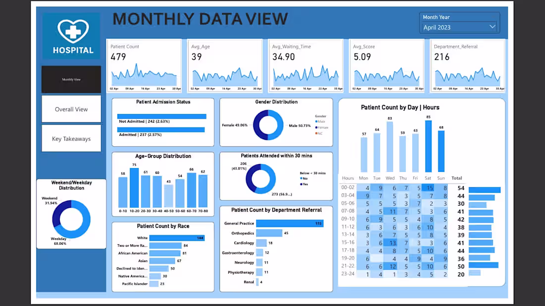
🏥 Hospital Analytics Dashboard
Overview
A comprehensive healthcare analytics solution featuring three interactive Power BI dashboards that analyze patient flow, operational efficiency, and hospital resource management. This project transforms raw hospital data into actionable insights for healthcare administrators and decision-makers.
📊 Dashboard Components
1. Monthly View
Real-time patient metrics with trend analysis
Key performance indicators: Patient count, average age, waiting times, and satisfaction scores
Time-series visualizations for operational planning
2. Overall View
Comprehensive patient demographics and admission patterns
Department-wise analysis and resource allocation insights
Weekend vs. weekday operational trends
🎯 Key Metrics Analyzed
9,216 total patients across all departments
60% of patients attended within 30 minutes (efficiency benchmark)
7 departments analyzed including General Practice, Orthopedics, and Cardiology
Peak operational hours: 07-08 AM requiring enhanced staffing
🛠️ Technologies Used
Power BI: Multi-page interactive dashboards with advanced visualizations
DAX: Custom measures and calculated columns for KPI development
Data Modeling: Optimized relationships and performance tuning
💡 Business Impact
Identified peak patient flow patterns for staff optimization
Analyzed demographic trends for targeted healthcare services
Provided actionable insights for reducing patient waiting times
Enhanced operational efficiency through data-driven decision making
2
38
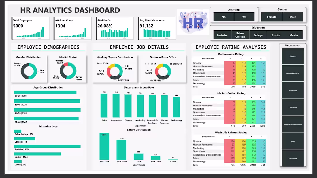
👥 HR Analytics Dashboard
Overview
A comprehensive HR analytics solution built with Power BI to analyze employee attrition, performance metrics, and workforce demographics. This project provides actionable insights for talent retention strategies and organizational decision-making.
🎯 Key Features
Employee Demographics Analysis: Gender, age groups, marital status, and education distribution
Attrition Intelligence: 26.08% attrition rate analysis with predictive indicators
Performance Metrics: Department-wise ratings and job satisfaction scores
Compensation Analysis: Salary distribution and income benchmarking
Work-Life Balance Insights: Distance from office and tenure correlations
📊 Dashboard Highlights
5,000 total employees analyzed
1,304 attrition cases identified
₹91,132 average monthly income
Interactive filtering by department, gender, and education
Multi-dimensional performance rating system
Geographic workforce distribution analysis
🛠️ Technologies Used
Power BI: Advanced visualizations and interactive dashboards
DAX: Custom calculations and KPI development
Data Modeling: Relationship optimization and performance tuning
💡 Key Insights
Identified high-risk employee segments for attrition
Analyzed correlation between education levels and job satisfaction
Evaluated department-wise performance patterns
Provided data-driven recommendations for HR policy improvements
2
40
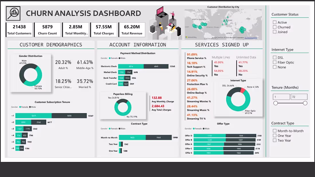
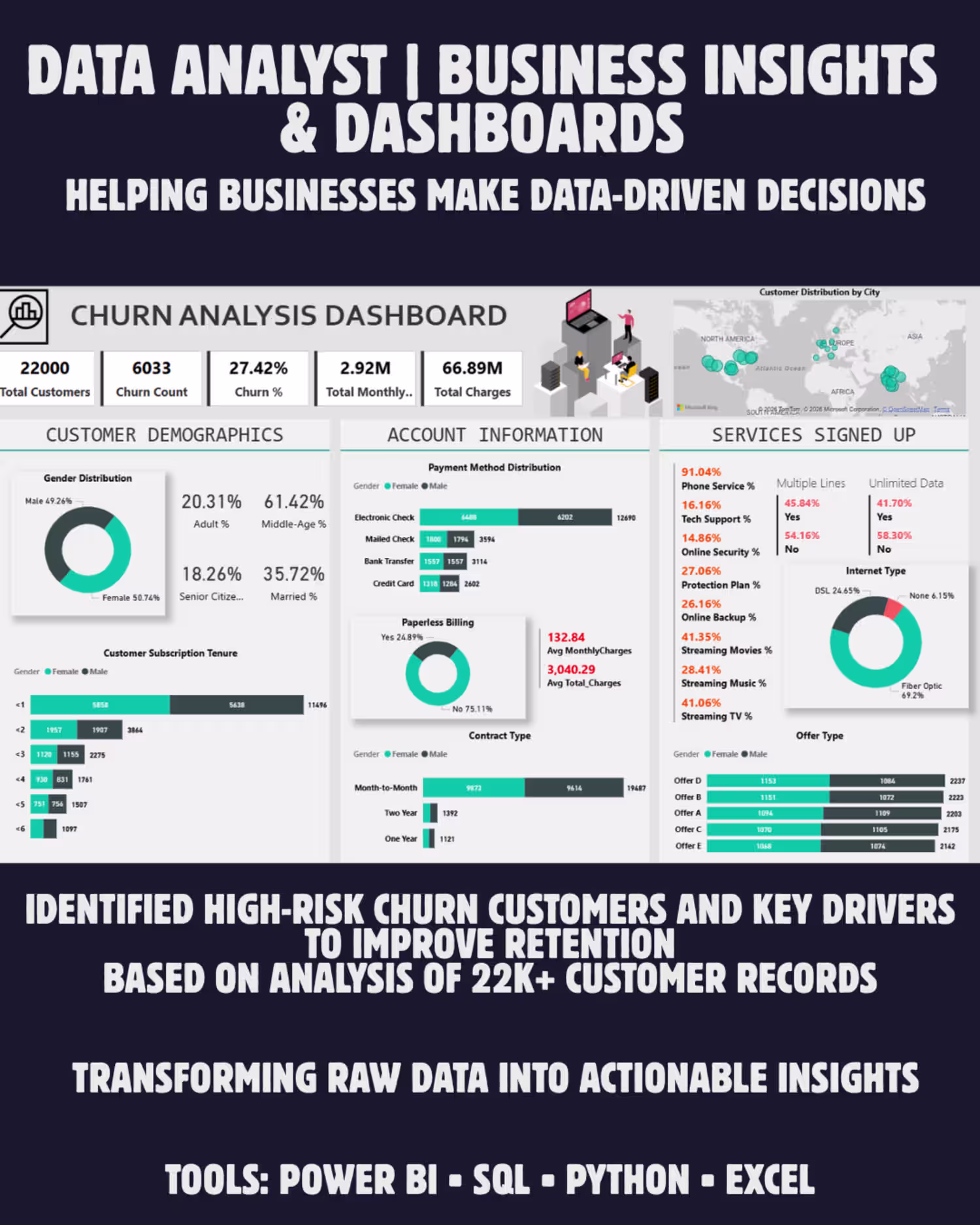
📊 Telecom Churn Analysis Dashboard
🎯 Key Features
Customer Demographics Analysis: Gender distribution, age segments, and tenure patterns
Service Usage Insights: Internet types, contract preferences, and service adoption rates
Financial Metrics: Revenue analysis, monthly charges, and payment method preferences
Churn Prediction Indicators: Key risk factors and customer segmentation
📈 Dashboard Highlights
21,438 total customers analyzed
5,879 churned customers identified
$2.85M total monthly revenue tracked
Interactive visualizations with drill-down capabilities
Geographic distribution mapping
Service-wise performance metrics
🛠️ Technologies Used
Power BI: Interactive dashboard creation and data visualization
💡 Key Insights
Identified high-risk customer segments
Analyzed correlation between contract types and churn rates
Evaluated impact of service offerings on customer retention
Provided data-driven recommendations for reducing churn
1
39