
Bayu Krisnayana
Modern Brand Web Designer | UI/UX Design
Ready for work
Bayu is ready for their next project!
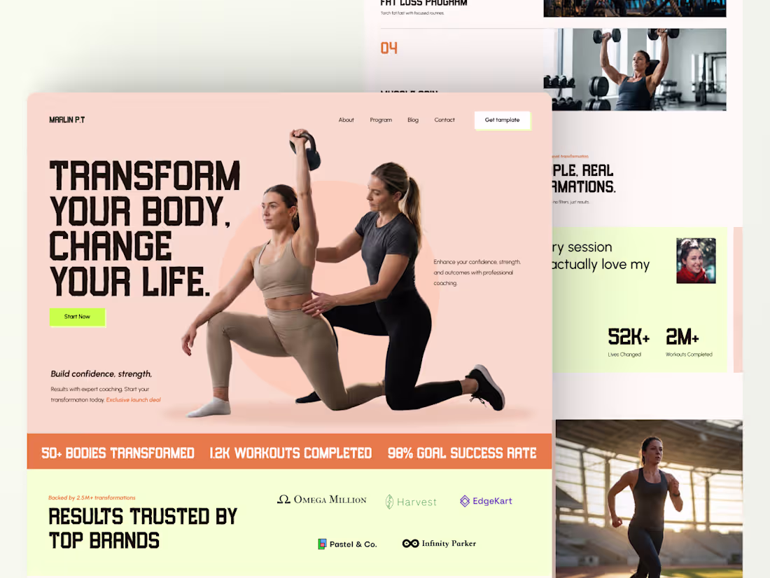
Most fitness websites look strong.
But they don’t convert.
A good website isn’t just well-designed it’s designed for the right audience.
When it feels relevant, it feels personal. And that’s what drives action.
This landing page focuses on:
• Clear messaging
• Strong hierarchy
• Real credibility
• Simple CTA
Because people don’t need more information.
They need clarity to start.
2
3
147
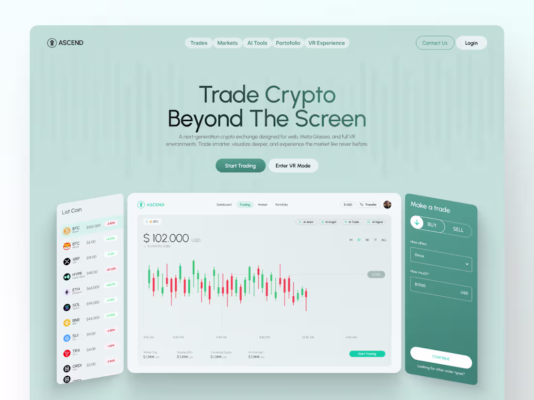
Currently exploring a landing page for a crypto exchange platform.
The real challenge isn’t visual design. It’s turning a complex and often intimidating product into something that feels accessible, secure, and easy to trust.
This concept focuses on:
• Clear visual hierarchy for complex trading data
• A modern interface that feels both premium and reliable
• A structure designed to support fast decision-making
Because in crypto platforms, design plays a critical role in how quickly users build trust and take action.
1
119
Financial dashboards don’t need to look aggressive.
They need to feel trustworthy.
In trading environments, users scan they don’t read.So the design principle here was simple:
Reduce friction. Highlight action. Eliminate doubt. The layout separates analysis from execution.
The CTA zone is visually controlled.
The chart breathes.
Because when money is involved,
clarity becomes a competitive advantage.
3
5
192
Construction Agency
1
124
Professional Portfolio Web Clean, Modern & Confident
2
199
Marathon Event Landing Page, What do you think guys ?
2
3
170
POS Landing Page, for my client a few months ago
2
2
150
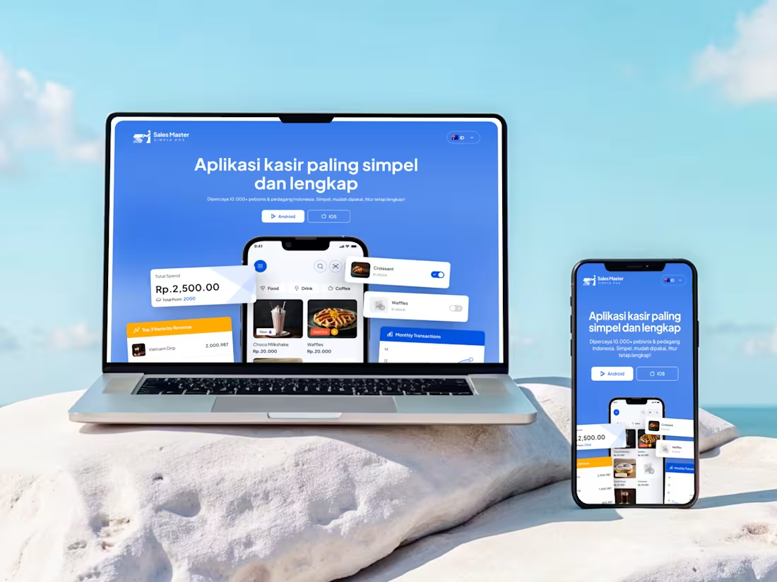
Landing page design for one of the clients named sales master, app for POS system
1
221
Landing page for swimming coaches that generates conversions
2
297
3D spline for elevate your web design
1
1
Web Portofolio
0
8
Yoga House
1
1
Skincare Website
1
1
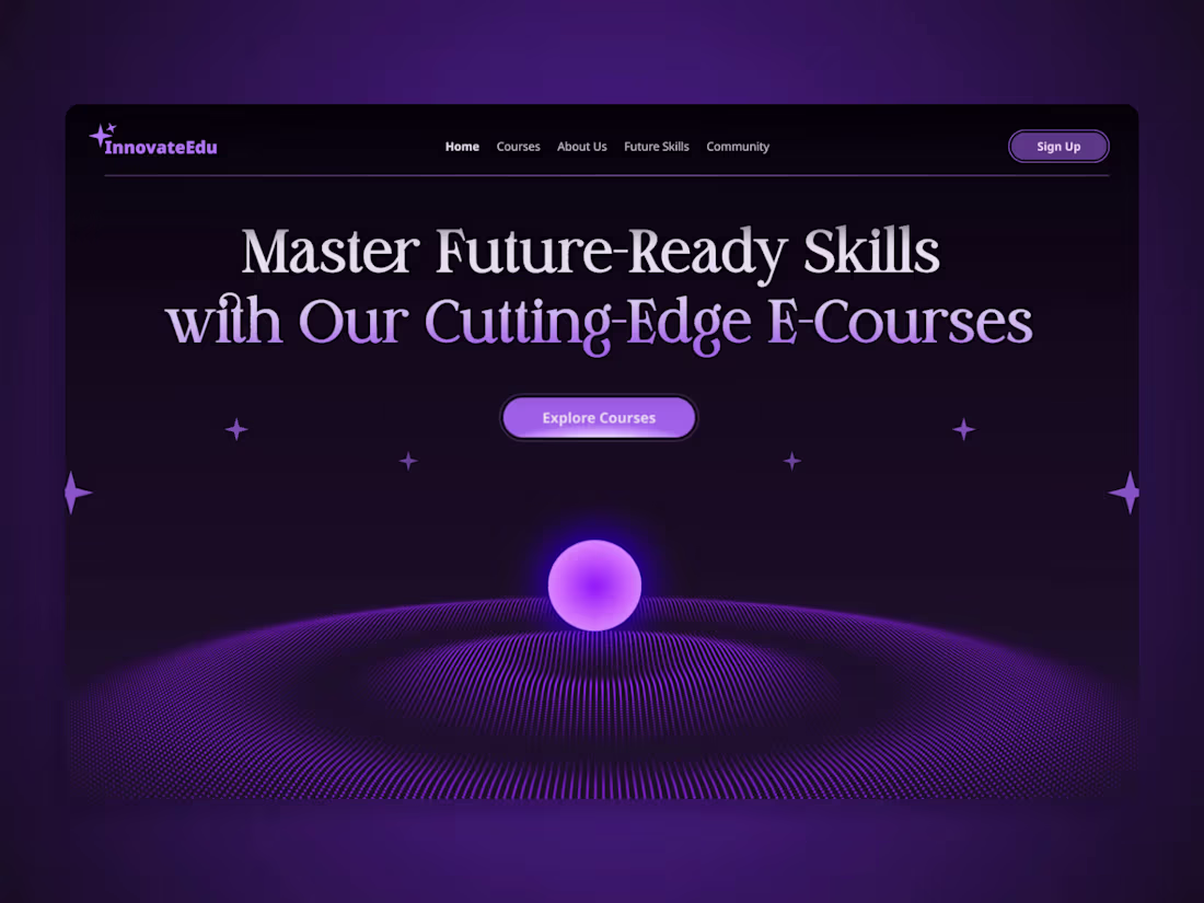
InnovateEdu - Future Courses Hero Page
1
2