
Manar Ebid
PowerPoint Presentations Designer
New to Contra
Manar is building their profile!
Cinematic Pitch Deck Redesign | AlpsCon (German Market)
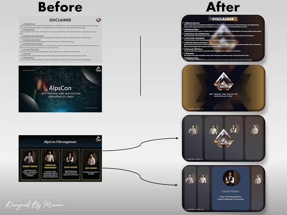
I transformed a static, text-heavy corporate presentation into a high-end visual journey. The original slides lacked brand consistency and failed to capture the premium nature of the firm.
What I Delivered:
Visual Identity Alignment: I ditched the random color palette and rebuilt the entire deck using the brand’s core for a unified, professional look.
The Goal: To turn a simple meeting tool into a powerful brand asset that commands attention.
1
13
Premium Company Profile Redesign
I transformed a cluttered, inconsistent corporate PowerPoint for AlpsCon, a German firm, into a cohesive visual masterpiece. The original slides used random, uncoordinated colors that weakened the brand's impact.
The Transformation Strategy:
Strategic Color Harmony: I meticulously extracted the core palette from their existing professional logo (Deep Blue & Gold) and applied it throughout the entire deck to create a seamless, unified brand experience.
Visual Hierarchy: Reprioritized information layouts to move away from chaotic designs toward clean, premium corporate standards.
Team Showcase: Redesigned the "People" section with custom-cut layouts that emphasize the human element of the brand.
1
76