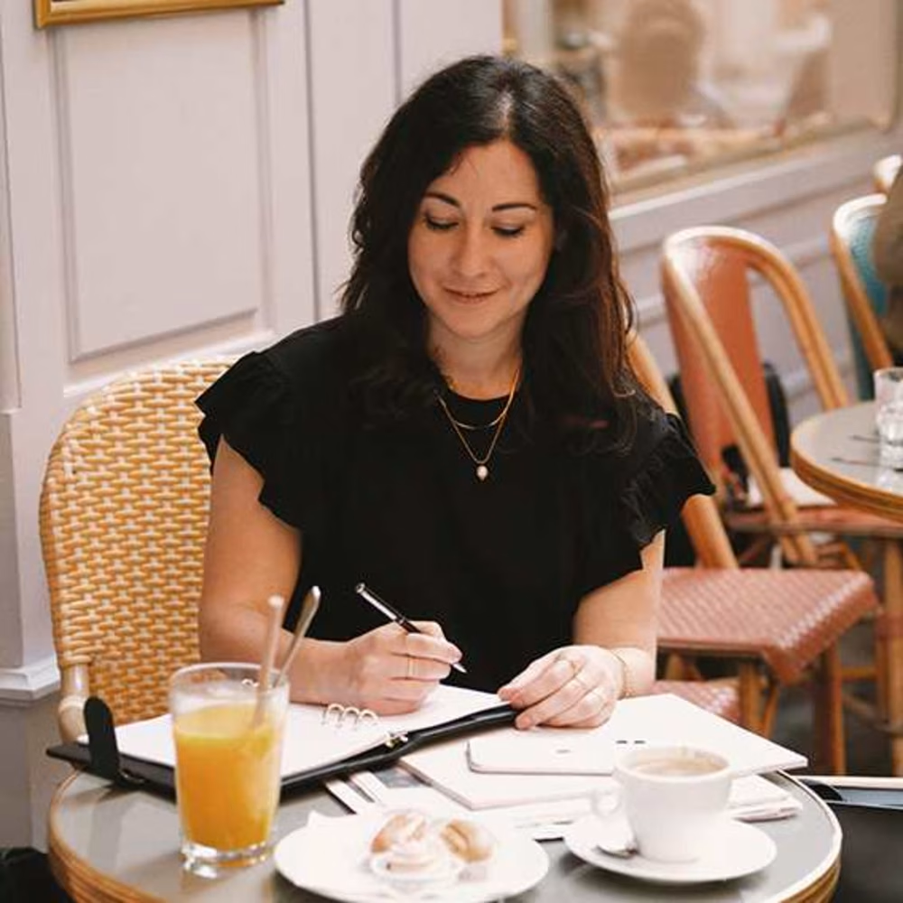
Malorie Hibon
Graphic designer - Branding & webdesign
Ready for work
Malorie is ready for their next project!
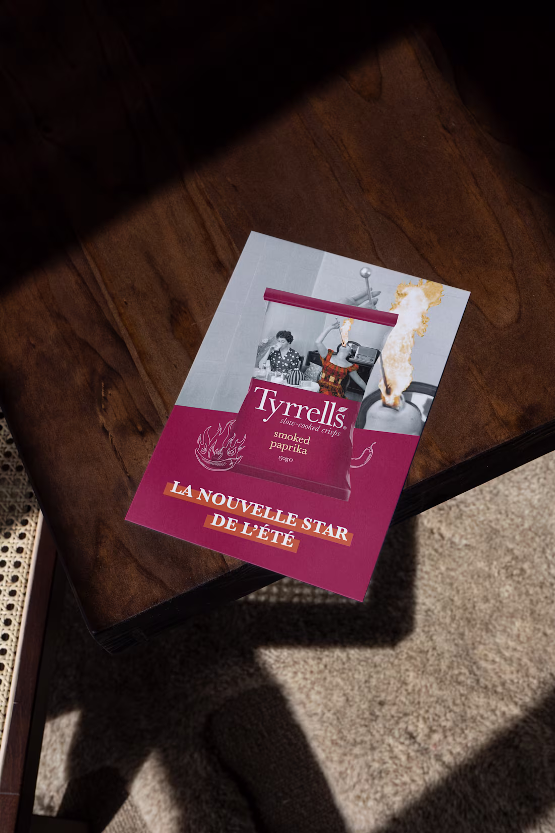
At Tyrrells, crisps aren't just crisps: they're a quintessentially English way of life—crispy, elegant, and with a touch of irreverence. To support their product launches, I had the pleasure of designing several press materials. Working with Tyrrells means immersing yourself in a world that's both refined and unconventional, where indulgence is presented with a distinctly British flair.
From catchy press releases and comprehensive dossiers highlighting the story behind each recipe to layouts designed to reflect the brand's unique identity, my role was to combine clear communication, aesthetics, and brand awareness to capture journalists' attention and showcase each product launch.
1
1
14
Collaborating on the creation of the new identity for Reunion Island means contributing to shaping the image of a rich, powerful, and diverse territory. I co-developed the new graphic charter and the institutional logo, designed to embody the island's values, diversity, and modernity. This in-depth work laid the foundations for a strong visual identity, applied across all communication materials: print, digital, publishing, signage, and more. Each element was designed to reflect the unique soul of Reunion Island, a blend of majestic nature, mixed culture, and contemporary dynamism.
A large-scale, award-winning project at the crossroads of strategic design and visual expressiveness, where every graphic choice tells a part of Reunion Island's story.
6
18
57
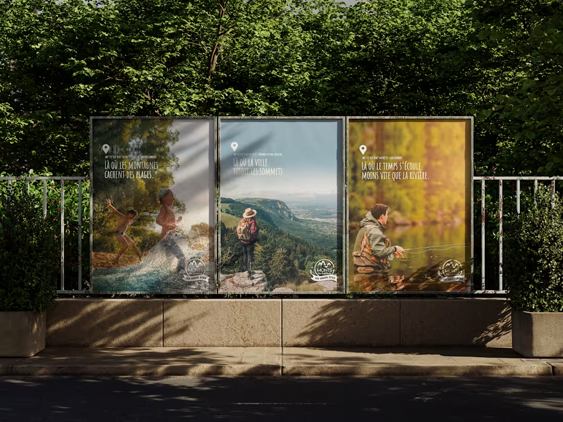
At the gateway to Haute-Savoie, the Monts de Genève form a unique territory, at once natural, cultural, and profoundly vibrant. I had the opportunity to co-create their new brand platform, designed to reveal the full richness of this destination through a strong and coherent identity. This work resulted in a new brand platform, rolled out across all communication channels via a comprehensive brand presentation document, serving as the foundation for all future communications. I also participated in the creation of an original and impactful advertising campaign, designed to reposition the Monts de Genève as a must-see destination, blending natural inspiration with urban roots. A strategic and creative project, where design, storytelling, and territory converge to build a brand image worthy of the experience offered there.
1
12
39
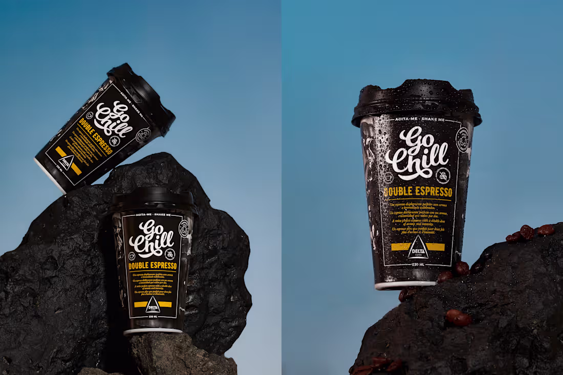
For the launch of Go Chill, its new collection of iced coffees to go, Delta Cafés opted for an energetic campaign, reflecting the spirit of its products. A portable, youthful, and colorful range—designed to appeal to coffee lovers seeking freshness and convenience. I created the press kit to accompany the launch of this collection: an informative and visually appealing document that highlights the unique identity of each product—cappuccino, espresso, latte… Each drink has its own packaging, and the challenge was to reflect this diversity while maintaining a consistent tone and style. The result: a press kit that perfectly embodies the Go Chill range—dynamic, refreshing, and decidedly contemporary.
1
1
21
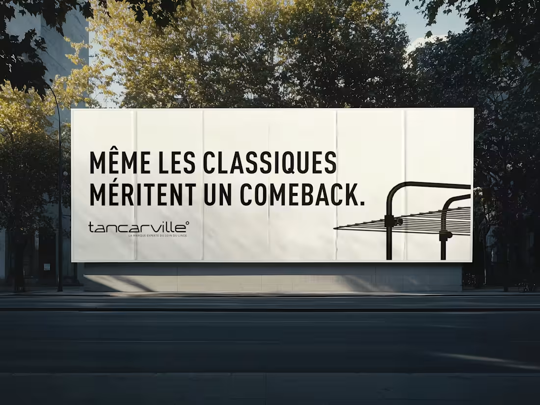
A new minimalist approach, thanks to a clean and modern sans-serif typeface, conveys an image of simplicity and sophistication. The two "a"s have been specially stylized to evoke an iron, a subtle nod to the world of laundry care, the heart of the brand's identity. This visual detail reinforces Tancarville's technical and expert aspect, while remaining true to the brand's DNA.
Finally, a small "bubble" has been added to the end of the word to recall the temperature symbol, a direct reference to the ideal temperature for laundry care and the precision that Tancarville embodies in its products. This graphic choice harmoniously completes the design, adding a modern touch while anchoring the logo in its world. A logo that is simple, evocative, and perfectly suited to Tancarville's image: a trusted brand, an expert in laundry care.
0
18
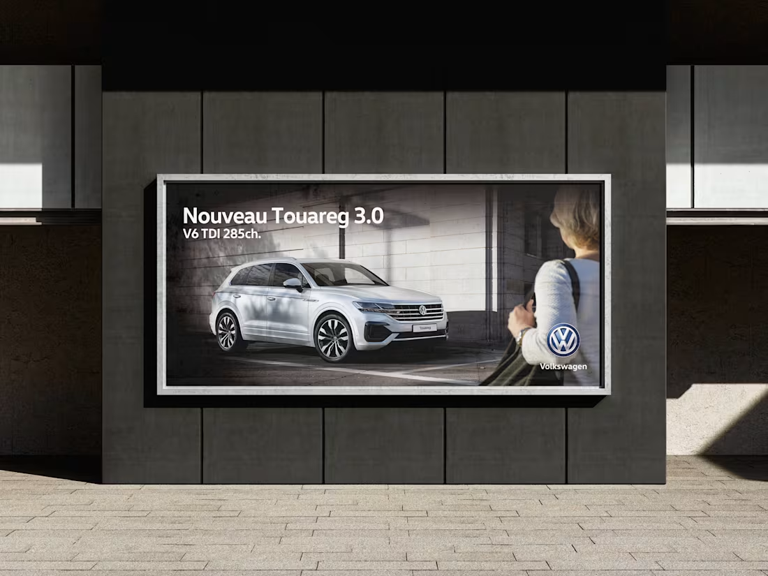
Working with an iconic brand like Volkswagen means immersing yourself in a world where precision, creativity, and rigor converge. As part of this collaboration, I had the opportunity to work on various print communication materials designed to enhance the brand image and support its marketing communications. I designed the layout of automotive catalogs, conceived as powerful sales tools that combined clarity, aesthetics, and adherence to the brand's graphic guidelines. I also contributed to the creation of advertisements for newspapers and magazines, worked on posters for urban displays, and designed promotional flyers. It was a comprehensive project, central to Volkswagen's marketing objectives, where each medium had to combine advertising effectiveness, readability, and visual elegance.
0
17
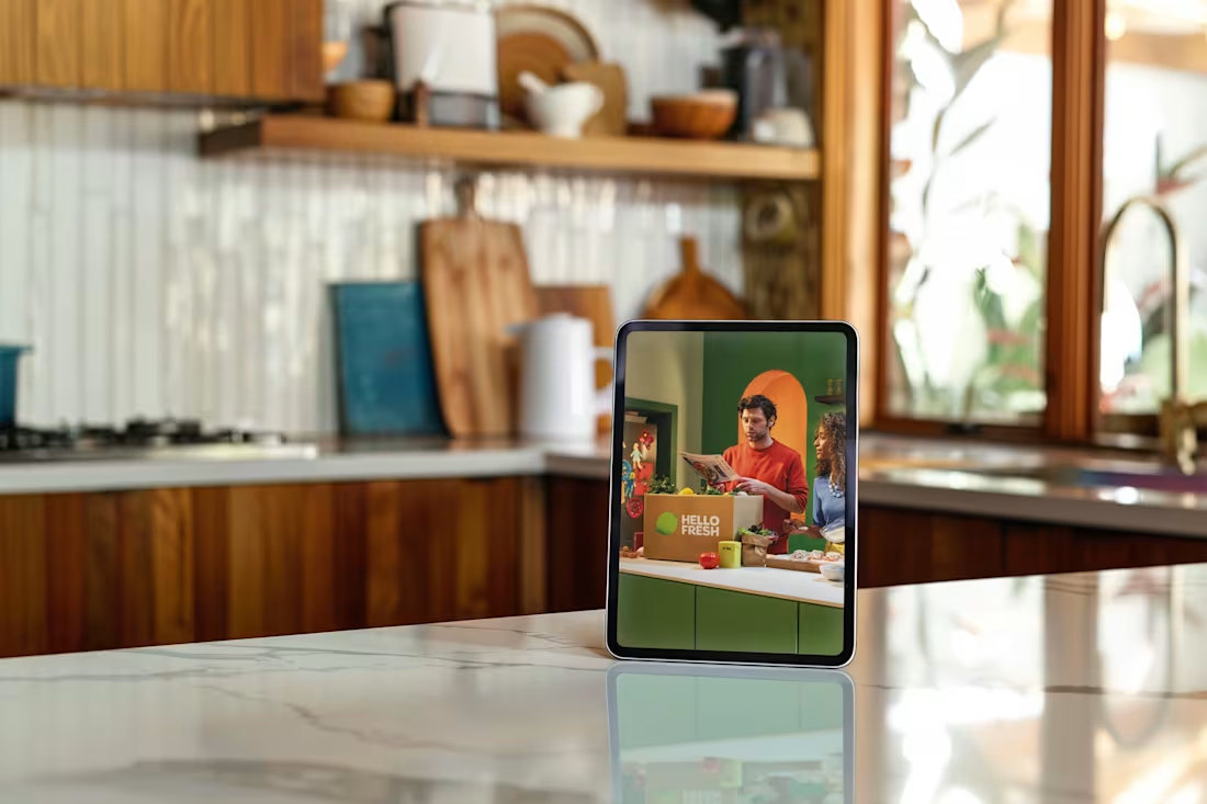
How do you create a press kit that inspires you to cook, to travel…
and above all, to linger a little longer on each page? That was the challenge HelloFresh, the world leader in home-delivered meal kits, entrusted to me. Their brief: a clear, user-friendly, and appetizing document to present their summer offerings and their commitments to quality, convenience, and responsible consumption. My approach: to design a vibrant and enticing layout, reflecting the appeal of their recipes. Crafting headlines to capture attention, highlighting visuals to whet the appetite, spacing out the content for easy reading… and giving each page that little extra something that makes all the difference. A project where graphic design and storytelling converge, serving a brand that puts the joy of cooking back at the heart of everyday life.
0
22