Maaz Mirza
I design bold, clean websites that tell your brand’s story
New to Contra
Maaz is ready for their next project!
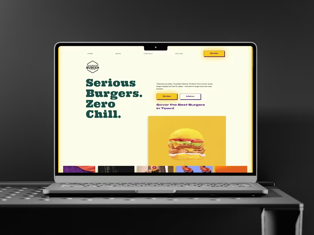
I recently worked on a website for a burger company with a trendy, premium vibe — but their old site didn’t reflect that energy at all. Most of their branding lived on social media, so I decided to bring that same personality to the web.
I built the design around their own visuals, using colors inspired by the restaurant’s ambience and aesthetic. To make the site feel more alive, I added smooth hover and scroll animations that match their upbeat brand tone.
A big part of my focus was ensuring the experience feels just as good on mobile — clean, fast, and visually consistent.
Really happy with how it turned out, and like every project, there’s always room to refine further. Would love to hear your thoughts.
0
27
Built a website for a construction company — this one was a bit of a challenge since they hadn’t really built a strong brand identity yet.
I went with a minimal, structured design to reflect their work — clean lines, clear hierarchy, and lots of breathing space. The hero uses bold typography to communicate their values and goals right away.
Grids and geometric shapes bring an architectural, modern feel, while the neutral color palette ties it back to the materials and tone of their projects.
I also added custom loading and scroll animations to make the site feel dynamic without losing that professional edge — and made sure it looks just as solid on mobile.
Really happy with how this one came together.
0
26
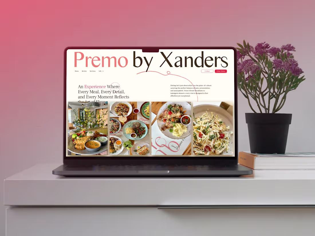
Built this website for a premium café that already had a strong offline presence — but their old site didn’t quite capture that same charm.
The goal was to translate their warm, sophisticated vibe into a digital experience. I used visuals from their own space and menu to make the design feel familiar and real. The color palette and typography were chosen to match their ambience — calm, elegant, and slightly playful.
Added subtle hover and scroll animations to make the site feel more alive, and made sure it looks just as beautiful on mobile.
Really proud of how this one turned out — it perfectly balances design, storytelling, and the brand’s personality.
0
29
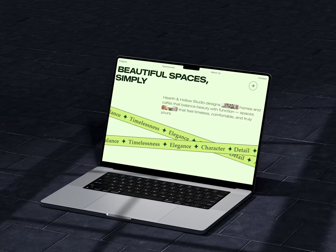
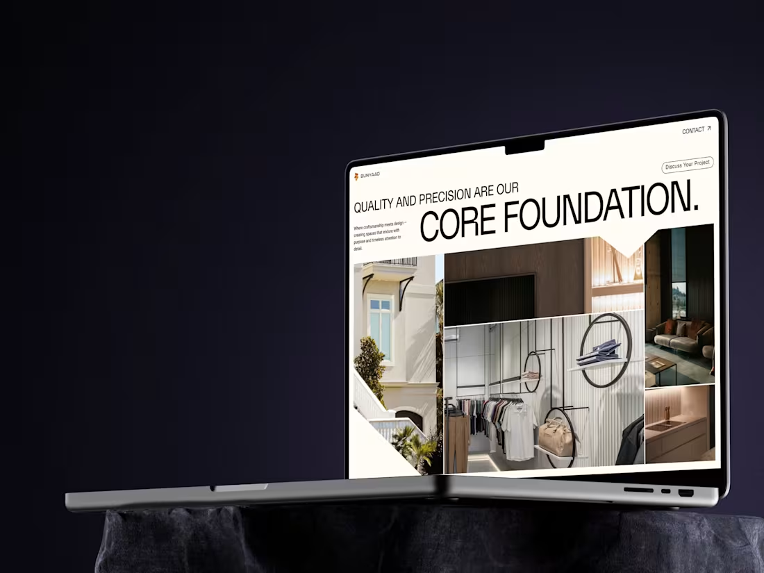
This project was for an interior design studio. The main goal was to let their work shine — minimal text, strong visuals, and colors that matched their brand and aesthetic. Simple, elegant, and true to their style.
0
28