
Luvjyot Kaur
Product Designer with expertise in B2B SaaS and B2C products
Profile in progress
Luvjyot is building their profile!
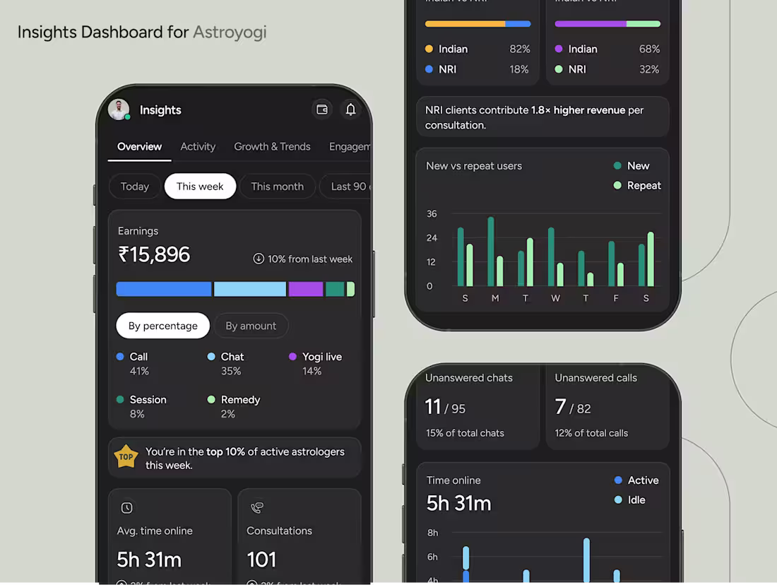
Built a clean, focused Insights dashboard for the astrologer side of the Astroyogi app. I designed the metrics from scratch so they get only the numbers that actually matter, instead of a cluttered pile of data. Full Screens here (https://www.figma.com/design/eWFSKfV8xop8jRmzMNyrTj/Astroyogi-Insights-Dashboard?node-id=0-1&t=Jf0nBQd95hrXUVaC-1).
I grouped everything into four simple zones: Overview, Activity, Growth & Trends, and Engagement, each with quick time filters (Today, 7D, 30D) so they can actually track progress without getting lost.
To keep it human, I added small handwritten-style nudges that explain why a metric matters, not just what it says.
Clean. Actionable. Zero noise.
2
1
46
Came across a really cool animation on the Inkwell website that I couldn’t resist recreating it in Framer.
Loved experimenting with the motion and timing to get that same satisfying feel.
Sharing a quick clip of how it turned out 👇
0
27