Lúcia Pinho
Communication Designer with a love for abstract art
New to Contra
Lúcia is ready for their next project!
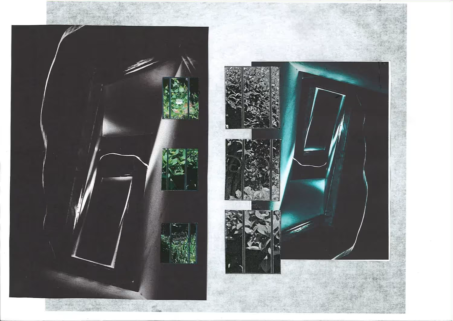

In the early days of the internet, the so-called "vernacular web" was built by a community of individuals and enthusiasts who created HTML pages simply to share and express their interests. It wasn't about selling an image or a message: it was driven by a genuine desire for sharing and experimentation. We drew inspiration from the work of Olia Lialina, using the chapter "A Vernacular Web" from her book Digital Folklore (co-authored with Dragan Espenschied) as the structural foundation for this website.
This project is our tribute to what was an anthropological internet: built by people, not algorithms.
Co-created with Tomás Rodrigues and Helena Rosa
0
76
Concept for
Fishmans – 98.12.28 Otokotachi no Wakare (Deluxe Edition)
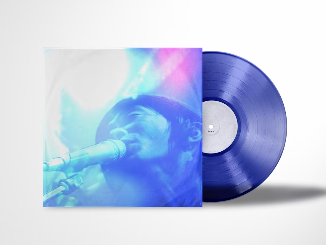
This project is a physical boxset redesign for Fishmans’ legendary final live performance, 98.12.28 Otokotachi no Wakare, recorded at Akasaka Blitz on December 28, 1998 made alongside two colleagues. The core objective of this project is to transform a digital cult phenomenon into a tactile and physical artifact, bridging Tokyo’s late-90s dub and dream-pop scene with contemporary minimalist editorial standards to honor the late Shinji Sato’s musical legacy.
The overarching conceptual foundation of this archival redesign came from an idea of "Dream Stratigraphy", used specifically in the booklet, by approaching the live album as a physical artifact built from overlaid emotional strata the same way geological stratigraphy studies the accumulated layers of soil and rock to reconstruct Earth's distant past. The concert itself exists in the collective memory as a weightless, hallucinatory experience, so the design challenge was to translate that intangible, dream-like quality into a tactile object without flattening its depth.
Visually and materially, this concept is manifested through careful layering and atmospheric transitions. By using shoegaze-inspired color gradients of blue, cyan, and soft magenta over textured archival photography, the project captures the transient atmosphere of the live soundscapes. To physically embody this hallucinatory movement, the cover is made in a lenticular print, creating a shifting effect that transforms the stage photography as the viewer moves the package.
The three 180-gram vinyl discs are pressed on translucent colored vinyl in Deep Cobalt, Magenta, and Clear, echoing the reverb-heavy textures of the music and the visual transition throughout the performance. Enhancing this audio-tactile experience, Side F features a physical locked groove mechanism engraving the final decaying reverb of Long Season into an infinite, repeating loop that endlessly suspends the final moment of the concert. Alongside that, the set also comes with a Moiré-inspired spiral slipmat to put underneath the transparent discs.
The typographic system uses clean, technical sans-serif typography against minimalist grid layouts, alongside a handwritten typeface of the frontman's handwriting. The accompanying booklet combines concert photography with minimalist typography that materializes the dream stratigraphy idea with translucent paper overlays, ensuring that text and blurred concert imagery bleed into one another so the viewer experiences the performance as a series of semi-transparent slices of time. Custom guitar picks using the handwritten typography and signature color gradients serve as tangible souvenirs. Completing the archival set is a vintage-inspired t-shirt featuring a high-contrast screen-print of Shinji Sato performing on the front, while the back displays Sato’s original handwritten setlist serving as an intimate trace of the performance's exact chronology.
Ultimately, the project balances nostalgia with functional contemporary design, ensuring that every material choice from the lenticular movement and locked groove to the translucent vinyl pressings, raw handwritten typography, and layered paper textures works to evoke the feeling of holding a preserved, unearthed piece of music history.
Design & Concept: Lúcia Pinho
1
145
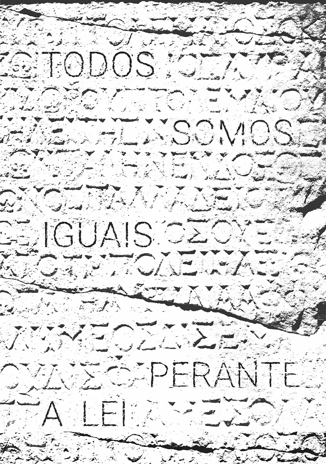
This project was centered on the Universal Declaration of Human Rights, focusing specifically on the fundamental principle of equality before the law. The core concept draws deep inspiration from the ancient Greek notion of Isonomy: the equality of political rights and protection under the law. To bridge historical foundations with modern human rights values, the Portuguese text "Todos somos iguais perante a lei"(All are equal before the law) was visually inscribed into stone, referencing ancient epigraphy. The final artwork creates a contrast between classical Greek stone carvings and modern typography, emphasizing how these timeless principles continue to shape our rights today.
Made by Lúcia Pinho and Dália Kovriga
1
73
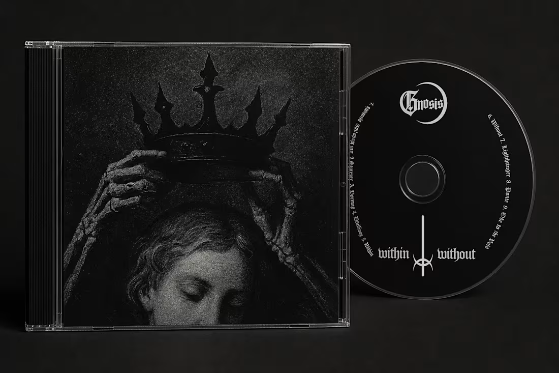
My main objective for this Gnosis physical release was to craft an immersive visual extension of their sound through the CD packaging and booklet design. I made the graphic design for the album cover, back, and disc layout, grounding it in this dark black metal aesthetic. Beyond the outer packaging, I designed and paginated the entire multi-page booklet, carefully balancing typography and dark visual elements to create an editorial flow for the lyrics. Every detail was crafted to elevate the physical CD experience.
Designed by Lúcia Pinho
1
31