
pro
Laura Martínez
Senior Graphic Designer | Brand Identity
New to Contra
Laura is ready for their next project!
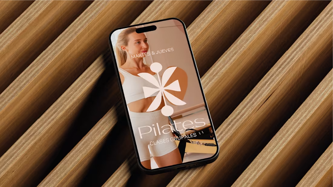
Branding & Wellness Identity
Goal: High-end visual identity for an integral wellness center.
Solution: Developed a minimalist brand system that balances clinical precision with a luxury lifestyle aesthetic, including custom iconography and typography.
Impact: A cohesive visual ecosystem that establishes a premium market position for the brand.
29
71
1.9K
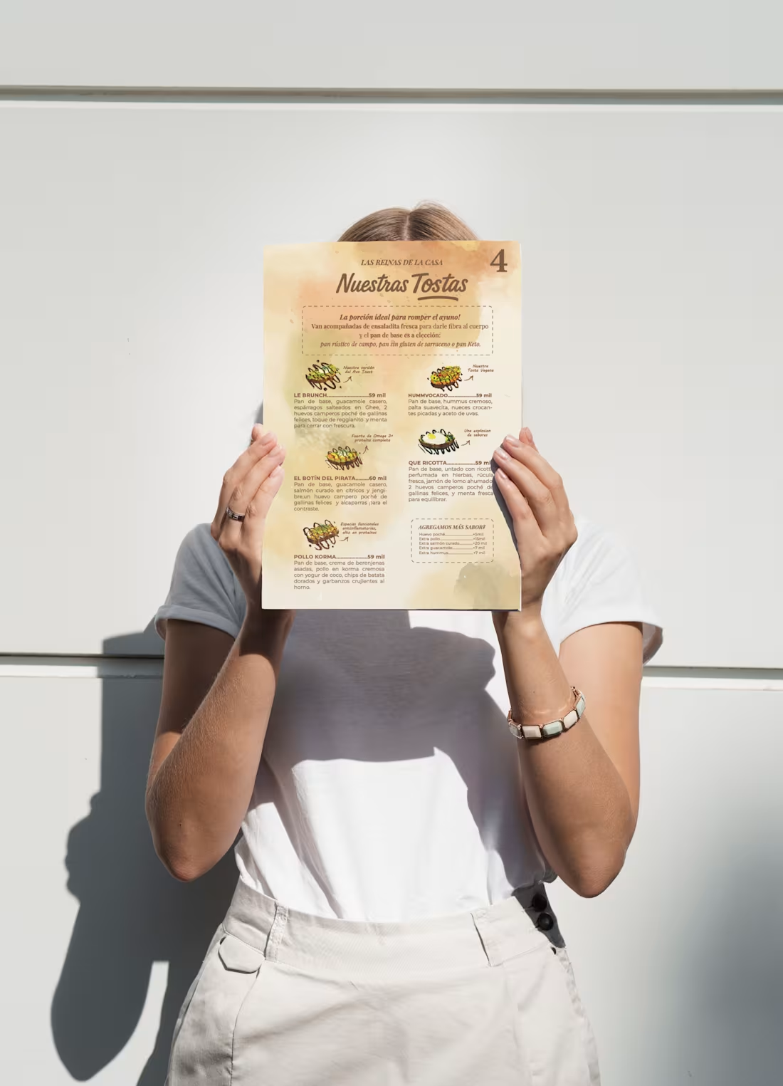
Wellness Menu Design
Problem: A high-end bistro needed to organize a complex, ingredient-heavy menu without losing its premium feel.
Solution: I created a clean editorial layout using organic textures and a structured hierarchy to make functional nutrition easy to navigate.
Result: A professional, functional asset that improves ordering flow and reinforces brand authority.
1
1
246
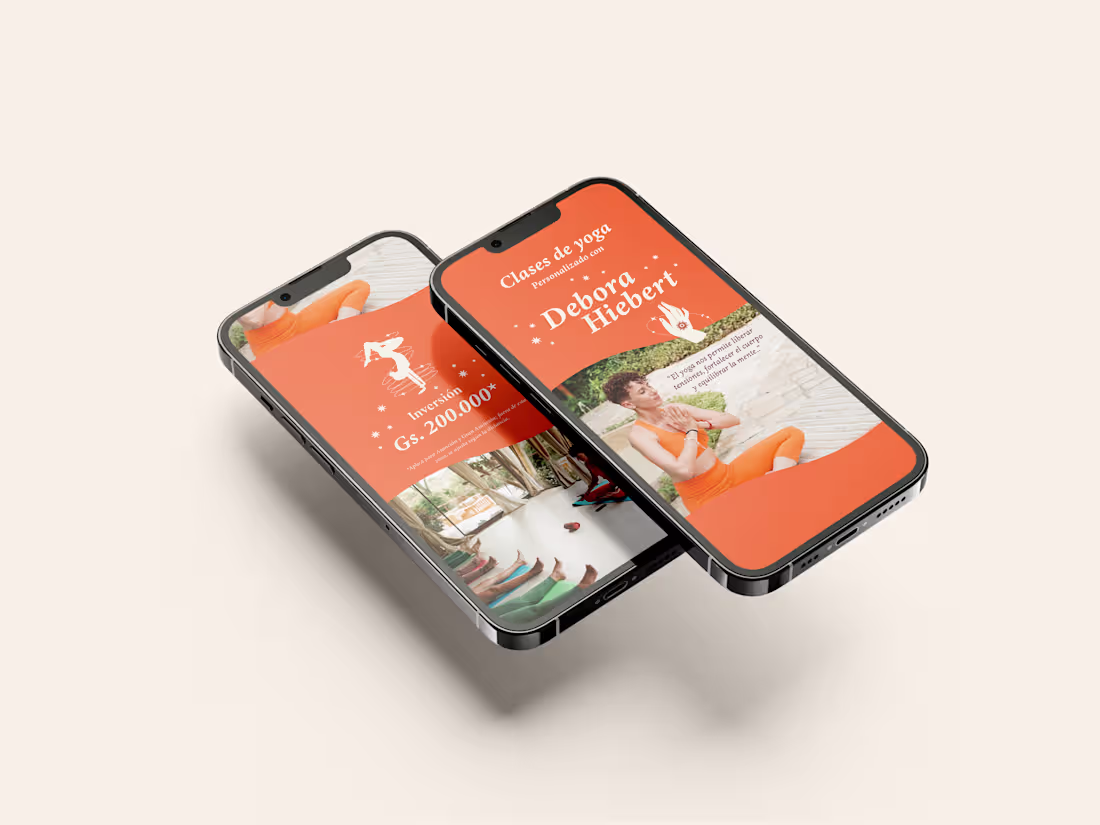
Yoga Brand Identity & Digital Media Kit
Problem: A yoga instructor needed a professional personal brand to stand out and sell personalized classes through digital channels.
Solution: I developed a vibrant, high-contrast visual identity and a mobile-optimized sales presentation that balances energy with professional authority.
Result: A cohesive, "ready-to-use" brand system that facilitates direct client bookings and elevates the instructor’s market positioning.
2
1
267
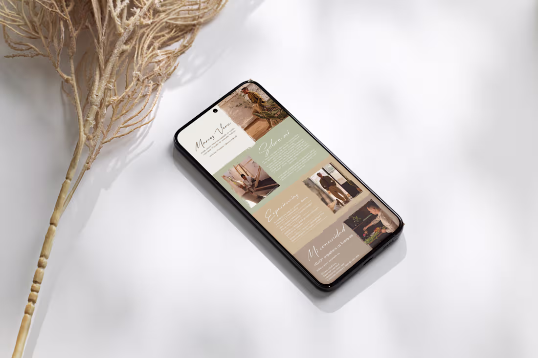
Health Coach Media Kit
The Challenge: Transform raw audience data and wellness content into a high-converting sales asset for a Health Coach/Chef aiming for premium brand partnerships.
The Solution: Executed a minimalist editorial layout using an organic color palette to bridge the gap between "wellness aesthetics" and "corporate professionalism." I prioritized data hierarchy, ensuring key metrics (ROI, engagement, reach) are scannable for busy marketing directors.
The Result: A sophisticated, mobile-optimized tool that elevates the creator’s authority and streamlines the sponsorship acquisition process.
0
221
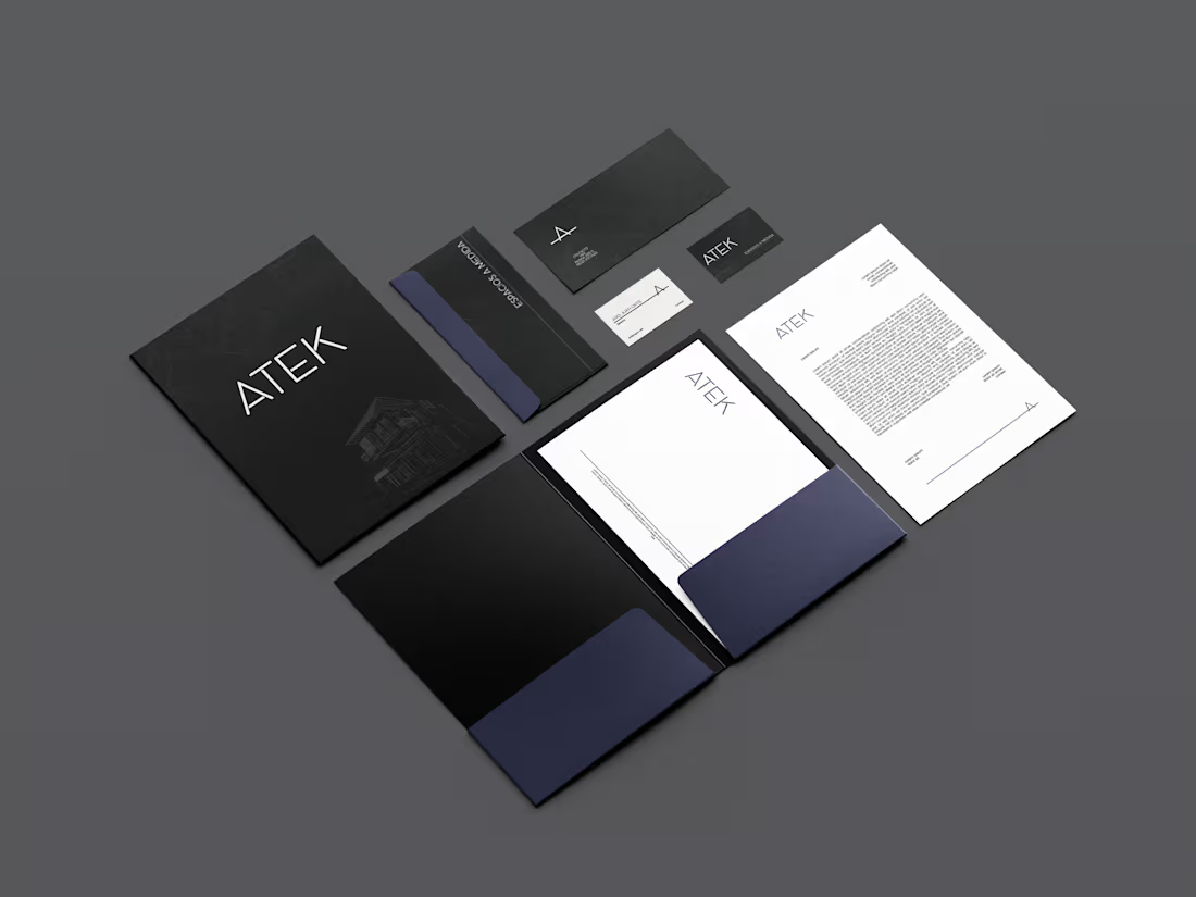
Architecture Brand Identity
Problem: An architecture studio needed a visual identity that reflected its modern, precise, and technical approach to high-end design.
Solution: I developed a structured, minimalist branding system based on clean lines and a neutral palette to mirror the studio's architectural language.
Result: A solid, professional brand image that communicates technical excellence and builds immediate trust with high-end developers and private clients.
0
162
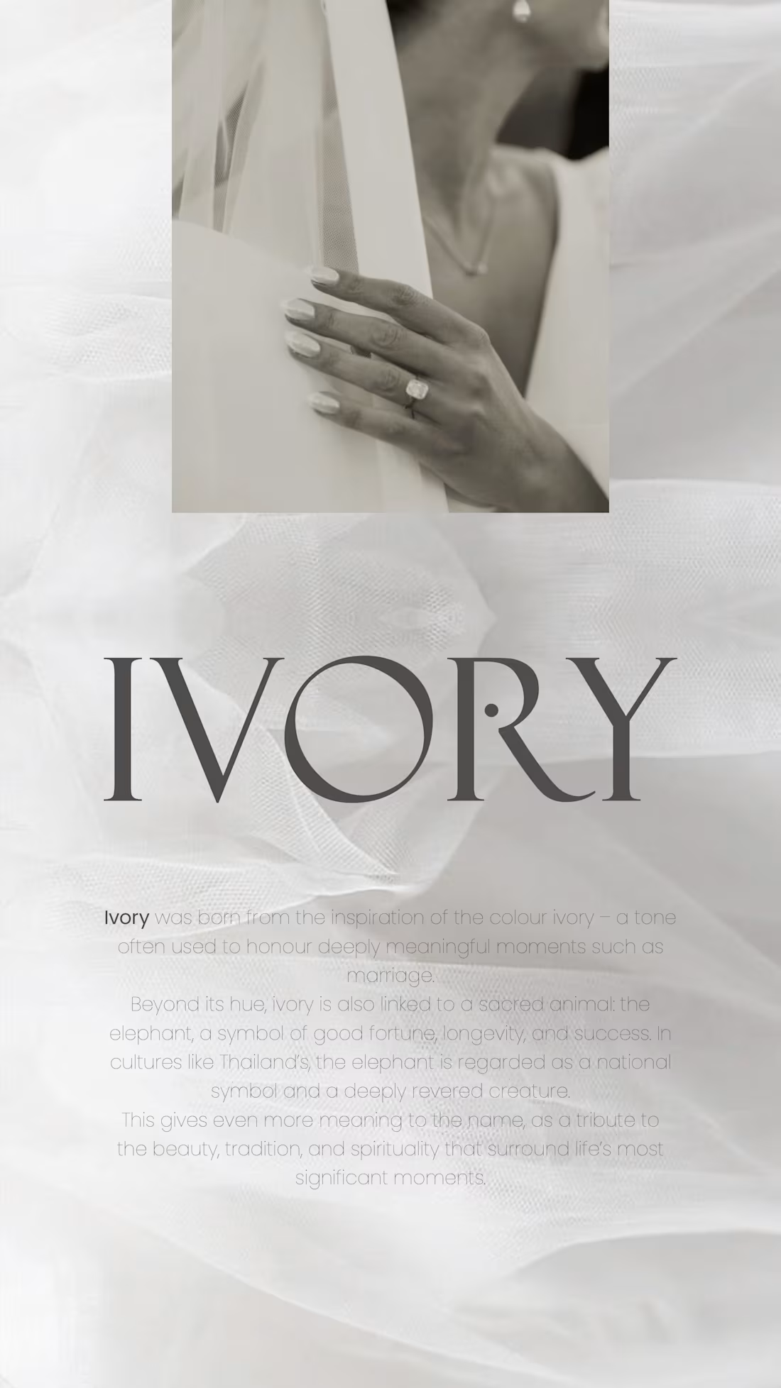
IVORY | Brand Identity & Visual System
A brand identity inspired by the symbolic depth of the color ivory and its cultural connection to longevity and success. The project focuses on a "quiet luxury" aesthetic, blending traditional significance with a modern, minimalist visual language for high-end events and meaningful moments.
Visual Identity: Sophisticated primary and secondary logo systems that evoke elegance and timelessness.
Typography & Hierarchy: A refined typographic system designed for high-end legibility and editorial feel.
Brand Strategy: A conceptual framework bridging cultural symbolism (longevity and fortune)
Asset System: A cohesive color palette and brand guidelines for seamless application across physical and digital touchpoints.
1
4
94
Atlas Ambiental del Paraguay | Brand Identity & Information Design
Full branding system for a national environmental data project. The visual concept is rooted in Paraguay’s geography, using continuous lines to represent the flow of information across the country’s 11 ecoregions.
• Strategic Identity: Modular logo system designed for institutional authority and scalability.
• Custom Iconography: Specialized icon set for environmental dimensions (Biodiversity, Water, Energy).
• Systems & UI: Visual direction for web interfaces, statistical data layouts, and stationery.
• Technical Guidelines: Comprehensive brand manual ensuring consistency across digital and print assets.
Website: https://estadisticasambientales.ine.gov.py/
0
55
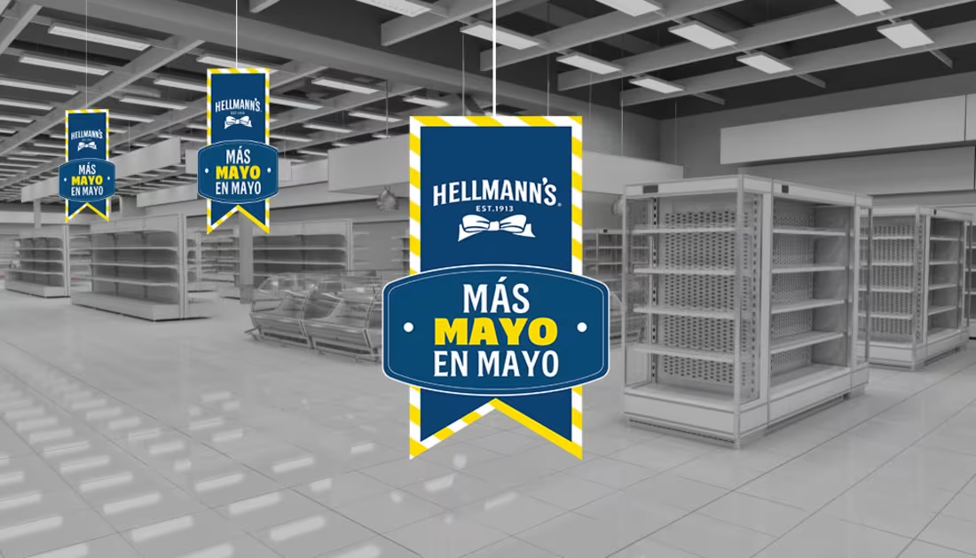
Hellmann’s | Seasonal Retail Campaign & POS Strategy
The Challenge:
Maintain market dominance during the brand's most critical seasonal window (May Month) by breaking through supermarket visual noise and high-traffic environments.
The Solution:
I developed a comprehensive POS system based on a "kermés" (festive fair) concept. Instead of standard retail layouts, I focused on creating an immersive shopper experience through festive visual cues and a bold visual hierarchy that triggered immediate product recognition.
The Result:
A concept-driven, production-ready system that strictly followed global brand guidelines while maximizing shelf visibility and driving immediate conversion.
3
205
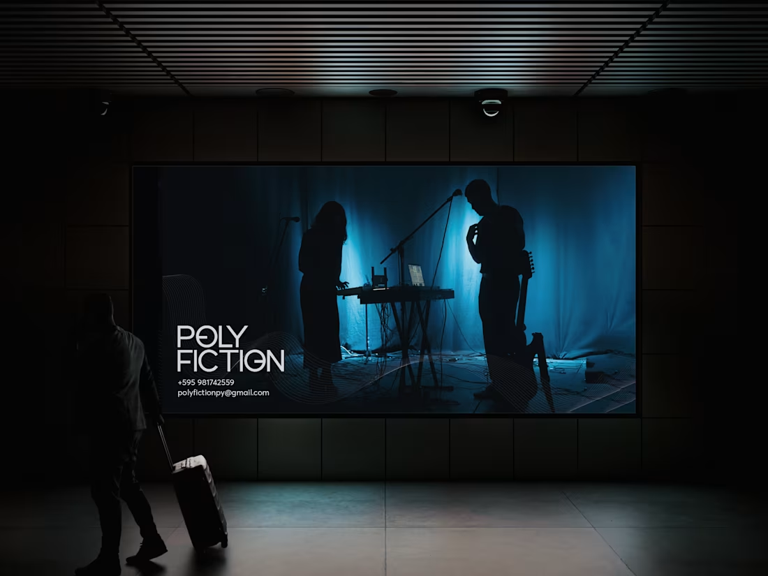
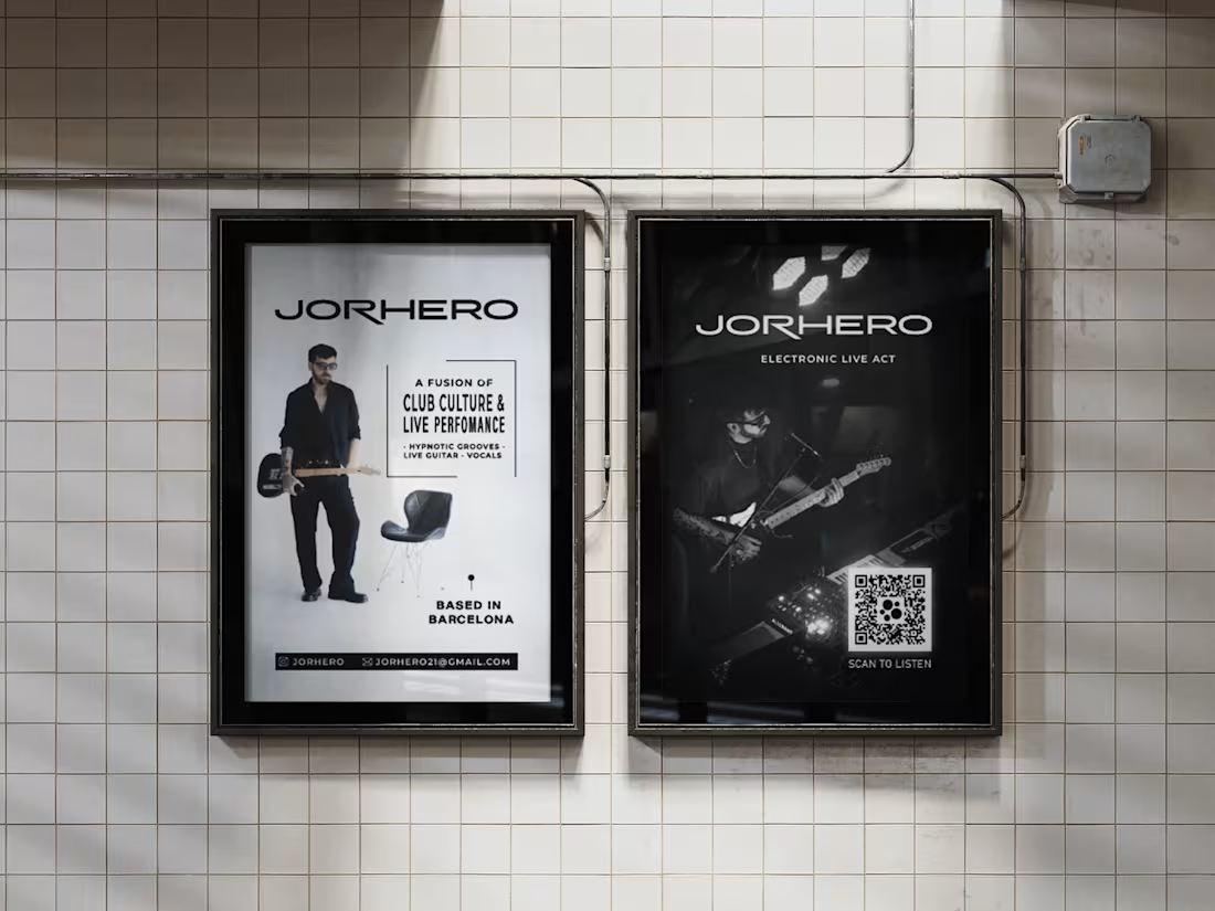
Electronic Live Duo Identity & EPK Design
A dark, sophisticated visual identity for an electronic music duo.
Developed a comprehensive brand system and a 9-slide Electronic Press Kit (EPK) highlighting the duo's live act, discography, and international reach.
A professional industry asset that successfully translated the band's aesthetic into a functional tool for bookings and media.
1
2
178
Album Identity & Art Direction
Comprehensive visual identity for the Electronic Live Act album "De Negro Te Ves Bien".
Developed a high-contrast, minimalist aesthetic tailored for the electronic scene. The design covers the album artwork, digital release assets, and promotional media.
A cohesive, professional brand presence ready for international distribution and live performance visuals.
4
184