
Kashif Khan
Data Analyst uncovering insights through advanced data clean
Profile in progress
Kashif is building their profile!
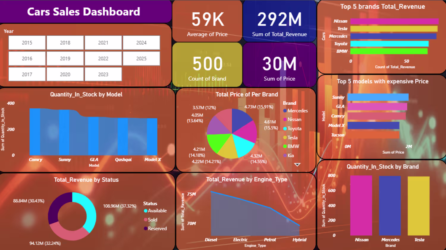

The Cars Sales Dashboard is an interactive Power BI dashboard created to analyze vehicle sales performance, revenue trends, inventory levels, and brand performance. The data was processed using SQL and visualized in Power BI to provide meaningful business insights. The dashboard highlights key metrics including an Average Car Price of 59K, Total Revenue of 292M, Total Price of 30M, and 500 vehicle brands/models in the dataset. It shows the top-performing car brands by revenue, with Nissan, Tesla, and Mercedes leading sales. The analysis also identifies the most expensive car models, inventory distribution across different models and brands, revenue generated by vehicle status (Available, Sold, and Reserved), and revenue trends by engine type. The dashboard enables users to filter data by year and helps businesses monitor sales performance, manage stock efficiently, and make informed decisions regarding pricing, inventory, and market demand.
0
3
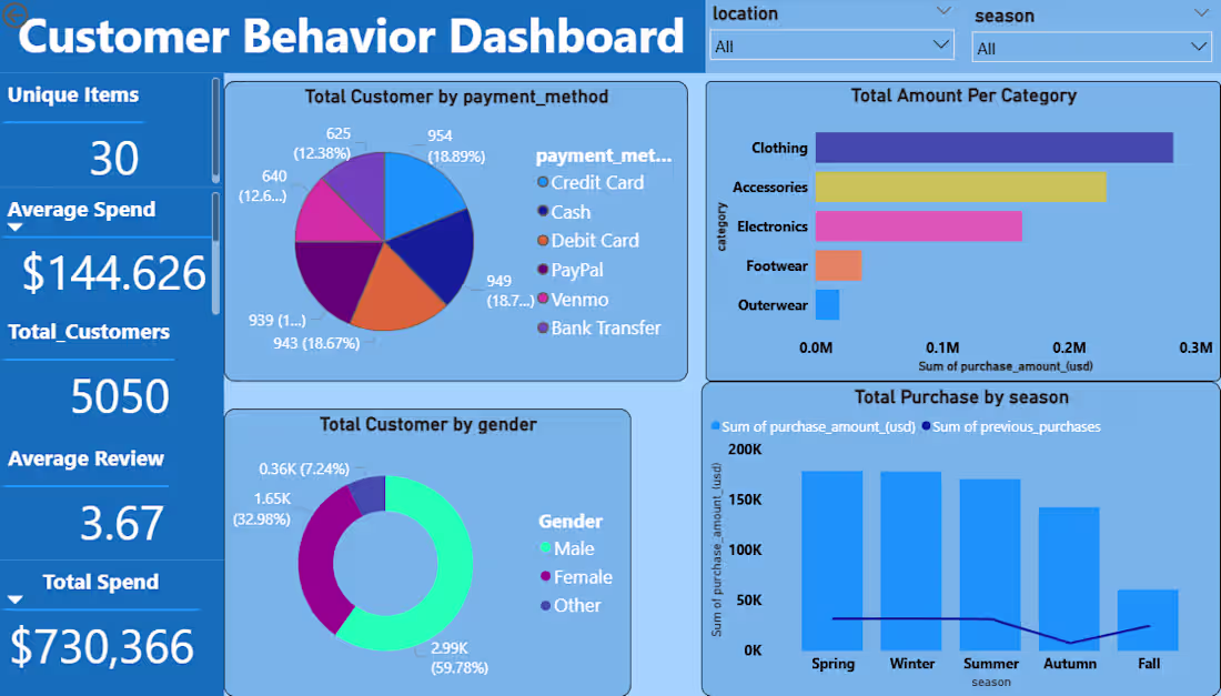
The Customer Behavior Dashboard is an interactive Power BI dashboard designed to analyze customer purchasing patterns and business performance. The data was cleaned and transformed using Python (Pandas and NumPy), stored and queried using PostgreSQL and SQL, and visualized in Power BI. The dashboard shows key metrics such as Total Customers (5,050), Total Spend ($730,366), Average Spend ($144.63), Average Review (3.67), and Unique Items (30). It provides insights into customer payment preferences, gender distribution, category-wise sales, and seasonal purchasing trends. The analysis reveals that Clothing generates the highest revenue, male customers represent the largest customer segment, and Spring and Winter experience the highest purchase activity. Interactive filters for location and season allow users to explore customer behavior dynamically and support data-driven business decisions.
0
10