
Kartik Gaur
Senior Data Analyst who turns messy data into growth factors
New to Contra
Kartik is ready for their next project!

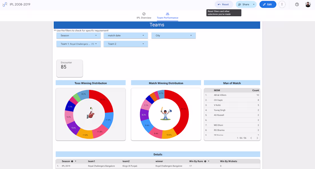
Using IPL match data from 2008–2019, this filtered dashboard analyses RCB's historical performance patterns — toss winning distribution, match win rate, and head-to-head encounters. RCB shows a 41.2% match win share in encounters tracked, with AB de Villiers and V Kohli dominating Man of Match awards. The interactive filters allow season-by-season and opponent-specific analysis — useful for understanding team consistency over a decade of IPL cricket.
0
13

Marketing & Sales Analytics Dashboard Project
Project Overview
Designed and developed a complete end-to-end Marketing & Sales Analytics Dashboard from scratch to help businesses track acquisition, revenue, campaign performance, and sales funnel efficiency in real time.
What I Did
Gathered business requirements from stakeholders and identified key KPIs.
Designed the complete dashboard UI with modern and executive-friendly visualization.
Built data models and connected multiple data sources into one reporting layer.
Created automated data pipelines for regular data refresh and live tracking.
Implemented performance metrics such as:
Revenue
ROAS
CPA
CTR
Conversions
Sales Funnel Tracking
Closed-Won vs Closed-Lost Analysis
Revenue Attribution
Applied proper business color logic:
Green for profit/growth
Red for losses or declining metrics
Neutral colors for operational KPIs
Added alert-based sections to quickly identify performance issues.
Problems Before Dashboard
Data was scattered across spreadsheets and ad platforms.
Reporting process was manual and time-consuming.
Leadership lacked real-time visibility into campaign and sales performance.
Teams focused on vanity metrics instead of profitability.
Difficult to identify weak stages in the sales funnel.
Solution Delivered
Centralized all business metrics into one interactive dashboard.
Automated reporting and reduced manual effort significantly.
Improved visibility into marketing ROI and sales conversion rates.
Helped teams quickly identify low-performing campaigns and funnel drop-offs.
Enabled faster and smarter business decisions using live insights.
Business Impact
Reduced reporting analysis time by approximately 60–70%.
Improved campaign budget allocation using ROAS and CPA tracking.
Increased transparency across marketing and sales teams.
Improved stakeholder reporting with easy-to-understand visual storytelling.
Helped leadership focus on revenue-driving channels and profitable campaigns.
Tools & Skills Used
Power BI / Tableau / Looker Studio
SQL
BigQuery
Data Analysis
Dashboard Design
Data Engineering
Data Pipeline Automation
Business Analysis
KPI Reporting
Marketing Analytics
Final Outcome
This project transformed raw and messy business data into actionable insights that directly improved decision-making, operational efficiency, and overall business visibility. The dashboard became a single source of truth for both marketing and sales performance tracking.
0
10
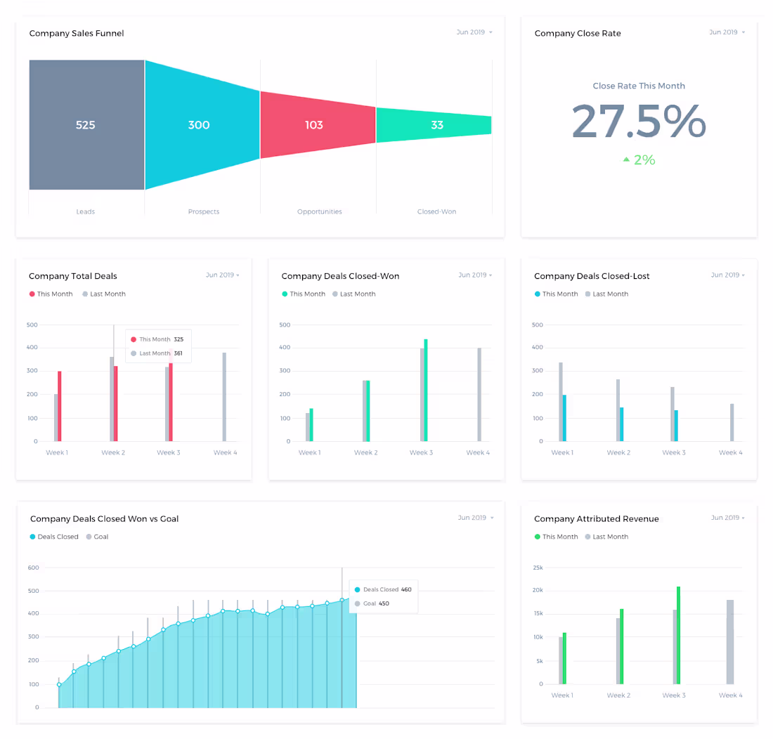
This sales performance dashboard was designed to provide complete visibility into the company’s deal pipeline, conversion efficiency, and revenue contribution. It helped leadership track key metrics like Leads, Prospects, Opportunities, Closed-Won deals, Close Rate, and Attributed Revenue in one centralized view. Earlier, teams struggled with fragmented reporting and delayed sales insights. With this dashboard, sales managers could quickly identify funnel drop-offs, monitor weekly deal performance, compare targets vs achievements, and track revenue trends effectively. Color-based visualization improved readability and decision-making speed. Overall, the dashboard increased sales transparency, improved forecasting accuracy, and helped optimize the sales process by identifying weak conversion stages.
0
14
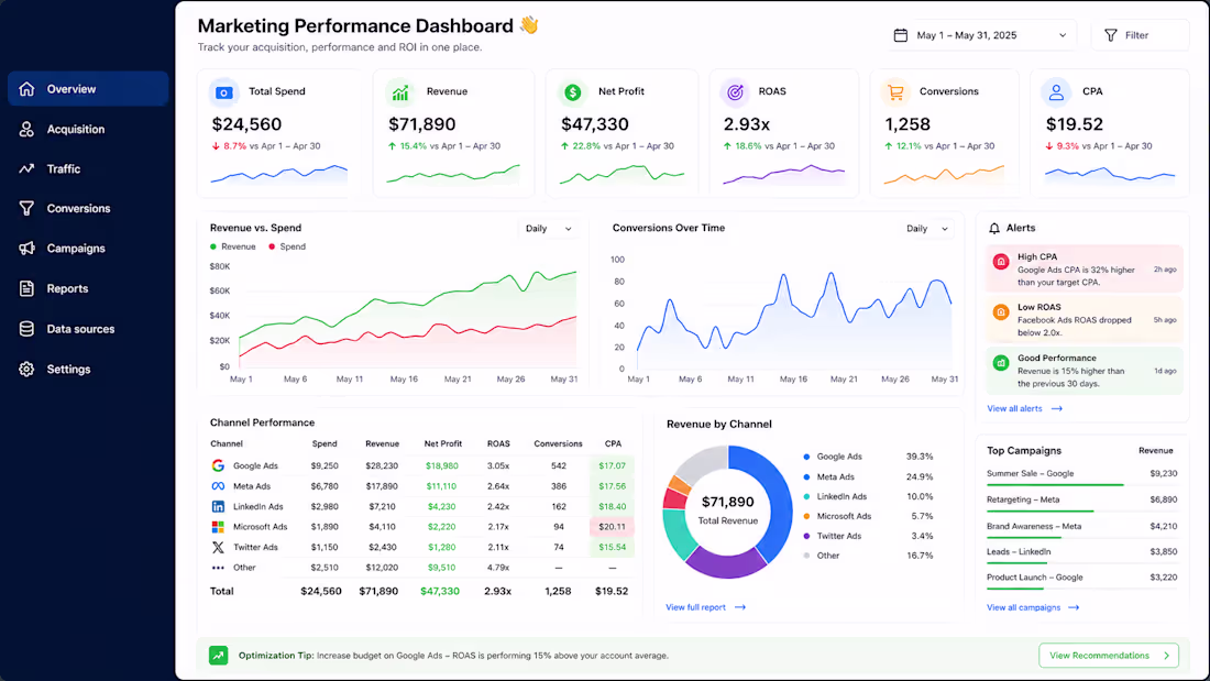
This dashboard was created to centralize marketing and acquisition performance into one easy-to-understand reporting system. Earlier, data was scattered across multiple platforms and reports, making analysis slow and confusing. With this dashboard, key KPIs like Spend, Revenue, ROAS, CPA, Conversions, and Profitability became visible in real time. Proper color logic was used where green highlights positive growth and red indicates performance drop or higher costs. The dashboard helped identify low-performing campaigns, improve budget allocation, reduce manual reporting effort, and increase decision-making speed. It also removed dependency on vanity metrics and improved overall visibility for stakeholders and leadership teams.
0
25
Here's your project description for the Executive Dashboard, ready to paste:
Built a multi-page executive dashboard at Lowe's for US finance and logistics leadership, tracking transportation costs, carrier performance, and fulfillment expense across lanes. Used Tableau and BigQuery to connect live data sources, built custom KPI cards, outlier detection, and automated weekly commentary for stakeholder alignment. The dashboard reduced manual reporting effort by several hours weekly and directly supported a $1.2M carrier cost optimization project by surfacing lane-level inefficiencies that leadership used in contract renegotiations with US carriers.
0
26