
Karan Das
Data Analyst | Excel Dashboards | Power BI | SQL
New to Contra
Karan is building their profile!
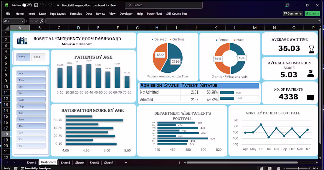
📊 Interactive Excel Dashboard with Data Cleaning & Insights
🔍 Project Overview
This project demonstrates how raw, unstructured data can be transformed into a clean dataset and converted into an interactive Excel dashboard for better business insights.
⚙️ Work Done
Imported raw data and cleaned it using Excel and Power Query
Removed duplicates and handled missing values
Standardized formats for consistency (dates, text, numbers)
Created calculated fields for key metrics
Built an interactive dashboard using Pivot Tables, Charts, and Slicers
📈 Dashboard Features
Dynamic filtering using slicers
Clear visualization of trends and performance
KPI tracking for quick decision-making
User-friendly layout for easy navigation
💡 Key Insights
Identified performance trends over time
Highlighted top and low-performing categories
Enabled quick comparison across different segments
🛠️ Tools Used
Microsoft Excel
Power Query
Pivot Tables & Charts
🚀 Outcome
The final output is a fully interactive dashboard that helps users:
Analyze data quickly
Make informed decisions
Reduce manual reporting effort
👉 Open to similar projects involving Excel dashboards, data cleaning, and reporting automation.
1
21
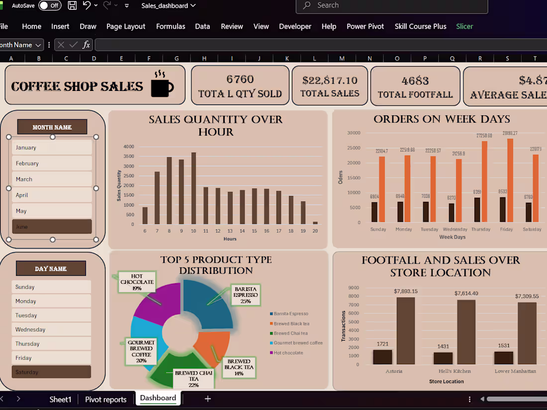
📊 Excel Sales Dashboard & Data Cleaning Project
🔍 Problem
Businesses often deal with messy, unstructured sales data (missing values, duplicates, inconsistent formats), making it difficult to generate accurate reports and insights.
⚙️ Solution
In this project, I transformed raw sales data into a clean, structured dataset and built an interactive Excel dashboard for better decision-making.
🛠️ What I Did
Cleaned and structured raw CSV data using Excel formulas and Power Query
Removed duplicates, handled missing values, and standardized formats
Created calculated columns for KPIs like Total Sales, Profit, and Growth
Built an interactive dashboard with slicers and dynamic charts
📈 Key Insights Delivered
Identified top-performing products and regions
Highlighted monthly sales trends
Enabled quick filtering for better business analysis
💻 Tools Used
Microsoft Excel
Power Query
Pivot Tables & Charts
🚀 Outcome
The final dashboard allows users to:
Track performance in real-time
Make data-driven decisions
Save hours of manual reporting effort
👉 If you need a similar dashboard or data cleaning service, feel free to reach out.
1
22