
Kamran Ali
I am a Full Stack Engineer in React,Node,SaaS,and WordPress.
- 6
- Followers


🎉 A new milestone: I’m officially a Jitter Expert on Contra!
I’m excited to have earned this recognition and to keep building better visual experiences for the web.
I enjoy creating clean, modern interfaces and motion-driven visuals that help products communicate more clearly — from animated UI elements to polished landing-page experiences.
Now I’m looking forward to connecting with founders, designers, and developers who need help bringing their ideas to life.
Working on a product that could use better motion or a more polished interface? Let’s connect.
#Jitter #MotionDesign #WebDesign #Contra #CreativeDevelopment
1
2
16

A business website should do more than just look good.
When someone visits a website, they should quickly understand:
What the business offers
Why it may be right for them
How to get in touch
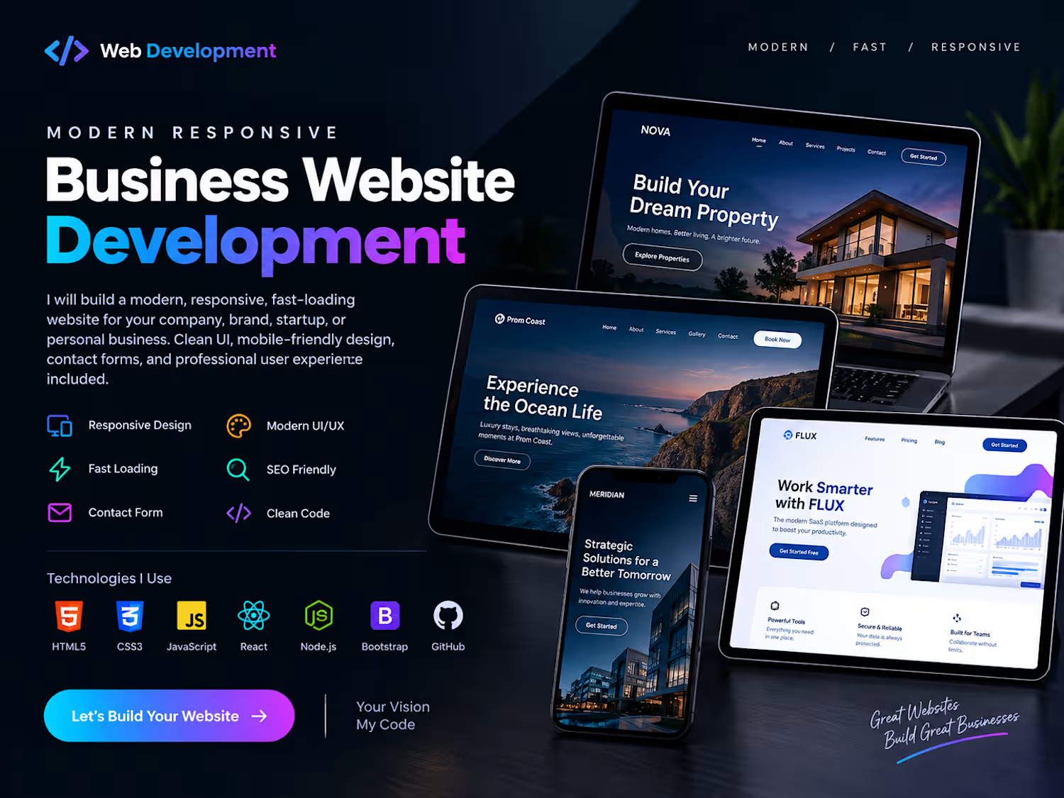
I’ve been building responsive website projects with HTML, CSS, and JavaScript, focusing on clear layouts, mobile usability, and straightforward navigation.
I’m continuing to improve my approach with every project.
What’s the first thing you look for when visiting a business website?
2
77
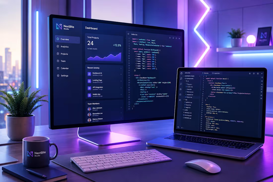
A beautiful website is good. A website that works smoothly on every screen is better. 🚀
When I build a website, I focus on more than just how it looks.
I care about:
→ Clean, maintainable code
→ Responsive layouts for mobile, tablet, and desktop
→ Fast loading and smooth interactions
→ Clear navigation and user-friendly design
→ Turning business goals into practical web experiences
My current toolkit:
🛠️ HTML5 · CSS3 · JavaScript · React
💻 VS Code · Git · GitHub
📱 Responsive Web Design · Frontend Development
My process is simple: understand the goal, build the interface, test it across screen sizes, and refine the details.
I'm currently building my portfolio and looking to connect with businesses and founders who need a reliable website or a landing page.
What matters most to you in a business website: speed, design, or conversions? 👇
1
58
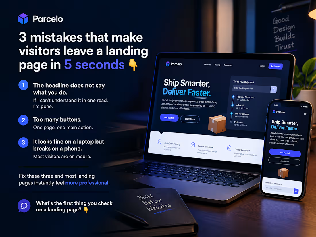
3 mistakes that make visitors leave a landing page in 5 seconds 👇
The headline does not say what you do. If I can't understand it in one read, I'm gone.
Too many buttons. One page, one main action.
It looks fine on a laptop but breaks on a phone. Most visitors are on mobile.
Fix these three and most landing pages instantly feel more professional.
What's the first thing you check on a landing page? 👇
0
41