
Kalprajsinh Rana
I deliver sales analytics reports and dashboards
New to Contra
Kalprajsinh is building their profile!
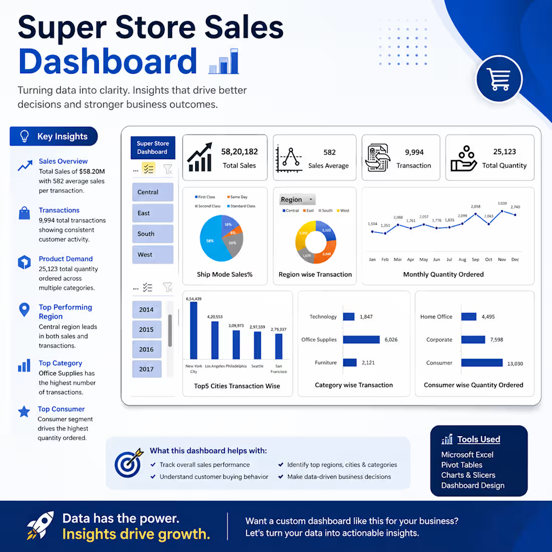
📊 Super Store Sales Dashboard | Microsoft Excel
Data is only valuable when it leads to better decisions.
This project showcases an interactive Excel dashboard designed to transform raw sales data into meaningful business insights. Using Pivot Tables, Pivot Charts, KPI cards, and interactive slicers, the dashboard provides a clear overview of sales performance, customer behavior, and regional trends.
🔍 Key Metrics
• Total Sales: ₹5.82M+
• Total Transactions: 9,994
• Total Quantity Sold: 25,123
• Average Sales per Transaction: ₹582
✨ Dashboard Highlights
• Interactive Region & Year Filters
• KPI Summary Cards
• Monthly Sales & Quantity Trends
• Region-wise Performance Analysis
• Ship Mode Distribution
• Top 5 Performing Cities
• Category-wise Transaction Analysis
• Customer Segment Analysis
• Clean & Executive-Friendly Dashboard Design
💡 Business Value
Rather than displaying data, this dashboard enables stakeholders to quickly answer important business questions, such as:
• Which regions contribute the highest sales?
• Which product categories drive the most transactions?
• How do customer purchasing patterns change over time?
• What trends can support better strategic decisions?
🛠 Tools & Technologies
• Microsoft Excel
• Pivot Tables
• Pivot Charts
• Interactive Slicers
• Dashboard Design
• Data Visualization
This project demonstrates how Excel can be leveraged to build professional, interactive dashboards that simplify complex datasets and support data-driven decision-making.
I'm always looking to solve business problems through data analytics, automation, and visualization.
#DataAnalytics #Excel #Dashboard #BusinessIntelligence #DataVisualization #MicrosoftExcel #ExcelDashboard #Analytics #BusinessAnalytics #PowerBI #SQL #DataDriven #Portfolio
1
54