
Kaique Santos Gomes
Brand, web, and motion design for startups.
New to Contra
Kaique is ready for their next project!
Resellify is a circular fashion platform helping shoppers save purchased fashion items into a digital wardrobe and later resell them, while giving merchants a way to participate in secondhand value after the first sale.
Store Credit was designed to explore a sharper business loop: instead of resale ending as a one-off commission event, sellers could choose merchant-funded store credit after an eligible item sold, creating a potential path back to the original store.
As Lead Product Designer, I worked with founders and engineering to turn that business idea into a clear, trustworthy seller experience. The challenge was not only showing users a better payout option, but making the trade-off feel fair, understandable, and safe. Sellers needed to compare cash vs. store credit, understand the uplift, review limitations, and confirm a one-way switch without feeling pushed into a less flexible payout.
I designed the payout flow structure, cash vs. credit comparison, eligibility communication, confirmation step, interaction states, and handoff-ready flows. The v1 shipped as a post-sale payout experience for eligible resale items, giving the team a real product surface to learn from selection rate, redemption behavior, repeat purchase behavior, and support issues.
0
8
Resellify is a fashion-tech startup helping merchants turn past purchases into new resale, loyalty, and customer engagement opportunities.
For this B2B go-to-market video, the challenge was to translate a complex product proposition into a simple, visual story for merchants: how Resellify connects with Shopify, adds resale touchpoints to the customer journey, and helps brands participate in circular fashion without adding operational complexity.
I developed the video direction, narrative structure, and visual approach to make the product easier to understand for potential partners and merchants. The focus was on communicating the business value quickly, showing how the experience works, and making the product feel credible, modern, and easy to adopt.
2
45
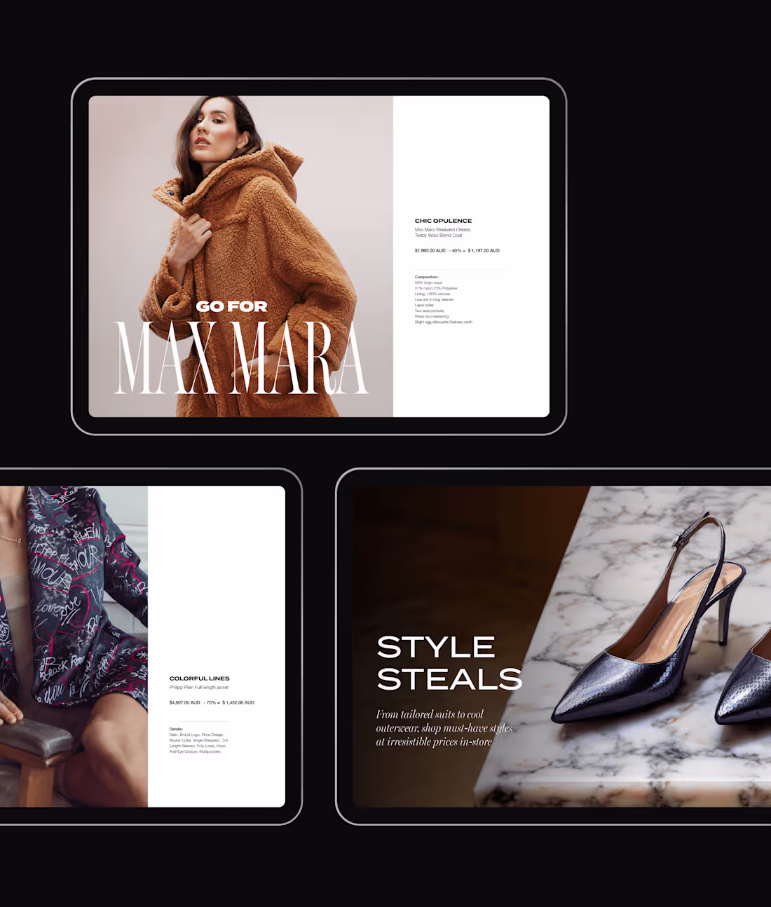
Designed premium campaign visuals for Estro Luxury Designer Outlet, a Sydney-based luxury fashion retailer. As Lead Graphic Designer, I created assets across e-commerce, social media, paid ads, email marketing, and in-store signage, helping the brand maintain a cohesive editorial identity across digital and physical touchpoints.
1
63
Il Pontile was an Italian restaurant located at Sydney’s Finger Wharf, a premium dining destination known for its waterfront setting.
Working in-house, I designed the restaurant’s visual identity and extended it across key brand touchpoints, including the wordmark, brand book, menus, wine list, social media assets, motion pieces, and website direction.
The challenge was to create a brand that felt modern, elegant, and distinctly Italian, while differentiating the restaurant from the previous venue that occupied the same space. The final identity used a custom wordmark and a warm Mediterranean-inspired visual direction to communicate a more refined, minimalist dining experience.
1
15
Project Overview
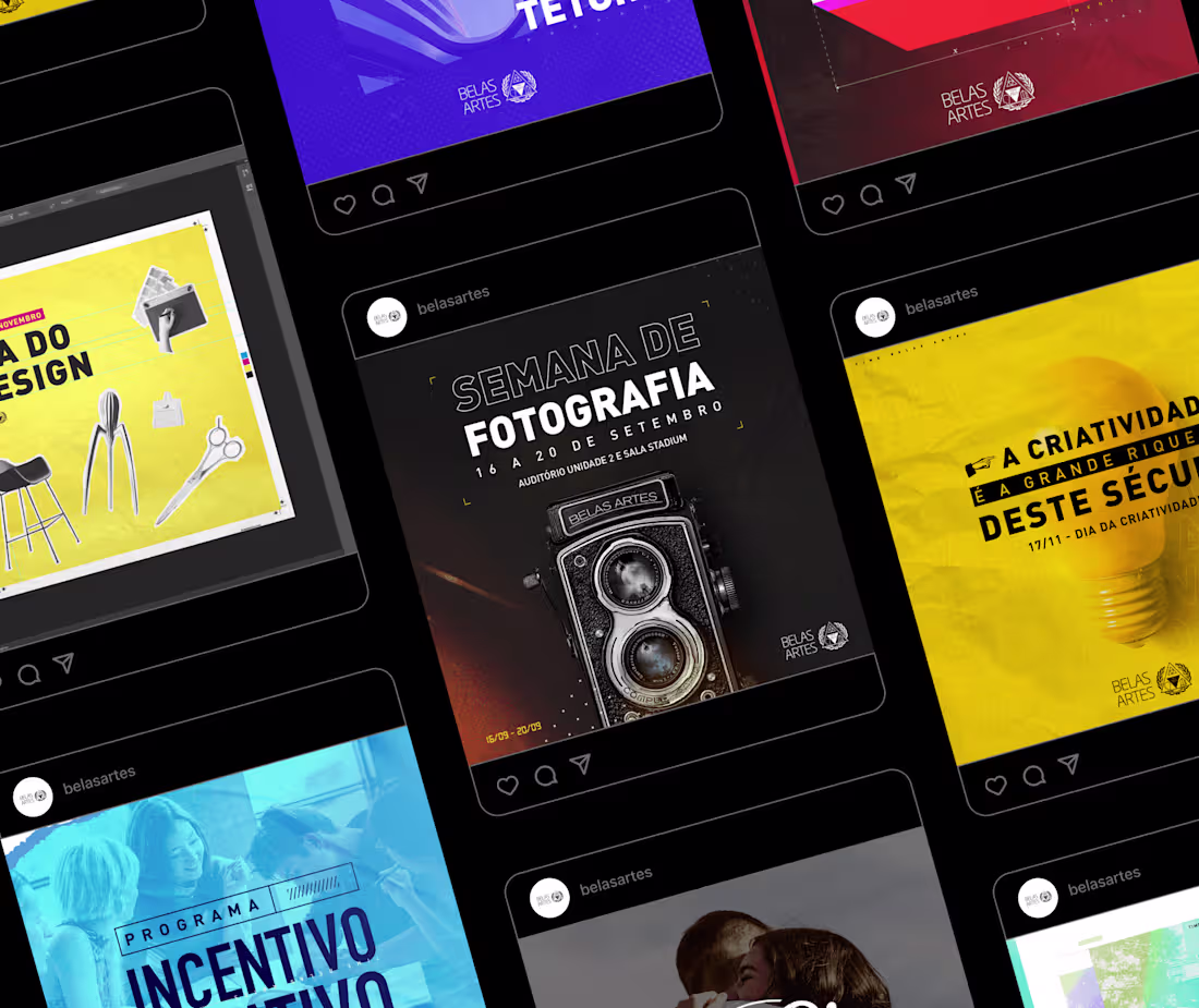
Belas Artes University is a Brazilian institution focused on art, design, architecture, communication, and creative education.
While working part-time in the university’s marketing department, I designed key visuals for a wide range of academic, cultural, and institutional campaigns. The challenge was to create distinct visual directions for different courses, events, and celebrations while keeping every piece aligned with the university’s broader brand standards.
Working under the guidance of the art director and alongside the marketing team, I developed social media assets that needed to be visually expressive, adaptable, and production-ready in a fast-paced environment. The work included campaign concepts, layout exploration, image treatment, typography, and visual systems that could be replicated across multiple formats.
1
26
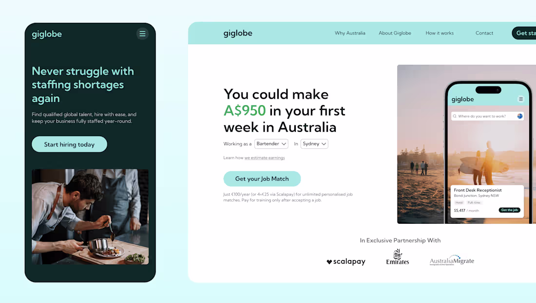
Giglobe is a cross-border job matching startup connecting international talent with hospitality and retail employers in Australia.
The website needed to communicate two sides of the marketplace clearly: helping candidates understand the earning potential and job opportunities in Australia, while also showing employers how Giglobe could help reduce staffing shortages.
I designed and built the landing page in Webflow, creating responsive layouts for both B2C and B2B messaging. The goal was to make the product feel credible, easy to understand, and conversion-ready, with clear calls to action, partner signals, and a visual system that could support future growth.
1
50
Nutrily is a mobile app concept focused on helping families build better nutritional awareness and make healthier decisions while grocery shopping.
As the sole designer, I created the visual identity from the ground up, including the logo, brand system, typography direction, brand book, and motion graphics concept. The goal was to create a friendly, memorable, and health-focused identity that could feel trustworthy for parents while still feeling modern and accessible for everyday use.
The project also included a logo animation and marketing video direction to communicate the app’s value proposition in a simple, engaging way. The visual system was designed to support both product communication and future marketing touchpoints.
1
37
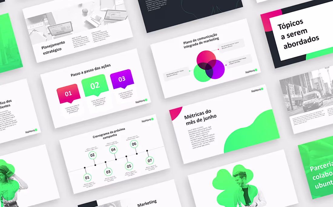
NaHora is a fintech platform designed to connect financial institutions, retailers, and end consumers through simpler and more accessible financial experiences.
I worked closely with the company’s director and key stakeholders to translate the brand vision into a cohesive visual identity and a practical presentation system. The goal was to create a pitch deck template that felt modern, approachable, and trustworthy, while giving the team enough flexibility to present strategy, metrics, marketing plans, partnerships, and business opportunities consistently.
The final deliverable was an editable PowerPoint deck system supported by NaHora’s brand identity, including logo, color palette, typography, layout principles, visual direction, and reusable slide patterns. This allowed the team to create polished presentations without losing brand consistency.
1
21